Category: Website Design & Dev

  • 12 Examples of Stunning UK E-commerce Website Design

    12 Examples of Stunning UK E-commerce Website Design

    Building a great e-commerce website is not just about looking pretty. It is about making sure the customer journey is smoother than a freshly paved road. It is about ensuring your visitor does not throw their hands up in despair and close the tab. If your checkout process is a total nightmare, people will simply leave. They will go elsewhere. They will find someone who does not make them fill out fifteen different forms just to buy a simple pair of socks.

    We have spent some serious time hunting down the absolute best online shops in the country. These twelve homegrown champions have truly cracked the digital code. They are sleek. They are clever. They know exactly how to turn a casual browser into a loyal paying customer. Let us dive into what makes them so special and see what we can learn from their digital brilliance.

    The High-Octane Fashion Masters

    – Gymshark

    Gymshark started in a quiet garage in Solihull. It is now a global sportswear powerhouse. Their website design tells you exactly why. It is built entirely for mobile devices. It is fast. It is punchy. It does not waste a single second of your time. The images are incredibly sharp. The text is bold. It feels exactly like stepping into a modern high-intensity gym.

    The desktop site looks wonderful but the mobile interface is where the magic really happens. Everything is within perfect reach of your thumb. Swiping through clothing items feels completely natural. The add-to-cart animation is incredibly smooth. It gives you instant visual confirmation without interrupting your browsing flow. It keeps you moving forward.

    • The mobile-first design functions smoothly on smaller smartphone screens.
    • Frictionless micro-interactions make adding items to your bag a total breeze.
    • High-contrast photography makes every product look premium and desirable.
    • The checkout path requires very few steps to complete a purchase.

    – Passenger Clothing

    Passenger Clothing is tucked away in the beautiful New Forest. They make clothing for outdoor adventurers and nature lovers. Their website looks like a breath of fresh country air. They use a gorgeous palette of deep forest greens, soft sandy beiges and rich autumn leaves. It instantly tells you exactly who they are and what they stand for.

    They do not just sell jackets and woolly hats. They sell a complete lifestyle. Their blog section is called the Journal. It is packed with stories about wild camping, surfing trips and protecting the environment. Their eco-friendly missions are woven directly into the shopping process. You see exactly how many trees are planted with your purchase before you pay.

    • An organic colour palette perfectly matches their sustainable clothing philosophy.
    • Immersive visual storytelling turns a basic shop into an active community hub.
    • Clear environmental impact markers show customers their ethical choices in real time.
    • Simple layouts give large outdoor lifestyle images plenty of room to breathe.

    – OddBalls

    OddBalls arrived on the scene with a very clear mission. They wanted to sell bright underwear and raise vital awareness for testicular cancer. They are based in Newcastle upon Tyne. Their website design is completely unapologetic. It is incredibly loud. It is brilliantly colourful. It is absolutely bursting with classic British personality and humour.

    Many brands are terrified of using bright colours. OddBalls embraces them fully. The homepage is an absolute festival of neon pinks, electric blues and sunny yellows. Yet it never feels chaotic. The underlying grid system is incredibly neat. The bright colours are used intentionally to guide your eyes directly to the shopping buttons.

    • Bold typography grabs your attention the very second the page loads up.
    • Bright contrasting buttons make finding the checkout incredibly straightforward.
    • A playful tone of voice builds an instant friendly connection with shoppers.
    • Charity integration is highlighted clearly without dampening the fun mood.

    The Culinary Innovators

    – Ooni Pizza Ovens

    Ooni designs portable pizza ovens up in Edinburgh. These are premium high-ticket items. People do not usually buy an expensive outdoor oven on a wild whim. They need a bit of gentle persuading. The Ooni website handles this brilliantly through the clever use of high-definition video loops right on the homepage.

    The very first thing you see is wood-fired pizza cooking in seconds. You see the cheese bubbling. You see the crust turning perfectly golden brown. It makes your mouth water instantly. They also include an incredibly helpful breakdown of exactly what comes inside the box. This completely removes any lingering doubts before you buy.

    • High-definition video loops demonstrate the product in action immediately.
    • An explicit visual checklist shows exactly what arrives in your delivery box.
    • An extensive recipe archive keeps customers returning to the site weekly.
    • Clear structural comparison charts help you choose the right oven model easily.

    – Sous Chef

    Sous Chef is the ultimate online paradise for dedicated food lovers in London. They stock thousands of incredibly niche ingredients. Managing a massive inventory can easily result in a cluttered website. Sous Chef completely avoids this trap. They use a masterfully structured mega-menu that organises everything beautifully.

    The design is wonderfully clean and minimalist. It feels like walking into a high-end boutique grocer. You can search by specific country, ingredient type or current culinary trend. The predictive search bar is lightning fast. It suggests the exact item you want before you even finish typing the word.

    • A brilliant mega-menu manages massive inventory without cluttering the screen.
    • A minimalist layout lets colourful exotic spice jars do all the visual talking.
    • Intelligent predictive search parameters save customers heaps of browsing time.
    • Curated recipe kits combine ingredients and cooking equipment into single clicks.

    – The Fish Society

    The Fish Society operates out of Surrey. They sell premium frozen seafood online. Frozen fish is not traditionally the easiest product to make look glamorous. Yet their website design pulls it off flawlessly. They use professional food styling and exceptional lifestyle photography to make every single fillet look like a luxury item.

    They understand that buying fresh fish online requires a great deal of trust. Their design places customer reviews and trust badges right at the top of the page. They also use a clear countdown timer. It tells you exactly how many hours you have left to secure next-day delivery. This creates a helpful sense of urgency.

    • Premium lifestyle photography elevates an everyday item into a luxury experience.
    • Next-day delivery countdown timers encourage faster buying decisions.
    • Prominent trust signals reassure customers about product freshness and safety.
    • Detailed cooking guides provide genuine value right on the product pages.

    The Beauty and Wellness Guardians

    – Charlotte Tilbury

    Charlotte Tilbury is a massive name in the luxury beauty world. Her London-based online store is a masterclass in digital glamour. Shopping for makeup online can be incredibly tricky. You cannot easily test the shades on your skin. The website solves this massive problem by using highly interactive digital tools.

    Their proprietary Shade Finder tool is absolutely brilliant. It uses advanced algorithms to match foundations to your skin tone via your camera. The whole website feels like stepping into a premium department store. It uses rich burgundy backgrounds and glittering gold accents. It feels expensive. It feels exclusive. It guides you seamlessly through the process.

    • Interactive skin-matching tools completely eliminate online buying guesswork.
    • Rich colour choices replicate the luxurious feeling of a physical beauty counter.
    • An interactive mega-menu uses helpful images alongside standard text links.
    • A virtual gift finder simplifies the process of buying products for others.

    – Space NK

    Space NK brings premium cosmetics to the digital world from their London headquarters. Their design strategy is the exact opposite of loud branding. They embrace a beautiful minimalist aesthetic. They use heaps of clean white space. The entire website acts as a quiet, sophisticated canvas for the luxury products.

    When you sell colourful makeup items, your website background should not compete for attention. Space NK understands this perfectly. The clean layout makes the vibrant product packaging pop right out at the viewer. Navigating through different luxury brands is incredibly easy. The filtering options are exceptionally detailed without feeling heavy.

    • Abundant negative space creates an instant feeling of high-end prestige.
    • Advanced filtering systems let you sort products by specific skin concerns.
    • A highly sophisticated loyalty programme dashboard keeps customers coming back.
    • Clean grid layouts make browsing through multiple brands feel completely effortless.

    – Form Nutrition

    Form Nutrition is a wellness brand based in London. The fitness supplement industry is usually filled with aggressive designs. You often see neon colours, massive plastic tubs and intense gym imagery. Form Nutrition completely turned that cliche on its head. They created a website that looks like a beautiful high-end magazine.

    They use elegant serif typography. Their colour palette relies on soft, muted tones and gentle greys. It feels incredibly calm, trustworthy, and authoritative. They do not shout at you to lift heavier weights. They speak quietly about health, mindfulness and nutrition. It is a stunning example of breaking industry rules to stand out.

    • Editorial-style layouts break away from aggressive fitness design cliches.
    • Elegant serif typography establishes immediate authority and scientific trust.
    • Muted natural tones appeal directly to a modern, health-conscious demographic.
    • Clear ingredient breakdowns explain the benefits of every single component.

    The Lifestyle and Gifting Experts

    – Bloom & Wild

    Bloom & Wild completely redefined the flower delivery business from London. They are famous for their brilliant letterbox flowers. Their website design is a masterclass in removing friction from the gifting process. They understand that people buying flowers are usually in a bit of a rush. They want a fast, reliable service.

    The checkout process is tailored specifically for gifting. It does not ask you for irrelevant information. It clearly shows you exactly how the flowers are packed flat to fit through a standard British letterbox. This immediately answers the customer’s biggest worry. It proves the recipient does not need to be home to receive them.

    • A specialised gifting checkout process simplifies entering recipient addresses.
    • Clear explanatory graphics show exactly how letterbox delivery functions.
    • Smart calendar integrations remind customers of upcoming birthdays and events.
    • Frictionless mobile payment options allow you to buy flowers in seconds.

    – Fortnum & Mason

    Fortnum & Mason has been trading in London since 1707. They are the ultimate definition of British heritage luxury. Merging three centuries of royal history with modern e-commerce functionality is no easy task. Yet their online store handles it with absolute grace. They wrap the entire digital experience in their iconic Eau de Nil colour.

    The website feels incredibly historic yet functions perfectly on modern browsers. The fonts are classic and elegant. The product descriptions are filled with posh British wit and charm. They make buying a luxury hamper feel like a grand occasion. The design ensures the heritage never gets in the way of a speedy checkout.

    • A signature heritage colour scheme creates instant brand recognition online.
    • Elegant traditional typography maintains a strong connection to royal history.
    • Modern UI functionality ensures that the historic design never slows you down.
    • Beautiful digital hamper builders let you customise your luxury gifts easily.

    – Farrow & Ball

    Farrow & Ball manufactures premium paint and wallpaper down in Dorset. Paint is an incredibly visual and tactile product. People like to see how a colour looks on a real wall under different lights. The Farrow & Ball website handles this challenge beautifully through an award-winning digital colour visualisation tool.

    When you select a paint colour, the website displays large, rich images of real rooms painted in that exact shade. It shows you how the colour responds to natural sunlight and evening shadows. The navigation is incredibly simple. It guides you gently from browsing inspiration to ordering your small sample pots.

    • Interactive room visualizers show paint shades in real-world lighting conditions.
    • Seamless sample ordering processes encourage users to test products at home.
    • Rich, detailed imagery provides endless inspiration for home decorators.
    • An intuitive navigation path connects inspirational blog posts directly to checkout.

    The Final Takeaway

    Looking closely at these twelve brilliant examples reveals a very clear pattern. The absolute best e-commerce websites do not succeed by accident. They succeed because they understand their specific audience inside out.

    They choose their colours with real intent. They keep their navigation simple. They make sure their mobile checkout is faster than a speeding bullet.

    You do not need to implement every single feature overnight. Start small. Look at your own digital storefront with fresh eyes. Is your checkout process a bit of a slog? Is your mobile layout looking a little tired? Fix those small issues first. Your customers will certainly thank you for it, and your sales figures will definitely show the difference.

    Ready to Transform Your Digital Storefront?

    If all of this feels like a massive mountain to climb, do not worry. You do not have to tackle it entirely on your own. Here at Prox Digital Agency, we specialise in building stunning, high-converting e-commerce websites in London that work flawlessly. We know exactly how to untangle complex layouts and create journeys your customers will absolutely love. Get in touch with Prox Digital Agency today, and let us turn your online shop into a true digital masterpiece.

    For the fundamentals behind great design, see our complete Web Design Guide for 2026, or talk to our ecommerce web design team.
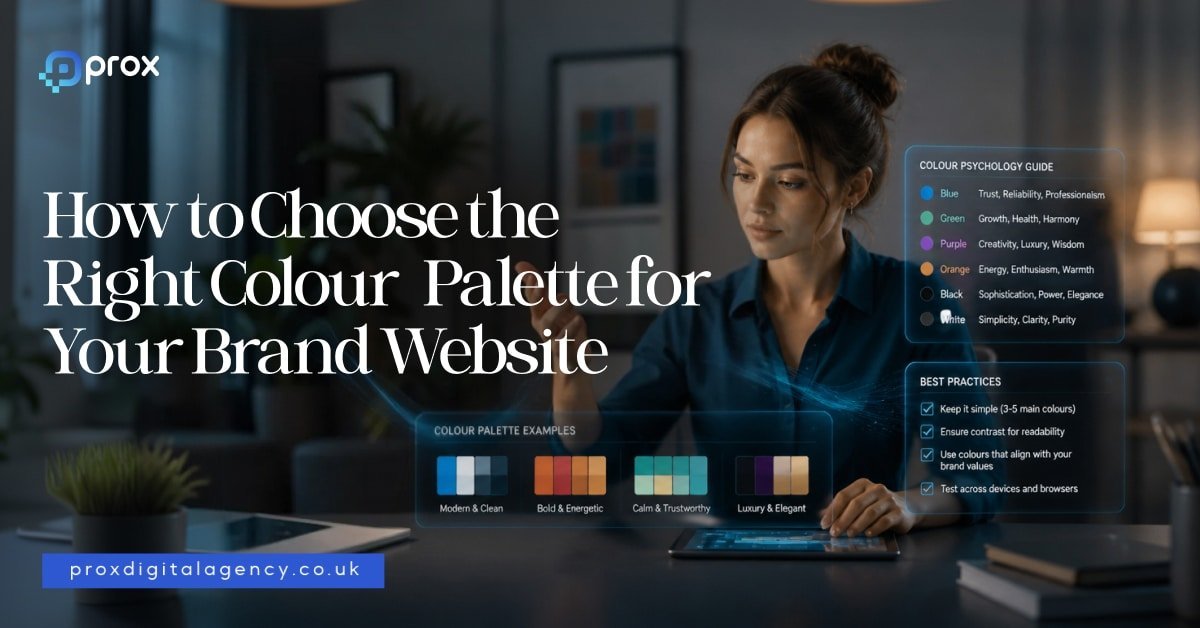

  • How to Choose the Right Colour Palette for Your Brand Website

    How to Choose the Right Colour Palette for Your Brand Website

    That makes colour one of the most powerful tools in modern web design. In 2026, brands no longer choose colours simply because they look attractive. They choose them because they communicate meaning. Every shade sends a signal. Every palette creates an expectation.

    As designer and artist Wassily Kandinsky famously said:

    “Colour is a power which directly influences the soul.”

    That statement feels more relevant today than ever. Modern websites compete for attention in crowded digital spaces. Users make decisions quickly. They judge credibility almost instantly. In many cases, colour becomes the difference between staying and leaving. Choosing the right palette is not about personal preference. It is about strategic communication.

    The Psychology Behind Colour Choices

    Human beings naturally associate colours with emotions and experiences. These associations influence behaviour every day. When we see certain colours, our brains create immediate interpretations based on culture, memory, environment and psychology.

    This is why colour psychology plays such an important role in branding and website design. The goal is not to manipulate users. The goal is to align visual communication with audience expectations.

    A luxury fashion brand should not feel like a discount supermarket. A healthcare company should not feel like a nightclub. Colour helps establish those distinctions instantly. Let us explore the meanings behind some of the world’s most commonly used brand colours.

    1- Blue Creates Trust and Stability

    Blue remains one of the most popular brand colours in the world. There is a reason for that. Blue communicates reliability, confidence, security and professionalism. It helps people feel comfortable. It reduces perceived risk.

    This explains why many financial institutions, technology companies and professional service firms use blue as a primary colour.

    Think about brands such as:

    • Facebook
    • LinkedIn
    • PayPal
    • IBM
    • Barclays

    Each of these brands wants users to trust them. Blue supports that objective. In 2026, designers continue using blue heavily in sectors where credibility matters more than excitement. For businesses in finance, technology, consulting, legal services, cybersecurity, or SaaS, blue remains a strong option.

    2- Red Captures Attention and Creates Energy

    Red works differently. It demands attention. Red creates urgency, excitement, passion, movement and action. It often increases emotional intensity. This explains why many food brands and retail companies use red strategically.

    Examples include:

    • Coca-Cola
    • Netflix
    • YouTube
    • Virgin

    These brands want energy. They want engagement. They want users to notice them immediately. However, red requires careful handling. Too much red can feel aggressive or overwhelming. Strong brands often combine red with neutral colours to maintain balance. In web design, red works particularly well for promotions, calls to action and high-energy consumer brands.

    3- Green Signals Growth and Wellbeing

    Green continues to dominate sectors linked to health, sustainability, finance and wellbeing. People associate green with nature, balance, freshness and growth. That association feels especially relevant in 2026 as consumers become more environmentally conscious. Brands increasingly use green to communicate responsibility and long-term thinking.

    Examples include:

    • Spotify
    • Whole Foods
    • Animal welfare organisations
    • Sustainable product companies

    Green also works exceptionally well for fintech businesses because it naturally connects with wealth and financial growth. A well-designed green palette can create a calm and reassuring digital experience.

    4- Yellow Brings Optimism and Positivity

    Few colours feel as cheerful as yellow. Yellow communicates warmth, happiness, confidence and creativity. It attracts attention without creating the intensity associated with red. Many brands use yellow to create a friendly personality.

    Think about:

    • McDonald’s
    • IKEA
    • Snapchat

    These companies want to feel approachable and memorable. However, yellow works best as an accent colour on websites. Large blocks of bright yellow can create visual fatigue. Smart designers often pair yellow with darker tones to improve readability and balance.

    5- Black Defines Luxury and Sophistication

    Luxury brands understand the power of restraint. That is why black remains a favourite choice among premium companies. Black communicates exclusivity, elegance, confidence and authority. It creates contrast. It creates drama. It creates focus.

    Some of the world’s most recognisable luxury brands use black extensively, including:

    • Chanel
    • Prada
    • Dior
    • Rolex

    In website design, black works particularly well when paired with generous white space and strong typography. The result feels refined rather than cluttered.

    As fashion designer Yohji Yamamoto once said:

    “Black is modest and arrogant at the same time.”

    Luxury brands understand exactly what he meant.

    6- White Space Is a Colour Strategy Too

    Many businesses focus entirely on colours and forget about what sits between them. White space matters. In fact, some of the strongest websites in 2026 use fewer colours than ever before. They rely on clean layouts, breathing room and visual simplicity. White creates clarity. It improves readability. It helps users focus on what matters.

    Brands such as Apple have mastered this approach for years. Their websites rarely feel crowded because they allow content and products to breathe. Sometimes the smartest colour decision is knowing when not to add another colour.

    Why Modern Brands Use Fewer Colours

    One major design trend continues to dominate in 2026. Simplification.

    Many brands are reducing colour complexity rather than increasing it. Instead of using six or seven competing colours, successful websites often rely on:

    • One primary brand colour
    • One supporting colour
    • One accent colour
    • Neutral backgrounds

    This creates consistency across websites, apps, social media and marketing campaigns. It also improves recognition. When people see a colour repeatedly, they begin associating it with a specific brand. That consistency creates long-term brand equity.

    Colour Is About Meaning, Not Preference

    One of the biggest mistakes businesses make is choosing colours based solely on personal taste.

    • A founder might love orange.
    • A director might prefer purple.

    But branding decisions should never begin with personal preferences. They should begin with audience expectations.

    The right question is not: ‘What colour do we like?’

    The right question is: ‘What colour helps our audience trust, remember and understand us?’

    That shift changes everything. The most successful colour palettes are built around communication instead of over-ornate embellishments. And that is where strategic brand design begins.

    Why Colour Matters More Than Ever in 2026

    Colour influences perception long before content does. It shapes emotion, trust, credibility and behaviour within seconds. Every colour carries meaning. Every palette tells a story. The strongest brands understand this. They choose colours deliberately rather than emotionally.

    Now, we will explore how different industries should approach colour selection, the biggest colour mistakes businesses make, the leading website colour trends shaping 2026, and a practical framework for building the perfect colour palette for your brand website.

    Matching Colours to Your Industry

    Choosing the right colour palette becomes much easier when you understand the expectations of your market. Different industries communicate different promises. Colours help reinforce those promises before a visitor reads a single line of copy.

    This does not mean every business in a sector should use identical colours. It simply means certain colours naturally support certain messages. When colour and brand positioning work together, users experience consistency. When they clash, trust weakens.

    Let’s explore some common examples.

    1- Technology and SaaS Brands

    As we all know that tech companies often rely on blue because trust remains a critical part of the buying process. People want confidence when they purchase software, cybersecurity solutions, cloud services or digital platforms.

    Blue communicates stability and expertise. However, modern SaaS brands in 2026 are becoming more adventurous. Many now combine blue with vibrant accent colours such as:

    • Purple
    • Cyan
    • Electric green
    • Bright coral

    This creates a balance between trust and innovation. Brands want to appear reliable, but they also want to feel modern and forward-thinking.

    2- Financial Services and Fintech

    Money creates emotion and people want security when making financial decisions. They also want confidence that a company understands their future goals. This is why blue and green continue to dominate financial branding.

    • Blue suggests trust and professionalism.
    • Green suggests growth, prosperity, and long-term success.

    Many fintech brands now blend these colours with minimalist interfaces to create a clean and modern experience. The result feels less corporate and more approachable.

    3- Healthcare and Wellness Brands

    Healthcare websites need to create calm. Users often arrive with concerns, questions or uncertainty. Strong healthcare design reduces anxiety rather than increasing it.

    This explains the popularity of:

    • Soft blues
    • Greens
    • White backgrounds
    • Muted neutral tones

    These colours create feelings of safety and reassurance. Wellness brands often push this even further by introducing earthy colours inspired by nature.

    Sage green, soft beige, clay tones and warm creams continue to grow in popularity throughout 2026.

    4- Luxury Brands

    Luxury branding follows a different set of rules. Luxury brands rarely try to attract attention through bright colours. Instead, they focus on exclusivity.

    Black, charcoal, deep navy, gold and white remain dominant choices.

    These colours communicate confidence without shouting. Luxury brands understand an important principle. True confidence rarely needs to be loud. That is why many premium websites feel simple, elegant and highly restrained.

    5- Creative Agencies and Design Studios

    Creative businesses have more freedom than most industries. Their websites often serve as proof of their creativity. Many agencies use bold colour combinations to create memorable experiences.

    Bright gradients, vibrant accents and unexpected colour pairings continue to appear across agency websites in 2026.

    However, successful agencies still maintain strategic control. They use colour to reinforce personality rather than create chaos. The best creative websites feel distinctive without becoming overwhelming.

    6- Ecommerce and Consumer Brands

    Retail brands often use colour to drive emotion and purchasing behaviour.

    • Fashion brands frequently choose black and white palettes to keep attention on products.
    • Beauty brands often use soft neutrals, blush tones, and muted pastels.
    • Food and beverage companies frequently rely on warmer colours that stimulate energy and appetite.
    • Consumer brands must think carefully about emotional triggers.

    A website should feel consistent with the experience customers expect from the product itself.

    The Biggest Colour Mistakes Brands Make in 2026

    Choosing colours can be exciting. Unfortunately, many businesses make decisions that create confusion instead of clarity.

    • One common mistake involves following trends without considering brand identity. A colour trend may look attractive today, but it may not align with your positioning.
    • Another mistake involves using too many colours. When every element competes for attention, nothing stands out. Users struggle to understand hierarchy. The experience becomes visually exhausting.
    • Some businesses also ignore accessibility. A beautiful palette loses value if users cannot comfortably read the content. Strong colour palettes balance aesthetics with usability.

    Colour Trends Shaping Websites in 2026

    Every year introduces new design trends. However, the strongest trends in 2026 focus on authenticity and emotional connection rather than visual gimmicks.

    • One major trend involves natural colour palettes. Brands increasingly use colours inspired by nature because they create calm and credibility. Earthy greens, warm browns, soft blues, and organic neutrals continue gaining popularity.
    • Another trend involves richer, deeper tones. Instead of bright primary colours, many brands now prefer sophisticated shades with greater depth. These colours feel more mature and premium.
    • We also see increased use of subtle gradients. Unlike the loud gradients of previous years, modern gradients feel softer and more refined. They add depth without overwhelming the user experience.
    • Dark mode design also continues influencing colour selection. Many brands now create palettes that perform equally well in both light and dark environments. This requires greater consideration of contrast, accessibility and visual hierarchy.

    How to Build the Right Colour Palette for Your Website

    Choosing a colour palette does not need to feel complicated. A simple framework can make the process much easier.

    • Start with your brand personality. Ask yourself: What do we want people to feel when they visit our website? Do you want to appear trustworthy? Innovative? Premium? Friendly? Bold? Your answer should influence your primary colour choice.
    • Next, select a supporting colour that complements your primary colour. This colour should reinforce your overall personality rather than compete with it.
    • Then choose an accent colour. This colour should attract attention to important actions such as buttons, links, and calls to action.
    • Finally, build a neutral foundation using whites, greys, or muted background colours. This foundation creates breathing room throughout the design.

    Many successful websites rely on a simple formula:

    • One primary colour
    • One supporting colour
    • One accent colour
    • Neutral backgrounds

    Simple often wins.

    – Test Colours in Real Situations

    Many brands choose colours in isolation. They view them as swatches rather than experiences. This creates problems. Colours behave differently when placed inside real interfaces. A colour that looks fantastic in a logo may perform poorly on a website. Always test colours within actual layouts.

    Review them on:

    • Desktop screens
    • Mobile devices
    • Dark mode environments
    • Different lighting conditions

    Observe how users respond. Strong branding comes from evidence instead of bogus assumptions.

    – Colour Creates Memory

    One of the most overlooked benefits of colour is memorability. People remember colours remarkably well. Think about some of the world’s most recognisable brands. You can often picture their colours instantly.

    • The red of Coca-Cola.
    • The blue of Facebook.
    • The yellow of IKEA.
    • The green of Spotify.

    Colour helps brands occupy mental space. When used consistently, it becomes a shortcut to recognition. That recognition creates familiarity. Familiarity creates trust and trust creates business.

    – Colours Are Far More Than a Design Choice

    They influence perception, behaviour, emotion and decision-making. It shapes how people experience your brand long before they engage with your products or services.

    The most successful websites in 2026 do not choose colours based on trends alone. They choose colours that reflect their positioning, connect with their audience and support their commercial goals. A strong colour palette creates clarity. It strengthens recognition. It guides attention and reinforces trust at every stage of the user journey.

    As artist Paul Klee once said:

    “Colour possesses me. I don’t have to pursue it. It will possess me always.”

    Great brands understand this idea. They do not treat colour as decoration. They treat it as a strategy. And when colour strategy aligns with brand strategy, remarkable things happen.

    For the fundamentals behind this, see our UK web design guide, or talk to our website design and development agency. If a colour change is part of a bigger rebrand, see our complete guide to rebranding.

  • The Role of Typography in Web Design: A Step-by-Step Guide

    The Role of Typography in Web Design: A Step-by-Step Guide

    Typography controls mood, readability, and brand personality, creating a subtle sense of order that keeps people scrolling. You can easily add friction by adding wrong typography, or you have the chance to let your message feel effortless with the right typography application.

    The selection of typeface, word spacing, font sizing and structure all contributes in a good typography technique. Prox, a website design agency London, carefully crafts websites that show error-free typography in web design, and here’s how they begin.

    What Is Typography in Web Design?

    Before we dive into typography tips, you must learn what typography is in web design in 2026. Typography refers to the artful practice of aligning different texts and sentences on a website to make it visually attractive and reader-friendly. 

    Why Typography Matters for User Experience

    Web typography is not just selecting your favourite font from the library; it’s basically all about styling, sizing, spacing and adding structure to your selected fonts. And that’s the reason why it matters the most in improving the user journey. 

    Typography in web design allows your audience to comprehend your brand tone, tell them what to do next, where they should click and what to see first and enhances overall usability for them.

    Your text, their size, styling and alignment must be compatible with your web design on every device so that typography and user experience go side-by-side on any device they log in from. 

    Understanding Typography Hierarchy in Web Design

    Understanding website typography is an art. It magically tells you from where to begin, pause and last. It guides a visitor to know what you’re selling, the latest discount offers, and why you must have it in your cart. 

    Let’s learn about the hierarchy of typography for websites in UK. Start by mapping the layers.

    • H1 (Headline): One per page. The dominant statement.
    • H2 (Subheadings): Break the content into clear sections.
    • Body text: The meat of your message.
    • Supporting text: Captions, footnotes, disclaimers.

    How to Choose the Right Fonts for Your Website

    Improving website readability with typography and brand personality is the key to choosing the right fonts for your website. Here’s how to choose fonts for a website and what they reflect on your landing pages.

    Font Type Font Names What They Reflect Drawbacks
    Web-safe fonts Arial, Georgia, Verdana They are safe and load instantly as they already live on most devices. Limited in character
    Google Fonts Roboto, Tiira, Open Sans, Inter Free, huge library, and easy to implement. Each font adds download weight
    Custom typefaces San Francisco, Coca-Cola Spencerian, Netflix Sans Add Uniqueness. They require a web licence to use. They can also bloat your page if not served in modern formats like WOFF2.

    As a rule, stick to a maximum of two typefaces. One for headings and one for body. If you still try to add any more font styles, your webpage starts to feel messy.

    Typography Best Practices for Readability

    Good font pairing creates readability. Bad pairing feels like an argument. Best typography practices for websites include pairing fonts, “a serif with a sans-serif.” This means creating contrast using a modern font for headings and a simpler font for body text provides consistency and typography hierarchy.

    Font pairing for websites prioritises legibility and establishes visual hierarchy in web design. Here is a quick website font selection guide and how they create effects.

    Heading Typeface Body Typeface Result
    Playfair Display Inter Refined, crisp, editorial
    Montserrat Source Serif 4 Modern, structured
    Merriweather Open Sans Warm, solid, readable
    Lora Poppins Approachable, creative

    Even after selecting two typefaces of your choice, apply it on a paragraph and read it with your eyes. You will understand instantly if it’s working or not.

    Typography and Website Accessibility

    Typography and website accessibility are reflected in good web design. It is about making text available in a form that can be read and understood by all people, including those with vision impairments, intellectual disabilities, or motor difficulties.

    Typography and accessibility typically involve applying deliberate formatting like optimal sizing, high contrast, and clear spacing. These practices also help assistive technologies interpret content smoothly and make it easier for diverse users to understand information.

    • Colour contrast: Regular text should have a strong contrast, while larger text can use slightly lower contrast. Check with a reliable colour contract checker to make sure your colours are easy to read.
    • Alignment: Left-aligned text makes reading easiest for left-to-right languages. Justified text creates uneven gaps and visual distraction.
    • Weight: Very thin fonts can be difficult to read on some screens. Stick to 400 or above for body copy.
    • Zoom: Always enable pinch-to-zoom for mobile devices. Many users depend on it. Even advanced technologies also offer Zoom for desktop versions.
    • Inclusive typefaces: Sans-serif fonts like Open Sans and Arial are reader friendly font even for dyslexic people. Lengthy Italics usually add reading friction.

    Responsive Typography for Mobile Devices

    Responsive typography design principles are helpful for mobile users. Responsive typography includes font sizes, column widths, and line spacing that automatically adjust to fit on different screen sizes easily. This reduces the efforts to Pinch, Zoom or scroll horizontally for any performed actions.

    Open a page on your phone, read a full paragraph without zooming or pinching under ordinary light. If your eyes feel a slight pull, adjust it in your web design. 

    Responsive typography best practices offer

    • Enhanced readability in web design
    • Better SEO
    • Overall improved usability.

    Common Typography Mistakes to Avoid While Web Designing

    You can choose excellent fonts, but they won’t help much if the basics aren’t right. Spotting these mistakes early keeps a website readable and trustworthy. 

    • Using more than two typefaces. Two typefaces are enough. One for headings, one for body. More than that creates visual chaos and adds unnecessary page weight.
    • Smaller body text. Any text below 16px forces the reader to put effort. On mobile, it becomes a fast exit. Use 18px as it’s a safer default for content-rich pages.
    • Low contrast. Pale grey text on white backgrounds may look elegant in a mockup, but fails accessibility checks and can be tiring to read. Aim for a ratio of 4.5:1 minimum on body copy.
    • Justification text on the web. Uneven word spacing is nothing but awkward gaps and interrupts the reading flow badly. Apply left-aligned text to improve consistency and readability.
    • Decorative fonts for body copy. Display and script typefaces belong in headlines or accents only. Paragraphs set in decorative fonts demand effort rather than reward attention.
    • Neglect typography testing on devices. It is highly possible that a beautifully readable font on a Mac can feel broken on a desktop or an Android. Always check live hardware before sending your website live.

    Typography tips for better user experience

    Work on these mistakes and apply typography tips for better user experience. Fixing them costs little and pays back in trust. If you’re looking to avoid these issues altogether, it’s wise to hire web designer in London who pays close attention to typography, usability, and overall website performance.

    Typography Trends in Modern Web Design

    Bold visuals, high-contrast layouts, and responsive typography design are the latest typography trends in 2026. Let’s take a look.

    Modern Typography Trends 2026 What It Does Best Used For
    Variable Fonts One file holds multiple weights and widths. Less load, more flexibility. Responsive sites where performance and fluid scaling matter.
    Kinetic Type Subtle motion applied to key headings. Guides attention without noise. Creative portfolios and brand-forward homepages.
    Oversized Headings Heavy, dominant headlines set against modest body text. Hero sections and landing pages that need instant hierarchy.
    Brutalist Type Raw, unrefined letterforms. Deliberately rough and direct. Brands want to signal authenticity over polish.

    Final Thoughts on Typography in Web Design

    Typography in web design is not decoration. It directly shapes how long people stay and how easily they read. Comfortable text keeps bounce rates low and trust high. These signals feed into search performance. Google’s Core Web Vitals reward pages that load instantly and stay visually stable on different devices. 

    We presented this step-by-step typography guide for web designers who are looking to build websites that engage visitors and support business growth.

    As a focused web design agency in London, Prox Digital build typography for UX design into the structure of every page. Our web designers in UK set hierarchies, pair fonts, and tune spacing so your content carries authority without friction. If you want a reading experience that feels effortless, we’re ready to connect.

    FAQs

    How many typefaces should I use on one site?

    Using two typofaces on a website is considered ideal; one for headings, one for body. That covers hierarchy without visual clutter.

    Does typography affect search rankings?

    Yes, typography indirectly affects search rankings. Readable, well-structured text improves engagement metrics that search engines interpret as quality signals. A clear heading hierarchy also helps crawlers understand content.

    How typography affects web design?

    Good typography makes content easier to read, strengthens visual hierarchy, and creates a better user experience.

    For the fundamentals behind good design, see the core principles of modern web design, or talk to our web design team. Colour matters just as much — see choosing the right colour palette.

  • Website Performance Optimization Speed, Core Web Vitals & Developer Best Practices

    Website Performance Optimization Speed, Core Web Vitals & Developer Best Practices

    Slow websites lose users before content is even seen. This is why website performance optimization has become critical for SEO, user experience and business growth.

    The 3 Second Rule That Decides If You Win or Lose Users

    Most users in the UK will leave a website if it takes longer than 3 seconds to load. That is not an opinion anymore, it is behaviour data backed by Google performance studies and real ecommerce analytics.

    A slow website does not just feel annoying. It quietly drains revenue.

    • 1 second delay can reduce conversions by up to 7 percent
    • Mobile users abandon slow pages even faster
    • Google tracks real user experience signals for ranking

    This is where website performance optimization becomes more than a technical task. It becomes a business requirement.

    Speed is no longer a ‘nice to have’. It is directly tied to SEO performance, user trust and conversion rate.

    Why Google Treats Speed Like a Ranking Language

    Google does not guess which website is better. It measures it.

    Through website performance optimization by Google, search rankings are now strongly influenced by real user experience signals known as Core Web Vitals.

    These include:

    • Largest Contentful Paint (LCP)
    • Interaction to Next Paint (INP)
    • Cumulative Layout Shift (CLS)

    Each one measures how real users experience your site, not just how it looks in code.

    A fast website is easier to crawl, easier to index, and easier to rank. A slow one struggles even with great content. That is why modern SEO is no longer just keywords. It is performance engineering.

    What Actually Slows Websites Down Without You Realising

    Most websites do not feel slow because of one big issue. They feel slow because of many small ones combined. Here are the most common problems behind poor website speed and performance optimization:

    • Uncompressed images in PNG or JPEG format
    • Heavy WordPress themes with unused scripts
    • Too many third party tracking tools
    • Render blocking JavaScript
    • Poor hosting infrastructure
    • No caching strategy
    • Lack of CDN distribution

    Even modern websites built on frameworks like React or WordPress can suffer if they are not properly optimised. In most audits, over 60 percent of performance issues come from unnecessary assets alone.

    Core Web Vitals Explained Like a Developer Would Explain It

    Let’s simplify it properly.

    LCP Largest Contentful Paint

    This measures how long it takes for the main content to appear. Ideally under 2.5 seconds.

    INP Interaction to Next Paint

    This measures how fast your website responds when users click or interact. Anything above 200 milliseconds feels slow.

    CLS Cumulative Layout Shift

    This measures visual stability. If elements move while loading, users lose trust instantly.

    Developers track these using:

    • Google Lighthouse
    • PageSpeed Insights
    • Chrome DevTools Performance Tab
    • Web Vitals extension

    But the real data comes from field users, not lab tests. That is called CrUX data. Understanding this is the foundation of modern performance optimization website strategy.

    Website Performance Optimization Techniques That Actually Work

    There is no single fix. Real improvement comes from layered optimisation. Here are proven website performance optimization techniques used in modern development:

    Image Optimization Pipeline

    • Convert images to WebP or AVIF
    • Compress using tools like Squoosh or ImageMagick
    • Use responsive image sizes

    Lazy Loading Strategy

    Load images and components only when needed. This reduces initial load time significantly.

    Code Splitting

    Break large JavaScript bundles into smaller chunks using frameworks like Next.js or Webpack.

    Minification

    Remove unnecessary characters from CSS, JS, and HTML using tools like Terser or ESBuild.

    Server Side Rendering

    Frameworks like Next.js or Nuxt.js render content faster on the server side.

    CDN Integration

    Use Cloudflare, Fastly or AWS CloudFront to serve content closer to users.

    Caching Layers

    • Browser caching
    • Server caching
    • Edge caching

    Compression Techniques

    Enable Brotli or Gzip compression for faster file delivery.

    These combined create a structured website performance optimization tool stack rather than relying on a single solution.

    The Best Website Performance Optimization Tools in 2026

    There is no single ‘best tool’. There is a stack.

    Top tools used in top website performance optimization tools 2026 include:

    • Google PageSpeed Insights
    • Lighthouse
    • GTmetrix
    • WebPageTest
    • Cloudflare Analytics
    • New Relic Performance Monitoring
    • Vercel Speed Insights

    Each tool measures different layers of performance.

    If you are choosing the best website performance optimization tool, you should look for:

    • Real user data support
    • Core Web Vitals tracking
    • Mobile performance insights
    • Waterfall breakdowns

    Tools alone do not fix performance. They only expose problems.

    Mobile Website Performance Optimization Is Now the Default

    Over 60 to 70 percent of traffic in most UK industries comes from mobile.

    That changes everything.

    Mobile website performance optimization focuses on:

    • Reducing layout shifts on small screens
    • Compressing images aggressively
    • Minimising JavaScript execution
    • Avoiding heavy animations
    • Improving touch response speed

    Mobile users are less patient. If your site feels slow, they will not wait.

    Google also uses mobile-first indexing, which means mobile performance defines your ranking.

    E commerce Website Performance Optimization That Impacts Revenue

    In e-commerce, speed is money. A delay of just 1 second can reduce conversions by up to 20 percent in some retail studies.

    e-commerce website performance optimization focuses on:

    • Faster product page rendering
    • Lightweight checkout flows
    • Reduced API calls during cart updates
    • Preloading critical assets
    • Optimised product image delivery

    If checkout is slow, users abandon carts immediately. No persuasion fixes that. Speed is your silent salesperson.

    The Prox Framework for Website Performance Engineering

    At Prox, performance is not treated as an add-on. It is built into the development lifecycle.

    Our website performance optimization services follow a structured system.

    Step 1: Audit Layer

    We run full technical audits using Lighthouse, WebPageTest and real user monitoring tools.

    Step 2: Bottleneck Mapping

    We identify whether the issue is frontend, backend, database or infrastructure.

    Step 3: Optimization Stack Execution

    • CDN setup using Cloudflare
    • Caching architecture design
    • Image pipeline restructuring
    • Code refactoring in React, Next.js or PHP
    • Database query optimisation

    Step 4: Testing and Benchmarking

    We validate improvements against Core Web Vitals thresholds.

    Step 5: Continuous Monitoring

    Performance is tracked over time. This is what a real optimization of website performance service looks like.

    Developer Best Practices That Separate Fast From Slow Websites

    Great performance is usually not about tools. It is about discipline.

    Here are core practices used by high level engineers:

    • Keep DOM structure minimal
    • Avoid unnecessary JavaScript execution
    • Use efficient API design patterns
    • Apply component level optimisation in React or Next.js
    • Index databases properly
    • Reduce render blocking resources
    • Load assets asynchronously

    Teams like Prox website developers in London apply these principles across all projects to ensure performance is built in, not patched later.

    Website Performance Optimization Checklist You Can Use Today

    Before launch:

    • Run Lighthouse audit above 90 score
    • Compress all images
    • Enable caching headers
    • Remove unused scripts
    • Test mobile responsiveness

    After launch:

    • Monitor Core Web Vitals weekly
    • Track bounce rate changes
    • Analyse PageSpeed Insights reports

    Monthly:

    • Recompress new assets
    • Audit third party scripts
    • Review server performance

    This simple website performance optimization checklist prevents long term performance decay.

    Benefits of Website Speed and Performance Optimization

    Fast websites consistently outperform slow ones.

    Key benefits include:

    • Higher Google rankings
    • Better user engagement
    • Lower bounce rates
    • Improved conversion rates
    • Stronger brand perception
    • Reduced hosting costs

    Performance directly influences how people trust your brand.

    When You Need Professional Optimization Services

    DIY tools help, but they have limits.

    You need website performance optimization services when:

    • Your site fails Core Web Vitals consistently
    • Your traffic is growing but conversions are not
    • Your website feels slow despite optimisation attempts
    • You run an e-commerce or high traffic platform

    This is where structured support from digital agency services London or experienced developers becomes critical.

    How Prox Builds Faster Digital Experiences

    Prox Digital Agency combines design, engineering and performance into one system. We do not treat speed as a final step. It is part of the architecture.

    Our ecosystem includes:

    The goal is simple. Build websites that feel instant, stable and scalable.

    Final Thought Speed Is Now the Competitive Edge

    In 2026, users do not compare websites by design alone. They compare by experience speed. If your website feels slow, it already feels outdated.

    Website performance optimization is no longer a technical upgrade. It is a business survival strategy. The faster your site feels, the more your brand feels trusted.

    For the fundamentals behind performant builds, see our web development guide for UK SMEs, or talk to our web design and development agency in London. For quick wins, see practical steps to cut load time.

  • Website Security Best Practices: What Every Business Owner Needs to Know in 2026

    Website Security Best Practices: What Every Business Owner Needs to Know in 2026

    For decades, the cybercrime rate has been potentially rising, and in the UK, recent stats have shown that up to 75% of large businesses fall victim to cybercrime each passing year. Therefore, website security is no longer arbitrary, but it’s a basic framework necessity for small and large businesses in the UK.

    Prox, as a leading creative digital Agency London understands that integrating website security protocols is actually crucial for protecting customer data and business continuity. That’s why we’ve compiled this guide to help you explore the website security best practices requirements in 2026 to keep your websites away from expected cyberthreats.

    The Importance of Website Security in Today’s World

    While a secure website is important in preventing cyberattacks, it is also critical in building your brand’s digital trust, protecting customers’ data, and supporting compliance requirements, i.e., GDPR.

    Hackers look for vulnerabilities in website security to hijack and make ransom demands. They use login details, such as simple passwords, outdated apps or software, and easily attacked parts of websites to complete their strike.

    The consequences of such security breaches include:

    • Data theft
    • Financial losses
    • Website downtime
    • Lost customer trust
    • Search engine penalties
    • Regulatory fines
    • Damaged brand reputation

    This is why website security best practices for business owners should be a core part of every digital strategy and must not be avoided at any cost. As a provider of website development services London companies rely on, Prox ensures security is built into every stage of development.

    Types of Website Security Threats for Small Business Owners

    Here are the most common yet significant types of website security threats for small business owners in the UK.

    Types of Threats How They Work
    Phishing Attacks Using fake login pages or domain spoofing, hackers steal personal information or business credentials.
    SQL Injection Using malicious SQL code, hackers exploit web vulnerabilities via forms to bypass authentication, alter or delete data, and steal business information.
    Malware Infections Cyber attackers inject harmful stuff, such as ransomware, spyware, or viruses, into devices or systems. Resulting in displaying intrusive ads to web visitors, locking out users, or stealing valuable assets.
    XSS or Browser based Injection Injecting malicious JavaScript into a business site lets attackers take over user sessions, hijack keystrokes, and turn web pages into digital dust.
    Trial and Error Method or Brute Force Attack Attackers use repeated automated bots and attempt multiple username and passcode combinations to get business access.
    DDoS Attacks A type of malicious attempt to damage a targeted server or website with fake internet traffic, causing complete process outages or usually slow performance.

    Understanding these threats helps businesses implement the best website security practices 2025-2026 and beyond.

    Essential Website Security Measures Every Business Needs

    Every site needs serious security layers. They lower major cyber risks. Essentials every business must implement include strong passwords, regular updates, and secure backups.

    SSL Certificates Installation

    This encrypts data between your site and visitors. Without SSL Certificates, browsers warn users away. SSL provides HTTPS to prevent alarming users with “not secure” notifications, trust signals, an SEO bump, and data interception blockage.

    An SSL certificate is no longer optional; it is one of the most fundamental website security best practices in 2026.

    Two-Factor Authentication Enabling

    Many business owners ask: What is two-factor authentication for website admin accounts?

    Two-factor authentication (2FA) is similar to adding a second check besides your primary password. It can be an app code, an SMS text, or simply a security check Email. Makes admin takeovers difficult.

    The two-factor authentication method remains one of the most effective website login security best practices available today.

    Keep Software Updated

    Outdated plugins and CMS versions are hacker goldmines. When discussing outdated plugins security risk statistics, industry reports consistently show that attackers frequently exploit vulnerabilities for which patches already exist.

    To avoid security risks, update your CMS platforms, themes, extensions, APIs, and Third party integrations regularly. It’s boring but works.

    Maintaining updates is one of the most overlooked yet effective website development security best practices to date.

    WordPress & E‑commerce Security Measures

    Essential website security measures every business needs apply to both WordPress sites and online stores. Here’s how to protect both.

    WordPress Website Security Best Practices

    • Use only trusted plugins and themes, and remove inactive ones without any delays.
    • Limit login attempts.
    • Enable web firewall and create automated backups.
    • Add a two-factor authentication method.
    • Apply strong password standards.

    Maintaining a WordPress site well makes it resilient to common 2026 cyberattacks. So keeping it up is crucial for staying safe online.

    E-commerce Website Security Best Practices

    Due to the sensitive customer information and payment datasets, e-commerce platforms require a double layer of security protocols.

    • Avoid saving customer card details in systems.
    • Track if there are any unusual logins or checkouts.
    • Add strong passwords to customer accounts
    • Enable two factor authentication where necessary.
    • Apply end to end encryption on customer information when in transit or stored.

    These E‑commerce security best practices will surely help prevent financial and reputational disruptions for founders and customers. Moreover, if you’re still unsure about how to secure a business website from hackers? Follow each step carefully, or contact Prox’s expert security team to manage your web protocols.

    Common Website Security Mistakes

    Many security incidents occur because of preventable mistakes. Some of the most common website security mistakes small businesses make include:

    Weak Password Policies

    Simple or reused passwords remain a major vulnerability.

    Ignoring Software Updates

    Delaying updates leaves known vulnerabilities exposed.

    Excessive User Permissions

    Not every employee requires administrative access.

    Lack of Backups

    No proper backups can cause difficult data recovery following a cyberattack.

    Seeing Security as a One-Time Fix

    Security requires continuous monitoring and improvement.

    Avoiding these mistakes is one of the best website security practices for beginners and experienced website owners in the UK in 2026.

    GDPR Website & Small Business Website Security Checklist

    For businesses looking for a practical starting point, this small business website security checklist can help

    Small Business Website Security Checklist A GDPR Website Security Requirements Checklist
    Install SSL certificates HTTPS encryption
    Enable two-factor authentication Access controls
    Keep software updated Secure data storage
    Create regular backups Data breach response plans
    Monitor website activity User consent management
    Limit administrator access Security monitoring
    Install a website firewall Backup procedures
    Use secure hosting Regular audits
    Review user permissions regularly

    This checklist covers many of the most important website security best practices 2026 businesses should implement. Moreover, compliance and security should always work together to reduce organisational risk.

    External Website Security Best Practices

    Businesses often overlook risks from third-party services and integrations. Important external website security best practices include:

    • Monitoring third-party scripts
    • Conducting penetration testing
    • Reviewing API permissions
    • Vetting software vendors
    • Managing supplier risk
    • Auditing external integrations

    Prox Digital Website Security Guide for Business Owners

    At Prox Digital, we believe security should be integrated into every stage of website planning, development, and maintenance.

    This Prox Digital website security guide for business owners focuses on practical measures that improve protection without creating unnecessary complexity.

    Our approach includes

    • Secure development frameworks
    • GDPR-conscious website architecture
    • SSL implementation
    • Security monitoring
    • Vulnerability management
    • Secure hosting recommendations
    • Ongoing maintenance support

    By building security into the foundation of every project, businesses can reduce risks while improving long-term performance.

    Prox Digital SSL Certificate Installation Guide 2026

    A critical component of modern website protection is SSL encryption. This Prox Digital SSL certificate installation guide follows a simple but strategic process. Here you go.

    1. Choose a trusted SSL certificate provider.
    2. Install the certificate on the hosting server.
    3. Configure HTTPS redirects.
    4. Update internal website links.
    5. Test SSL functionality.
    6. Monitor certificate renewals.

    SSL certificates remain one of the most important website development security best practices and should be implemented on every business website.

    Prox Digital London Website Security Best Practices For UK Organisations

    Our Prox Digital London website security best practices are built around proactive protection, avoiding just reactive fixes. We ensure the following practices in our processes

    • Secure coding standards.
    • Web application firewall implementation.
    • User access management.
    • Secure database configuration.
    • Vulnerability scanning.
    • Compliance-focused development.
    • Security-focused hosting environments.

    These website security tips from Prox Digital Agency London for non technical business owners and startups significantly strengthen overall digital protection. You can also explore our web development guide for SMEs in UK to learn how security fits into every stage of modern web development.

    Choosing the Right Website Security Experts in 2026

    Choosing the right website security best practices is essential across every industry. This guide shows how crucial security measures are and the risks businesses take by ignoring them. However, instead of dealing with the complexity, technical challenges, and ongoing security responsibilities on your own, you can leave it to Prox security experts.

    So, why choose Prox Digital for website security London? Because we take full responsibility for securing your website through secure development, compliance, performance optimisation, and continuous maintenance.

    With Prox, all these best practices are implemented for you, ensuring your website and business remain protected without the added stress.

    FAQs

    What are the most important website security best practices?

    A website’s best security practices include SSL encryption, strong passwords, TFA, regular updates, strong data backups, and enabling firewalls.

    How to secure a business website from hackers?

    To keep your websites safeguarded from hackers, you should use strong passwords, update software and apps regularly, install security tools and encryption, limit administrator access, and conduct security audits on a regular basis.

    What are the signs your business website has been hacked?

    Signs that your business website is hacked include

    • unexpected page redirections
    • sudden browser security warnings
    • and a reduced search visibility.

    How to tell if a website is secure for customers?

    Look for HTTPS encryption, SSL certificates, secure payment systems, trust signals, and transparent privacy policies.

    What happens if your website is not secure?

    When your website is labelled as “not secure,” it simply means that there’s an absence of HTTPS encryption. This absence can make sensitive information such as passwords and payment details more vulnerable to theft and interception by cybercriminals.

    For the fundamentals behind a secure build, see how web development works for growing businesses, or talk to our web design team.

  • How Long Does It Take to Design a Website? A Realistic Timeline

    How Long Does It Take to Design a Website? A Realistic Timeline

    The frustrating part is that web agencies often answer with ‘It depends.’ Technically, they are right. But it is also not very helpful when you are trying to plan launches, marketing campaigns, budgets or investor deadlines. Here is the reality.

    A basic business website can take 2 to 6 weeks. A custom brand website may take 6 to 12 weeks. Large ecommerce stores and advanced platforms can easily stretch into 3 to 6 months or more.

    The biggest surprise for most businesses? The actual design work is rarely the main delay. In many website projects, the biggest bottlenecks are:

    • Late content submissions
    • Slow feedback cycles
    • Endless revision requests
    • Changing requirements halfway through the project

    In fact, project management research consistently shows that unclear scope and delayed approvals are among the leading causes of timeline overruns in digital projects.

    This guide breaks down a realistic website design timeline, phase by phase, so you know:

    • What actually takes time
    • What slows projects down
    • How long different website types realistically take
    • How to launch faster without cutting corners

    Because a good website should not feel rushed. But it also should not take so long that your competitors launch three campaigns while your homepage is still ‘under revision.’

    Why Website Design Timelines Vary So Much

    If one agency says 3 weeks and another says 3 months, somebody must be exaggerating, right? Not necessarily. Website timelines vary because not all websites are solving the same problem.

    Designing a 5-page consulting website is very different from designing a multi-language ecommerce platform with 500 products, booking systems, integrations and custom animations.

    That is like comparing building a coffee cart with building a shopping mall. Several factors directly affect how long website design takes.

    1. Website Complexity

    This is the biggest timeline driver.

    A simple website usually includes:

    • Homepage
    • About page
    • Services page
    • Contact page
    • Basic forms

    A more complex website may include:

    • Custom layouts
    • Ecommerce functionality
    • User dashboards
    • Membership systems
    • API integrations
    • Booking systems
    • Interactive tools

    The more moving parts involved, the more planning, testing and revisions are required. A homepage alone can sometimes take the same amount of effort as designing five internal pages if it contains advanced interactions, conversion funnels and heavy branding work.

    2. Number of Pages

    Page count matters more than people realize. A 5-page website is not just “half the work” of a 10-page website. Some pages require unique structures, custom visual hierarchy and individual user flows. For example:

    Simple pages

    • About Us
    • Contact
    • FAQ

    Complex pages

    • Pricing pages
    • Ecommerce product collections
    • Comparison pages
    • Multi-step service funnels

    A 20-page website with repeated layouts can move quickly. A 10-page website where every page is completely custom can move very slowly.

    3. Content Readiness

    Here is the uncomfortable truth most agencies quietly know:

    The website is usually waiting for the client, not the designer.

    You would be surprised how many projects pause because of messages like:

    ‘We are still finalizing the About page.’ or ‘The founder photo shoot got delayed.’

    Or the classic:

    ‘Can we rewrite all the messaging again?’

    No copy. No images. No approved branding. No progress. Even the best designer cannot build strong pages using placeholder text forever. A website with ready content can launch weeks earlier than one still waiting on approvals.

    4. Feedback Speed

    Fast feedback shortens timelines dramatically. Slow feedback quietly kills momentum. Here is how timelines usually expand:

    Designer sends homepage → Client waits 5 days → Internal meeting happens → New revisions requested → Another stakeholder joins → More feedback arrives.

    Suddenly, one homepage revision takes two weeks. Many agencies actually budget delays into timelines because review rounds almost always take longer than expected.

    The fastest website projects usually have:

    • One clear decision maker
    • Consolidated feedback
    • Fast approvals
    • Clear objectives from day one

    The slowest projects? Twenty opinions in one email thread.

    5. Customization Level

    Templates save time. Custom design takes longer. There is nothing wrong with either approach. A template-based website can still look polished if executed properly.

    But if you want:

    • Fully custom UI design
    • Brand-specific interactions
    • Custom graphics
    • Motion effects
    • Unique layouts

    Expect additional time. Think of it like tailoring clothes. Buying a suit off the rack is quick. Getting one custom-made takes longer because every detail is built around your measurements.

    Average Website Design Timelines by Website Type

    Now let us answer the real question. How long does website design actually take?

    Here is a realistic breakdown based on website type and project complexity.

    Website Type Estimated Timeline
    Landing Page 1–2 Weeks
    Basic Business Website (5–8 Pages) 2–4 Weeks
    Custom Business Website (10–20 Pages) 4–8 Weeks
    Ecommerce Website 6–12 Weeks
    Enterprise or Custom Platform 3–6+ Months

    These timelines assume:

    • Clear requirements
    • Reasonably fast feedback
    • Content availability
    • No major scope changes

    If content is delayed or revisions spiral out of control, timelines can easily double.

    Landing Page Design

    Timeline: 1 to 2 weeks

    A focused landing page is usually the fastest type of website project.

    Because the goal is clear:

    Get visitors to take one action.

    That action might be:

    • Book a call
    • Buy a product
    • Download a guide
    • Join a waitlist

    The process is relatively straightforward:

    Week 1

    • Research and wireframe
    • Messaging structure
    • Visual design

    Week 2

    • Revisions
    • Mobile optimization
    • Final approval

    If content is ready, some landing pages can even be completed in a few days. Of course, this assumes nobody suddenly decides:

    ‘Actually… maybe we should reposition the whole brand.’

    Because that sentence alone has delayed more projects than bad Wi-Fi.

    Basic Business Website

    Timeline: 2 to 4 weeks

    This is where most small businesses fall.

    Typical examples include:

    • Agencies
    • Local businesses
    • Consultants
    • Service providers
    • Personal brands

    Usually, these websites include:

    • Home
    • About
    • Services
    • Contact
    • Blog or portfolio

    The timeline often looks like this:

    Week 1

    • Discovery
    • Sitemap planning
    • Wireframes

    Week 2

    • Homepage design
    • Internal page designs

    Week 3

    • Revisions and responsive design

    Week 4

    • Final polish and handoff

    The biggest variable here is usually feedback speed. Quick approvals can make this surprisingly fast. Slow revisions can quietly turn a 3-week project into 8 weeks.

    Custom Business Website

    Timeline: 4 to 8 weeks

    Custom websites take longer because strategy matters more. You are not just building pages. You are designing a digital sales experience.

    These projects often involve:

    • Conversion-focused UX
    • Brand storytelling
    • Custom page layouts
    • SEO architecture
    • Detailed competitor research

    This stage usually includes deeper collaboration between designers, strategists and stakeholders. More thinking. More revisions. More refinement. But usually better outcomes too. Because websites built for serious growth require more intention than simply ‘making it look modern.’

    A modern-looking website that converts poorly is still an expensive decoration.

    Ecommerce Websites

    Timeline: 6 to 12 Weeks

    This is where things start getting serious. An ecommerce website is not just a website. It is basically a digital store, salesperson, inventory manager, checkout counter and customer support assistant trying to work together without causing chaos.

    Unlike a normal business website, ecommerce projects involve far more moving parts, including:

    • Product pages
    • Category structures
    • Shopping cart flows
    • Payment gateways
    • Shipping settings
    • Tax configurations
    • Customer accounts
    • Mobile shopping experiences

    And yes, every single button suddenly becomes very important because one small friction point can quietly kill conversions.

    A realistic ecommerce timeline often looks like this:

    Week 1–2

    • Discovery and store architecture
    • Product categorization
    • User flow planning
    • Competitor analysis

    Week 3–5

    • Homepage and category page design
    • Product page layouts
    • Cart and checkout experience

    Week 6–8

    • Mobile responsiveness
    • Design refinements
    • User experience improvements

    Week 9–12

    • Final revisions
    • QA testing
    • Launch preparation

    Of course, timelines change based on scale.

    A store with 20 products moves much faster than one with 2,000 SKUs, multiple currencies and custom filters.

    Because uploading products sounds easy until somebody says:

    ‘Wait… why are 400 product images missing?’

    Suddenly everybody becomes an accidental spreadsheet expert.

    Enterprise Websites and Custom Platforms

    Timeline: 3 to 6+ Months

    If you are building a large-scale website, expect a longer process. Not because agencies move slowly. Because complex systems require deeper planning.

    Enterprise projects often include:

    • Multiple departments
    • Advanced user permissions
    • CRM integrations
    • API connections
    • Localization and multilingual support
    • Custom dashboards
    • Security requirements
    • Compliance reviews

    At this stage, the project starts looking less like “website design” and more like software planning. The timeline usually becomes:

    Phase 1: Discovery and Strategy (2–4 Weeks)

    This is where teams figure out:

    • Business goals
    • User journeys
    • Technical requirements
    • Site architecture
    • Functional needs

    Skipping this phase is usually where expensive mistakes begin. It feels slow in the beginning.

    But rebuilding things later feels much slower.

    Phase 2: UX and Wireframes (2–3 Weeks)

    Before visuals begin, teams map:

    • User flows
    • Navigation structure
    • Conversion paths
    • Content hierarchy

    Think of wireframes as architectural blueprints. Nobody decorates the living room before the walls exist.

    Phase 3: Visual Design (3–6 Weeks)

    This is where the brand finally starts looking alive. Teams design:

    • Homepage concepts
    • Internal page systems
    • Design systems
    • UI components
    • Mobile experiences

    Multiple review rounds usually happen here. And yes, there is almost always one meeting where someone says:

    ‘Can we make it feel more premium?’

    Without explaining what “premium” actually means.

    Phase 4 — Testing and Refinement (2–4 Weeks)

    Before launch, websites go through heavy quality checks.

    Teams test:

    • Responsive layouts
    • Browser compatibility
    • Forms and interactions
    • Navigation issues
    • Conversion flows

    Because a beautiful website that breaks on mobile is basically an expensive digital billboard nobody can use.

    What Actually Delays Website Projects?

    Here is the uncomfortable answer. Usually, it is not the designer. It is the process. Most delays happen because of avoidable issues.

    1. Missing Content

    This is the biggest one. No designer can finish pages if there is no approved:

    • Website copy
    • Images
    • Brand guidelines
    • Product details

    Placeholder text only works for so long. Eventually, somebody has to answer:

    ‘What exactly do we sell?’

    2. Too Many Decision Makers

    One person says modern. Another says corporate. Another wants playful. Someone’s cousin suddenly joins the feedback thread and dislikes the entire homepage. Projects slow down when every revision becomes a committee debate. The fastest websites usually have one clear decision-maker.

    3. Scope Creep

    This is the silent timeline killer. It sounds like:

    ‘Can we add a membership area too?’ or ‘Maybe we should redesign the whole brand while we are at it.’ or everyone’s favorite…’It should be a small change.’ 

    (The small change is never small.)

    Every new request expands the timeline. Good agencies usually define project scope early to avoid this spiral.

    4. Slow Feedback

    A website waiting five days for approval is still waiting. Fast projects happen when feedback happens quickly and clearly. The best workflow looks like this:

    • Review designs quickly
    • Consolidate all feedback into one document
    • Avoid scattered messages across emails and WhatsApp

    Because nothing confuses a project faster than:

    ‘Please ignore my last feedback.’

    How to Speed Up Website Design Without Sacrificing Quality

    Want your website finished faster? Good. But faster should not mean rushed. Here is how businesses cut weeks off timelines without destroying quality.

    Prepare Content Before the Project Starts

    Have these ready:

    • Website copy
    • Brand assets
    • Images
    • Logos
    • Product details

    This single step can shorten timelines dramatically.

    Choose One Decision Maker

    Too many voices slow momentum. One clear approver keeps things moving. Less confusion. Fewer revision loops. Less collective suffering.

    Share Inspiration Early

    Show examples of websites you like. Not to copy. But to align expectations. Because ‘modern luxury but playful and corporate’ means something different to everyone.

    Trust the Process

    Wireframes look boring on purpose. Early drafts are not supposed to look perfect. Design improves through iteration. Judging unfinished work too early often creates unnecessary delays.

    So, How Long Does Website Design Actually Take?

    Here is the realistic answer. A simple website?

    2 to 4 weeks.

    A strong business website?

    4 to 8 weeks.

    An ecommerce website?

    6 to 12 weeks.

    A large custom platform?

    Several months.

    But the real answer depends on one thing:

    How prepared you are.

    Because the fastest website projects are rarely the ones with the biggest budgets.

    They are the ones with:

    • Clear goals
    • Ready content
    • Fast feedback
    • Strong collaboration

    A great website takes time. But it should never feel endless. The goal is not just to launch quickly. The goal is to launch something that actually works, converts and grows with your business.

    Big Ideas Need Better Timelines

    Designing a website takes time, but it should never feel unpredictable. Your timeline depends on your website complexity, content readiness and decision-making speed. Businesses that prepare content, set clear goals and give fast feedback launch faster. At Prox Digital Agency, we design websites that match your vision, support your growth and deliver real business impact. Whether you want a sleek business website or a fully custom digital experience, we can design exactly what you imagine.

    For the fundamentals behind planning a build, see our complete Web Design Guide for 2026, or talk to our web design and development agency in London. Budgeting too? See what a project like this typically costs.

  • Web Development Trends For 2026 That Will Actually Matter

    Web Development Trends For 2026 That Will Actually Matter

    Research already shows that over 65% of developers now use AI-assisted coding tools, while performance-focused frameworks continue replacing slower, traditional builds. At the same time, stricter accessibility rules, privacy concerns and faster browsers are reshaping how websites work behind the scenes.

    In simple words? The websites winning in 2026 will not just look modern. They will feel invisible. Fast enough to remove friction. Smart enough to predict intent. Structured enough for both humans and machines to understand.

    Why Web Development Changed Faster Than Anyone Expected

    For years, web development moved steadily. Then AI arrived and stepped on the accelerator. Development cycles shortened. Browsers improved. User expectations changed almost overnight. People stopped tolerating slow websites, confusing navigation and clunky interfaces.

    Nobody enjoys waiting six seconds for a website to load anymore. Especially after experiencing apps that respond instantly. The internet no longer rewards websites that merely exist. It rewards websites that feel effortless. That shift changes everything for developers, founders and businesses.

    Here are the trends that will genuinely matter in 2026.

    AI Stops Feeling Like A Tool And Starts Feeling Like A Teammate

    AI no longer sits quietly in the corner helping with autocomplete. It now writes components, suggests architecture, identifies bugs and helps developers ship faster. Tools like GitHub Copilot, Cursor, Claude, v0, Lovable and AI coding agents increasingly support full workflows instead of isolated tasks.

    Developers are becoming orchestrators. Instead of manually building every small function, they now guide systems, validate outputs and focus more on architecture and experience.

    That changes productivity dramatically. One experienced developer using AI workflows can often move faster than teams that still rely entirely on traditional development.

    Server First Websites Quietly Win

    For years, websites pushed too much work into the browser. Heavy JavaScript, large bundles and painfully slow loading. In 2026, performance moves back to the server.

    Frameworks like Next.js, Remix and Astro increasingly prioritise Server-Side Rendering (SSR) and React Server Components (RSC). Why? Because faster websites convert better. Simple.

    Users expect instant experiences. Google expects stronger Core Web Vitals. Businesses expect fewer abandoned sessions. A website loading quickly no longer feels impressive. It feels expected.

    Businesses investing in better website security optimization and performance architecture increasingly prioritise server-first systems because speed quietly shapes trust.

    Full Stack Frameworks Become The New Normal

    The days of stitching together disconnected frontend and backend systems are fading. Modern development now favours full stack frameworks.

    Platforms like:

    • Next.js
    • Nuxt
    • Remix
    • SvelteKit

    allow developers to manage routing, APIs, rendering and logic in one environment. This reduces friction.

    Fewer moving parts usually mean:

    • fewer bugs
    • cleaner workflows
    • faster launches
    • easier maintenance

    Businesses benefit too. Development becomes more scalable and less chaotic. Because nobody enjoys technical debt showing up like an uninvited house guest.

    TypeScript Quietly Becomes The Standard

    JavaScript still matters. Massively. But in professional web development, TypeScript increasingly becomes the baseline. Why? Because it catches mistakes before users ever see them.

    Type safety helps developers spot issues early, especially inside larger projects with multiple contributors.

    • Less guessing.
    • Less breaking.
    • Less panic during deployment.

    For businesses, this means more stable websites and fewer expensive fixes later. Not glamorous. Extremely useful.

    Edge Computing Makes Slow Websites Feel Ancient

    Distance creates delay. Traditional hosting often sends requests across regions before websites respond. Edge computing changes that.

    Platforms like:

    • Cloudflare Workers
    • Vercel Edge Functions
    • Netlify Edge

    move processing closer to users.

    The result? Faster experiences, lower latency and of course better responsiveness. For someone browsing your website in Manchester, Toronto or Sydney, performance feels noticeably smoother.

    In 2026, users will not compare your website against competitors. They will compare it against the fastest experience they have ever had. That changes expectations. Fast.

    Accessibility Stops Being Optional

    Accessibility used to feel like an afterthought. Not anymore. In 2026, legal requirements and user expectations continue pushing accessibility into mainstream development.

    The European Accessibility Act and evolving WCAG standards already encourage businesses to build websites everyone can use.

    That includes:

    • readable typography
    • keyboard navigation
    • colour contrast
    • screen reader compatibility
    • semantic HTML

    Accessibility improves usability for everyone. Not just compliance. Ironically, many AI-generated websites still struggle badly here. Beautiful? Sometimes. Usable? Not always. Smart businesses now treat accessibility like quality assurance, not paperwork.

    Headless CMS Systems Quietly Take Over

    Traditional CMS systems often forced websites into rigid templates. That flexibility problem continues disappearing. Headless CMS platforms separate content management from design and frontend delivery.

    Popular systems include:

    • Contentful
    • Sanity
    • Strapi
    • Shopify Hydrogen

    This gives teams more control. Developers build faster interfaces while content teams manage updates independently. It creates flexibility without sacrificing speed. Businesses investing in scalable web design and development services increasingly choose headless systems because growth demands flexibility. The backend finally adapts to the experience instead of limiting it.


    Motion Design Becomes Functional Not Decorative

    Animation in 2026 serves a purpose. It guides attention. Explains interactions. Improves usability. Smart motion design helps users understand transitions naturally.

    Think:

    • smooth menu interactions
    • micro animations
    • loading transitions
    • expanding cards
    • feedback states

    The goal feels subtle, not flashy. Nobody misses websites that animate like a PowerPoint presentation from 2009. Functional motion quietly improves user confidence because interfaces feel more natural. Good design increasingly feels invisible. That is the point.

    Security Becomes Part Of Everyday Development

    Security used to feel like something teams handled later. After launch. After problems. After panic. That mindset changes in 2026. As websites manage more authentication, payments and user data, attack surfaces continue growing. Framework vulnerabilities, weak APIs and poor authentication create risks businesses cannot ignore.

    Developers increasingly prioritise:

    • secure APIs
    • safer authentication flows
    • stricter permissions
    • dependency scanning
    • automated security testing

    Security stops becoming a department. It becomes part of development itself. Quietly protecting trust.

    Websites Start Feeling More Like Apps

    The line between websites and apps continues disappearing. Modern web applications increasingly feel native. Faster interactions. Offline capabilities. Instant feedback.

    Technologies like:

    • Progressive Web Apps (PWAs)
    • WebAssembly (WASM)
    • browser-native APIs

    allow websites to deliver desktop-level experiences inside browsers. Think advanced editors, interactive dashboards, AI-powered tools, complex interfaces without massive downloads.

    Users care less about what something is.

    Website. App or a Platform. They simply care that it works beautifully.

    What Businesses Should Actually Do In 2026

    Trends feel exciting but execution matters more. If businesses want websites that stay competitive, focus here first.

    Prioritise Speed Over Fancy Effects

    Performance quietly shapes rankings, conversions and trust. Fast wins.

    Choose Scalable Frameworks

    Do not chase hype. Choose technologies your team can actually maintain.

    Build For Humans First

    Good UX still beats clever complexity. Always.

    Think About AI Visibility

    Search increasingly includes AI systems. Clear structure and semantic content matter more now.

    Stop Ignoring Accessibility

    Inclusive websites perform better and reduce legal risk. It helps everyone.

    Businesses exploring digital agency services London often prioritise long-term scalability instead of quick fixes because web expectations keep evolving.

    Fast Smart Websites Will Quietly Outperform Everyone Else

    The future of web development will not reward websites packed with trends for the sake of trends. It will reward experiences that feel smooth, secure and genuinely useful.

    Businesses working with Prox website developers in London increasingly combine performance, UX, SEO and scalable architecture together because speed and structure now matter just as much as design. Beautiful websites matter but useful websites always win.

    Web development in 2026 will feel less technical to users. That sounds strange. But it is true. The best websites will quietly disappear into the experience. No friction, no waiting and no confusion. Just speed, clarity and usefulness.

    The businesses that adapt early will create experiences users trust faster and remember longer. Because the future rarely waits for websites still loading.

    Frequently Asked Questions

    What are the biggest web development trends in 2026?

    AI-assisted development, server-first rendering, edge computing, accessibility, headless CMS architecture, stronger security and app-like website experiences will shape web development in 2026.

    Is AI replacing web developers in 2026?

    No. AI supports developers rather than replacing them. Developers increasingly act as architects and reviewers while AI handles repetitive tasks.

    Which frameworks will dominate web development in 2026?

    Frameworks like Next.js, Remix, Nuxt, Astro and SvelteKit continue growing because they simplify full stack development and improve performance.

    Why does website speed matter more in 2026?

    Users expect instant experiences and Google prioritises performance signals like Core Web Vitals. Slow websites often lose traffic and conversions.

    What is edge computing in web development?

    Edge computing moves processing closer to users, reducing delays and improving responsiveness across regions.

    Why is accessibility important for websites in 2026?

    Accessibility improves usability, supports legal compliance and creates better experiences for all users, including people using assistive technologies.

    Are websites replacing mobile apps?

    Not completely, but modern websites increasingly deliver app-like experiences through PWAs, browser APIs and faster performance.

    For the fundamentals behind where development is heading, see our SME web development guide, or talk to our website design and development agency.

  • Website Redesign vs. Refresh: How to Know Which Your Business Needs

    Website Redesign vs. Refresh: How to Know Which Your Business Needs

    But wait for a while! Is it actually closing deals or is it quietly driving potential clients straight into the arms of your competitors?

    If your digital performance has stalled, you are likely facing a critical choice: do you invest in a quick website refresh or is it time for a ground-up website redesign?

    Making the wrong call is costly. A superficial coat of paint will not fix broken software. Conversely, completely scrapping a structurally sound website wastes massive chunks of your marketing budget.

    ‘An outdated website is not just an eyesore; it is a direct leak in your sales funnel.’

    This guide strips away the agency jargon. We outline the clear metrics, business benefits and strategic testing paths to help you choose the exact treatment your digital asset needs.

    Redesign vs. Refresh: The Core Definitions

    Understanding the precise technical scope of each approach prevents budget misallocation.

    What is a Website Refresh?

    A website refresh is a tactical and surface-level makeover. The underlying code, database structure and page URLs remain exactly the same. Instead, you swap out visual assets to modernise the aesthetic. This typically involves updating typography, adjusting your brand color palette, updating imagery and sharpening your copywriting headlines.

    What is a Website Redesign?

    A website redesign is a comprehensive and strategic overhaul. You are tearing down the existing infrastructure to build a faster, more effective system. A redesign changes the fundamental information architecture, user experience (UX) pathways, content management system (CMS) and technical database logic.

    The Ultimate Comparison Matrix

    The table below breaks down how these two optimisation pathways differ across key business operational dimensions.

    Dimension Website Visual Refresh Full Website Redesign
    Primary Project Focus Visual aesthetics, brand alignment, copy tone Technical infrastructure, conversion funnels, code stack
    Typical Project Cost Lower investment Substantial capital commitment
    Typical Turnaround 2 to 6 weeks 3 to 6 months
    Core Business Benefit Rapid deployment, low risk, immediate brand update Massive scalability, lower cost per acquisition, improved data layers
    SEO Impact Profile Minimal risk to existing keyword rankings High short-term risk; requires meticulous migration mapping
    Expected Conversion Lift Subtle improvements (up to 10% or 15%) Exponential growth (25% to 50% performance lifts)


    When a Visual Refresh is the Smart Choice

    Do not fix what is not broken. If your business metrics are strong, a lighter touch is often the most profitable move.

    [Healthy Tech Foundation] + [Outdated Visuals] ➔ Execute a 3-Week Brand Refresh

    Your Core Performance Metrics are Healthy

    If your website loads in under two seconds, passes its Core Web Vitals and safely converts traffic at or above your industry benchmark, your structural foundation is sound. You do not need to rewrite your code stack just to introduce a new seasonal marketing campaign.

    You Have Launched a Visual Rebrand

    If your business recently updated its logo, corporate color schemes or brand messaging style, your website must reflect that shift. A quick refresh aligns your online presentation with your new offline marketing materials without disrupting your established search engine optimization rankings.

    Your Product Offerings or Target Audiences Have Refined

    When a business expands its services slightly or modifies its ideal client profile, in that case updating landing page hero copy and visual photography is highly effective. You can guide new audience segments to conversion points without re-engineering the entire site architecture.

    When a Structural Redesign is Mandatory

    Surface-level design changes cannot mask a broken user experience or obsolete technology stack. If your site displays the following warning signs, an overhaul is your only viable path forward.

    Severe Conversion Drop-Offs and High Bounce Rates

    If your analytics indicate that users are routinely abandoning your pricing or checkout pages, you are facing a structural clarity issue. Industry research indicates that 88% of online users will never return to a website after a single bad user experience. A redesign maps out entirely new conversion paths to remove those friction points.

    Painful Mobile Performance and Outdated UX Layouts

    Mobile devices now drive over 63% of all global web traffic. If your current layout forces smartphone users to pinch and zoom to read text blocks or if your buttons are positioned too closely together, your site architecture is actively costing you clients. A modern redesign prioritises mobile-first usability from day one.

    Crippling Site Speed and Bad Core Web Vitals

    Slow performance kills revenue. Statistics confirm that nearly 47% of consumers expect a web page to load in less than two seconds. For every single second of delay beyond that threshold, your overall conversion rate drops by approximately 7%.

    [6-Second Load Time] ➔ [Drop-off Surge] ➔ [Redesign Code Overhaul] ➔ [Under 2-Second Load]

    If your CMS code is bloated, a visual refresh will not rescue your loading speeds. You need a clean code deployment to restore technical compliance.

    Strategic Benefits of Making the Right Call

    Choosing the correct development track delivers distinct operational advantages to your business bottom line.

    Benefits of a Website Refresh

    • Rapid Implementation: You avoid lengthy development queues, launching your new visual presentation within a matter of weeks.
    • Capital Efficiency: It preserves your corporate cash flow, leaving your core budget free for active paid media acquisition campaigns.
    • Low Operational Friction: Because your underlying page URLs do not change, you eliminate the risk of accidental broken redirect links or search engine drops.
    • Immediate Brand Realignment: It allows your business to mirror sudden marketplace shifts, seasonal updates, or fresh corporate messaging instantly without waiting for a lengthy development cycle.
    • Low Stake Testing Potential: A refresh acts as a live, low-risk testing environment. You can deploy and monitor new headline copy or call-to-action button color variations before committing major funds to a massive rebuild.

    Benefits of a Full Website Redesign

    • True Financial Return on Investment (ROI): A well-executed structural rebuild transforms your platform from a passive digital brochure into an aggressive sales generation machine. For example, moving a site with 10,000 monthly visitors from an underperforming 0.5% conversion rate to a sleek and optimized 1.5% conversion rate triples your lead volume without increasing your ad spend.
    • Future-Proofed System Tech: Redesigning your platform allows you to deploy lightweight modern frameworks that slash internal maintenance costs by 40% to 60%.
    • Advanced AI Search Readiness: A clean redesign allows you to introduce precise machine-readable assets like highly nested JSON-LD schema and an explicit root llms.txt file. It ensures your brand ranks reliably inside conversational AI search engines.
    • Complete Process Automation: A ground-up rebuild allows you to integrate your website directly with your backend customer relationship management system, enterprise resource planning platforms and advanced inventory data streams. This removes manual administrative data entry and slashes internal processing inefficiencies.
    • Elite Security and Legal Compliance: Building a fresh code stack ensures your data layer fully adheres to modern privacy legislation, web accessibility mandates and the latest secure encryption protocols to protect your business from costly structural liabilities.

    Diagnostic Steps to Choose Your Path

    Avoid relying on something that doesn’t work. Use this three-step data framework to determine the exact project scope your business requires.

    • Step 1: Audit the Core Web Vitals. Run your domain through performance tools like Google PageSpeed Insights. If your site scores poorly or fails basic responsiveness checks, stop planning a visual update. Your infrastructure requires a redesign.
    • Step 2: Track Active User Friction. Deploy behavioral recording tools like Hotjar or Crazy Egg. Analyze real user session playback sessions. If visitors are getting confused by your main navigation bar or showing signs of frustration during form completion, your page layouts need a complete UX restructuring.
    • Step 3: Measure the Conversion Deficit. Compare your current digital conversion rate against your specific industry standard. If you are converting traffic at less than 1%, your content positioning and funnel mechanics are broken. You need a customized redesign strategy to restore market competitiveness.

    Summary Actions Checklist

    To bring complete clarity to your next stakeholder meeting, complete these three direct tasks:

    • Review Your Server Speed: Confirm if your home page loads completely in under two seconds on standard mobile connections.
    • Gather Customer Support Inputs: Audit recent user feedback tickets to pinpoint recurring complaints regarding platform navigation or booking system errors.
    • Map Your Multi-Year Goals: Assess whether your current web infrastructure can effortlessly scale to support the new product launches and digital integrations your business has planned over the next three years.

    Stop Leaking Revenue with Prox

    Let us be completely honest here. Your website is either making you money or it is quietly killing your business. There is no middle ground.

    If your tech foundation is solid but your layout looks like a visual design from five years ago, do not overcomplicate things. Save your money, skip the heavy coding and give it a sharp visual refresh.

    But if your checkout page is broken, your mobile experience is a nightmare and your loading speed makes people want to smash their screens, a new coat of paint is a complete waste of time. You cannot fix a fundamentally broken engine with a glossy corporate sticker.

    Making this call can feel like a massive headache, but you do not have to figure it out alone. At Prox Digital Agency, we work with businesses across the globe to strip away the guesswork. We audit your actual user data, track down exactly where you are losing people and build high-performance sites that actually do what they are supposed to do… close deals.

    Take a hard look at your analytics today and let the numbers tell you what to do. Whether you need a quick visual lift or a ground-up rebuild, let us get to work and fix those leaks.

    For the fundamentals behind this decision, see our UK web design guide, or talk to our website design and development agency. If you’re redesigning an existing site, see how to redesign without losing SEO equity.

  • Custom Website Development Vs CMS Platforms: Which Is Right for Your Business?

    Custom Website Development Vs CMS Platforms: Which Is Right for Your Business?

    Getting your hands on a readymade CMS template and launching your brand next Monday? Or investing in a bespoke website customised as per your requirements?

    One wrong decision and boom! You will be out of the league due to slow load times, security hitches, and an invisible digital presence with zero customer engagement.

    Wait a second. As the best web design agency London businesses trust, Prox is here to simplify the decision by comparing the two most popular approaches: custom website development vs CMS website development. Read ahead!

    Defining Custom Website Vs. CMS

    What is a CMS platform?

    CMS is like living in a rented house, where you can decorate the rooms, add new furniture, and change the colour scheme, but you can’t change how it was originally built.

    This is an example that depicts what CMS systems really are and how these systems assist organisations in creating websites with ease.

    CMS platforms such as WordPress, Wix, and Squarespace are the leading players in the market. As per stats, WordPress alone covers 67% of all CMS-based websites in the UK. Wix holds roughly 49%, whereas Squarespace runs 146,000+ live UK websites.

    What is Custom Website Development?

    By name, it’s your customised dream home. You built it from scratch. From selecting the bricks to installing every single wire, you’ve completed each step carefully.

    Custom websites are usually for serious businesses and professional investors. Every line of code is written around the business objective. One of the major advantages of custom website options is that there’s nothing pre-made. Nothing is wasted.

    Custom websites = Unique → time consuming → heavy investments.

    Honest advice

    If you’re still unsure when to choose a custom website over CMS platforms? Here’s our verdict. The WordPress vs custom website decision should be based on your budget, growth plans, and technical requirements.

    Quick Comparison Between Custom Website vs. CMS in 2026

    Here is a quick comparison between custom code vs CMS platforms in UK 2026.

    # Features Custom Development CMS Platform
    1 Launch time period 6 to 12 months or more 1 to 4 weeks or more
    2 Design flexibility You’re the designer of your website Limited by theme and plugins
    3 Ease of use Difficult – need developers Easy – Just drag and drop system
    4 Scalability Design for huge business scaling Best for standard growth opportunities
    5 Security High risk – unique coding and hidden attack surfaces Moderate risk – public coding
    6 Upfront cost £10,000–£100,000+ £150–£15,000
    7 Managed by Agency or developer, or web engineers You or your managing team

    The Custom Website vs. CMS Platform Showdown

    Here are the three key factors that decide whether you need a custom website or a CMS platform for your business in the UK.

    Accessibility and Usability

    CMS wins this round for most business founders. Without knowing a single code, you only need to log in using your credentials, and there you go! Edit a headline, post a blog, upload new products, and check the progress in your web dashboard.

    Yes, it is that simple! For around 90% of standard businesses, CMS platforms are all you’ll ever need.

    But here’s the catch. You’re stuck inside the theme’s layout. Want a completely new navigation style? Need a custom checkout flow? You’ll end up either struggling with free plugins or paying a developer to hack the system anyway.

    On the other hand, custom sites give total control. But you’ll need a developer for even small changes. It surely takes time, and sometimes waiting is all you can do to make something fixed.

    A moment of truth

    Do you want to give your keys to CMS platforms? Or do you want to be the architect of your business? Your first instinct is your answer.

    The Wallet Watch

    One of the main factors that could help you decide whether you should get a CMS or a custom website is ‘the budget.’ Here’s a realistic breakdown for both

    CMS costs – realistic estimates for 2026
    DIY builder £150–£500 per year
    Professional WordPress site £3,000–£7,000
    Complex WordPress business site £7,000–£15,000

    Realistic cost breakdown for different custom websites in UK.

    Custom development costs
    Basic bespoke brochure site £10,000–£30,000
    Custom e-commerce platform £20,000–£100,000+
    Complex web application £30,000–£150,000+

    These are just the upfront costs; don’t forget about the additional web development costs, i.e., ongoing plugins, performance fixes, security and compliance, and emergency patches.

    A moment of truth

    CMS is lighter on your wallet today. Custom is an investment in your unique needs tomorrow. Choose wisely.

    Performance, Scalability & Security

    Speed

    Custom websites are often 40–60% faster than CMS sites. Why? No “code bloat.” No unnecessary plugins are loading in the background. You get only the features you actually need.

    Scalability

    Expecting 100K visitors, and you want to integrate a complex API? Here, custom builds are the winner as they can handle that seamlessly. However, a CMS can scale, but you’ll hit limits.

    Security

    In the first half of 2025, 41.5% of WordPress vulnerabilities were exploitable in real life. Over 2.8 million websites were vulnerable to a single plugin flaw. Another flaw exposed 400,000+ sites.

    Custom websites use unique code. Therefore, automated hacking scripts won’t recognise your architecture. You’re effectively invisible to mass attacks.

    A moment of truth

    Are you concerned about losing your customer data or your valuable business assets? If ‘yes,’ you already know which option to choose.

    The Verdict: How to Decide Between CMS and Custom Development in 2026

    Opt for a CMS platform if:

    • You need a website in days or weeks, not months..
    • Your budget is under £10,000 upfront.
    • You want to update the content yourself.
    • Your business has standard needs (blog, contact form, basic shop).

    Choose custom development if:

    • You have truly unique functionality.
    • You plan for explosive growth.
    • Security is non-negotiable.
    • You need deep integration with legacy systems or CRMs.

    The Hybrid Option: Headless CMS

    More businesses in 2026 are going “headless.” You have a CMS through which your marketing department writes blogs. However, the front end (which users see) is custom-coded.

    Though it costs 15% more for three years, it provides 80% of customised features for 40% less cost.

    Quick Answer: What Should Most UK Businesses Do?

    We’ve already discussed the pros and cons of custom website development and CMS, let’s look at a further breakdown of what most businesses in the UK opt for; CMS website or a custom-developed website.

    Your business type Recommended approach
    Startup with a standard offering CMS, then consider custom later
    Local bakery, plumber, salon CMS. It includes (Wix, Squarespace, or WordPress)
    E-commerce store CMS. Shopify or WooCommerce
    Business handling sensitive data Custom
    Growing SaaS or tech platform Custom or headless CMS
    Agency or portfolio site CMS. Including Squarespace or WordPress

    Custom Website vs CMS? Let Us Help You Decide

    Let’s clear up the final doubts about choosing custom website vs CMS platforms in the UK 2026.

    The right choice is not always about picking up the most expensive or the biggest toolbox. It’s about selecting the toolkit that aligns with your budget, timeline, and ambitions.

    A CMS gets you online fast, keeps costs low, and puts control in your hands. For most UK small businesses, that’s a winning move.

    Custom development is for when you need something that doesn’t exist yet, and you’re ready to invest in a competitive advantage that no competitor can copy.

    With this conclusive comparison, here’s our honest advice! With years of experience in CMS and custom web development, Prox Digital Agency can help you build a website that is scalable, secure, and designed around your budget and business ambitions, all this effortlessly.

    Choose wisely. Your digital home is worth it.

    FAQs

    How to choose between a website builder or CMS?

    If you own a startup company and want less complex web processes, a website builder is the best option. But if you want more professional skills and a technical dashboard, CMS will provide you with much greater opportunities to create and manage your brand online.

    My custom website is three years old and feels slow. Do I rebuild?

    Not necessarily. Get a performance audit first. You just need digital optimisation, or better hosting. A full rebuild is for when your business has fundamentally changed.

    Can I start with a CMS and switch to custom later?

    Yes. You can switch to a custom website later with a CMS. Use a CMS to validate your idea, get customers, and generate cash flow. When you outgrow it, invest in custom. Just budget for a migration project. Moving content between systems takes time.

    Is a custom website always better for SEO?

    No. A well-optimised CMS with good plugins gives you 90% of what you need. Custom sites can be faster and have cleaner code, which Google prioritises. But you have to build that SEO strategy from day one. A slow custom site will rank worse than a clean CMS website.

    How long does CMS and a custom web application actually take to build?

    • CMS (template): 1 to 4 weeks
    • CMS (customised design): 4 to 8 weeks
    • Basic custom site: 3 to 6 months
    • Complex custom application: 6 to 12+ months

    For the fundamentals behind this decision, see our web development guide for UK SMEs, or talk to our web design and development agency in London. For the cost side, see the cost trade-offs of custom vs template builds.

  • A Complete Guide to Web Development for SMEs UK 2026

    A Complete Guide to Web Development for SMEs UK 2026

    Customers expect secure, rapid, and professional online experiences. Whether you own a consultancy firm, a construction company, or an e-commerce store, your customers should never encounter an outdated, slow, or confusing website experience. Or else, they will simply turn towards your competitors, something that nobody wants!

    But here’s the good news. Modern web development solutions are now more accessible and scalable for SMEs in the UK. This guide covers everything UK SMEs need to know about web development in 2026.

    Through successful case studies, Prox, a creative Digital Agency London has proven itself as the best at delivering web development solutions for SMEs in the UK. So, without further ado, let’s explore the key elements every successful SME website should include.

    Why Web Development Matters More Than Ever for UK SMEs in 2026?

    Since your website is your business’s first impression, your customers will judge your credibility by just visiting it.

    A professionally developed SME website UK helps:

    • Establish trust and brand credibility
    • Generate qualified leads
    • Enhance local SEO presence
    • Automate customer processes
    • Deliver a better user experience
    • Compete with larger brands
    • Boost online revenue

    Industry conversations and the trend for small to medium enterprises indicate a shift from “simple brochure websites” to systematic ones that help grow UK businesses.

    What Modern UK SME Websites Look Like in 2026?

    There have been massive changes in web development during the past few years. The UK SMEs need websites that are not only aesthetically pleasing but are also technologically optimised. If your current site is missing several of these fundamentals, it may be worth reading 11 signs your website needs to be rebuilt from scratch first.

    Here are the features of UK SME websites and the reasons why they matter the most in 2026.

    Features Key Benefits
    Mobile responsive design Most users browse from smartphones
    AI integrations Automates support and lead capture
    Fast loading speed Improves user experience and SEO
    Secure hosting Protects business and customer data
    SEO-ready structure Helps businesses rank on Google
    Accessibility compliance Meets UK accessibility expectations
    Conversion-focused layouts Turns visitors into customers
    CRM integration Streamlines customer management

    Nowadays, web development encompasses much more than designing visually appealing websites, as it is closely associated with digital marketing, automation solutions, analytics, and customers’ behaviour.

    Types of Websites SMEs Are Building in 2026

    To improve business scalability and online visibility, choosing the right type of platform is essential. Different types of websites serve different business types.

    1- Business Brochure Websites

    Brochure-type websites are perfect for:

    • Local service businesses
    • Consultants
    • Agencies
    • Professional firms

    These websites focus on contact enquiries, brand trust, local SEO, and service showcases.

    2- E-Commerce Websites

    Websites designed especially for e-commerce, such as Shopify, WooCommerce, and Magento, are perfect for:

    • Fashion brands
    • Online retailers
    • Beauty businesses
    • Product-based startups

    The characteristics covered by the websites are payment gateway security, inventory management, filtering, and customer accounts.

    3- Custom Web Applications

    Healthcare Portals, ERP Systems, Logistics Dashboards, and similar ones are perfect for

    • SaaS startups
    • Membership platforms
    • Internal business tools
    • Booking systems

    These websites are more advanced and usually involve API integrations, custom databases, React or Next.js, and user dashboards.

    Web Development Technologies SMEs Should Know

    You are not expected to become a developer yourself, but having an idea of what goes on will help you make wiser business choices.

    1- Backend Technologies

    Your website’s brain behind the scenes! It takes care of all your data processing and server communications.

    2- Frontend Technologies

    It is the part that your website or application users will see. It utilises contemporary frameworks so that each of your visitors has an enjoyable experience.

    Content Management Systems

    CMS is a user-friendly platform for creating and managing website content without any programming knowledge. Enables your marketing department to edit pages, blogs, and products easily.

    For SMEs looking to implement these technologies effectively, partnering with Prox, the best web development company in London can make the process more strategic and result-driven.

    Web Development Costs in the UK for 2026 and 2027

    Web development costs in the UK depend on website size, functionality, custom features, SEO requirements, design complexity, and additional ongoing costs as well.

    Here’s a realistic website development cost in UK overview for SMEs in 2026:

    Website Type Estimated UK Cost
    SME business website £5,000 to £15,000
    Custom web application £20,000 to £100,000+
    eCommerce website £8,000 to £30,000+
    Basic brochure website £2,500 to £6,000

    Many SMEs underestimate long-term maintenance costs during planning stages.

    Why Website Security Is Now a Business Necessity

    Even one instance of vulnerability could lead to loss of customer confidence, imposition of heavy fines, and the possibility of having your business shut down permanently. This is why security compliance is more than important for business growth.

    Every SME website must have the following security features.

    • Secure hosting & SSL certificates.
    • Firewall protection & daily backups
    • Two-factor authentication
    • GDPR compliance & malware scanning systems.

    The Role of AI in SME Websites

    Anything less than AI configured in SME websites is considered outdated in 2026. AI system integration, like AI chatbots & automation features, provides instant responses to customers, improves AI visibility, and offers AI-assisted analytics.

    AI website builders can also help track user behaviour and identify conversion opportunities faster.

    Common Web Development Mistakes SMEs Must Avoid in 2026-2027

    Do businesses still make mistakes? Yes, regardless of how modern the tech becomes, businesses continue making mistakes. Here are some common web development mistakes SME owners should avoid at all costs.

    Choosing Cheap, Not Strategic

    Selecting the lowest bidder often means that you are going to experience poor SEO, slow performance, security issues, and eventually have to redo everything.

    Neglecting Mobile Traffic

    Today the major ratio of traffic comes from mobile users. You’re missing out on sales opportunities when your site is not user-friendly for mobiles.

    Overcomplicating the Website

    Not all SMEs require complex websites. Sometimes, it is better to have a clean WordPress or a Shopify that works well compared to a complex one.

    Forgetting Conversion Optimisation

    The traffic on your website cannot generate any significant value until you apply the right strategies for traffic conversion. The purpose of the website should be to motivate visitors to perform actions such as scheduling calls, purchasing services, making inquiries, and downloading information.

    How to Choose the Right Web Development Agency in UK

    Prox understands the importance of choosing the right web development partner for UK SMEs. So, if you are planning to hire web developers in London, make sure to go through this concise two-pointer guide to make your selection process quick and easy.

    Look Beyond Portfolio Designs

    A visually attractive portfolio is great, but founders should ask the following questions before hiring a dev team.

    • Can they improve SEO?
    • Can they scale my business later?
    • What support do they provide after launch?
    • Do they focus on sales and conversions?
    • Do they understand your industry?

    Ask About Their Process

    Only professional web development agencies follow a framework and structured workflow.

    • Discovery and planning
    • UI/UX design
    • Development
    • Testing
    • Launch
    • Ongoing support

    Agile development methods are gaining popularity since they enable companies to be very flexible in their projects.

    What Are The Key Web Development Trends for UK SMEs in 2026?

    Here are the biggest trends shaping SME websites right now

    Web Development Trends for UK SMEs Business Impact
    Headless CMS Better flexibility
    AI integrated websites Faster customer interaction
    Progressive Web Apps App-like website experiences
    Voice search optimisation Improved discoverability
    Automation integrations Improved efficiency
    Accessibility-first design Inclusive user experiences
    Hyper-personalisation Better conversions

    Companies that adopt new technology seamlessly will have an edge over their less technologically advanced competitors.

    Choosing The Right Web Development Partner For UK SMEs in 2026

    Websites are not just meant to be visually appealing, but they must be optimised for user journey, digital visibility and of course scalability. If you own a SME (small or medium sized enterprise) in the UK and now want to go digital, you should choose the right web development partner first.

    Creating a website for the first time or upgrading an existing one needs modern editions. Avoid getting trapped into cheap designing team tactics and choose the best one suitable for your business. The right team could provide you with a safe and efficient website experience for the future ahead.

    Seeking real quick advice? Here you go!

    Hire Prox Digital Agency London for your best web development experience in the UK and shrug off the struggles you’re facing with your raw ideas. They continue their support for the SMEs by offering advanced solutions for effective web development that will enhance their user experience and enhance their online presence. Book your strategic call now and discuss your budget to get started instantly.

    FAQs

    What is the cost of a professional SME website in UK in 2026?

    A basic SME website can cost around £2,500 to £6,000. Advanced E-Commerce or other custom platforms in the UK can exceed up to £20,000.

    How long does web development usually take?

    Around 4 to 8 weeks. Larger E-commerce or custom web designs may take several months depending on the web complexity.

    Is WordPress still good for SMEs in 2026?

    Yes. As of 2026, WordPress is the most known and easy to use platform for SMEs. It is flexible, SEO optimised, scalable, and most importantly affordable for most business websites.

    Which offers the best web development solutions for UK SMEs?

    Prox Digital Agency in UK offers the best web development solutions for your SMEs, MVPs and even established organisations. If performance and rankings are the concern, see how Core Web Vitals affect your rankings.

    Do SMEs really need SEO during web development?

    Absolutely. SEO must be integrated from the start because you need your website to be fast, search engine ready, and technically optimised to rank it well on Google search engines.