Category: Website Design & Dev

  • 9 Web Design Mistakes That Quietly Kill Conversions

    9 Web Design Mistakes That Quietly Kill Conversions

    The real reason is often simpler yet harder to spot. These conversion killers are mostly small web design mistakes that work quietly in the background. They confuse visitors and add friction where there should be none.

    Nobody complains about these things. Buyers just leave, quietly, without making any purchases.

    At Prox Digital Agency, we audit websites for a living. We see the same conversion killers repeat across industries and geographies. The businesses change. The design mistakes stay the same. To identify these mistakes early, we’ve compiled this playbook for you.

    Here are the nine most common ones. Fix these before you spend another dollar on driving traffic.

    Top 9 Web Design Mistakes That Quietly Kill Conversions

    Mistake #1: Prioritising Aesthetics Over Usability

    Your website is quite beautiful, but it means nothing to visitors as they cannot use it.

    This is the most common trap. Designers chase awards. Business owners chase trends. Clarity gets left behind in the process. Fancy animations and unusual navigation menus confuse first-time visitors.

    The problem:

    A visitor lands on the page. They pause, scan, and when the path forward is not instantly obvious, they hit the back button.

    The quick fix:

    Give your visitors standard layouts. Familiar icons. Clear labels and call-to-actions. Your design should guide them, not impress them. This is a conversion rate optimisation mistake with an easy fix.
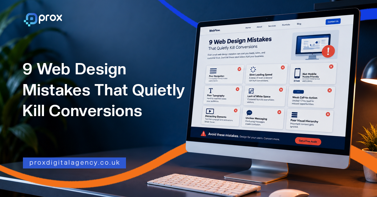
    Diagram listing nine web design mistakes that quietly kill conversions

    Mistake #2: Cluttered Layouts That Overwhelm Visitors

    Too much choice kills action.

    Homepages that try to say everything at once, such as five banner sliders, three pop-ups, a live chat widget, social proof notifications, a newsletter sign-up, a video, a “meet the team” section, and whatnot.

    Visitors land on this type of homepage and instantly freeze. This classic UX design mistake, aka ‘Hick’s Law,’ leads to longer decision time, and that usually results in no decision at all.
    Wireframe comparison of a cluttered web page layout against a clean layout with one primary call to action

    Cluttered Layout Signs Clean Layout Signs
    Multiple competing CTAs One primary action per fold
    Auto-playing sliders Static hero section with a single offer
    Dense text blocks Short paragraphs with breathing room
    Everything above the fold Progressive disclosure of information

    The quick fix: Reduce clutter on your pages. Your landing page should focus on one action at a time. Follow our clean layout checklist to fix it. And that’s all it takes.

    Mistake #3: Weak CTA Placement

    Your CTA is your sales door. Do not hide it. This is one of the most common website design errors that hurt sales across every sector.

    The problem:

    A page explains the offer well. It builds a decent case. Then it ends with a link that vaguely says “Submit” or “Learn More.” Nobody gets excited about submitting anything. That’s what a weak CTA looks like.

    The quick fix:

    • Make CTAs specific, for example, “Get Your Free Audit” beats “Click Here.”
    • Make them high-contrast buttons as they beat low-contrast links.
    • Place CTAs where the visitor’s interest peaks, not just at the very bottom of the page.
    • Test different versions. Button colour. Copy. Position. A small lift here allows big changes.

    Mistake #4: Slow Load Times in a 5G World

    In 2026, speed expectations have changed drastically. Many businesses assume fast networks solve slow websites. They do not. Even on 5G, a poorly built site takes time to render. Our breakdown of how Core Web Vitals affect rankings covers which speed metrics Google actually measures. And the buyer’s patience is thinner than ever.

    This is a critical web design mistake because the damage happens before anyone sees your content.

    The problem:

    A widely cited industry benchmark puts the cost of a single extra second of load time at up to a 7% drop in conversions on mobile. Pages that take over three seconds lose more than half their visitors before the first scroll.

    Core Web Vitals remain a ranking signal. But slow loading simply feels unprofessional and signals neglect.

    The quick fix:

    • Compress images to next-gen formats like WebP
    • Use a content delivery network for global audiences
    • Test your site on a throttled connection. That is how many of your visitors experience it.
    • Reduce third-party scripts, especially on mobile

    Mistake #5: Non-Responsive Design

    Responsive design used to mean mobile-friendly. Our complete web design guide sets out the principles behind layouts that hold up across devices.

    Devices have changed. Foldable phones open into tablets. Users browse on smartwatches while commuting. Desktop monitors span ultra-wide resolutions. A site that simply “resizes” is not enough.

    The problem:

    This web design mistake kills conversions by creating hidden friction. Buttons become too small to tap on small viewports. Text columns stretch endlessly on ultrawide screens. Forms break at certain breakpoints.

    The quick fix:

    • Use a responsive CSS framework that auto-scales layouts across all screen sizes.
    • Test on real devices every month or after a certain time to check if they’re still working fine on different devices.

    Mistake #6: Generic AI-Generated Imagery That Destroys Trust

    AI-generated images are everywhere now. Visitors can spot them instantly and are tired of them.

    The problem:

    Generic stock photography has always had a trust problem. Teams smiling at laptops in glass offices. AI tools have flooded the web with images that feel hollow and slightly uncanny.

    This is a new UX design mistake that directly hurts conversions. If your imagery feels fake, visitors may not see your business or brand as authentic.

    The quick fix:

    • Real photos perform better. Always. Your actual team. Your actual workspace. Your actual product being used. Imperfections are fine. Authenticity matters.
    • If you’re using stock or AI-generated imagery, use it sparingly. Blend it with real photos. Avoid the obvious synthetic look.

    Mistake #7: Confusing Navigation and Dead Ends

    Navigation is a promise. It tells visitors they can find what they need. Broken navigation breaks that promise.

    The problem:

    A dropdown menu with too many layers. A missing search bar. Footer links that lead nowhere. Mobile menus that cover half the screen without a clear close button.

    When visitors hit a dead end, they reverse back.

    The quick fix:

    Here is a clean navigation audit checklist:

    • The main menu should be visible without scrolling on the desktop
    • The search bar must be accessible on every page
    • Zero broken links across the site
    • Clear breadcrumbs on inner pages
    • Footer must be organised by logical categories

    Spend an afternoon clicking every link on your site. Fix every 404. The result? Better conversions.

    Mistake #8: Zero Social Proof and Missing Trust Signals

    Visitors do not trust your claims. They trust what others say about you.

    The problem:

    A site without testimonials, reviews, or case studies asks visitors to take a leap of faith. The lack of social proof is a problem, and it quietly kills conversions across every industry.

    The quick fix:

    • Add at least three trust signals near every CTA, such as client testimonials, security badges, or client logos, which work best.
    • Display real-time activity if you have traffic. “59 people viewing this product now” or “Sold 72 in the last 24 hours” builds urgency and trust instantly.

    Mistake #9: Aggressive Pop-Ups, Banners, and Chat Interruptions

    Immediate pop-ups annoy visitors. Chat widgets that launch unsolicited conversations feel invasive. Sticky banners that push content down frustrate users on small screens.

    The problem:

    Most visitors never return after a single bad interruption. Rankings slide too, since Google actively penalises aggressive mobile interstitials.

    The quick fix:

    The fix is not to remove pop-ups entirely.

    • Use them smartly.
    • Delay them.
    • Trigger them based on behaviour.
    • Show them after a visitor has scrolled 60% of your web page.

    Good pop-ups allow relevant value at the right moment. Bad pop-ups sacrifice long-term trust for short-term metrics.

    One Silent Conversion Killer: A Complicated Checkout and Lead Forms

    Poor forms reduce conversions. This silent web design mistake deserves its own section because it is so common and damaging.

    The problem:

    The page does its job. The visitor decides to buy. Then the form appears.

    Too many fields. Forced account creation. Hidden shipping costs with unexplained invalid phone number errors. This type of cart abandonment rate sits above 70% on average — Baymard Institute puts the figure at 70.22% across 50 studies.

    The quick fix:

    • Ask only for information you absolutely need to confirm the order.
    • Auto-fill wherever the browser can handle it.
    • Allow guest checkout.
    • Display all costs before the final step.
    • Test your own forms monthly. Fill them out on mobile with one hand. This way, you will spot friction fast.

    The Prox Digital Agency CRO Approach

    A redesign is an investment with clear, measurable returns. Fix several of the mistakes above and you can often lift conversions meaningfully from the exact same traffic — though the size of the gain depends entirely on your starting point, traffic quality and offer. Without extra ad spend. Without new campaigns.

    At Prox Digital Agency, we take a structured path to fixing conversion problems. Every single change ties back to a number that matters to your bottom line.

    • First, we audit. We look at analytics and real user insights. We find exactly where visitors drop off and why.
    • Not all fixes are equal, so we mark priorities. We identify the changes that will move the needle fastest.
    • Finally, we implement and measure. We launch changes and track results.

    Wrapping Up

    The nine plus one major mistakes above explain how they quietly kill business conversions. The good part is, they are all fixable. They do not require a massive budget or a complete brand overhaul. Start seeing your website the way your visitors do, and you’ll see significant business success.

    If you are ready to find and fix the conversion killers on your site, Prox Digital Agency is here to help.

    FAQs

    What is the most common web design mistake that kills conversions?

    The most common web design mistake that hurts conversions is prioritising how a site looks over how it works. Visitors leave when they cannot find what they’re looking for. A beautiful but confusing website loses sales faster than a plain but clear one.

    Does a slow page speed of a website affect revenue?

    Yes. Even a single second of delay is commonly linked to a conversion drop of around 7%. If your web speed is slow, it will make your business look unreliable. Because visitors expect near-instant pages, and they will leave for a competitor within the next second.

    Why is mobile responsiveness still a problem in 2026?

    Mobile responsiveness is still a problem in 2026 because devices are changing fast. Different types of devices require different layouts. A site that works on a standard phone might break on a foldable.

    Do AI-generated images actually lower trust?

    Yes. Visitors are now smart enough to spot fake imagery, and it erodes trust instantly. Real photos are the source of building brand authenticity. Even if you have to use AI visuals, use them sparingly; always blend AI photos with real-product photography.

    Can I fix the conversion killer mistakes myself, or do I need an agency?

    The 9 common web design mistakes that kill conversions can be fixed easily. However, mistakes like accessibility compliance, complete CRO optimisation, and audits need external expertise.

  • Full SEO Website Migration Checklist Guide

    Full SEO Website Migration Checklist Guide

    Now, picture this. You opted for a full SEO website migration, changed your domain name, added new features, and redesigned your site architecture – all without costing your rankings or traffic. Yes! That’s exactly what we all want. This guide is for anyone looking for a practical SEO migration checklist to minimise the risk of costly mistakes.

    This guide walks you through every step, so your move is smooth, and your search visibility stays intact. If you want the wider context first, start with our guide to what search engine optimisation actually involves.

    SEO Website Migration

    A process of changing a website’s URL structure, domain, or switching its CMS without interrupting organic search traffic or Google rankings is SEO website migration. Done badly, these changes can seriously disrupt crawlability, indexing and how search engines understand your new structure — which is exactly why the process needs managing step by step.

    Every successful migration starts with a complete SEO website migration checklist to reduce risks and protect organic visibility.
    Diagram of the four phases of an SEO website migration from planning to post-launch monitoring

    Phase 1: Pre-Migration Planning & Benchmarking

    Rushing pre-migration benchmarking will only lead to tanking your website’s ranking. First plan and then implement strategies. 
    Checklist of metrics to benchmark before starting an SEO website migration

    Set Clear Migration Goals

    Understand the end goal. Aim for what you want to achieve. Whether it’s 95% of your current organic traffic or site speed improvement? Write down every tiny KPI, as you will measure your results against them later. 

    Carry Out a Risk Assessment

    Not all migrations are equal. Moving from HTTP to HTTPS is a different challenge from merging two sites. List every potential risk, from broken backlinks to Google Business Profile mismatches. So there are no unexpected errors.

    Benchmark Your Current Performance

    Analyse and monitor keyword rankings, organic traffic, and conversion rates of your site. Use Google Search Console and Google Analytics to gather numbers for at least the last three months. Call this phase your “before SEO website migration” picture.

    Crawl Your Entire Web

    Crawl every single URL on your current website. Record all page titles, descriptions, meta descriptions and status codes. You can’t build a proper site migration seo checklist without knowing exactly what exists today.

    Audit Your Backlinks

    Pull your external backlink profile. Identify the pages with the most valuable links pointing to them. Mark them as priority pages and must be redirected with pinpoint accuracy later.

    Team Planning and Responsibilities

    Website migration is not a single person’s job; it’s a collaborative effort. Segregate the operation team to handle DNS changes, test the staging site, and monitor performance after launch. Leave no room for finger-pointing, and you’ll see a smooth SEO migration strategy implemented from day one.

    Phase 2: Staging & Content Preparation

    Always build and test your new website in a staging environment. Avoid making changes directly to the live site.

    Create a Secure Staging Environment

    Configure a staging server. Either use IP restrictions or password-protect it, so it doesn’t get indexed by search engines. There is nothing worse than Google finding duplicate pages on your site.

    Map Every URL and Prepare 301 Redirects

    Keep track of every old URL and write the new equivalent one beside it. Make two columns on a spreadsheet to begin mapping. Aim for one-to-one redirects. Never leave everything to the homepage. A clear redirect map helps protect your rankings and user experience.
    Correct versus incorrect 301 redirect mapping during an SEO website migration

    Update All Internal Links

    Do not make visitors or bots bounce through multiple redirects. Replace old internal links in your navigation, content, and footer directly with the new URLs. It’s time-consuming, but it keeps your web loading speed fast and SEO-clean. Point every redirect straight at its final destination rather than through a chain: Google advises keeping chains to no more than three hops, and fewer than five.

    Migrate Your Structured Data

    Ensure your schema markup for your business, products, and FAQs is migrated. Check that your LocalBusiness schema still shows the right name, address, and phone number. Broken structured data can harm your results.

    Run a Pre-Launch Technical SEO Audit

    At this stage, your pre-launch site is ready for a technical SEO audit. Crawl it, check preferred page URLs, test page speed, and ensure that no ‘no-index’ tags are accidentally redirecting any important pages. Fix any errors you find, since you’re still on safe ground.

    Phase 3: Launch Day Execution

    You’ve made it to the launch day, congrats! Now double-check everything and follow these steps. 
    Launch day order of operations for an SEO website migration

    Remove Staging Block

    It’s time to remove any limitations you added during the staging phase of SEO migration checklist – any password protection to avoid indexing and any noindex tags. Make your new website fully crawlable.

    Deploy 301 Redirects Sitewide

    Activate your full redirect map in one go. Test a sample of old URLs to make sure they land on the correct new pages. 

    Verify HTTPS and DNS

    This is the critical time when your SSL certificate must be installed and working perfectly. Make sure your DNS is pointing to the new server. DNS misconfiguration can lead you to zero traffic, so verify it twice.

    Update Robots.txt and XML Sitemaps

    Check your live robots.txt file. It must not block anything important. Submit a new XML sitemap containing your new URLs to Google Search Console.

    Submit a Change of Address

    This step if for those who changed their domain in the process. Use Google Search Console’s Change of Address tool and signal to Google that your site has permanently moved. This helps in SEO website migration fast.

    Phase 4: Post-Migration Monitoring

    Here comes the most important phase of this SEO site migration guide – post-migration monitoring. The following steps will help you track results and monitor your website’s performance after launch. 
    Signals to monitor after an SEO website migration and how often to check them

    Keep a Close Eye on Google Search Console 

    Check if there are any spikes in 404 pages, coverage issues or crawl errors. Do not ignore mobile usability reports. 

    Track Rankings and Organic Traffic

    Remember the benchmarks you set in the pre-migration phase? Take those benchmarks and compare your post-launch results against them. A small fluctuation in the first few days is completely normal. Check carefully if the drop in data persists.

    Do a Post-Launch Crawl

    Running the crawler again at this point helps scan the overall live website. It can detect broken links, accidentally blocked pages and any redirect chains.

    Check Core Web Vitals

    Page speed and visual stability matter more than ever. You can use PageSpeed Insights or Lighthouse to test your main landing pages and identify any speed issues. Fix them immediately. Our breakdown of how Core Web Vitals affect rankings explains which numbers actually matter.

    Troubleshoot Issues Quickly

    Create a shared channel for logging and resolving bugs. If conversions drop, re-check your analytics tracking codes. Analyse the redirects and content of pages that show a decline in rankings. 

    And use this Prox SEO migration guide as your go-to checklist until your migration is complete and your web traffic stabilises.
    Illustrative chart of the organic traffic dip and recovery after an SEO website migration

    A Smarter Way to Handle Your Next SEO Website Migration

    An SEO migration checklist only works when you execute it smartly. And the best part? You don’t have to worry about this tricky execution as long as Prox’s expert SEO migration team is here for you.

    Our SEO team in London has helped UK local businesses move their websites without losing the rankings they rely on for enquiries and sales. Whether you’re switching domains or revamping your entire business website, we will build you a bespoke seo migration strategy, handle the technical heavy lifting, and monitor performance until your migration is fully complete. 

    So, don’t leave your organic visibility to chance. Get in touch with our team today.

    FAQs About SEO Website Migration

    How soon will SEO recover after an SEO website migration?

    Expect fluctuation rather than an instant return. Google’s guidance is that a medium-sized site can take a few weeks for most pages to move across in its index, and that larger sites can take longer — the speed depends on how many URLs you have and how fast your server responds. Treat a few weeks of movement as normal. If traffic is still well below your benchmark after that, audit redirects, indexation and internal links before assuming the migration itself failed.

    What are the common mistakes people make in a site migration?

    The two common mistakes in an SEO site migration are

    • Forgetting to map every single old URL to a relevant new one. 
    • Redirecting everything to the homepage loses the context Google needs and frustrates users. 

    A proper website migration seo checklist always includes a detailed redirect map.

    Should I update Google Business Profile when I move my site?

    Yes, updating GBP is important. However, it should only be done once the website is live and verified. Update the website’s URL, name, address, and contact details and verify them at every platform.

    Can SEO migration require an agency partner?

    Not really. However, for domain changes or complex restructures, partnering with the right agency, like Prox Digital, can help you avoid traffic loss and other serious drawbacks.

    How to know if my 301 redirects are working correctly?

    You can check your 301 redirects using a crawling tool and test a large batch of old URLs with it. Also, monitor the “Indexing” section in Google Search Console for any errors in redirects.

    How long should I keep my 301 redirects in place?

    Google advises keeping them for at least a year. That window gives its systems time to transfer signals to the new URLs, including recrawling and reassigning links that other sites still point at your old addresses. From a user’s point of view there is a good argument for keeping them indefinitely, so only remove them if you have a concrete reason to.

    Do I need the Change of Address tool for every migration?

    No. It applies to domain moves, not to every change. If you are moving from HTTP to HTTPS you do not need it. If you are moving to a different domain you do, and you should submit requests for all subdomains plus the www and non-www variants of the old domain, even ones you were not actively using — each needs to be verified in Search Console first.

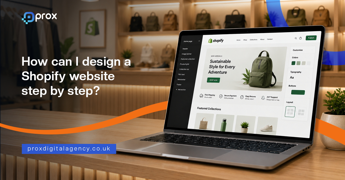
  • How Can I Design a Shopify Website Step by Step?

    How Can I Design a Shopify Website Step by Step?

    Prox Digital Agency has walked hundreds of business owners through this exact journey. This Shopify website design guide breaks the process into clear steps. If you follow these steps, you will have a solid foundation in Shopify. And if you get stuck, we are here.

    This guide walks you through how to design a Shopify website step by step, built around the needs of small and enterprise-level businesses in 2026. Let’s get started. For the broader principles behind high-performing UK websites, see our complete web design guide.


    Pick Your Store Layout and Pick the Right Shopify Plan

    Before you even touch a theme, pause. Grab a pen. Write, what do you actually sell? A rough plan on paper saves hours of digital unpicking later. Every good Shopify website design tutorial begins with a solid plan.
    Diagram showing how to map Shopify store collections and choose the right Shopify plan

    • Make a list of your product collections on paper first (e.g., Webcams, Smartwatches, Wireless chargers).
    • Think like your customer; if they can’t find the product in three seconds, they leave.
    • Start with a free Shopify trial. The Basic plan is suitable for startups.
    • Upgrade your plan as your sales climb.
    • Activate Shopify Payments from day one for smooth online transactions.

    Select and Customise a Mobile-Responsive Shopify Theme

    It’s time to decorate your Shopify. For any local business, speed and mobile look matter most. Over 70% of browsing happens on a phone. Go with a free theme first. The best part of Shopify website design for beginners is that you can create a professional-looking store without any coding experience. 

    Prox Digital Agency often rebuilds themes that looked good on desktop but confuse phone users. Here’s what you can do. For inspiration before you start customising, browse these examples of standout UK eCommerce website design to see what a well-executed Shopify theme looks like once it is dialled in.
    Desktop and mobile layout comparison for choosing a mobile-first Shopify theme

    • Use Shopify’s Theme Store filters for your industry and layout.
    • Start with a free theme. We would suggest ‘Dawn.’ It’s fast and trusted.
    • Use the drag-and-drop editor to match colours to your shop sign.
    • Add your logo and keep fonts readable on a five-inch screen.
    • Test every button on your mobile; a thumb must easily tap “Add to Cart”.

    Configure Payments, Shipping, and Tax Settings

    It is the part where many DIY builds fall apart. Incorrect settings can lead to compliance problems with HMRC — including missing the point at which you must register for VAT. But you don’t have to worry at all. Use this Shopify website builder guide to configure payments, shipping processes, and tax settings with confidence, even if you’re starting from scratch.
    Shopify payments, shipping and tax settings for a UK store

    • Set up Shopify Payments so customers can pay using Visa, Mastercard, and Apple Pay.
    • Add PayPal Express as a trusted backup for new customers.
    • Set up shipping integrations to automate labels, tracking, and order fulfilment.
    • Set up flat shipping rates or a free delivery threshold.
    • Don’t forget “Local Pickup” and local delivery for your postcode radius.

    Create Optimised Shopify Product Listings

    Products sell themselves, right? Wrong! A bad image kills a good product. Your image description is your silent salesperson. Go beyond the specifications and highlight the value your product offers. This is the true secret of how to make a Shopify website for your business to stand out against generic listings.
    Anatomy of an optimised Shopify product listing that converts

    • Use clean, natural light backdrops instead of blurry phone shots.
    • Show the product in use, such as a content creator using a USB microphone.
    • Write benefits, not just specs.
    • Write clear product titles, such as Bluetooth Wireless Mouse.
    • Write a compelling meta description in the search engine listing preview.

    Set Up Home, About, Contact, and Legal Policy Pages

    Your store needs a strong brand identity that customers recognise and trust. Show your story, your workshop, your messy desk. These pages help you build a Shopify store in reality. Without them, you’re just a stall, not a shop.
    The core Shopify pages that build customer trust

    • Create a home page with a clear hero image and a prominent “Shop Now” button. 
    • Skip tiny, moving carousels.
    • Use your About page to share your story and include authentic photos instead of stock images.
    • On the contact page, include your physical address, phone, email, and a form.
    • Legal pages should adapt Shopify’s templates for Privacy, Terms, and Refunds.

    Install Must-Have Shopify Apps 

    Apps add function. But too many can slow your site. Start lean with just the essentials. This modern Shopify website builder guide stops you from creating a bloated, slow digital store. Only install what you need today.
    How to keep a lean Shopify app stack so your store stays fast

    • Judge.me: For importing reviews and building essential social proof.
    • Yoast SEO or similar: To help you nail your search engine listing snippets.
    • Zapiet or Local Delivery: If your customer needs to choose a delivery date, delivery time, or store pickup at checkout.
    • A QuickBooks or Xero integration to keep your UK accountant calm.

    Only add an app if it addresses a specific and current business need.

    Testing and Launching Your New Shopify Website Checklist

    The finish line is close. A successful launch starts with thorough testing. This checklist caps off the rigorous Shopify design step-by-step 2026 blueprint. 
    Pre-launch testing checklist for a new Shopify website

    • Remove the password protection and do a live fake order to a real delivery address.
    • Check every confirmation email; ensure it is not landing in the spam folder.
    • Buy a product on your mobile using 4G, not your office Wi-Fi.
    • Use Google PageSpeed Insights to identify any high bounce rates.
    • Secure your domain connection.
    • Announce the launch with an Instagram post, WhatsApp status, and client emails.

    Choosing Between DIY Shopify Setup and Professional Website Design

    You can build a store. The tools exist. But a DIY approach often holds you back from your growth. Time is also a currency. Prox Digital Agency steps in where the drag-and-drop ends — our eCommerce website design and development service maps out customer psychology and builds revenue engines around it.

    We will help you pin down when it is time to hire a professional Shopify design agency instead of continuing DIY experimentation — and if you are weighing up the trade-offs, our cost-benefit breakdown of custom vs template websites is a good place to start.

    • The design might look functional, but not distinctive enough for your brand.
    • You follow the Shopify website design for beginners path perfectly, yet sales are stagnant.
    • Every hour spent designing your store is time not spent on your core business.
    • You need custom API integrations or a totally bespoke storefront design.
    • Your site feels “home-made” rather than “hand-crafted”; we fix that.

    When these challenges start holding your business back, it’s time to consider a professional Shopify solution from Prox Digital Agency.

    Conclusion

    So, that’s the whole roadmap. From blank page to first sale. Building a Shopify site is not magic. It’s a sequence. Plan the structure, dress it cleanly, set up compliance, add soul through products, and test like a customer. Follow this Shopify website design tutorial, and you’ll avoid the classic pitfalls.

    Knowing the steps and executing them beautifully are two different roads — and that is where Prox Digital Agency comes in, now supporting Shopify businesses globally.

    Frequently Asked Questions About Shopify Website Design

    Can I design a Shopify website with no tech background?

    Absolutely, you can design your Shopify store with no tech background. Shopify uses a visual editor. Plan your content and product presentation. And follow these steps

    Pick Your Store Layout and Pick the Right Shopify Plan

    • Select and Customise a Mobile-Responsive Shopify Theme
    • Configure Payments, Shipping, and Tax Settings
    • Create Optimised Shopify Product Listings
    • Set Up Home, About, Contact, and Legal Policy Pages
    • Install Must-Have Shopify Apps 
    • Testing and Launching Your New Shopify Website Checklist

    How much does a basic Shopify site cost to run in the UK?

    Shopify’s Basic plan costs about £19 a month if you pay annually, or around £25 a month on monthly billing. Add a domain name for roughly £10 a year. You can launch a functional UK store for under £50 in your first month if you do the design graft yourself. App costs add a few quid monthly if you need extras.

    What is the common mistake new Shopify store owners make?

    The two common mistakes new Shopify store owners make are

    • Poor product images and hidden costs. 
    • Springing unexpected shipping charges at checkout kills the trust. 

    Fix those two things, and you’re ahead of 90% of beginner projects to build a Shopify store.

    Should I pay for Shopify’s premium theme immediately?

    No. Shopify’s free “Dawn” theme is robust and fast. Launch with a free theme, make your first few sales, and only upgrade if you need a specific feature you can’t achieve.

    How long does it take to design and launch a Shopify website?

    A basic store built on a free theme like Dawn can go live in one to three days once your products and images are ready. A fuller, professionally styled store with custom branding typically takes two to four weeks, and complex builds with bespoke features or large catalogues can run to four to eight weeks.

    Is Shopify good for SEO?

    Yes. Shopify generates clean URLs, automatic XML sitemaps and fast-loading themes like Dawn out of the box. Strong rankings still depend on you writing unique product descriptions, setting proper title tags and meta descriptions, and keeping your collection structure logical, so most stores still benefit from a dedicated SEO pass.

  • The Complete Guide to Lead Generation Web Copy

    The Complete Guide to Lead Generation Web Copy

    Lead generation web copy is the difference between a website that gets visited and one that gets booked.

    This is the reality for many UK businesses in 2026. The problem usually isn’t visibility. It isn’t design either. More often than not, it is the words. Your website copy determines whether visitors stay or leave within seconds. It decides whether someone trusts your business enough to book a consultation or continues comparing competitors. Every headline, sentence and call-to-action either builds momentum or creates friction.

    Modern buyers are also behaving differently. AI search tools, Google’s AI Overviews and ChatGPT allow people to research companies long before speaking to a salesperson. By the time someone reaches your website, they have already formed expectations. They are not looking for clever marketing language. They are looking for evidence that your business understands their challenges better than anyone else.

    That means web copy has become one of the highest-return investments a business can make. Good design attracts attention. Exceptional copy converts attention into revenue.

    What Is Lead Generation Web Copy?

    Lead generation web copy is written with one clear objective: encouraging the right visitor to take the next step. That next step could be booking a discovery call, requesting a quotation, downloading a guide, subscribing to a newsletter or arranging a product demonstration.

    Unlike traditional copywriting, lead generation copy doesn’t simply explain what a business does. It removes uncertainty. It answers objections before they arise. It creates confidence by demonstrating expertise rather than simply claiming it.

    Think of your website as your highest-performing salesperson. A great salesperson doesn’t overwhelm prospects with information. Instead, they ask the right questions, understand problems, explain solutions clearly and guide conversations naturally towards a decision. Your website should achieve exactly the same outcome.

    Why Most Business Websites Fail to Generate Leads

    Many companies assume visitors are leaving because prices are too high or competitors offer better services. In reality, visitors often leave because the website gives them no compelling reason to continue. The majority of websites still focus almost entirely on themselves.

    You’ll often find headlines such as:

    • ‘We are an award-winning agency.’
    • ‘Delivering excellence since 2014.’
    • ‘Your trusted digital solutions provider.’

    While these statements may be true, they answer the wrong question. Visitors are silently asking:

    ‘Can you solve my problem?’

    If the homepage fails to answer that within a few seconds, attention disappears. Research from Nielsen Norman Group consistently shows that users scan before they read, taking in signals of relevance first and details second. Every unnecessary sentence increases cognitive effort, making visitors more likely to leave. Winning copy removes that effort.

    The Psychology Behind High-Converting Copy

    People rarely buy services because of features alone. They buy outcomes. A company searching for a new website is rarely excited about responsive layouts or modern code frameworks. What they actually want is more enquiries, stronger credibility, higher conversion rates and faster business growth.

    Successful web copy shifts the conversation from features to transformation. Instead of saying your agency builds responsive websites, explain how those websites reduce bounce rates, improve customer trust and generate more qualified enquiries.

    Every paragraph should answer one simple question:

    ‘Why should this matter to the reader?’

    When copy continually connects business services to business outcomes, conversion rates improve naturally because readers begin imagining success rather than evaluating specifications.

    Start With Your Customer, Not Your Company

    Many websites introduce the business before introducing the customer’s problem. That order should almost always be reversed. The opening section of every important landing page should demonstrate complete understanding of the visitor’s situation.

    • Perhaps they’re frustrated by declining enquiries.
    • Perhaps their website feels outdated.
    • Perhaps competitors appear higher in AI search results.
    • Perhaps marketing activities generate traffic without producing quality leads.

    When readers recognise their own frustrations in your copy, something important happens. They feel understood. Trust begins long before your business introduces itself.

    Only after establishing empathy should your copy explain how your solution removes those challenges. The visitor becomes the hero. Your business becomes the guide.
    UK small business owner reviewing declining website enquiries before improving their lead generation web copy

    The Five Questions Every Landing Page Must Answer

    Before asking anyone to complete a contact form, your copy should quietly answer several important questions. Every high-converting page should communicate:

    • What problem do you solve?
    • Why should someone trust you?
    • What makes your approach different?
    • What result can clients realistically expect?
    • What should visitors do next?

    If even one of these questions remains unclear, hesitation increases. Hesitation is the silent killer of conversions. Visitors rarely complain. They simply leave.
    Flowchart of the five questions every landing page must answer to generate leads

    Clarity Always Beats Cleverness

    Many businesses try to sound sophisticated. Unfortunately, sophisticated language often creates confusion. Compare these examples.

    ‘Our integrated digital ecosystem accelerates scalable organisational transformation.’

    Now compare it with:

    ‘We help growing businesses generate more leads through better websites, SEO and AI visibility.’

    The second version is easier to understand because it speaks the customer’s language rather than internal business jargon.

    This principle applies throughout your website. Choose everyday language over corporate vocabulary. Write naturally. Explain complex ideas simply. The easier your copy is to understand, the easier it becomes for people to trust your business. And trust remains the foundation of every successful lead generation strategy.

    Headlines That Stop Visitors From Leaving

    The headline is the most valuable sentence on your website. Before anyone reads your service descriptions, testimonials or pricing, they read your headline. If it fails to capture attention, the rest of the page rarely gets a chance.

    Many businesses waste this opportunity with generic statements like ‘Welcome to Our Website’ or ‘Professional Digital Solutions’. These phrases could belong to almost any company. They communicate nothing memorable and offer no reason to continue reading. A stronger headline immediately promises value.

    Instead of talking about your business, talk about the visitor’s outcome. Explain the problem you solve and the result people can expect. Visitors should know within a few seconds whether they have found the right solution.

    A simple framework works well:

    Problem + Solution + Outcome

    For example:

    ‘Generate more qualified leads with a website built for conversions, instead of just compliments.’

    That headline speaks directly to business owners who want measurable growth rather than attractive design alone. The best headlines reduce uncertainty. They reassure visitors that they’re in the right place before they have even started reading the rest of the page.

    Every Page Needs One Clear Next Step

    One of the biggest conversion mistakes is asking visitors to do too much. Some websites offer six different buttons, multiple contact forms, newsletter subscriptions, downloadable guides, chatbot pop-ups and social media links all competing for attention. Instead of increasing engagement, this creates decision fatigue.

    High-converting websites usually have one primary goal for each page. If the page exists to generate consultations, every section should gradually move visitors towards booking that consultation. Your calls-to-action should also explain the value of clicking.

    Compare these examples.

    Weak CTA

    ‘Submit’

    Better CTA

    ‘Book Your Free Strategy Call’

    The second version removes uncertainty and explains exactly what happens next. Good CTAs reduce perceived risk by making the next step feel simple, helpful and worthwhile. For the underlying formulas behind CTAs like this, see our breakdown of the psychology of the CTA.

    Trust Converts Better Than Persuasion

    Visitors are naturally sceptical. They’ve seen exaggerated promises before. They’ve read claims about being ‘industry leaders’ and ‘award-winning experts’ countless times. Trust is no longer built through self-promotion. It is built through evidence. Rather than telling visitors you’re experienced, demonstrate it through proof.

    Effective trust signals include:

    • Client success stories
    • Verified reviews
    • Industry certifications
    • Case studies with measurable results
    • Recognisable client logos
    • Media mentions
    • Awards and partnerships

    These elements quietly answer an important question every buyer asks:

    ‘Can I trust this company?’

    The stronger your proof, the less persuasion your copy requires.

    Write For Humans First, AI Second

    Search behaviour has changed dramatically over the past two years. People now ask ChatGPT, Google AI Overviews and voice assistants complete questions instead of typing short keywords. That means your copy should sound like natural conversation. Instead of forcing exact-match keywords into every paragraph, answer genuine customer questions clearly and directly.

    Imagine a business owner asking:

    ‘How can I generate more enquiries from my website?’

    Your content should answer that question exactly as a consultant would during a meeting. Natural language improves readability, increases trust and gives AI search engines clearer context about your expertise.
    Ironically, writing more naturally often improves SEO because modern search algorithms increasingly reward relevance, clarity and topical authority rather than keyword repetition. The future belongs to websites that educate before they sell.

    Remove Friction Wherever Possible

    Every additional obstacle reduces conversions. Sometimes the problem isn’t the offer. It’s the effort required to accept it. Ask yourself how many unnecessary barriers exist on your website.

    • Perhaps your contact form asks for twelve fields instead of four.
    • Perhaps pricing is completely hidden.
    • Perhaps visitors must navigate through several pages before finding basic information.

    Every extra click increases the chance of abandonment. Simplify wherever possible. Small improvements often produce surprisingly large gains. Look for opportunities to:

    • Shorten enquiry forms.
    • Reduce unnecessary navigation.
    • Make pricing expectations clearer.
    • Improve page speed.
    • Add answers to common objections before visitors ask them.

    The easier your website feels to use, the more likely people are to complete their journey. If auditing every page yourself feels like a lot to take on, our digital marketing team can rebuild the messaging and conversion strategy alongside you rather than leaving you to guess.

    Measure What Actually Matters

    Many businesses celebrate increasing website traffic while ignoring the only metric that truly matters. Conversions. Ten thousand visitors mean very little if nobody makes contact. Instead of focusing solely on page views, monitor the numbers that influence revenue.

    Track metrics such as:

    • Contact form submissions
    • Discovery call bookings
    • Landing page conversion rates
    • Average engagement time
    • Scroll depth
    • Lead quality
    • Cost per qualified enquiry

    These insights reveal whether your copy is genuinely persuading visitors or simply attracting attention. Great copywriting is never based on assumptions. It evolves through testing, measurement and continuous improvement. Even changing a headline, restructuring a page or rewriting a call-to-action can significantly increase conversion rates over time.

    The Future Of Lead Generation Copy

    Lead generation is changing. AI search engines increasingly summarise information before visitors even click through to websites. Buyers conduct extensive research independently before speaking with sales teams. Trust now develops across multiple digital touchpoints rather than during a single website visit, which is why copy can’t be treated in isolation from the rest of your marketing — see our digital marketing guide for UK businesses for how it fits alongside SEO, paid search and content strategy.

    This means web copy has a much larger role than simply filling empty spaces on a page.

    • It must educate.
    • It must reassure.
    • It must demonstrate expertise.
    • It must position your brand as the obvious choice before competitors even enter the conversation.

    Businesses that continue writing purely for search engines will struggle. Businesses that write for people, while making their expertise easy for AI systems to understand, will continue attracting qualified leads as search evolves.

    The principles remain timeless.

    • Understand your audience.
    • Communicate clearly.
    • Build trust.
    • Guide action naturally.

    Everything else supports those foundations.

    Frequently Asked Questions About Lead Generation Web Copy

    How long do visitors actually spend reading a web page before deciding to leave?

    Not long, and most of that time is spent scanning rather than reading. Nielsen Norman Group’s research found that 79% of users scan any new page rather than reading it word for word, and on average people only read 20 to 28% of the words on a page during a visit. That is why headlines, subheadings and the first line of each section carry most of the weight.

    What makes a call-to-action convert better than a generic one?

    Specificity and clarity. A CTA like ‘Submit’ describes an action with no value attached to it, while ‘Book Your Free Strategy Call’ tells the visitor exactly what happens next and what it costs them. The stronger version reduces perceived risk by making the outcome feel simple and worthwhile rather than vague.

    Should website copy be written for humans or for AI search engines like ChatGPT?

    Humans first. Writing in natural, direct language that answers real customer questions tends to perform better with AI search tools too, because those systems reward clarity, relevance and topical authority over keyword repetition. Copy written purely to satisfy search algorithms usually reads awkwardly and converts worse for actual visitors.

    Does shortening a contact form actually increase leads?

    Often, though not automatically. HubSpot’s analysis of tens of thousands of contact forms found that conversion rates rose by nearly half when the number of fields dropped from four to three. That said, other studies have found the opposite in specific cases, so form length matters less than whether every remaining field is genuinely necessary for that stage of the enquiry.

    What is the actual difference between traditional copywriting and lead generation copywriting?

    Traditional copywriting often focuses on describing a business clearly and professionally. Lead generation copywriting goes further: it is written with one specific action in mind, actively removes the doubts a visitor is likely to have, and guides them towards that action rather than simply informing them.

    How many trust signals should a landing page include?

    There is no fixed number. What matters is relevance and proof: a couple of specific, verifiable signals such as a named case study with real results or genuine client reviews will usually do more for conversions than a long row of generic badges and logos.

    Last But Not Least

    Your website is often the first conversation potential customers have with your business. Every headline, paragraph and call-to-action either builds confidence or creates doubt. Strong lead generation copy doesn’t rely on clever slogans or aggressive sales tactics. It removes uncertainty, answers genuine questions and makes taking the next step feel effortless. As AI search reshapes how buyers discover businesses, clear and authoritative copy has become more valuable than ever.

    At Prox, we combine strategic messaging, UX, SEO and Generative Engine Optimisation (GEO) to create websites that don’t simply attract visitors. In fact they convert them into qualified leads and long-term customers along with so many success stories.

  • How to Design a Website That Builds Trust in the UK Market

    How to Design a Website That Builds Trust in the UK Market

    A website that builds trust does not happen by accident. It is engineered, section by section, decision by decision.

    This is where most websites fail quietly. Not because they look bad but because they do not feel stable, clear or grounded. A website can be visually impressive and still lose trust if it creates confusion or hesitation in the user’s mind.

    And in 2026, hesitation is expensive. Because users are no longer comparing you to one competitor. They are comparing you to every smooth digital experience they had last week. So the real challenge is simple. Your website must reduce doubt faster than it creates it.

    Trust Is No Longer a Design Layer. It Is a Behavioural System

    Older websites treated trust as something you added at the end of a project. You would finish the homepage, polish the design and then add testimonials, logos and badges in the footer. That approach no longer works.

    Modern UK users do not treat trust as a separate section of a website. They experience it continuously through structure, clarity, speed and tone. A trust-first website behaves differently from a traditional one. It does not try to impress users with complexity. It guides them with simplicity. It does not overwhelm them with information. It prioritises clarity at every step of the journey.

    This shift matters because trust is no longer built through persuasion. It is built through reduction of friction. The less effort a user needs to understand you, the more credible you appear.

    How UK Users Actually Judge Trust in 2026

    Most founders assume trust comes from branding or visuals. In reality, UK users rely on far more practical signals.

    They ask silent questions while browsing, such as:

    • Does this business look real or overly polished in a suspicious way?
    • Can I find contact details without searching too much?
    • Do they clearly explain what they do and where they operate?
    • Is there evidence that real customers have used them?
    • Does this feel consistent or slightly thrown together?

    These judgments happen quickly and subconsciously. Users rarely articulate them but they act on them immediately. This is why many websites lose potential customers without any obvious reason.

    Everything looks fine from the outside. But inside the user’s mind, small uncertainties accumulate until they decide to leave. Trust is often lost in silence instead of confrontation.
    Faceted glass crystal illustration representing the scrutiny behind a website that builds trust

    Old Websites vs Modern Trust-Driven Websites

    To understand how trust design has evolved, it helps to compare older website thinking with modern expectations.

    Traditional websites focused heavily on presentation. The goal was to showcase services, explain the business and look professional. Navigation was often structured around pages rather than user intent. Teams created separate pages for separate messages, a homepage to introduce the business, service pages to explain offerings, a contact page to close the loop. That structure made sense when users moved through websites in a straight line. They rarely do that anymore.

    Modern websites operate differently. They behave like guided systems that remove uncertainty step by step. Instead of showing everything, they reveal information in a controlled flow that matches user behaviour. Even if a visitor lands directly on a service page instead of the homepage, the structure should still give them context, reassurance and direction.

    The difference can be understood simply. Older websites ask users to explore. Modern websites guide users to decide.

    Older structure:

    • Homepage as introduction
    • Separate pages for services and information
    • Trust elements placed at the bottom or secondary areas

    Modern structure:

    • Immediate clarity on what the business does
    • Trust signals integrated early in the experience
    • Actions available at every stage without friction

    This shift is not cosmetic. It directly impacts conversion and user confidence. A website that forces users to think too much loses them faster than a simple, direct one.

    Clarity Is the Strongest Trust Signal in the UK Market

    If there is one consistent rule across high-performing UK websites, it is this. Clarity always wins. Users do not want to decode your messaging. They do not want to interpret abstract branding statements. They want immediate understanding.

    A common mistake businesses make is trying to sound impressive instead of being clear. They use broad, vague language that feels polished internally but confusing externally.

    For example, a statement like ‘We deliver innovative digital transformation solutions’ might sound sophisticated in a boardroom, but it does very little for a visitor trying to understand what you actually do.

    Compare that to something simple like ‘We design and build websites for UK service businesses and startups.’

    The second version builds trust faster because it removes uncertainty immediately. In the UK market, clarity is the new rich as a form of communication and reassurance. And reassurance is the foundation of trust.

    The Role of Real Proof in Building Credibility

    One of the strongest trust signals in modern web design is not colour, typography or layout. It is evidence. UK users actively look for proof that your business exists beyond the website itself. They want to see real indicators such as completed work, customer feedback and tangible results.

    This is why websites that rely too heavily on stock imagery often struggle with credibility. Stock photos do not create doubt by themselves but they also do not remove it. Real proof does.

    This includes:

    • Genuine project images instead of generic visuals
    • Case studies that explain real outcomes
    • Customer reviews linked to real platforms
    • Clear service coverage areas that feel grounded in reality
    • Team or business identity that feels authentic
    • Visible security and data-handling practices, the kind we cover in our website security best practices guide, which matter just as much once a visitor is ready to hand over contact or payment details

    Independent researchers agree on this point. Nielsen Norman Group’s research on web credibility identifies design quality, up-front disclosure and current content as core factors in whether a website feels trustworthy. Proof is one of the few signals users check almost instinctively, often without realising it.

    The goal is not to overwhelm users with information. It is to show enough reality that doubt naturally decreases. Trust is rarely created through claims. It is created through confirmation.

    What a Website That Builds Trust Looks Like: Simplicity Over Complexity

    There was a phase in web design when complexity was seen as innovation. Heavy animations, layered visuals, experimental layouts and dramatic transitions were all signs a business had invested in its digital presence. That era has quietly ended.

    In 2026, simplicity signals maturity. A clean, structured, easy-to-navigate website feels more reliable than one that tries too hard to impress, especially in the UK market, where users value practicality over spectacle. A cluttered interface reads as unnecessary effort, and unnecessary effort reduces confidence.

    Good websites now focus on calm design systems. They avoid visual noise, prioritise spacing and keep key actions obvious. This does not mean design should be boring. It means design should be controlled. There is a subtle but important difference between creativity and confusion, and modern trust-focused websites understand it well.

    Interestingly, many high-converting UK websites now feel slightly ‘unexciting’ at first glance. That is intentional. They prioritise understanding over entertainment, because no one hires a service provider just because their website looked like a film trailer. Simple layouts, readable typography and consistent spacing create a sense of control, and that sense of control is what turns browsing into enquiries, bookings and purchases.

    Navigation Used to Organise Information. Now It Must Reduce Thinking

    Older websites treated navigation like a map. Everything had to be listed clearly so users could ‘choose where to go.’ The problem is that too many choices create hesitation. Modern UK websites simplify navigation aggressively, not because they lack content, but because they understand how users behave under decision pressure. A trust-first navigation system does not try to show everything. It focuses only on the paths that matter most.

    Instead of overwhelming users with categories, modern navigation highlights clear intent-based actions such as services, pricing, contact or key solutions. The goal is not to display structure. The goal is to remove thinking.

    When users do not need to interpret where to click, they feel more confident about continuing. And confidence builds trust faster than any visual design choice.
    Illuminated pathway illustration representing simplified navigation and trust signals in UK web design

    Trust Architecture Matters More Than Visual Design

    One of the biggest misunderstandings in web design is thinking that trust comes from visuals. In reality, trust comes from architecture. Trust architecture refers to how information is structured and revealed across a website. It determines when users see proof, how they access key information and how smoothly they move from curiosity to action.

    For example, a poorly structured website might hide pricing logic, bury contact details and delay proof until the bottom of the page. Even if the design looks good, users feel uncertain.

    A strong trust architecture does the opposite. It places clarity early, supports claims with evidence and keeps essential actions visible throughout the experience. This structure quietly answers user concerns before they even form fully. And that is what makes it powerful. It is also only one part of the picture, since structure, speed, accessibility and content all work together, which is why we cover the full framework in our web design guide for UK businesses in 2026.

    Common Trust Mistakes UK Websites Still Make

    Despite better tools and better awareness, many websites still repeat the same mistakes.

    • One of the most common issues is over-designing the homepage while neglecting supporting pages. This creates a disconnect where the entry experience feels polished but deeper pages feel inconsistent or unclear.
    • Another issue is unclear messaging. Businesses often describe themselves in abstract or overly creative language that sounds impressive internally but confusing externally.
    • A third mistake is hiding key information. Users should not have to search for contact details, pricing guidance or service areas. When they do, trust drops immediately.

    There is also a tendency to rely too heavily on generic stock visuals. While they may look clean, they do not reinforce authenticity. UK users are particularly sensitive to this because they are used to evaluating real businesses instead of polished illusions.

    Fixing these issues does not require complex redesigns. It requires discipline in clarity and consistency. For a wider checklist beyond trust specifically, our 10 web design best practices for UK businesses covers the same ground in more detail.

    Practical Ways to Build Trust Into Your Website System

    Building trust is not about adding more elements. It is about improving how existing elements work together.

    • One of the most effective approaches is to ensure every page answers three silent user questions. What does this business do, why should I trust them and what should I do next. If any of these questions remain unanswered, hesitation increases.
    • Another practical improvement is consistency. Fonts, spacing, tone of voice and visual patterns should remain stable across the entire website. Inconsistency creates subconscious doubt even when users cannot explicitly explain it.
    • Speed also plays a critical role. Slow websites feel unreliable, even if the content is strong. In the UK market, where users expect instant access, even small delays can damage perception.
    • Finally, contact accessibility matters more than most teams realise. If users cannot easily find a way to speak to you, they assume the business is less responsive than competitors. Trust is often lost not in big moments but in small moments of friction.

    If you would rather have this built in from the start than fix it after launch, our web design and development team can architect the structure, speed and proof points together instead of bolting trust on at the end.

    Why UK Users Respond Strongly to Transparency

    UK audiences tend to value straightforward communication. They are not easily convinced by exaggerated claims or overly polished branding language. Instead, they respond better to transparency.

    This includes clear explanations of services, honest descriptions of process, visible contact options and realistic expectations around pricing or timelines. When a website feels honest, users relax. And when users relax, they are far more likely to convert.

    This is why overly ‘salesy’ websites often underperform in the UK market. They try to persuade too quickly instead of building confidence first. Trust always comes before conversion. Never after it.

    Frequently Asked Questions About Website Trust and Design

    How quickly do visitors decide whether to trust a website?

    Research from Carleton University found that users form a first impression of a website’s credibility in as little as 50 milliseconds, based almost entirely on visual design rather than content. That snap judgement does not decide everything, but it sets the tone, and users then spend the next few seconds looking for evidence that confirms or corrects it, which is why clarity and structure matter from the very first screen.

    What are the most important trust signals for a UK business website?

    The signals that matter most are the ones that answer a visitor’s unspoken questions quickly: clear contact details, an honest explanation of what the business does and where it operates, genuine proof such as case studies or reviews, and visible security or data-handling practices. None of these require a redesign on their own. They require being easy to find.

    Do UK websites legally need to display company registration details?

    Yes. Under the Companies Act 2006, UK-registered companies must display their company registration number and registered office address somewhere on their website, such as the footer or contact page. It does not need to appear on every page, but it must be easy to find, and failing to include it can result in a fine.

    Does adding trust signals actually improve conversion rates?

    Yes. Baymard Institute research asked thousands of online shoppers why they abandon a purchase at checkout, and nearly one in five cited not trusting the site with their payment details as a reason, which shows how directly perceived trust affects revenue rather than just perception.

    Is a simple website design more trustworthy than a highly animated one?

    Generally, yes, for UK service businesses. Heavy animation and experimental layouts can look impressive in isolation, but they slow down comprehension, and users read that friction as effort rather than polish. A calm, structured layout tends to convert better because it lets people find what they need without thinking about the interface itself.

    How is a trust-driven website different from a normal business website?

    A standard website presents information and expects visitors to explore it. A trust-driven website is structured as a guided journey. It anticipates the questions a visitor is silently asking at each stage and answers them in order, so hesitation is reduced before it has a chance to build.

    Trust Is a System Not a Style Choice

    Designing a website that builds trust in the UK market is not about decoration or visual trends. It is about how the entire system behaves when users interact with it. Older websites focused on pages and presentation. Modern websites focus on journeys and decision-making. That difference determines everything from bounce rates to enquiries to long-term brand perception.

    The most successful websites in 2026 are not the most complex. They are the most reliable. They communicate clearly, reduce friction and guide users without confusion. For founders and teams trying to improve performance, the lesson is simple.

    Do not start with visuals. Start with structure. Do not focus on impressing users. Focus on helping them understand. At Prox Digital Agency, we build websites with this exact principle in mind. Not just websites that look good but systems that earn trust quickly and convert consistently in real UK markets. Because in the end, a website is not just a digital presence. It is your first conversation with a customer.

  • Core Web Vitals: How Page Experience Affects Your Rankings

    Core Web Vitals: How Page Experience Affects Your Rankings

    Core Web Vitals have become one of the clearest signals Google uses to judge whether a website deserves to rank well. The same thing happens online every day. Businesses invest heavily in SEO, content marketing, backlinks, paid advertising and conversion optimisation. Then they send visitors to websites that load slowly, jump around while loading or respond sluggishly when users try to click a button. Visitors become frustrated before they have even read the first sentence. Google notices those poor experiences too. As a result, rankings suffer, engagement drops and valuable traffic disappears. In 2026, page experience is no longer a technical consideration sitting quietly in the background. It plays a direct role in how users perceive your business and how search engines evaluate your website.
    It’s now a core part of how web development works for growing businesses.

    The Internet Has Changed And Google Changed With It

    Ten years ago, ranking on Google was often a fairly straightforward exercise. Create content around a target keyword, build a reasonable backlink profile and wait for the rankings to improve. User experience certainly mattered, but it rarely dominated SEO conversations in the way it does today. Many websites achieved strong rankings despite being slow, clunky and difficult to use because Google had fewer ways to measure real-world user satisfaction.

    Today, the landscape looks completely different. Google now evaluates not only the relevance of your content but also the quality of the experience users receive when they land on your website. A page might contain the most comprehensive information available on a topic, but if visitors struggle to access that information comfortably, Google sees that struggle as a problem. Search engines increasingly reward websites that respect users’ time and attention. That shift has transformed performance from a developer concern into a business concern.

    This evolution explains why Core Web Vitals have become such a significant ranking factor. Google wants to understand something that traditional SEO metrics could never fully capture. How does a website actually feel to use? Does it load quickly? Does it remain stable while loading? Does it respond instantly when someone interacts with it? These questions matter because user expectations have changed dramatically. Nobody celebrates a website that eventually loads. People expect it to work immediately.
    Illustration of a glowing digital speedometer representing Core Web Vitals page speed performance

    What Are Core Web Vitals

    Core Web Vitals are a collection of performance metrics that Google uses to evaluate real-world page experience. Instead of relying solely on laboratory testing or technical benchmarks, Google measures how actual users interact with your website. For the official breakdown, see Google’s own Core Web Vitals documentation. This approach gives search engines a much clearer understanding of what visitors experience when they browse your pages on mobile devices, laptops and tablets across different network conditions.

    The three Core Web Vitals metrics are Largest Contentful Paint (LCP), Interaction to Next Paint (INP), and Cumulative Layout Shift (CLS). Together, they help Google determine whether a website feels smooth, responsive and stable. Rather than viewing them as technical jargon, it is helpful to think of them as indicators of customer satisfaction. They reveal whether visitors can quickly see your content, interact with your pages without delays and browse without annoying layout movements disrupting their experience.

    For founders, marketers and business owners, this matters because Core Web Vitals influence far more than rankings. They affect bounce rates, engagement, conversions and brand perception. A website that performs well often feels more professional and trustworthy. A website that performs poorly can create doubt before a visitor has even considered your products or services.

    Why Google Cares So Much About Page Experience

    Google’s business model depends on trust. Every time someone performs a search, Google makes an implicit promise that it will deliver the most useful and reliable results available. If those search results consistently send users to slow, unstable, frustrating websites, that trust begins to erode. Google’s focus on page experience is therefore not surprising. The search engine has a strong incentive to reward websites that create positive experiences for visitors.

    This is why page experience updates have become increasingly important over the last several years. Google wants users to land on a page and immediately feel comfortable. They should not encounter long loading delays, unexpected layout shifts or frustrating interaction lags. The smoother the experience, the more likely users are to remain engaged with the content. When visitors stay longer, interact more and return in the future, Google receives signals that suggest the page delivered value.

    From Google’s perspective, Core Web Vitals provide measurable evidence of user satisfaction. They allow the search engine to move beyond simply analysing content and begin evaluating the quality of the overall experience. That makes them one of the most important bridges between technical performance and SEO success.

    The Three Metrics Google Watches Closely

    Now that we understand why page experience matters, it is time to look at the three measurements that sit at the heart of Core Web Vitals. Many business owners hear terms like LCP, CLS, and INP and immediately switch off because they sound technical. In reality, these metrics measure something very simple.

    They measure frustration. Google wants to know how much friction users experience while interacting with your website. If visitors can access content quickly, navigate comfortably and interact without delays, your scores improve. If your website creates unnecessary obstacles, your scores suffer.

    Think of Core Web Vitals as a customer satisfaction survey happening silently in the background. Users never fill out a form, yet their behaviour tells Google everything it needs to know. Every delay, layout jump and sluggish interaction contributes to a larger picture of how enjoyable your website feels to use. The better that experience becomes, the stronger your position in search results can be.

    Largest Contentful Paint (LCP) And The Importance Of First Impressions

    The first Core Web Vital is Largest Contentful Paint, commonly known as LCP. This metric measures how long it takes for the main content of a page to appear on screen. In simple terms, Google wants to know when visitors can actually start consuming the information they came for. A blank screen, spinning loader, or half-loaded page does not count as meaningful content.

    Imagine walking into a coffee shop and waiting several minutes before anyone acknowledges your existence. Even if the coffee eventually turns out to be excellent, the first impression has already suffered. Websites work in exactly the same way. Visitors form opinions almost immediately. If your hero image, headline, or primary content takes too long to load, people begin questioning the reliability of the experience.

    Google recommends an LCP score of under 2.5 seconds. That might sound demanding but modern users have become remarkably impatient. Streaming platforms, social media apps and ecommerce giants have trained people to expect near-instant experiences. When your website feels slower than the rest of the internet, users notice. They may not understand why the experience feels frustrating, but they certainly feel it.

    This shift highlights an important lesson for businesses. Speed is no longer just a technical achievement. It has become part of customer experience design. A fast website creates confidence before a visitor reads a single line of content. A slow website creates doubt before your message even has a chance to land.

    Cumulative Layout Shift And The Art Of Staying Still

    The second Core Web Vital is Cumulative Layout Shift, usually shortened to CLS. This metric measures visual stability. In other words, Google wants to know if your website remains steady while loading or if elements jump around unexpectedly.

    Most people have experienced this frustration. You try to click a button, only for an image or advert to load at the last second and push everything down the page. Suddenly, you click the wrong thing. Few online experiences feel more irritating. It is a bit like trying to sit on a chair just as someone quietly moves it. Technically, nobody has broken the rules, but it still leaves you annoyed.

    Older websites often suffered from this problem because designers focused heavily on aesthetics while giving less attention to loading behaviour. Large images, embedded videos, advertisements and custom fonts frequently loaded at different times, causing layouts to shift unpredictably. In 2026, that approach feels outdated.

    Users expect stability. They want websites to behave predictably from the moment they arrive. A stable layout creates a sense of professionalism because it signals that the website has been carefully engineered. Even subtle layout shifts can reduce trust, particularly on mobile devices where screen space is limited and every movement feels more noticeable.

    When businesses improve CLS, they often notice benefits beyond SEO. Conversion rates improve, user engagement increases and frustration decreases. It is a reminder that many technical improvements ultimately serve human needs rather than search engine algorithms.

    Interaction To Next Paint And The Need For Responsiveness

    The newest Core Web Vital is Interaction to Next Paint, or INP. This metric measures how quickly a website responds when users interact with it. Clicking a button, opening a menu, submitting a form or using a search feature all contribute to this score.

    Think about the difference between a conversation with a friend and a conversation with someone who pauses for five seconds before answering every question. Even if the answers are good, the interaction feels awkward. Digital experiences follow the same principle. People expect immediate feedback when they click or tap something. Delays create uncertainty. Users start wondering if the action worked, if the website is frozen or if they need to try again.

    This issue has become increasingly important because modern websites rely heavily on JavaScript, animations, third-party integrations and dynamic content. While these features can create impressive experiences, they often introduce performance bottlenecks. A website may load quickly yet still feel sluggish once users start interacting with it.

    Google introduced INP because page speed alone no longer tells the full story. A fast-loading website that feels slow to use is still delivering a poor experience. Businesses that optimise responsiveness create smoother journeys, stronger engagement and ultimately better outcomes for users and search engines alike.

    Why Core Web Vitals Matter More Than Ever In 2026

    A few years ago, many SEO professionals viewed Core Web Vitals as a secondary ranking factor. Important, certainly, but not critical. That perception has changed significantly. As search results become more competitive, the margin between winning and losing often comes down to small differences in quality.

    Imagine two businesses targeting the same keyword. Both publish strong content. Both have respectable backlink profiles. Both offer similar products or services. In situations like this, page experience becomes a deciding factor. If one website loads faster, responds more smoothly, and creates less frustration, Google has a clear reason to favour it.

    This does not mean Core Web Vitals can magically compensate for weak content or poor SEO strategy. They cannot. However, they increasingly act as a tie-breaker in competitive markets. For businesses operating in crowded industries, that tie-breaker can represent thousands of pounds in additional revenue over time.

    The broader trend is clear. Google wants websites to deliver exceptional user experiences, not simply answer questions. Core Web Vitals help measure that experience in a structured and scalable way.

    How Websites Used To Be Built Compared To Today

    Many performance problems originate from outdated design habits. Older websites often prioritised visual impact above everything else. Designers filled pages with massive image sliders, autoplay videos, complex animations and dozens of third-party plugins. At the time, these features felt innovative. Today, they often feel unnecessary.

    Modern web design follows a different philosophy. Instead of asking, ‘What can we add?’ successful teams ask, ‘What can we remove?’ The goal is not to create the busiest website. The goal is to create the clearest and fastest experience possible.

    This shift reflects a broader change in user expectations. Visitors no longer equate complexity with quality. In fact, many users associate simplicity with professionalism. A clean and responsive website often feels more premium than a flashy website struggling under the weight of unnecessary features. See what else is shaping web development trends for 2026.

    For founders and business owners, this lesson is valuable. Every design decision should support performance, usability and clarity. If a feature slows down the experience without providing meaningful value, it may be doing more harm than good.
    Illustration of glowing interconnected gears and dials representing Core Web Vitals optimization techniques

    Practical Ways To Improve Core Web Vitals

    Improving Core Web Vitals does not always require a complete rebuild. In many cases, a series of focused improvements can produce significant gains. Businesses often achieve noticeable results by optimising images, reducing unnecessary scripts, improving hosting infrastructure and implementing modern caching solutions. For a deeper, developer-focused breakdown, see our Core Web Vitals best-practices guide for developers.

    Another common opportunity involves reviewing third-party tools. Many websites accumulate marketing widgets, chat systems, tracking scripts and integrations over time. Individually, each tool may seem harmless. Collectively, they can create substantial performance problems. A regular audit helps identify which tools genuinely contribute value and which simply add weight. If load time specifically is the bottleneck, see practical steps to cut load time.

    Design teams should also prioritise mobile performance from the beginning of every project. Mobile traffic now dominates most industries and Google largely evaluates websites through a mobile-first lens. A website that performs brilliantly on desktop but struggles on mobile devices risks losing both rankings and customers.

    The most effective approach is to treat performance as an ongoing process rather than a one-time task. Websites evolve constantly. New features, campaigns and content updates can introduce fresh issues. Regular monitoring ensures performance remains aligned with user expectations.

    Quick Wins: Where To Start

    If you only act on five things this month, make it these:

    • Compress and lazy-load images so the largest visible element renders fast (helps LCP)
    • Reserve space for images, ads and embeds before they load (helps CLS)
    • Defer or remove third-party scripts that don’t earn their keep (helps INP)
    • Move to modern hosting with caching built in rather than bolted on
    • Re-test on real mobile devices, not just desktop dev tools

    The Bigger Picture Behind Core Web Vitals

    It is easy to view Core Web Vitals as another technical SEO requirement. In reality, they represent something much larger. They reflect a fundamental shift in how websites are evaluated. Search engines no longer focus solely on information. They increasingly focus on experiences.

    Businesses that embrace this shift gain a competitive advantage. They stop thinking about websites as collections of pages and start viewing them as products that users interact with every day. Every improvement in speed, stability and responsiveness strengthens the overall experience. If you’d like a professional audit, our web design and development agency can help.

    When visitors enjoy using your website, they stay longer, engage more deeply and trust your brand more readily. Search engines notice those positive signals. Over time, better experiences contribute to stronger rankings, better conversions and more sustainable growth.

    Frequently Asked Questions About Core Web Vitals

    What are Core Web Vitals?

    Core Web Vitals are a set of three metrics Google uses to measure real-world page experience: Largest Contentful Paint (LCP) for loading speed, Interaction to Next Paint (INP) for responsiveness, and Cumulative Layout Shift (CLS) for visual stability.

    What is considered a good Core Web Vitals score?

    A page passes Core Web Vitals when at least 75% of visits meet these thresholds: LCP under 2.5 seconds, INP under 200 milliseconds, and CLS under 0.1. Google measures this using real user data from the Chrome User Experience Report over a rolling 28-day period.

    How can I check my website’s Core Web Vitals?

    The most reliable ways are Google Search Console’s Core Web Vitals report, which shows real user data for your whole site, and PageSpeed Insights, which gives a page-by-page breakdown alongside lab-based recommendations.

    Do Core Web Vitals directly affect Google rankings?

    Yes, Core Web Vitals are part of Google’s page experience signals and factor into ranking, though relevance and content quality still carry more weight. Where two pages are similarly relevant, better page experience can be the deciding factor.

    What happened to First Input Delay (FID)?

    FID was officially retired and replaced by Interaction to Next Paint (INP) as a Core Web Vital in March 2024. INP gives a fuller picture of responsiveness because it measures the full interaction, not just the initial delay.

    Final Thoughts Before You Leave

    Core Web Vitals are not just about pleasing Google. They are about respecting your visitors’ time. Every second saved, every layout shift prevented and every interaction improved creates a smoother experience for real people. That is why these metrics continue to grow in importance.

    The businesses winning organic search in 2026 are not simply publishing more content. They are delivering better experiences. They understand that rankings, conversions and customer trust are closely connected. A fast, stable, responsive website creates confidence. A frustrating website creates doubt.

    At Prox Digital Agency, we see this every day. Businesses often focus on keywords, backlinks and content strategies while overlooking the experience users receive after arriving on the website. Yet that experience frequently determines whether visitors stay, convert or leave for a competitor.

    In the end, Core Web Vitals are not really about metrics. They are about people. Improve the experience for people and the rankings usually follow.

  • 11 Signs Your Website Needs to Be Rebuilt from Scratch

    11 Signs Your Website Needs to Be Rebuilt from Scratch

    Knowing when to rebuild your website from scratch, rather than patch it again, is one of the clearest calls a growing UK business can make for its own long-term health.

    Because in 2026, websites are no longer just digital brochures. They function as decision systems. And when the underlying system is misaligned, surface-level fixes stop working completely.

    At that point, the real question is not what to improve. It is whether the website is still structurally capable of supporting your business. If you are not yet sure whether your situation calls for a full rebuild or something lighter, our guide on website redesign vs refresh is a useful starting point before you read on.

    1. Your Website Looks Modern but Does Not Convert

    This is one of the most common and misleading situations. A website can look visually strong and still fail commercially. The design might feel clean, the branding consistent and the layout professional. But users still do not convert.

    They land on the page, scan briefly and leave without taking action. The issue is rarely visual. It is structural. Modern conversion depends on clarity, flow and timing. If users are not guided properly through intent, trust and decision stages, even a well-designed interface will fail.

    At this point, improving buttons or visuals will not fix the problem. The issue is deeper than design. It is about how the entire experience is structured.

    2. Your Website Is Not Truly Mobile-First

    Many websites today are labeled as ‘responsive,’ but responsiveness is not the same as mobile-first design. A responsive website simply adapts to screen sizes. A mobile-first website is built around mobile behavior from the beginning.

    The difference becomes obvious in usage. You often see mobile users struggling with layouts that feel compressed versions of desktop pages. Navigation feels heavy, scrolling is excessive and interactions are not optimised for thumbs.

    Comparison chart showing why responsive design differs from mobile-first design when you rebuild your website

    In markets like the UK, where mobile usage dominates browsing behavior, this becomes a critical limitation. Users expect speed, simplicity and direct interaction. If your mobile experience feels like a reduced desktop version, it is already outdated.

    3. Your CMS or Tech Stack Is Slowing Your Growth

    Not all website problems are visible on the surface. Some are operational. You notice them when simple updates take too long, when developers are needed for basic changes or when the system becomes fragile under small updates.

    Over time, this creates technical friction across the entire business. Instead of improving your website, your team starts avoiding it. Instead of experimenting, they start working around limitations. If you are weighing your options here, custom development vs CMS platforms breaks down which route actually fits a growing business.

    This is how technical debt builds silently. A modern website should enable speed, flexibility and iteration. If it restricts those things, it stops being a growth tool and becomes a dependency.

    4. Your Website No Longer Meets Modern User Expectations

    User expectations have evolved significantly in recent years. People now expect instant clarity. They expect fast loading, simple navigation and direct communication of value.

    If a user needs to spend time figuring out what your website does, you already lose a large percentage of potential engagement. The problem is not that users are impatient. The problem is that better experiences already exist elsewhere.

    When users compare your website to faster, clearer alternatives, the decision becomes automatic. They leave.

    5. You Have Traffic but No Meaningful Engagement

    This is one of the clearest signs of structural failure. You may have consistent traffic but the behaviour tells a different story. Users do not scroll deeply, they do not interact with key sections and they rarely move beyond landing pages.

    This usually means the website is attracting attention but not guiding it. In a well-structured system, every page should naturally lead users forward. When that progression is missing, users become observers instead of participants. At that point, redesigning visuals or content alone is not enough. The journey itself needs rethinking.

    When Maintaining the System Becomes Harder Than Replacing It

    At a certain point, a website stops being a flexible asset and becomes a constraint. Many businesses continue investing in fixes at this stage because rebuilding feels like a major decision. But in reality, the cost of staying on a broken system is often higher than starting again. Not just financially but in lost opportunities, reduced conversions and slower growth.

    6. Your Brand Has Evolved but Your Website Has Not

    Businesses rarely stay the same for long. They evolve in positioning, audience, pricing and service offerings. But websites often lag behind this evolution. This creates a disconnect between what your business is and what your website communicates.

    Users feel this instantly, even if they cannot articulate it. The messaging feels slightly outdated, the structure feels misaligned and the overall experience does not reflect the current business reality.

    A website is not just a communication tool. It is a reflection of identity. And when that identity is outdated, trust weakens.

    7. Your Website Cannot Scale or Integrate Properly

    Modern websites are no longer standalone systems. They connect to CRMs, analytics tools, automation platforms and increasingly, AI-driven workflows. If your website struggles with integration, every new improvement becomes a challenge. Instead of enabling growth, it slows execution.

    This often shows up as manual workarounds, limited flexibility and dependency on developers for even small updates. A scalable website should support growth without friction. If it does not, it becomes a structural bottleneck.

    8. Your Website Performance Is Consistently Weak

    Speed is no longer a technical concern. It is a business performance factor. Slow websites reduce conversions, weaken SEO performance and damage user trust almost instantly.

    Even small delays affect behavior. Users do not wait for slow experiences. They switch to alternatives immediately. Google’s own mobile speed research found that as load time increases from one to three seconds, the probability of a mobile visitor bouncing rises by 32%, and 53% abandon a page entirely once it passes the three-second mark. In competitive markets like the UK, where alternatives are always one click away, performance becomes a direct revenue factor rather than a technical metric.

    9. Your Design System Is Inconsistent Across Pages

    Consistency is what creates familiarity and trust in digital systems. When different pages behave differently, users are forced to re-learn the interface repeatedly. This creates friction and reduces confidence.

    It often happens gradually. Different teams, different updates and no unified design system. Over time, the website starts feeling fragmented rather than unified. A strong website feels predictable. A weak one feels like multiple systems stitched together.

    10. Your Conversion Flow Is Outdated

    User behavior has changed but many conversion systems have not. Modern users expect guided experiences rather than static pages. They want clarity before commitment, not generic calls to action.

    If your website still relies on basic conversion paths without context or guidance, it will underperform even if traffic is strong. Conversion today is not about asking users to act. It is about helping them decide.

    11. Your Team Avoids Working on the Website

    This is a subtle but powerful internal signal. When teams hesitate to update or improve the website, it usually means the system is fragile. They avoid changes not because they are unnecessary but because the system feels risky or outdated.

    UK developers looking apprehensive at a legacy website codebase, a common sign a business needs to rebuild its website

    A strong website encourages iteration. A weak one discourages it. When this happens, stagnation becomes inevitable.

    Frequently Asked Questions About Rebuilding a Website

    How do I know if I need a redesign, a refresh, or a full rebuild?

    It depends on whether the problems are visual or structural. A refresh updates the look and feel without touching the underlying system. A full rebuild is needed when the CMS, tech stack, performance or information architecture itself is holding the business back, not just the visual design. Our website redesign vs refresh guide walks through how to tell the two apart.

    My website is already responsive. Why would it still need to be mobile-first?

    Responsive design means a site adapts to different screen sizes. Mobile-first means the site was designed around mobile behaviour from the start, including navigation, page speed and thumb-friendly interactions. A responsive site can still feel like a compressed desktop experience on mobile, which is the gap mobile-first design closes.

    Is rebuilding a website more expensive than continuing to maintain an old one?

    Not necessarily in the long run. Ongoing patches and workarounds on a fragile system carry their own hidden cost in developer time, missed opportunities and lost conversions. A rebuild is a larger upfront investment but often removes years of accumulated technical friction in one step.

    My website looks fine. Why would it still need a technical rebuild?

    Visual design and technical health are separate things. A site can look modern while running on a CMS or tech stack that is slow to update, difficult to scale or expensive to maintain. The signs that matter most are usually operational, not visual: how long changes take, how often things break and how confident your team feels making updates.

    Does a slow website really affect conversions?

    Yes. Google’s own mobile speed research found that a load time increase from one to three seconds raises the probability of a mobile visitor bouncing by 32%, and 53% of visitors abandon a page entirely once it passes three seconds. Speed is a measurable revenue factor, not just a technical detail.

    How long does a website rebuild typically take?

    Timelines vary significantly based on scope, the complexity of the existing system and how much content needs to be migrated. Our realistic timeline guide covers the factors that most affect how long a project actually takes.

    Your Website Is a System Not a Static Asset

    A modern website is not just a digital presence. It is a living system that shapes perception, drives conversions and supports business growth. When that system becomes outdated, incremental fixes are no longer effective. The structure itself needs to be re-evaluated. For a deeper look at the technical foundations worth getting right, see our web development guide for UK SMEs.

    Rebuilding is not about starting over unnecessarily. It is about aligning your digital foundation with your current business reality and future ambition. In many cases, a rebuild removes years of technical friction and unlocks clarity that small improvements never could. If your team is ready to explore what that looks like in practice, our web design and development team can walk through the options with you.

    In 2026, the real question is not whether rebuilding is expensive. It is whether continuing with a broken system is silently costing more every day in lost leads, reduced trust and missed opportunities. Because ultimately, a website is not just something users see. It is something that either supports your growth or limits it.

  • How to Optimise Your Website for UK Regional Keywords & Intent Mapping

    How to Optimise Your Website for UK Regional Keywords & Intent Mapping

    A company that performs exceptionally well in London may struggle to appear in searches made in Leeds or Glasgow, even when offering identical services. The reason is straightforward. People across the UK search differently, compare differently and often make purchasing decisions based on regional expectations rather than national averages. Search is becoming increasingly personalised, and websites that acknowledge these regional differences are earning more visibility than those relying on generic nationwide content.

    Recent analysis of UK search trends also shows greater emphasis on regional relevance, intent alignment and local market fit rather than simply matching keywords.

    The UK Doesn’t Search With One Voice

    Imagine two business owners looking for the same service. One runs a manufacturing company in Birmingham. The other owns a fast-growing technology start-up in Shoreditch. Both need a web design agency, yet their searches are unlikely to be identical.

    The Birmingham business owner might search for manufacturing website design agency Midlands. Meanwhile, the London founder may type B2B SaaS web design agency London. Both users want a professional website, but their industries, priorities and language differ. Search engines recognise these nuances because they reflect real user behaviour.

    This is why regional SEO extends far beyond adding city names to title tags. Your content should reflect the industries, challenges and vocabulary associated with each location.

    • Manchester businesses often discuss digital transformation and scale.
    • Bristol frequently attracts technology, engineering and creative companies.
    • Edinburgh searches may include financial services, tourism and public sector terminology.

    When your website mirrors these regional conversations, it becomes significantly easier for search engines to understand who you serve and where your expertise lies. Successful regional optimisation feels authentic. Visitors should believe the page was written specifically for businesses in their area rather than copied from another city and edited with a different place name.

    Regional Keywords Are About Context, Not Geography

    Many marketers still think regional keywords simply involve adding a location to a primary keyword. For example:

    • Web Design London
    • SEO Manchester
    • Solicitor Leeds
    • Accountant Bristol

    Although these phrases remain important, they represent only one layer of regional optimisation. Modern regional SEO considers several dimensions simultaneously. It asks whether your content reflects local industries, nearby landmarks, surrounding counties, regional language patterns and commercial expectations. Search engines increasingly understand relationships between places rather than treating every city as an isolated keyword.

    Consider someone searching for a commercial property solicitor near Canary Wharf. Another user searches for property solicitor Docklands. Although the wording differs, both queries point towards a similar geographical area and commercial need. Modern search systems connect these relationships automatically.

    Rather than targeting isolated keywords, build clusters around a region. For example, a Birmingham page could naturally reference:

    • West Midlands businesses
    • Black Country manufacturers
    • Solihull companies
    • Coventry partnerships
    • Regional commercial growth

    This approach creates topical depth while helping search engines understand the broader geographic context surrounding your services.

    Why Intent Mapping Has Become More Important Than Keywords

    Keywords tell you what people typed. Intent tells you why they searched. That distinction has become one of the most important principles in modern SEO. Consider these three searches:

    • ‘What does an SEO agency do?’
    • ‘Best SEO agency Birmingham’
    • ‘SEO agency pricing UK’

    Each query contains similar keywords, yet each visitor expects completely different information.

    • The first person is learning.
    • The second is comparing providers.
    • The third is evaluating affordability before making contact.

    Many websites make the mistake of trying to satisfy every search intention with one generic service page. Unfortunately, this often satisfies nobody. Search engines increasingly reward pages that solve one specific problem exceptionally well rather than several problems poorly. Industry analysis following recent Google updates suggests visibility is increasingly awarded to pages that best match user intent and expected content format, rather than simply the strongest domains.

    When planning your website, map content around decision stages instead of keyword lists. Each page should have one clear purpose. For example:

    • Informational: educational guides and explainers
    • Commercial: comparisons, case studies and service benefits
    • Transactional: service pages, pricing and consultations
    • Navigational: contact, locations and brand searches

    Build Regional Keyword Clusters Instead Of Some Individual Pages

    Many agencies still create dozens of thin location pages with identical copy. One page targets Sheffield. Another targets Nottingham. A third targets Leicester. Apart from changing the city name, very little else differs. Search engines have become remarkably good at recognising this pattern. Instead of producing twenty nearly identical pages, build what could be described as a regional content ecosystem.

    Suppose your business serves Yorkshire. Rather than creating disconnected pages, your content architecture might include a central Yorkshire hub supported by pages for Leeds, Sheffield, York and Bradford. Around these service pages, publish articles discussing regional business trends, local success stories, sector-specific challenges and nearby client case studies.

    This interconnected structure creates stronger topical authority because every page reinforces the others. Internal links help search engines understand the relationship between locations while allowing visitors to explore naturally. More importantly, it creates a far better experience for users. People want evidence that you genuinely understand their local market. They don’t want to read the same page repeated with different postcodes.

    Don’t Optimise for Places. Optimise for People

    One of the biggest mistakes in regional SEO is assuming geography alone drives rankings. It doesn’t. People do. Behind every regional keyword sits a person trying to solve a specific problem. Someone in Glasgow isn’t searching because they love typing city names into Google. They’re searching because they need a trustworthy solution nearby.

    The businesses dominating UK regional search in 2026 understand this simple truth. They don’t write pages for algorithms. They write for local decision-makers, business owners and buyers while making those pages easy for search engines and AI systems to interpret.

    Build Pages That Feel Local, Not Mass Produced

    Most businesses understand they need location pages. Far fewer understand what makes those pages worth reading. Search engines have become increasingly capable of recognising content created purely by swapping one city name for another. If your Manchester page reads almost identically to your Birmingham page, neither visitors nor search engines will view it as genuinely valuable. Regional optimisation is no longer about producing more pages. It is about producing better ones.

    A truly local page reflects the businesses, industries and challenges that shape a particular region.

    • If you’re targeting Leeds, discuss the city’s growing financial and professional services sector.
    • If you’re speaking to businesses in Bristol, acknowledge its reputation for technology, aerospace and creative innovation.

    London businesses often operate in faster, more competitive environments and expect different messaging from companies based elsewhere. These subtle differences create authenticity. Visitors immediately recognise when a business understands their local market rather than simply targeting it.

    Every regional page should answer one question:

    ‘Why should someone in this city trust you over another agency?’

    The answer should never be ‘because we added the city’s name to the heading.’ It should be demonstrated through relevant examples, meaningful insights and content that could only have been written with that audience in mind.

    Optimise for AI, Not Just Google

    Search is no longer limited to ten blue links. People increasingly receive answers before they ever visit a website. AI-powered search experiences summarise information, recommend companies and compare services within the search results themselves. This changes the role of your website. Instead of simply competing for rankings, it now competes to become a trusted source that AI systems choose to reference. That requires content with depth rather than decoration.

    Pages should explain concepts clearly, answer complete questions and demonstrate expertise through original thinking. Generic marketing language rarely appears in AI-generated summaries because it offers little informational value. Detailed explanations, practical frameworks and unique observations are far more likely to become part of the knowledge AI systems present to users.

    When writing regional content, think beyond keywords. Ask yourself whether an AI assistant could confidently recommend your business after reading the page. If the answer is uncertain, your content probably needs more substance.

    Connect Your Website Like a Regional Knowledge Hub

    Many websites treat each location page as an isolated destination. Visitors land on one page, consume the information and leave. Search engines find this structure equally limiting because it provides very little context about how your expertise extends across different regions.

    Instead, build a connected network of content. Imagine your London service page links naturally to related articles about digital marketing trends in the capital. That article then connects to case studies featuring London clients, while those case studies reference broader service pages and industry insights. The same approach can be repeated for Manchester, Birmingham, Glasgow or Edinburgh.

    A well-structured website helps both people and search engines understand the relationships between your services, locations and expertise. Useful internal links might connect:

    • Regional service pages.
    • Industry-specific case studies.
    • Local success stories.
    • Helpful guides answering regional questions.
    • Related service offerings.

    Rather than viewing internal linking as a technical SEO task, think of it as building a map that guides visitors towards the information they need next.

    Earn Trust Where Your Audience Already Looks

    Your website is no longer the only place where potential customers judge your credibility. Before making contact, many buyers check your LinkedIn presence, Google reviews, case studies, media mentions and even discussions on industry forums. Search engines and AI systems do something remarkably similar. They evaluate your business using signals collected from across the web rather than relying solely on what your own website claims.

    That means authority has become a multi-channel effort.

    If respected organisations mention your company, if satisfied clients leave detailed reviews and if industry publications quote your expertise, those signals strengthen your overall digital presence. Collectively, they help search engines understand that your business is recognised beyond its own website. Regional trust signals are especially powerful.

    A testimonial from a Manchester manufacturer carries more weight on your Manchester page than a generic client quote with no location or context. Likewise, a case study explaining how you helped a Leeds business increase enquiries demonstrates genuine regional experience rather than theoretical knowledge. People trust evidence. Search engines increasingly do the same.

    Measure Visibility Region by Region

    Many businesses celebrate national rankings while overlooking opportunities in individual cities. Imagine ranking ninth nationally for an important keyword but holding first position in Bristol, third in Birmingham and second in Nottingham. Those regional strengths may generate far more qualified enquiries than a single national ranking ever could. Measure performance with regional intent in mind.

    Track whether enquiries increase from target locations. Monitor which regional pages attract the most engagement. Identify cities where visitors spend more time reading your content or complete more contact forms. Useful indicators include:

    • Organic traffic by location.
    • Regional keyword visibility.
    • Enquiries from specific cities.
    • Conversion rates by landing page.
    • Time spent on regional content.

    This information reveals where your strategy is succeeding and where further optimisation is required.

    The Future of Regional SEO Is Regional Authority

    Over the next few years, businesses will compete less for individual keywords and more for overall authority. Search engines increasingly understand organisations as entities rather than collections of webpages. They evaluate expertise through your website, your content, your digital reputation and the consistency of information available across the web. This shift makes regional authority even more valuable because it demonstrates real-world relevance rather than keyword optimisation alone.

    Businesses that invest in understanding local audiences, publishing useful content and building meaningful regional credibility will continue earning visibility as search evolves. Those relying on duplicated location pages and outdated SEO tactics will gradually lose ground. Regional optimisation is therefore no longer a campaign. It is an ongoing commitment to serving each market with knowledge, relevance and trust.

    Last But Not Least

    Optimising for UK regional keywords is no longer about adding town names to page titles or creating dozens of near-identical landing pages. Success comes from understanding how people in different parts of the country search, what influences their decisions and how search engines interpret those signals. By combining regional intent mapping, meaningful local content, strong website architecture and AI-friendly authority signals, businesses can build visibility that extends well beyond traditional rankings.

    At Prox, we integrate Branding, SEO, and Generative Engine Optimisation (GEO) to help organisations become the trusted choice across every region they serve. In a search landscape increasingly shaped by AI recommendations, the businesses that understand local intent today will become tomorrow’s market leaders.

    For the fundamentals this builds on, see the fundamentals of modern SEO, or talk to our London SEO team.

  • Mobile App Design vs Website Design Key Differences in 2026

    Mobile App Design vs Website Design Key Differences in 2026

    Yet many businesses still believe that designing a mobile app is simply about shrinking a website to fit a smaller screen. That misconception often leads to poor usability, frustrated users, and lower conversions. Mobile app design and website design may appear similar on the surface, but they are built for completely different purposes. One focuses on helping users complete actions quickly inside a dedicated environment. The other helps users discover information through a browser.

    Both play an essential role in a company’s digital strategy but each follows different design principles, user behaviour and technical requirements. Understanding these differences before starting a project can save businesses time, money and costly redesigns.

    In this guide, we explore the key differences between mobile app design and website design while sharing practical examples and modern insights that many comparison articles fail to cover.

    What Is Mobile App Design

    Mobile app design is the process of creating digital experiences specifically for smartphones and tablets. Unlike websites, users install mobile apps directly on their devices through app stores. Designers create every screen around a single goal, helping users complete tasks with as little effort as possible. Instead of presenting large amounts of information, apps prioritise speed, convenience and usability. Every button, icon, animation and interaction exists for a reason.

    Mobile app designers also follow platform-specific guidelines so the app feels natural on both iOS and Android devices. This creates a familiar experience that users immediately understand. Good app design also takes advantage of hardware features such as cameras, GPS, biometric authentication, microphones and push notifications. These capabilities allow businesses to build more personalised and interactive experiences than a standard website can usually provide.

    For example, a banking app allows customers to log in with Face ID, approve payments instantly and receive fraud alerts in real time. A food delivery app tracks drivers live and sends updates throughout the delivery journey. Rather than simply displaying content, mobile apps help users accomplish specific tasks efficiently, making them an essential tool for businesses that rely on repeat customer engagement.

    What Is Website Design?

    Website design focuses on creating digital experiences that people access through internet browsers without installing anything. Visitors simply enter a web address and begin browsing immediately. Unlike mobile apps, websites must perform well across desktops, laptops, tablets and smartphones.

    Designers, therefore, create responsive layouts that automatically adapt to different screen sizes while maintaining usability and readability. Websites often serve a much broader purpose than mobile apps. They introduce businesses, educate customers, generate enquiries, publish articles, showcase products and support online sales.

    Because visitors usually arrive from search engines, social media, or advertisements, website design places greater emphasis on content structure, navigation and discoverability. Every page should guide users towards a clear objective while allowing them to explore related information naturally.

    A professional website design services company, for example, may use its website to explain services, publish case studies, answer common questions and encourage visitors to request a consultation. An online retailer may use detailed product pages, customer reviews and buying guides to help shoppers make informed decisions.

    Website design, therefore, combines visual appeal with clear information architecture, making it easier for users to find answers while helping businesses achieve marketing and commercial objectives.

    Why the Difference Matters in 2026?

    Many businesses make an expensive mistake before their project even begins. They ask whether they should build a website or a mobile app without first understanding what their customers actually need.

    The answer is rarely about choosing one over the other. Instead, it depends on how users interact with the business throughout their journey. Websites and mobile apps solve different problems, which means they should never be treated as interchangeable products.

    A website often attracts first-time visitors through search engines and educational content. A mobile app strengthens relationships with existing customers by making regular interactions faster and more convenient.

    Businesses that understand this distinction create better digital experiences while using their budgets more effectively. Consider a fitness company as an example. Its website attracts new members by explaining membership plans, publishing workout advice and answering frequently asked questions.

    Its mobile app helps existing members book classes, track workouts, receive reminders, and monitor progress every day. Both platforms contribute to business growth, but each serves a completely different purpose.

    Recognising these differences early allows designers, developers and business owners to make smarter decisions that improve customer satisfaction and increase long-term returns.

    User Intent Shapes Every Design Decision

    The biggest difference between mobile app design and website design is not appearance. It is user intent. People usually visit websites because they want to discover something. They compare products, research services, read articles, or gather information before making a decision.

    They expect to explore multiple pages before taking action. Mobile app users behave very differently. They usually know exactly what they want to do before opening the app. Their goal is speed, convenience and efficiency.

    They expect familiar navigation, quick responses and the ability to complete tasks with minimal effort. This difference changes every design decision from page layouts to navigation menus and content structure. A traveller may visit an airline website to compare ticket prices, read baggage policies, and choose destinations.

    Once the booking is complete, that same traveller switches to the airline’s mobile app to check in, receive boarding notifications, and access a digital boarding pass. The website supports research and decision-making.

    The app supports action. Successful designers always begin by understanding what users expect to achieve because every interface should remove obstacles rather than create them.

    Mobile Apps Make Better Use of Device Capabilities

    One major advantage that mobile apps have over websites is their ability to work closely with smartphone hardware and operating systems. Apps are designed to access features that improve convenience, personalisation and security without forcing users to leave the application.

    This creates smoother experiences that feel faster and more connected to everyday life. Websites have improved significantly over the years and modern browsers support many advanced features but they still operate within browser limitations.

    Mobile apps provide much deeper integration with the device, making them the preferred choice for businesses that rely on regular customer engagement or real-time interactions.

    Some of the most valuable mobile app capabilities include:

    • Push notifications for instant updates and reminders.
    • GPS for live navigation and location-based services.
    • Biometric login using fingerprint or facial recognition.
    • Camera integration for document scanning and image uploads.
    • Offline access to selected content and stored information.
    • Bluetooth connectivity for wearable devices and smart technology.

    These features transform how people interact with digital products. A banking app can verify identity using Face ID. A delivery app can provide live driver tracking. A healthcare app can remind patients to take medication at the correct time.

    These experiences simply cannot be replicated as effectively through a traditional website, making native app design the stronger choice whenever convenience, personalisation and ongoing engagement are business priorities.

    Navigation and User Experience

    Navigation is one of the clearest differences between mobile app design and website design. Although both aim to help users find what they need, they approach this goal in completely different ways. Websites encourage exploration.

    Visitors often arrive with limited knowledge about a business, product or service, so they expect to browse multiple pages before making a decision. Menus, search bars, breadcrumbs, filters and internal links all play an important role in helping users move around the site.

    A website should never make visitors feel trapped on one page. Instead, every section should encourage them to discover more relevant information. Mobile apps take the opposite approach. Users already know why they opened the app.

    They want to complete a task quickly and leave. Every unnecessary tap creates friction and increases the chance of abandonment. That is why successful mobile apps use simple navigation patterns that become familiar after only a few uses.

    Designers remove distractions and keep the interface focused on the user’s primary objective.

    Good mobile app navigation often includes:

    • Bottom navigation bars for quick access.
    • Large touch-friendly buttons.
    • Clear icons with consistent placement.
    • Gesture controls where appropriate.
    • Minimal menu levels to reduce confusion.

    This streamlined approach makes mobile apps feel faster and easier to use, particularly when people are interacting while travelling, shopping or multitasking.

    Performance and Speed Expectations

    Users expect both websites and mobile apps to load quickly but their expectations are not identical. A slow website creates frustration because visitors can easily leave and choose another result from a search engine.

    Mobile app users are often more forgiving of occasional loading screens but only if the overall experience remains smooth and responsive. Designers therefore optimise performance differently for each platform. Websites rely heavily on browser performance, hosting quality, image optimisation, caching, and responsive layouts.

    Every additional script or oversized image increases loading times and affects user experience. Mobile apps, however, store many resources directly on the device after installation. This allows faster navigation, smoother animations and reduced loading times for repeated actions.

    Apps can also continue working even when internet connectivity becomes unreliable, depending on how they are built. This offline capability is particularly valuable for travel, healthcare, education and productivity applications where users cannot always rely on a stable connection.

    Businesses that prioritise performance during the design stage often achieve better engagement, stronger customer retention, and higher conversion rates because users naturally prefer digital products that respond immediately to their actions.

    Search Engine Visibility

    One of the biggest advantages of websites is their visibility in search engines. Every well-optimised page creates another opportunity for potential customers to discover a business through organic search. This makes website design closely connected with search engine optimisation from the very beginning.

    Designers and developers must consider page speed, mobile responsiveness, structured content, internal linking, metadata, accessibility and user experience because these factors influence both rankings and visitor satisfaction. Mobile apps do not benefit from traditional search engine visibility in the same way.

    Users generally discover apps through app stores, advertising campaigns, social media, referral links, or existing websites. Although app store optimisation improves discoverability within app marketplaces, it cannot replace the long-term marketing value of a strong website.

    Many successful companies therefore use both platforms together. Their website attracts new visitors through valuable content while the mobile app strengthens relationships with existing customers.

    This combination creates a complete digital ecosystem where each platform supports different stages of the customer journey instead of competing with one another.

    A successful website helps businesses:

    • Rank for valuable search terms.
    • Publish educational content.
    • Generate enquiries and leads.
    • Build authority within the industry.
    • Support long-term digital marketing strategies.

    Development and Maintenance

    Many businesses focus only on design costs when comparing websites and mobile apps, but ongoing maintenance deserves equal attention. Websites are generally quicker to update because changes appear instantly for every visitor after deployment.

    Businesses can publish new content, update product information or adjust marketing campaigns without asking users to download anything. Mobile apps require a more structured update process. Developers often need to submit new versions through app stores before users receive improvements or new features.

    Supporting multiple operating systems also increases development complexity because iOS and Android have different technical requirements and design guidelines. Security updates, operating system compatibility, performance improvements, and new device releases all require continuous attention.

    However, mobile apps often reward this additional investment through stronger customer loyalty and higher engagement. Businesses that rely on repeat usage usually benefit from maintaining both a modern website and a well-designed app instead of treating them as competing investments.

    Understanding these long-term responsibilities allows organisations to plan realistic budgets and avoid unexpected costs after launch.

    When Should You Choose a Website Design?

    A website is often the best starting point for businesses that need visibility, credibility, and online discoverability. It provides a central location where customers can learn about products, compare services, read articles, complete purchases or contact the business.

    Start-ups, local companies, professional service providers, charities, educational institutions and B2B organisations all benefit from having a strong online presence that people can access instantly from any browser.

    Websites also support broader marketing strategies by working alongside search engine optimisation, paid advertising, email campaigns and social media. Because users do not need to install anything, websites reduce barriers to entry and reach the widest possible audience.

    For many organisations, a professional website becomes the foundation of every digital marketing effort before they consider investing in a dedicated mobile application.

    A website is usually the better choice if you want to:

    • Reach new customers through Google.
    • Publish blogs and educational resources.
    • Showcase products or services.
    • Collect enquiries and online bookings.
    • Build trust and brand credibility.
    • Launch quickly with lower development costs.

    When Should You Choose a Mobile App Design?

    A mobile app becomes a better option when your business depends on regular interaction, personalised experiences, or features that require smartphone hardware. If customers use your service every week or even every day, an app provides convenience that websites struggle to match.

    Banking, food delivery, healthcare, fitness, travel, streaming, education and productivity businesses all benefit from dedicated mobile applications because they encourage long-term engagement.

    Features such as biometric login, offline access, push notifications, live tracking and personalised dashboards improve the overall customer experience while increasing retention.

    However, an app should solve a genuine problem rather than exist simply because competitors have one. Businesses that build apps without a clear purpose often struggle with low downloads and poor user engagement.

    Before investing, organisations should carefully evaluate user behaviour, business objectives and long-term maintenance requirements to ensure an app will deliver measurable value.

    Last But Not Least

    The debate between mobile app design and website design has no universal winner because both platforms solve different business challenges. Websites excel at attracting new audiences, sharing information and supporting digital marketing strategies. Mobile apps strengthen customer relationships by delivering faster, more personalised and more convenient experiences.

    The most successful businesses no longer ask whether they need a website or a mobile app. Instead, they identify how each platform fits into the customer journey and design experiences that complement one another.

    As user expectations continue to evolve, companies that invest in thoughtful design rather than simply attractive interfaces will build stronger brands, increase customer satisfaction and achieve better long-term results.

    If your goal is sustainable digital growth, the smartest strategy is not choosing between a website and an app. It is choosing the right tool for the right audience at the right stage of their journey.

    For the fundamentals behind building an app specifically, see how to plan an app from scratch, or talk to working with a mobile app development agency. If a website might do the job instead, see our complete Web Design Guide.

  • Custom vs Template Websites: Cost-Benefit Analysis UK (2026)

    Custom vs Template Websites: Cost-Benefit Analysis UK (2026)

    For many organisations, the decision initially revolves around cost. Template solutions appear affordable, while custom development can seem significantly more expensive. However, focusing solely on the upfront investment often leads businesses towards the wrong conclusion. The true value of a website is rarely determined by its launch cost. Instead, it is measured by its ability to support business objectives, generate revenue, reduce operational friction and adapt to changing requirements over time.

    A website should not be viewed as a one-time purchase. It is a long-term business asset. Just as companies invest in office space, software infrastructure and talented employees, they must also consider the long-term impact of their digital platform. The challenge lies in understanding which approach offers the strongest return on investment for your specific goals.

    Understanding Template Solutions

    Template-based websites have become increasingly popular over the past decade. Platforms such as WordPress, Shopify, Wix, Squarespace and Webflow have transformed how businesses approach web development. Instead of building a website from scratch, organisations can start with a pre-designed framework and customise it to suit their branding and content requirements.

    The appeal is obvious. Templates allow businesses to launch quickly and keep development costs under control. A company can select a professionally designed layout, add its content, make visual adjustments and have a functioning website online within a relatively short timeframe. For start-ups and small businesses, this speed can be extremely valuable. Rather than waiting months for a bespoke platform, they can begin attracting customers and generating enquiries almost immediately.

    Modern templates are also far more sophisticated than they once were. Many offer responsive design, built-in SEO functionality, eCommerce capabilities and integration with popular marketing tools. To the average visitor, a professionally customised template website can look just as polished as a custom-built alternative. In many cases, users would struggle to tell the difference.

    This is why template solutions continue to dominate the market for small businesses. They provide a practical route to establishing a digital presence without requiring a substantial financial commitment.

    Understanding Custom Development

    Custom development takes an entirely different approach. Rather than adapting an existing framework, developers create a website specifically for the business. Every design element, user journey and functional component is planned and built around the organisation’s objectives.

    A useful way to think about custom development is to compare it with architecture. A template website resembles purchasing a modern home from a property developer. The structure already exists, and you can personalise the décor and furnishings. A custom website, by contrast, is like hiring an architect to design a property from the ground up. Every room, feature and detail is created around your specific requirements.

    This level of flexibility allows businesses to develop digital experiences that are impossible to achieve with many template systems. Custom development enables deeper integrations, unique customer journeys, specialised functionality and greater control over performance. The website becomes an extension of the business rather than a platform that the business must adapt itself to.

    However, this flexibility comes with increased investment. Custom projects require planning, research, design, development, testing and ongoing refinement. The process is more involved because the solution is being built specifically for the organisation rather than being adapted from an existing framework.

    Looking Beyond The Initial Price Tag

    One of the biggest mistakes businesses make is evaluating website projects based solely on launch costs. While initial investment is important, it represents only one part of the overall picture.

    Imagine two businesses. One invests £4,000 in a template website. The other spends £20,000 on a custom platform. At first glance, the template solution appears significantly more attractive. The company has saved £16,000 and still has a professional website.

    The situation becomes more complicated over time.

    As the business grows, new requirements begin to emerge. Marketing teams want advanced automation. Sales departments need CRM integrations. Customer support teams require self-service functionality. Management wants access to detailed reporting dashboards. Suddenly, the website is expected to do much more than display information.

    The template website may still accommodate these requirements, but often through plugins, third-party applications and various workarounds. Each addition introduces complexity. Subscription fees increase. Maintenance becomes more demanding. Performance may begin to suffer as new functionality is layered onto the existing framework.

    Meanwhile, the custom platform was designed with future growth in mind. Integrations can be implemented more efficiently. New functionality can be developed without being constrained by template limitations. While the upfront investment was higher, the long-term operational costs may be considerably lower.

    This illustrates why website decisions should always be evaluated over several years rather than several weeks.

    Why Business Growth Changes Everything

    The right website solution for a five-person company may be completely wrong for a fifty-person company. Business growth changes expectations, customer behaviour and operational requirements. What works perfectly today may become a significant obstacle tomorrow.

    Many growing organisations discover that their website evolves from a marketing asset into a business-critical platform. It becomes connected to customer relationship management systems, inventory databases, booking software, payment gateways and internal workflows. The website is no longer simply a digital brochure. It becomes part of the organisation’s infrastructure.

    At this stage, flexibility becomes increasingly valuable. Businesses need the ability to adapt quickly without encountering technical limitations. They need systems that support innovation rather than restrict it. This is often where custom development begins to demonstrate its true value.

    That does not mean every growing company requires a bespoke solution. Many businesses successfully scale using template platforms. However, it does mean that growth expectations should play a central role in the decision-making process. Companies must consider not only where they are today but where they expect to be in three, five or even ten years.

    The Hidden Cost Of Compromise

    Every website solution involves trade-offs. Templates trade flexibility for affordability and speed. Custom development trades speed and lower upfront costs for greater control and scalability.

    The challenge arises when businesses underestimate the cost of compromise. A feature that seems unnecessary today may become essential next year. A design limitation that appears minor during launch can affect conversion rates for years. A platform that cannot support future integrations may require a complete rebuild sooner than expected.

    Many organisations end up paying twice. They launch a template website to save money, only to replace it with a custom solution once growth exposes its limitations. While this approach can sometimes be appropriate, it often results in duplicated costs and missed opportunities.

    The most successful website projects begin with a clear understanding of long-term objectives. Rather than focusing solely on today’s requirements, they evaluate how the platform will support future ambitions. This perspective allows businesses to choose the solution that delivers the strongest overall value rather than simply the lowest initial price.

    A website’s success is not determined by how quickly it launches or how attractive it looks on day one. Its true value is measured by its ability to attract visitors, convert customers, support operations and adapt to changing business requirements. This is where the cost-benefit analysis becomes more interesting because the factors influencing return on investment often extend far beyond the initial development budget.

    Performance Can Impact Revenue

    Website performance has become one of the most important factors in digital success. Users expect websites to load quickly, function smoothly and deliver a seamless experience across all devices. Research consistently shows that slow-loading websites increase bounce rates and reduce conversions. In highly competitive industries, even small performance improvements can have a noticeable impact on lead generation and sales.

    Template websites can perform extremely well when properly configured. However, they often include features, scripts and functionality designed to serve a broad audience rather than a specific business. As a result, many templates contain code that a particular organisation may never use. This additional weight can affect loading speeds and overall performance if not carefully managed.

    Custom development allows businesses to build only what they need. Developers can optimise every element of the website around performance objectives, removing unnecessary components and creating a leaner digital experience. This approach often produces faster loading times, particularly for websites with complex functionality or large amounts of content.

    For organisations that rely heavily on online lead generation or eCommerce revenue, these performance gains can translate directly into financial returns. Faster websites often create better user experiences, improve engagement metrics and contribute to stronger conversion rates.

    SEO Benefits Depend On More Than The Platform

    One of the most common misconceptions in web development is that custom websites automatically outperform template websites in search rankings. The reality is more nuanced.

    Search engine optimisation depends primarily on content quality, technical implementation, user experience and authority. Both custom and template websites can achieve excellent rankings when these fundamentals are executed effectively.

    However, flexibility becomes increasingly important as SEO strategies evolve. Businesses investing heavily in content marketing, technical SEO and organic growth often require advanced functionality. They may need custom content structures, specialised schema implementations, unique user journeys or complex integrations with marketing platforms.

    Template solutions can support many SEO requirements, but they occasionally introduce restrictions that make advanced optimisation more challenging. Certain design elements may be difficult to modify. Technical improvements may depend on third-party plugins. Platform limitations can restrict experimentation.

    Custom development provides greater freedom. SEO strategies can be implemented without platform constraints, allowing businesses to respond quickly to algorithm updates, search trends and emerging opportunities. For organisations pursuing aggressive organic growth, this flexibility can create a significant competitive advantage over time.

    Security Should Never Be An Afterthought

    Security is another area where the cost-benefit analysis extends beyond the initial investment. Cybersecurity threats continue to evolve, and businesses must protect both customer information and operational continuity.

    Template platforms often benefit from large development communities that regularly release security updates and patches. Major platforms invest heavily in maintaining secure environments because their reputation depends on it. For many businesses, these built-in protections provide a strong foundation.

    However, popular platforms can also become attractive targets for attackers. Vulnerabilities in themes, plugins or third-party integrations can create security risks if updates are neglected. Businesses using numerous extensions may find themselves managing a growing list of potential vulnerabilities.

    Custom development provides more control over the security environment. Developers can implement security measures tailored to the organisation’s requirements and reduce reliance on third-party components. While custom websites are not automatically more secure, they allow businesses to design security strategies around their specific risks and compliance obligations.

    For sectors such as finance, healthcare, legal services and enterprise software, this level of control can be particularly valuable.

    Scalability Often Determines Long-Term Value

    Many businesses choose a website solution based on their current requirements. The challenge is that websites are expected to support future growth as well.

    A company launching today may have modest traffic levels, a small product catalogue and straightforward operational processes. Three years later, the same business may be handling thousands of monthly enquiries, integrating multiple software platforms and serving customers across different regions.

    Scalability becomes critical during this growth phase.

    Template solutions can accommodate significant growth, particularly on mature platforms such as Shopify and WordPress. Thousands of successful businesses continue to scale using these systems. However, scalability often becomes more complex as additional functionality is introduced. New requirements may require premium plugins, custom modifications or external services that increase maintenance demands.

    Custom development provides greater flexibility for future expansion because the architecture can be designed around anticipated growth. Features can be added systematically. Integrations can be planned strategically. The platform evolves alongside the business rather than relying on layers of third-party solutions.

    This does not mean every business needs a custom platform from the beginning. It simply means organisations should consider how quickly they expect to grow and whether their chosen solution can realistically support those ambitions.

    Understanding The Total Cost Of Ownership

    When evaluating website investments, many businesses focus on development costs while overlooking ownership costs. Yet the total cost of ownership often provides a more accurate measure of long-term value.

    Ownership costs include:

    • Hosting and infrastructure
    • Security management
    • Software licences
    • Plugin subscriptions
    • Maintenance and support
    • Performance optimisation
    • Future enhancements
    • Staff training and administration

    A lower-cost template solution may appear attractive initially, but ongoing subscriptions and support requirements can gradually increase expenses over time. Similarly, a custom platform may require a larger initial investment while reducing dependency on multiple third-party services.

    The goal is not to identify the cheapest option. The goal is to identify the option that delivers the strongest value relative to its total lifetime cost.

    Businesses that fail to consider ownership costs often underestimate the financial impact of their website decision.

    Which Option Delivers Better ROI?

    There is no universal answer because return on investment depends entirely on business objectives.

    • For a start-up validating a new concept, a template website often provides the strongest ROI. The lower investment allows the business to test demand, establish market presence and generate revenue without committing substantial resources. Speed becomes more valuable than flexibility during this stage.
    • For established organisations with complex requirements, the equation changes. Custom development often generates greater long-term returns because it supports efficiency, scalability and strategic growth. The higher upfront investment is offset by improved performance, reduced operational friction and stronger alignment with business goals.
    • Many mid-sized businesses adopt a hybrid approach. They begin with a template platform, validate their market position and later invest in custom development when growth justifies the additional expenditure. This staged strategy can provide a sensible balance between risk and opportunity.

    Ultimately, the best solution is the one that aligns with your current needs while supporting your future ambitions.

    Making The Right Decision For Your Business

    The debate between custom development and template solutions is not about determining which option is universally better. Both approaches have strengths. Both can deliver exceptional results when applied in the right circumstances.

    Template websites offer affordability, speed and simplicity. They provide an effective solution for businesses that need to establish an online presence quickly and efficiently. For many organisations, they represent an excellent starting point.

    Custom development offers flexibility, scalability and strategic control. It enables businesses to create digital platforms tailored to their operations, customers and growth objectives. For organisations with ambitious plans and complex requirements, the long-term benefits often justify the additional investment.

    The most successful businesses do not ask, ‘Which option is cheaper?’

    They ask, ‘Which option will create the most value over the next five years?’

    That question leads to a far more meaningful decision.

    By evaluating performance, security, scalability, ownership costs and long-term objectives alongside the initial budget, organisations can make informed decisions that support sustainable growth. The right website should not simply meet today’s requirements. It should provide a foundation for tomorrow’s opportunities as well.

    For the fundamentals behind this decision, see our web development guide for UK SMEs, or talk to our web design and development agency in London. For the platform side specifically, see custom development vs CMS platforms.