Category: Blogs

  • Mobile App Design vs Website Design Key Differences in 2026

    Mobile App Design vs Website Design Key Differences in 2026

    Yet many businesses still believe that designing a mobile app is simply about shrinking a website to fit a smaller screen. That misconception often leads to poor usability, frustrated users, and lower conversions. Mobile app design and website design may appear similar on the surface, but they are built for completely different purposes. One focuses on helping users complete actions quickly inside a dedicated environment. The other helps users discover information through a browser.

    Both play an essential role in a company’s digital strategy but each follows different design principles, user behaviour and technical requirements. Understanding these differences before starting a project can save businesses time, money and costly redesigns.

    In this guide, we explore the key differences between mobile app design and website design while sharing practical examples and modern insights that many comparison articles fail to cover.

    What Is Mobile App Design

    Mobile app design is the process of creating digital experiences specifically for smartphones and tablets. Unlike websites, users install mobile apps directly on their devices through app stores. Designers create every screen around a single goal, helping users complete tasks with as little effort as possible. Instead of presenting large amounts of information, apps prioritise speed, convenience and usability. Every button, icon, animation and interaction exists for a reason.

    Mobile app designers also follow platform-specific guidelines so the app feels natural on both iOS and Android devices. This creates a familiar experience that users immediately understand. Good app design also takes advantage of hardware features such as cameras, GPS, biometric authentication, microphones and push notifications. These capabilities allow businesses to build more personalised and interactive experiences than a standard website can usually provide.

    For example, a banking app allows customers to log in with Face ID, approve payments instantly and receive fraud alerts in real time. A food delivery app tracks drivers live and sends updates throughout the delivery journey. Rather than simply displaying content, mobile apps help users accomplish specific tasks efficiently, making them an essential tool for businesses that rely on repeat customer engagement.

    What Is Website Design?

    Website design focuses on creating digital experiences that people access through internet browsers without installing anything. Visitors simply enter a web address and begin browsing immediately. Unlike mobile apps, websites must perform well across desktops, laptops, tablets and smartphones.

    Designers, therefore, create responsive layouts that automatically adapt to different screen sizes while maintaining usability and readability. Websites often serve a much broader purpose than mobile apps. They introduce businesses, educate customers, generate enquiries, publish articles, showcase products and support online sales.

    Because visitors usually arrive from search engines, social media, or advertisements, website design places greater emphasis on content structure, navigation and discoverability. Every page should guide users towards a clear objective while allowing them to explore related information naturally.

    A professional website design services company, for example, may use its website to explain services, publish case studies, answer common questions and encourage visitors to request a consultation. An online retailer may use detailed product pages, customer reviews and buying guides to help shoppers make informed decisions.

    Website design, therefore, combines visual appeal with clear information architecture, making it easier for users to find answers while helping businesses achieve marketing and commercial objectives.

    Why the Difference Matters in 2026?

    Many businesses make an expensive mistake before their project even begins. They ask whether they should build a website or a mobile app without first understanding what their customers actually need.

    The answer is rarely about choosing one over the other. Instead, it depends on how users interact with the business throughout their journey. Websites and mobile apps solve different problems, which means they should never be treated as interchangeable products.

    A website often attracts first-time visitors through search engines and educational content. A mobile app strengthens relationships with existing customers by making regular interactions faster and more convenient.

    Businesses that understand this distinction create better digital experiences while using their budgets more effectively. Consider a fitness company as an example. Its website attracts new members by explaining membership plans, publishing workout advice and answering frequently asked questions.

    Its mobile app helps existing members book classes, track workouts, receive reminders, and monitor progress every day. Both platforms contribute to business growth, but each serves a completely different purpose.

    Recognising these differences early allows designers, developers and business owners to make smarter decisions that improve customer satisfaction and increase long-term returns.

    User Intent Shapes Every Design Decision

    The biggest difference between mobile app design and website design is not appearance. It is user intent. People usually visit websites because they want to discover something. They compare products, research services, read articles, or gather information before making a decision.

    They expect to explore multiple pages before taking action. Mobile app users behave very differently. They usually know exactly what they want to do before opening the app. Their goal is speed, convenience and efficiency.

    They expect familiar navigation, quick responses and the ability to complete tasks with minimal effort. This difference changes every design decision from page layouts to navigation menus and content structure. A traveller may visit an airline website to compare ticket prices, read baggage policies, and choose destinations.

    Once the booking is complete, that same traveller switches to the airline’s mobile app to check in, receive boarding notifications, and access a digital boarding pass. The website supports research and decision-making.

    The app supports action. Successful designers always begin by understanding what users expect to achieve because every interface should remove obstacles rather than create them.

    Mobile Apps Make Better Use of Device Capabilities

    One major advantage that mobile apps have over websites is their ability to work closely with smartphone hardware and operating systems. Apps are designed to access features that improve convenience, personalisation and security without forcing users to leave the application.

    This creates smoother experiences that feel faster and more connected to everyday life. Websites have improved significantly over the years and modern browsers support many advanced features but they still operate within browser limitations.

    Mobile apps provide much deeper integration with the device, making them the preferred choice for businesses that rely on regular customer engagement or real-time interactions.

    Some of the most valuable mobile app capabilities include:

    • Push notifications for instant updates and reminders.
    • GPS for live navigation and location-based services.
    • Biometric login using fingerprint or facial recognition.
    • Camera integration for document scanning and image uploads.
    • Offline access to selected content and stored information.
    • Bluetooth connectivity for wearable devices and smart technology.

    These features transform how people interact with digital products. A banking app can verify identity using Face ID. A delivery app can provide live driver tracking. A healthcare app can remind patients to take medication at the correct time.

    These experiences simply cannot be replicated as effectively through a traditional website, making native app design the stronger choice whenever convenience, personalisation and ongoing engagement are business priorities.

    Navigation and User Experience

    Navigation is one of the clearest differences between mobile app design and website design. Although both aim to help users find what they need, they approach this goal in completely different ways. Websites encourage exploration.

    Visitors often arrive with limited knowledge about a business, product or service, so they expect to browse multiple pages before making a decision. Menus, search bars, breadcrumbs, filters and internal links all play an important role in helping users move around the site.

    A website should never make visitors feel trapped on one page. Instead, every section should encourage them to discover more relevant information. Mobile apps take the opposite approach. Users already know why they opened the app.

    They want to complete a task quickly and leave. Every unnecessary tap creates friction and increases the chance of abandonment. That is why successful mobile apps use simple navigation patterns that become familiar after only a few uses.

    Designers remove distractions and keep the interface focused on the user’s primary objective.

    Good mobile app navigation often includes:

    • Bottom navigation bars for quick access.
    • Large touch-friendly buttons.
    • Clear icons with consistent placement.
    • Gesture controls where appropriate.
    • Minimal menu levels to reduce confusion.

    This streamlined approach makes mobile apps feel faster and easier to use, particularly when people are interacting while travelling, shopping or multitasking.

    Performance and Speed Expectations

    Users expect both websites and mobile apps to load quickly but their expectations are not identical. A slow website creates frustration because visitors can easily leave and choose another result from a search engine.

    Mobile app users are often more forgiving of occasional loading screens but only if the overall experience remains smooth and responsive. Designers therefore optimise performance differently for each platform. Websites rely heavily on browser performance, hosting quality, image optimisation, caching, and responsive layouts.

    Every additional script or oversized image increases loading times and affects user experience. Mobile apps, however, store many resources directly on the device after installation. This allows faster navigation, smoother animations and reduced loading times for repeated actions.

    Apps can also continue working even when internet connectivity becomes unreliable, depending on how they are built. This offline capability is particularly valuable for travel, healthcare, education and productivity applications where users cannot always rely on a stable connection.

    Businesses that prioritise performance during the design stage often achieve better engagement, stronger customer retention, and higher conversion rates because users naturally prefer digital products that respond immediately to their actions.

    Search Engine Visibility

    One of the biggest advantages of websites is their visibility in search engines. Every well-optimised page creates another opportunity for potential customers to discover a business through organic search. This makes website design closely connected with search engine optimisation from the very beginning.

    Designers and developers must consider page speed, mobile responsiveness, structured content, internal linking, metadata, accessibility and user experience because these factors influence both rankings and visitor satisfaction. Mobile apps do not benefit from traditional search engine visibility in the same way.

    Users generally discover apps through app stores, advertising campaigns, social media, referral links, or existing websites. Although app store optimisation improves discoverability within app marketplaces, it cannot replace the long-term marketing value of a strong website.

    Many successful companies therefore use both platforms together. Their website attracts new visitors through valuable content while the mobile app strengthens relationships with existing customers.

    This combination creates a complete digital ecosystem where each platform supports different stages of the customer journey instead of competing with one another.

    A successful website helps businesses:

    • Rank for valuable search terms.
    • Publish educational content.
    • Generate enquiries and leads.
    • Build authority within the industry.
    • Support long-term digital marketing strategies.

    Development and Maintenance

    Many businesses focus only on design costs when comparing websites and mobile apps, but ongoing maintenance deserves equal attention. Websites are generally quicker to update because changes appear instantly for every visitor after deployment.

    Businesses can publish new content, update product information or adjust marketing campaigns without asking users to download anything. Mobile apps require a more structured update process. Developers often need to submit new versions through app stores before users receive improvements or new features.

    Supporting multiple operating systems also increases development complexity because iOS and Android have different technical requirements and design guidelines. Security updates, operating system compatibility, performance improvements, and new device releases all require continuous attention.

    However, mobile apps often reward this additional investment through stronger customer loyalty and higher engagement. Businesses that rely on repeat usage usually benefit from maintaining both a modern website and a well-designed app instead of treating them as competing investments.

    Understanding these long-term responsibilities allows organisations to plan realistic budgets and avoid unexpected costs after launch.

    When Should You Choose a Website Design?

    A website is often the best starting point for businesses that need visibility, credibility, and online discoverability. It provides a central location where customers can learn about products, compare services, read articles, complete purchases or contact the business.

    Start-ups, local companies, professional service providers, charities, educational institutions and B2B organisations all benefit from having a strong online presence that people can access instantly from any browser.

    Websites also support broader marketing strategies by working alongside search engine optimisation, paid advertising, email campaigns and social media. Because users do not need to install anything, websites reduce barriers to entry and reach the widest possible audience.

    For many organisations, a professional website becomes the foundation of every digital marketing effort before they consider investing in a dedicated mobile application.

    A website is usually the better choice if you want to:

    • Reach new customers through Google.
    • Publish blogs and educational resources.
    • Showcase products or services.
    • Collect enquiries and online bookings.
    • Build trust and brand credibility.
    • Launch quickly with lower development costs.

    When Should You Choose a Mobile App Design?

    A mobile app becomes a better option when your business depends on regular interaction, personalised experiences, or features that require smartphone hardware. If customers use your service every week or even every day, an app provides convenience that websites struggle to match.

    Banking, food delivery, healthcare, fitness, travel, streaming, education and productivity businesses all benefit from dedicated mobile applications because they encourage long-term engagement.

    Features such as biometric login, offline access, push notifications, live tracking and personalised dashboards improve the overall customer experience while increasing retention.

    However, an app should solve a genuine problem rather than exist simply because competitors have one. Businesses that build apps without a clear purpose often struggle with low downloads and poor user engagement.

    Before investing, organisations should carefully evaluate user behaviour, business objectives and long-term maintenance requirements to ensure an app will deliver measurable value.

    Last But Not Least

    The debate between mobile app design and website design has no universal winner because both platforms solve different business challenges. Websites excel at attracting new audiences, sharing information and supporting digital marketing strategies. Mobile apps strengthen customer relationships by delivering faster, more personalised and more convenient experiences.

    The most successful businesses no longer ask whether they need a website or a mobile app. Instead, they identify how each platform fits into the customer journey and design experiences that complement one another.

    As user expectations continue to evolve, companies that invest in thoughtful design rather than simply attractive interfaces will build stronger brands, increase customer satisfaction and achieve better long-term results.

    If your goal is sustainable digital growth, the smartest strategy is not choosing between a website and an app. It is choosing the right tool for the right audience at the right stage of their journey.

    For the fundamentals behind building an app specifically, see how to plan an app from scratch, or talk to working with a mobile app development agency. If a website might do the job instead, see our complete Web Design Guide.
  • 9 Best UK App Design Studios & Freelancers in 2026 (Ranked by Portfolio Quality)

    9 Best UK App Design Studios & Freelancers in 2026 (Ranked by Portfolio Quality)

    What separates successful apps in 2026 is not how they look. It is how they make people feel. The best products remove friction, guide users naturally, and encourage people to return day after day. An elegant interface might convince someone to download an app but thoughtful user experience is what convinces them to stay.

    That is why judging an app design agency by screenshots alone no longer works. A visually attractive portfolio can hide poor navigation, confusing onboarding or weak product thinking. Equally, some of the most commercially successful apps have deliberately simple interfaces because every design decision serves a purpose.

    Beautiful Apps Are Everywhere. Memorable Apps Are Rare

    This guide ranks leading UK app design studios and recognised design specialists based on the quality of their portfolios rather than marketing claims. We looked beyond awards and social media followers to evaluate how effectively each company designs digital products that solve real business problems. While some agencies operate globally, every company featured works with UK businesses or maintains a significant presence in the UK market.

    Our goal is simple. If you are investing in an iOS application, these are the studios whose work deserves your attention.

    How We Evaluated Portfolio Quality

    A strong portfolio should tell a story. It should explain the challenge, demonstrate the thinking behind the solution and show measurable outcomes rather than simply displaying attractive mock-ups.

    For this ranking, we assessed each agency across several practical criteria that matter to founders, product owners and marketing leaders.

    We considered:

    • Depth of UX thinking
    • Originality of interface design
    • Product strategy and business understanding
    • Variety of industries served
    • Consistency across projects
    • Mobile-first execution
    • Quality of design systems
    • Evidence of measurable client success

    Rather than rewarding agencies for producing the flashiest visuals, we favoured those that consistently create digital products people genuinely enjoy using.

    1- Prox Digital — Best Overall for Product Thinking & Conversion-Focused Design

    Some agencies design interfaces. Others design products. The difference becomes obvious the moment you explore their work. Prox Digital earns the top position because its portfolio demonstrates far more than attractive mobile screens. Across branding projects, websites and MVP digital products, there is a consistent emphasis on solving business problems before designing interfaces. Every project begins with positioning, customer psychology and user behaviour, creating products that feel purposeful rather than decorative.

    This strategic approach has become increasingly valuable as AI changes how people discover and interact with digital products. Modern apps need clear information architecture, intuitive navigation and strong brand identity because users expect immediate answers and effortless experiences. Prox’s portfolio reflects this shift exceptionally well.

    Rather than applying identical design trends across every client, each product feels tailored to its audience. Financial technology projects prioritise trust and clarity. Healthcare interfaces simplify complex journeys. SaaS dashboards focus on productivity and information hierarchy. E-commerce applications encourage exploration without overwhelming users.

    Another noticeable strength is consistency. Many agencies produce one or two impressive flagship projects surrounded by average work. Prox maintains a high standard across its portfolio, suggesting a repeatable design methodology rather than occasional creative success.

    Its work also demonstrates mature design systems. Buttons, typography, spacing, navigation patterns and accessibility considerations remain consistent across screens, making products easier to scale as businesses grow.

    Businesses looking beyond launch day will appreciate this long-term thinking. Rather than delivering static designs, Prox creates digital foundations capable of supporting continuous product development.

    Best suited for:

    • SaaS companies
    • AI startups
    • Fintech businesses
    • Healthcare platforms
    • High-growth technology firms
    • Businesses seeking branding, UX and development under one strategic partner

    2- Clay — Premium Product Design for Ambitious Technology Companies

    Few design studios have influenced modern SaaS design as much as Clay. Although headquartered internationally, the agency works extensively with companies operating in the UK and continues to shape digital product standards worldwide.

    Clay’s portfolio immediately stands out because every project appears remarkably polished. Typography is carefully balanced, layouts breathe naturally and interactions feel sophisticated without becoming distracting. Their work demonstrates restraint, proving that exceptional design often comes from knowing what not to include.

    Beyond aesthetics, Clay excels at simplifying complicated products. Whether designing enterprise software, fintech platforms or AI applications, the agency consistently reduces complexity into interfaces that feel approachable for everyday users.

    Many of their strongest projects combine branding with product design, ensuring the visual identity extends naturally into the application itself. This creates a seamless customer experience from first impression through long-term product use.

    Another impressive characteristic is attention to interaction design. Micro-animations, transitions and interface feedback enhance usability rather than simply adding visual flair. Every movement appears intentional, making products feel premium without slowing users down.

    The agency naturally commands premium budgets, making it more suitable for funded startups, scale-ups and established enterprises than early-stage businesses. Nevertheless, its portfolio remains one of the strongest benchmarks for anyone interested in world-class digital product design.

    Best suited for:

    • Funded startups
    • Enterprise SaaS
    • AI platforms
    • Fintech products
    • Technology companies seeking premium UX

    3- Ramotion — Where Brand Identity Meets Product Design

    Many agencies treat branding and interface design as separate disciplines. Ramotion demonstrates how powerful they become when developed together. Its portfolio consistently blends memorable visual identities with practical digital experiences. Logos, colour systems, typography and interface components all work together to create products that users recognise instantly.

    This approach proves particularly effective for SaaS companies entering competitive markets. When dozens of products offer similar functionality, strong visual identity becomes an important differentiator. Ramotion also excels at designing onboarding experiences. Rather than overwhelming users with lengthy tutorials, its projects introduce features gradually through thoughtful interaction design. This reduces abandonment during the critical first few minutes after installation.

    Across dashboard applications, collaboration tools and cloud platforms, the agency shows an excellent understanding of information hierarchy. Complex data remains easy to scan, helping users find important information without unnecessary effort.

    While the visual quality of the portfolio is exceptional, Ramotion’s greatest strength lies in consistency. Every project demonstrates a disciplined design language supported by scalable systems that make future product development significantly easier. For technology businesses that view branding as part of the product experience rather than separate marketing activity, Ramotion remains one of the strongest agencies operating today.

    Best suited for:

    • SaaS platforms
    • Digital startups
    • Productivity applications
    • Cloud software
    • Businesses building recognisable technology brands

    4- Momentum Design Lab — Best for Enterprise UX

    Enterprise software rarely appears on design inspiration websites, yet it presents some of the toughest user experience challenges. Employees spend hours every day inside internal platforms, dashboards and business applications. If navigation feels confusing or repetitive, productivity suffers quickly. Momentum Design Lab has built a reputation by solving precisely these problems.

    Its portfolio demonstrates an exceptional understanding of user research. Rather than jumping directly into visual design, projects often begin with workshops, customer interviews, usability testing and journey mapping. The result is software that supports how people actually work instead of forcing them to adapt to poor interfaces.

    Another strength is the agency’s ability to simplify large ecosystems. Enterprise products frequently contain hundreds of screens, user permissions and workflows. Momentum consistently organises these into logical experiences that remain easy to learn. Unlike trend-driven agencies, the focus here is usability over decoration. Interfaces look modern but never sacrifice clarity for visual experimentation. That discipline makes their work particularly valuable for healthcare, finance, logistics and enterprise SaaS platforms.

    Best suited for:

    • Enterprise software
    • Healthcare technology
    • Financial platforms
    • Internal business systems
    • Large-scale digital transformation projects

    5- ustwo — The Studio Behind Product Innovation

    Few agencies have influenced mobile product design as much as ustwo. Known for creating digital experiences that combine creativity with practical usability, the studio has spent years proving that innovative products do not have to confuse users.

    Its portfolio feels noticeably different from many traditional agencies. Instead of following predictable layouts, ustwo experiments with interaction patterns while maintaining an intuitive user experience. That balance between innovation and usability has helped the studio work with global brands across transport, healthcare, finance and entertainment.

    One of the agency’s greatest strengths is human-centred design. Rather than beginning with technology, projects start by understanding behaviours, motivations and everyday frustrations. This often results in products that feel surprisingly simple despite solving complicated problems. The studio also invests heavily in accessibility and inclusive design, ensuring applications work well for a broad range of users instead of a narrow demographic.

    Businesses seeking something genuinely distinctive without sacrificing usability will find ustwo’s portfolio particularly inspiring.

    Best suited for:

    • Innovation projects
    • Consumer apps
    • Public sector products
    • Healthcare
    • Experience-led digital products

    6- AKQA — Premium Digital Experiences for Global Brands

    AKQA occupies a slightly different position from many agencies on this list. Rather than specialising exclusively in mobile products, it creates complete digital ecosystems that often include websites, applications, campaigns and connected customer experiences. Its app portfolio reflects this broader strategic thinking. Projects demonstrate exceptional visual execution, polished interactions and meticulous attention to detail. Every screen feels part of a larger brand story rather than an isolated interface.

    The agency particularly excels when established organisations need consistent experiences across multiple digital channels. Large retailers, financial institutions and multinational companies benefit from this integrated approach because customers increasingly move between websites, mobile apps and physical experiences.

    AKQA’s premium positioning naturally places it beyond the budget of many startups. However, its portfolio remains one of the strongest examples of how branding and product design can work together at scale.

    Best suited for:

    • Enterprise organisations
    • Retail brands
    • Financial services
    • Luxury brands
    • Omnichannel customer experiences

    7- Netguru — Reliable Product Design with Strong UX Discipline

    Netguru has become one of Europe’s most recognised digital product companies by combining strong design capabilities with technical delivery. Its portfolio demonstrates consistency rather than dramatic experimentation.

    Interfaces are clean, intuitive and built around practical business objectives. That reliability explains why many scale-ups and technology businesses continue working with the company beyond their initial product launch.

    A noticeable strength is collaboration between designers and developers. Many portfolios showcase attractive concepts that never survive implementation. Netguru’s projects generally translate successfully into finished digital products because design decisions consider technical feasibility from the beginning.

    The agency also performs particularly well in fintech, education, healthcare and marketplace applications, where balancing functionality with usability becomes essential. Businesses wanting dependable execution rather than design awards alone will appreciate this pragmatic approach.

    Best suited for:

    • Scale-ups
    • Fintech
    • HealthTech
    • Education platforms
    • Marketplace applications

    8- Leading UK Freelance iOS Designers — Best for MVPs and Founder-Led Products

    Hiring a freelancer instead of an agency is no longer seen as a compromise. Many experienced designers now operate independently after spending years inside leading studios, giving startups access to high-level expertise without agency overheads.

    The best freelance iOS designers offer something many agencies cannot: direct collaboration. Founders work closely with the person designing the product rather than communicating through multiple account managers and project coordinators. This often results in faster decisions, shorter feedback loops and more personal involvement throughout the project.

    That said, choosing a freelancer requires careful evaluation. A polished Dribbble profile is not enough. Ask to see live applications, case studies and evidence that users responded positively to the final product. Strong freelancers explain the thinking behind every design decision instead of simply presenting attractive visuals.

    For early-stage businesses building an MVP, an experienced freelancer can often deliver exceptional value.

    Best suited for:

    • Startup founders
    • MVP development
    • Product validation
    • Small businesses
    • Early-stage SaaS companies

    9- Dotsquares — Excellent Value for Growing Businesses

    Not every business requires a global design consultancy. Many SMEs simply need a dependable partner capable of delivering well-designed applications within sensible budgets. Dotsquares has built its reputation around exactly that proposition.

    Its portfolio covers healthcare, retail, education, logistics and business applications, demonstrating versatility across multiple industries. While the work may not pursue experimental design trends, projects consistently prioritise usability and commercial practicality.

    The company also benefits from offering design and development together, reducing the communication gaps that sometimes appear when separate teams manage each discipline. For organisations looking for a balanced combination of affordability, technical capability and reliable project delivery, Dotsquares represents a strong option within the UK market.

    Best suited for:

    • SMEs
    • Retail businesses
    • Healthcare providers
    • Education platforms
    • Companies seeking end-to-end delivery

    Comparison Table

    Rank Studio Best For Portfolio Quality
    1 Prox Digital AI, SaaS, Startups, Growth Brands ⭐⭐⭐⭐⭐
    2 Clay Enterprise SaaS & Product Design ⭐⭐⭐⭐⭐
    3 Ramotion Branding + SaaS Products ⭐⭐⭐⭐⭐
    4 Momentum Design Lab Enterprise UX ⭐⭐⭐⭐☆
    5 ustwo Innovation & Consumer Apps ⭐⭐⭐⭐☆
    6 AKQA Global Enterprise Brands ⭐⭐⭐⭐☆
    7 Netguru Scale-ups & Product Teams ⭐⭐⭐⭐☆
    8 UK Freelance iOS Designers MVPs & Startup Founders ⭐⭐⭐⭐
    9 Dotsquares SMEs & Business Apps ⭐⭐⭐⭐

    How to Choose the Right App Design Partner in UK

    The most expensive agency will not automatically produce the best product. Equally, the cheapest option may become the most expensive if poor user experience leads to low engagement and costly redesigns. Before making your decision, ask every agency the same questions:

    • Can they explain the business problem before discussing design?
    • Do they show measurable outcomes rather than attractive mock-ups?
    • Have they designed products similar to yours?
    • Do they provide user research and testing?
    • Can they create scalable design systems?
    • Will designers collaborate closely with developers?
    • Do they support product improvements after launch?

    The strongest portfolios are built around outcomes rather than aesthetics. Great agencies explain how design improved onboarding, reduced friction, increased retention or supported business growth.

    Last But Not Least

    Beautiful interfaces attract attention but thoughtful product design builds successful businesses. The studios in this ranking all demonstrate genuine strengths, whether in enterprise UX, startup innovation or scalable product design. The right choice depends on your ambitions, budget and stage of growth.

    If your goal is simply to create an attractive app, many agencies can help. If your goal is to build a product that users trust, recommend and continue using for years, you need a partner that understands branding, user psychology, business strategy and digital product design as one connected discipline.

    That is why Prox Digital London leads this ranking. Its portfolio shows a consistent ability to combine brand strategy, UX thinking and modern app design into products that do more than look impressive. They actually create experiences that support long-term business growth. In a strong UK market where users expect fast and memorable digital experiences, that strategic approach is becoming the real measure of design quality.

    For the fundamentals behind choosing your build path, see our complete app development roadmap, or talk to our app development team in London. Weighing this against an MVP-focused build? See agency vs in-house vs freelancer for product builds.

  • Custom vs Template Websites: Cost-Benefit Analysis UK (2026)

    Custom vs Template Websites: Cost-Benefit Analysis UK (2026)

    For many organisations, the decision initially revolves around cost. Template solutions appear affordable, while custom development can seem significantly more expensive. However, focusing solely on the upfront investment often leads businesses towards the wrong conclusion. The true value of a website is rarely determined by its launch cost. Instead, it is measured by its ability to support business objectives, generate revenue, reduce operational friction and adapt to changing requirements over time.

    A website should not be viewed as a one-time purchase. It is a long-term business asset. Just as companies invest in office space, software infrastructure and talented employees, they must also consider the long-term impact of their digital platform. The challenge lies in understanding which approach offers the strongest return on investment for your specific goals.

    Understanding Template Solutions

    Template-based websites have become increasingly popular over the past decade. Platforms such as WordPress, Shopify, Wix, Squarespace and Webflow have transformed how businesses approach web development. Instead of building a website from scratch, organisations can start with a pre-designed framework and customise it to suit their branding and content requirements.

    The appeal is obvious. Templates allow businesses to launch quickly and keep development costs under control. A company can select a professionally designed layout, add its content, make visual adjustments and have a functioning website online within a relatively short timeframe. For start-ups and small businesses, this speed can be extremely valuable. Rather than waiting months for a bespoke platform, they can begin attracting customers and generating enquiries almost immediately.

    Modern templates are also far more sophisticated than they once were. Many offer responsive design, built-in SEO functionality, eCommerce capabilities and integration with popular marketing tools. To the average visitor, a professionally customised template website can look just as polished as a custom-built alternative. In many cases, users would struggle to tell the difference.

    This is why template solutions continue to dominate the market for small businesses. They provide a practical route to establishing a digital presence without requiring a substantial financial commitment.

    Understanding Custom Development

    Custom development takes an entirely different approach. Rather than adapting an existing framework, developers create a website specifically for the business. Every design element, user journey and functional component is planned and built around the organisation’s objectives.

    A useful way to think about custom development is to compare it with architecture. A template website resembles purchasing a modern home from a property developer. The structure already exists, and you can personalise the décor and furnishings. A custom website, by contrast, is like hiring an architect to design a property from the ground up. Every room, feature and detail is created around your specific requirements.

    This level of flexibility allows businesses to develop digital experiences that are impossible to achieve with many template systems. Custom development enables deeper integrations, unique customer journeys, specialised functionality and greater control over performance. The website becomes an extension of the business rather than a platform that the business must adapt itself to.

    However, this flexibility comes with increased investment. Custom projects require planning, research, design, development, testing and ongoing refinement. The process is more involved because the solution is being built specifically for the organisation rather than being adapted from an existing framework.

    Looking Beyond The Initial Price Tag

    One of the biggest mistakes businesses make is evaluating website projects based solely on launch costs. While initial investment is important, it represents only one part of the overall picture.

    Imagine two businesses. One invests £4,000 in a template website. The other spends £20,000 on a custom platform. At first glance, the template solution appears significantly more attractive. The company has saved £16,000 and still has a professional website.

    The situation becomes more complicated over time.

    As the business grows, new requirements begin to emerge. Marketing teams want advanced automation. Sales departments need CRM integrations. Customer support teams require self-service functionality. Management wants access to detailed reporting dashboards. Suddenly, the website is expected to do much more than display information.

    The template website may still accommodate these requirements, but often through plugins, third-party applications and various workarounds. Each addition introduces complexity. Subscription fees increase. Maintenance becomes more demanding. Performance may begin to suffer as new functionality is layered onto the existing framework.

    Meanwhile, the custom platform was designed with future growth in mind. Integrations can be implemented more efficiently. New functionality can be developed without being constrained by template limitations. While the upfront investment was higher, the long-term operational costs may be considerably lower.

    This illustrates why website decisions should always be evaluated over several years rather than several weeks.

    Why Business Growth Changes Everything

    The right website solution for a five-person company may be completely wrong for a fifty-person company. Business growth changes expectations, customer behaviour and operational requirements. What works perfectly today may become a significant obstacle tomorrow.

    Many growing organisations discover that their website evolves from a marketing asset into a business-critical platform. It becomes connected to customer relationship management systems, inventory databases, booking software, payment gateways and internal workflows. The website is no longer simply a digital brochure. It becomes part of the organisation’s infrastructure.

    At this stage, flexibility becomes increasingly valuable. Businesses need the ability to adapt quickly without encountering technical limitations. They need systems that support innovation rather than restrict it. This is often where custom development begins to demonstrate its true value.

    That does not mean every growing company requires a bespoke solution. Many businesses successfully scale using template platforms. However, it does mean that growth expectations should play a central role in the decision-making process. Companies must consider not only where they are today but where they expect to be in three, five or even ten years.

    The Hidden Cost Of Compromise

    Every website solution involves trade-offs. Templates trade flexibility for affordability and speed. Custom development trades speed and lower upfront costs for greater control and scalability.

    The challenge arises when businesses underestimate the cost of compromise. A feature that seems unnecessary today may become essential next year. A design limitation that appears minor during launch can affect conversion rates for years. A platform that cannot support future integrations may require a complete rebuild sooner than expected.

    Many organisations end up paying twice. They launch a template website to save money, only to replace it with a custom solution once growth exposes its limitations. While this approach can sometimes be appropriate, it often results in duplicated costs and missed opportunities.

    The most successful website projects begin with a clear understanding of long-term objectives. Rather than focusing solely on today’s requirements, they evaluate how the platform will support future ambitions. This perspective allows businesses to choose the solution that delivers the strongest overall value rather than simply the lowest initial price.

    A website’s success is not determined by how quickly it launches or how attractive it looks on day one. Its true value is measured by its ability to attract visitors, convert customers, support operations and adapt to changing business requirements. This is where the cost-benefit analysis becomes more interesting because the factors influencing return on investment often extend far beyond the initial development budget.

    Performance Can Impact Revenue

    Website performance has become one of the most important factors in digital success. Users expect websites to load quickly, function smoothly and deliver a seamless experience across all devices. Research consistently shows that slow-loading websites increase bounce rates and reduce conversions. In highly competitive industries, even small performance improvements can have a noticeable impact on lead generation and sales.

    Template websites can perform extremely well when properly configured. However, they often include features, scripts and functionality designed to serve a broad audience rather than a specific business. As a result, many templates contain code that a particular organisation may never use. This additional weight can affect loading speeds and overall performance if not carefully managed.

    Custom development allows businesses to build only what they need. Developers can optimise every element of the website around performance objectives, removing unnecessary components and creating a leaner digital experience. This approach often produces faster loading times, particularly for websites with complex functionality or large amounts of content.

    For organisations that rely heavily on online lead generation or eCommerce revenue, these performance gains can translate directly into financial returns. Faster websites often create better user experiences, improve engagement metrics and contribute to stronger conversion rates.

    SEO Benefits Depend On More Than The Platform

    One of the most common misconceptions in web development is that custom websites automatically outperform template websites in search rankings. The reality is more nuanced.

    Search engine optimisation depends primarily on content quality, technical implementation, user experience and authority. Both custom and template websites can achieve excellent rankings when these fundamentals are executed effectively.

    However, flexibility becomes increasingly important as SEO strategies evolve. Businesses investing heavily in content marketing, technical SEO and organic growth often require advanced functionality. They may need custom content structures, specialised schema implementations, unique user journeys or complex integrations with marketing platforms.

    Template solutions can support many SEO requirements, but they occasionally introduce restrictions that make advanced optimisation more challenging. Certain design elements may be difficult to modify. Technical improvements may depend on third-party plugins. Platform limitations can restrict experimentation.

    Custom development provides greater freedom. SEO strategies can be implemented without platform constraints, allowing businesses to respond quickly to algorithm updates, search trends and emerging opportunities. For organisations pursuing aggressive organic growth, this flexibility can create a significant competitive advantage over time.

    Security Should Never Be An Afterthought

    Security is another area where the cost-benefit analysis extends beyond the initial investment. Cybersecurity threats continue to evolve, and businesses must protect both customer information and operational continuity.

    Template platforms often benefit from large development communities that regularly release security updates and patches. Major platforms invest heavily in maintaining secure environments because their reputation depends on it. For many businesses, these built-in protections provide a strong foundation.

    However, popular platforms can also become attractive targets for attackers. Vulnerabilities in themes, plugins or third-party integrations can create security risks if updates are neglected. Businesses using numerous extensions may find themselves managing a growing list of potential vulnerabilities.

    Custom development provides more control over the security environment. Developers can implement security measures tailored to the organisation’s requirements and reduce reliance on third-party components. While custom websites are not automatically more secure, they allow businesses to design security strategies around their specific risks and compliance obligations.

    For sectors such as finance, healthcare, legal services and enterprise software, this level of control can be particularly valuable.

    Scalability Often Determines Long-Term Value

    Many businesses choose a website solution based on their current requirements. The challenge is that websites are expected to support future growth as well.

    A company launching today may have modest traffic levels, a small product catalogue and straightforward operational processes. Three years later, the same business may be handling thousands of monthly enquiries, integrating multiple software platforms and serving customers across different regions.

    Scalability becomes critical during this growth phase.

    Template solutions can accommodate significant growth, particularly on mature platforms such as Shopify and WordPress. Thousands of successful businesses continue to scale using these systems. However, scalability often becomes more complex as additional functionality is introduced. New requirements may require premium plugins, custom modifications or external services that increase maintenance demands.

    Custom development provides greater flexibility for future expansion because the architecture can be designed around anticipated growth. Features can be added systematically. Integrations can be planned strategically. The platform evolves alongside the business rather than relying on layers of third-party solutions.

    This does not mean every business needs a custom platform from the beginning. It simply means organisations should consider how quickly they expect to grow and whether their chosen solution can realistically support those ambitions.

    Understanding The Total Cost Of Ownership

    When evaluating website investments, many businesses focus on development costs while overlooking ownership costs. Yet the total cost of ownership often provides a more accurate measure of long-term value.

    Ownership costs include:

    • Hosting and infrastructure
    • Security management
    • Software licences
    • Plugin subscriptions
    • Maintenance and support
    • Performance optimisation
    • Future enhancements
    • Staff training and administration

    A lower-cost template solution may appear attractive initially, but ongoing subscriptions and support requirements can gradually increase expenses over time. Similarly, a custom platform may require a larger initial investment while reducing dependency on multiple third-party services.

    The goal is not to identify the cheapest option. The goal is to identify the option that delivers the strongest value relative to its total lifetime cost.

    Businesses that fail to consider ownership costs often underestimate the financial impact of their website decision.

    Which Option Delivers Better ROI?

    There is no universal answer because return on investment depends entirely on business objectives.

    • For a start-up validating a new concept, a template website often provides the strongest ROI. The lower investment allows the business to test demand, establish market presence and generate revenue without committing substantial resources. Speed becomes more valuable than flexibility during this stage.
    • For established organisations with complex requirements, the equation changes. Custom development often generates greater long-term returns because it supports efficiency, scalability and strategic growth. The higher upfront investment is offset by improved performance, reduced operational friction and stronger alignment with business goals.
    • Many mid-sized businesses adopt a hybrid approach. They begin with a template platform, validate their market position and later invest in custom development when growth justifies the additional expenditure. This staged strategy can provide a sensible balance between risk and opportunity.

    Ultimately, the best solution is the one that aligns with your current needs while supporting your future ambitions.

    Making The Right Decision For Your Business

    The debate between custom development and template solutions is not about determining which option is universally better. Both approaches have strengths. Both can deliver exceptional results when applied in the right circumstances.

    Template websites offer affordability, speed and simplicity. They provide an effective solution for businesses that need to establish an online presence quickly and efficiently. For many organisations, they represent an excellent starting point.

    Custom development offers flexibility, scalability and strategic control. It enables businesses to create digital platforms tailored to their operations, customers and growth objectives. For organisations with ambitious plans and complex requirements, the long-term benefits often justify the additional investment.

    The most successful businesses do not ask, ‘Which option is cheaper?’

    They ask, ‘Which option will create the most value over the next five years?’

    That question leads to a far more meaningful decision.

    By evaluating performance, security, scalability, ownership costs and long-term objectives alongside the initial budget, organisations can make informed decisions that support sustainable growth. The right website should not simply meet today’s requirements. It should provide a foundation for tomorrow’s opportunities as well.

    For the fundamentals behind this decision, see our web development guide for UK SMEs, or talk to our web design and development agency in London. For the platform side specifically, see custom development vs CMS platforms.

  • 9 Ways to Optimise for Conversational Search Queries in 2026

    9 Ways to Optimise for Conversational Search Queries in 2026

    ‘Which SEO agency can help a manufacturing company generate more leads in Birmingham?’

    That single search tells us everything about where the search is heading. People no longer search using fragments of keywords. They search using complete thoughts. They ask questions. They provide context. They expect search engines to understand intent rather than simply match words.

    Google’s AI Overviews, voice search technology and conversational search systems are all built around this shift. Search engines are becoming increasingly capable of understanding language in the same way humans do. Rather than focusing solely on keywords, they now attempt to understand meaning, context and user intent.

    This evolution is forcing businesses to rethink their content strategy. The websites that continue to rely on keyword stuffing, robotic copy and generic blog posts are finding it harder to compete. Meanwhile, brands that answer real questions in a natural way are gaining visibility across search results, AI summaries and voice assistants.

    According to industry research from Google, conversational and long-form queries continue to increase as users become more comfortable interacting with search engines like they would with another person. The rise of AI-powered search experiences is accelerating this trend even further.

    The good news is that conversational search is not about gaming algorithms. It is about understanding people better. Businesses that genuinely help users solve problems are often the ones that benefit most. Let’s explore how.

    1- Write Like a Human Being

    One of the biggest mistakes businesses make is writing content that sounds nothing like the people they are trying to reach.

    Visit enough company websites and you will quickly spot the pattern. Every business claims to deliver innovative solutions, transformative growth and industry-leading excellence. Yet very few people speak that way in real life.

    Imagine meeting a potential client at a networking event in London. They ask what your agency does. You would not reply with a rehearsed paragraph filled with buzzwords and corporate cliches. You would explain your services clearly and naturally. The same principle applies to website content.

    Conversational search engines favour content that feels authentic because authentic content mirrors the way users search. If somebody asks Google, ‘How much does a professional website cost in the UK?’, they want a straightforward answer. They do not want three paragraphs of marketing language before reaching the information they need.

    This does not mean your content should become overly casual. Professionalism still matters. What matters more is clarity.

    Many of the highest-performing pages today succeed because they sound like helpful experts rather than sales brochures. They explain complex subjects using simple language. They avoid unnecessary jargon. Most importantly, they focus on answering questions rather than impressing readers with technical vocabulary.

    A useful exercise is to read your content aloud. If a sentence feels unnatural when spoken, it will probably feel unnatural when read. The goal is to create content that sounds like a knowledgeable conversation rather than a corporate presentation.

    2- Focus on Questions Rather Than Keywords

    Traditional SEO taught marketers to think in keywords. Modern search requires us to think in questions. This distinction may seem subtle, but it fundamentally changes how content should be planned and structured.

    Consider the keyword ‘cyber security services’. Thousands of companies target that phrase every month. The problem is that very few people naturally search using only those words. A business owner is far more likely to ask something specific.

    They may wonder whether their company is vulnerable to cyber attacks. They may ask how much cyber security protection costs. They may want to know whether cyber insurance is necessary. Each question represents a different stage of the buying journey.

    The businesses winning in conversational search are identifying these questions and building content around them. Instead of creating generic service pages, they are publishing detailed answers to the exact concerns their audience has.

    One of the best sources of content ideas is your existing customer base. Every sales call, customer email, support ticket and LinkedIn conversation contains valuable search data. These interactions reveal the language real people use when discussing their challenges.

    Google’s ‘People Also Ask’ feature provides another useful window into user behaviour. The questions displayed there represent genuine search interests and often uncover opportunities that traditional keyword research tools miss.

    When businesses start thinking like publishers and educators rather than marketers, conversational search becomes much easier to master.

    3- Give the Answer Before the Explanation

    Many websites still follow an outdated content structure. They spend hundreds of words building towards an answer that users wanted immediately. This approach frustrates readers and creates problems for AI-powered search systems.

    Today’s search engines are designed to identify direct answers quickly. When somebody asks a question, Google wants to surface content that provides immediate value. Long introductions and unnecessary filler often get in the way. Consider a search such as ‘How much does SEO cost in the UK?’ The strongest content answers the question near the beginning of the page. It provides a realistic price range and then explains the factors that influence costs. This structure satisfies both readers and search engines.

    By contrast, many websites spend several paragraphs discussing the importance of SEO before eventually mentioning pricing. Users often leave before reaching the information they came to find. This shift reflects a broader trend in digital content. People have become accustomed to immediate answers. AI Overviews, featured snippets and voice assistants are reinforcing that expectation.

    That does not mean your content should be short. In fact, comprehensive content often performs exceptionally well. The difference is that strong content delivers the answer first and expands on the details afterwards. Think of it as earning the reader’s attention before asking them to invest more time.

    4- Build FAQs That Reflect Real Conversations

    Most FAQ sections are wasted opportunities. Too often they are created as an afterthought. Businesses include a handful of generic questions that provide little value and rarely match what customers actually ask. A strong FAQ section works differently. It acts as a direct bridge between user intent and search visibility.

    Every business receives recurring questions. Prospective customers ask about pricing, timelines, guarantees, processes and outcomes. Existing clients raise concerns about implementation, support and results. These conversations represent a goldmine of content opportunities.

    The most effective FAQ sections use the exact language customers use. Rather than rewriting questions into corporate language, they preserve the natural wording people choose when speaking or searching. This approach helps search engines understand the relevance of your content while making readers feel understood.

    As conversational search continues to grow, FAQ sections are becoming increasingly valuable because they mirror the structure of AI-driven search experiences. Users ask questions and expect concise answers. A well-developed FAQ section delivers exactly that. Businesses that invest time in creating thoughtful, comprehensive FAQs often discover that these pages become some of their strongest organic traffic drivers.

    5- Think Beyond Individual Searches

    One of the biggest mistakes in content marketing is treating every search query as an isolated event. In reality, searches rarely happen in isolation. Someone searching for ‘What is SEO?’ today may search for ‘How much does SEO cost?’ tomorrow. Next week they may search for ‘Best SEO agency in Manchester’. A month later they may be comparing proposals from multiple suppliers. Each search forms part of a larger journey.

    Google understands this. Modern search systems increasingly focus on helping users progress from one question to the next. This is why AI Overviews frequently suggest follow-up questions and related topics. Businesses should adopt the same mindset.

    Rather than publishing standalone articles, create connected content ecosystems. Build content that answers the next logical question before users need to search elsewhere. When your website becomes a complete resource rather than a collection of isolated pages, both users and search engines begin to view your brand as an authority. That authority is becoming one of the most valuable assets in conversational search.

    6- Help Search Engines Understand Your Content

    Imagine walking into a library where every book has a blank cover. The information inside may be excellent, but finding the right book would be difficult.

    • That is exactly how search engines feel when content lacks structure.
    • This is where schema markup becomes valuable.

    Many business owners hear the term and immediately assume it is highly technical. In reality, schema is simply a way of helping search engines understand what information appears on a page.

    Think about a frequently asked question. A human reader can instantly recognise that a question appears followed by an answer. A search engine may not always interpret it the same way unless you provide additional context. Schema acts as a translator.

    It tells Google:

    • ‘This is a question.’
    • ‘This is the answer.’
    • ‘This is a review.’
    • ‘This is a product.’
    • ‘This is an article.’

    As conversational search becomes more sophisticated, structured data is becoming increasingly important. AI systems are constantly looking for clear and trustworthy information that can be incorporated into summaries and answers. When two websites provide similar content, the one that makes interpretation easier often gains an advantage.

    Fortunately, implementing schema is no longer reserved for developers. Most modern SEO plugins and content management systems provide simple ways to add structured data without touching code. The businesses that invest time in helping search engines understand their content today are likely to benefit as AI-driven search continues to evolve.

    7- Refresh Old Content Before Creating New Content

    Many businesses obsess over publishing new articles while ignoring the hundreds of pages already sitting on their websites. This is often a costly mistake. One of the most effective ways to improve conversational search visibility is to update content that already has authority. Think about how search behaviour has changed during the past five years. A blog post written in 2021 may still contain valuable information. However, the language may no longer reflect how people search today. Old headings often reveal the problem.

    A title such as:

    ‘Best CRM Software UK 2021’

    feels outdated. A conversational alternative such as:

    ‘Which CRM Software Is Best for Small Businesses in the UK?’

    better reflects how modern users search.

    The information may remain largely the same. The presentation changes. When updating older content, focus on making it more useful and more conversational. Review your articles and ask:

    • Does this answer real questions?
    • Does the language sound natural?
    • Are statistics still accurate?
    • Could FAQs improve clarity?
    • Are there opportunities to add examples?

    Content refreshes often deliver faster results than publishing entirely new articles because search engines already recognise the page. Rather than starting from scratch, you are improving an existing asset. Many successful SEO campaigns are built on this principle. They focus on improving what already exists before creating something new.

    8- Use AI as an Assistant, Not a Replacement

    AI tools have transformed content creation. Writers can now generate outlines, brainstorm topics and draft content faster than ever before. However, there is a growing problem. Much of the content appearing online sounds exactly the same. It follows identical structures. Uses identical phrases. Makes identical points. Readers notice. Search engines notice too.

    Google has repeatedly emphasised that helpful content matters more than the method used to create it. The challenge is that AI-generated content often lacks experience, perspective and originality. A business owner in Leeds does not want generic advice copied from hundreds of other websites.

    • They want practical insights.
    • They want examples.
    • They want expertise.

    This is where human input becomes invaluable. Use AI to accelerate research and organisation. Use it to identify questions, spot content gaps and improve efficiency. But never allow it to replace genuine expertise. The strongest content combines technology with human experience.

    For example, an article about website redesign costs becomes far more valuable when it includes lessons learned from real projects, real budgets and real client experiences. That level of insight cannot be generated from a prompt alone. As AI-generated content becomes more common, authentic expertise may become one of the strongest competitive advantages available.

    9- Build Authority Beyond Your Website

    Many businesses still view SEO as a website-only activity. That approach worked reasonably well in the past. It is becoming less effective every year. Modern search engines are increasingly focused on authority, reputation and trust. In simple terms, Google wants to know whether other people recognise your expertise.

    Imagine two agencies publishing articles about B2B marketing. One agency only publishes content on its own website. The other appears in industry publications, contributes expert commentary, earns backlinks, speaks at events and receives mentions across the web.

    Which one appears more trustworthy? The answer is obvious. Conversational search systems operate in a similar way. AI models are constantly evaluating signals that indicate credibility. They look beyond individual pages and consider the broader reputation of a business or individual.

    This is one reason why digital PR, thought leadership and brand-building activities are becoming increasingly important. Businesses that consistently share expertise across multiple platforms are creating stronger trust signals.

    Some effective approaches include:

    • Publishing original research
    • Contributing guest articles
    • Securing media coverage
    • Appearing on podcasts
    • Sharing expert commentary
    • Building authoritative backlinks

    The goal is not simply visibility. The goal is recognition. When search engines repeatedly encounter your brand associated with a specific topic, your authority grows. And in the era of conversational search, authority is becoming a powerful ranking advantage.

    The Future Belongs to Helpful Brands

    Conversational search is not a temporary trend. It represents a fundamental shift in how people discover information online. Users are moving away from fragmented keywords and toward natural conversations. They expect search engines to understand context, intent and nuance. AI-powered search experiences are accelerating this change and raising expectations for content quality. The businesses that thrive in this environment will not be those that chase algorithms. They will be the brands that answer questions clearly, share genuine expertise and build trust over time.

    Success in conversational search comes from understanding people better than your competitors do. When you create content that reflects real conversations, solves real problems and demonstrates real experience, visibility becomes a natural outcome. Search is becoming more human. The smartest brands are doing the same.

    New to this? Start with our GEO starter guide, or talk to our GEO agency. This pairs naturally with structuring your site for AI agents.

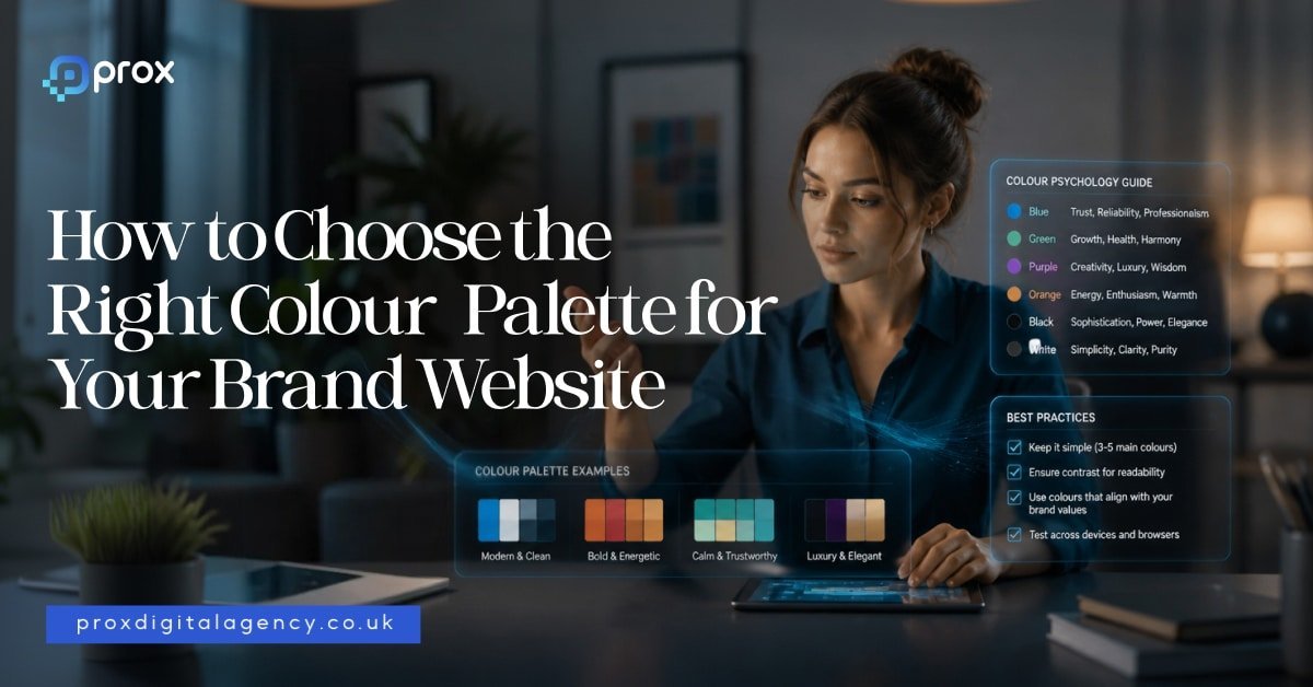
  • How to Choose the Right Colour Palette for Your Brand Website

    How to Choose the Right Colour Palette for Your Brand Website

    That makes colour one of the most powerful tools in modern web design. In 2026, brands no longer choose colours simply because they look attractive. They choose them because they communicate meaning. Every shade sends a signal. Every palette creates an expectation.

    As designer and artist Wassily Kandinsky famously said:

    “Colour is a power which directly influences the soul.”

    That statement feels more relevant today than ever. Modern websites compete for attention in crowded digital spaces. Users make decisions quickly. They judge credibility almost instantly. In many cases, colour becomes the difference between staying and leaving. Choosing the right palette is not about personal preference. It is about strategic communication.

    The Psychology Behind Colour Choices

    Human beings naturally associate colours with emotions and experiences. These associations influence behaviour every day. When we see certain colours, our brains create immediate interpretations based on culture, memory, environment and psychology.

    This is why colour psychology plays such an important role in branding and website design. The goal is not to manipulate users. The goal is to align visual communication with audience expectations.

    A luxury fashion brand should not feel like a discount supermarket. A healthcare company should not feel like a nightclub. Colour helps establish those distinctions instantly. Let us explore the meanings behind some of the world’s most commonly used brand colours.

    1- Blue Creates Trust and Stability

    Blue remains one of the most popular brand colours in the world. There is a reason for that. Blue communicates reliability, confidence, security and professionalism. It helps people feel comfortable. It reduces perceived risk.

    This explains why many financial institutions, technology companies and professional service firms use blue as a primary colour.

    Think about brands such as:

    • Facebook
    • LinkedIn
    • PayPal
    • IBM
    • Barclays

    Each of these brands wants users to trust them. Blue supports that objective. In 2026, designers continue using blue heavily in sectors where credibility matters more than excitement. For businesses in finance, technology, consulting, legal services, cybersecurity, or SaaS, blue remains a strong option.

    2- Red Captures Attention and Creates Energy

    Red works differently. It demands attention. Red creates urgency, excitement, passion, movement and action. It often increases emotional intensity. This explains why many food brands and retail companies use red strategically.

    Examples include:

    • Coca-Cola
    • Netflix
    • YouTube
    • Virgin

    These brands want energy. They want engagement. They want users to notice them immediately. However, red requires careful handling. Too much red can feel aggressive or overwhelming. Strong brands often combine red with neutral colours to maintain balance. In web design, red works particularly well for promotions, calls to action and high-energy consumer brands.

    3- Green Signals Growth and Wellbeing

    Green continues to dominate sectors linked to health, sustainability, finance and wellbeing. People associate green with nature, balance, freshness and growth. That association feels especially relevant in 2026 as consumers become more environmentally conscious. Brands increasingly use green to communicate responsibility and long-term thinking.

    Examples include:

    • Spotify
    • Whole Foods
    • Animal welfare organisations
    • Sustainable product companies

    Green also works exceptionally well for fintech businesses because it naturally connects with wealth and financial growth. A well-designed green palette can create a calm and reassuring digital experience.

    4- Yellow Brings Optimism and Positivity

    Few colours feel as cheerful as yellow. Yellow communicates warmth, happiness, confidence and creativity. It attracts attention without creating the intensity associated with red. Many brands use yellow to create a friendly personality.

    Think about:

    • McDonald’s
    • IKEA
    • Snapchat

    These companies want to feel approachable and memorable. However, yellow works best as an accent colour on websites. Large blocks of bright yellow can create visual fatigue. Smart designers often pair yellow with darker tones to improve readability and balance.

    5- Black Defines Luxury and Sophistication

    Luxury brands understand the power of restraint. That is why black remains a favourite choice among premium companies. Black communicates exclusivity, elegance, confidence and authority. It creates contrast. It creates drama. It creates focus.

    Some of the world’s most recognisable luxury brands use black extensively, including:

    • Chanel
    • Prada
    • Dior
    • Rolex

    In website design, black works particularly well when paired with generous white space and strong typography. The result feels refined rather than cluttered.

    As fashion designer Yohji Yamamoto once said:

    “Black is modest and arrogant at the same time.”

    Luxury brands understand exactly what he meant.

    6- White Space Is a Colour Strategy Too

    Many businesses focus entirely on colours and forget about what sits between them. White space matters. In fact, some of the strongest websites in 2026 use fewer colours than ever before. They rely on clean layouts, breathing room and visual simplicity. White creates clarity. It improves readability. It helps users focus on what matters.

    Brands such as Apple have mastered this approach for years. Their websites rarely feel crowded because they allow content and products to breathe. Sometimes the smartest colour decision is knowing when not to add another colour.

    Why Modern Brands Use Fewer Colours

    One major design trend continues to dominate in 2026. Simplification.

    Many brands are reducing colour complexity rather than increasing it. Instead of using six or seven competing colours, successful websites often rely on:

    • One primary brand colour
    • One supporting colour
    • One accent colour
    • Neutral backgrounds

    This creates consistency across websites, apps, social media and marketing campaigns. It also improves recognition. When people see a colour repeatedly, they begin associating it with a specific brand. That consistency creates long-term brand equity.

    Colour Is About Meaning, Not Preference

    One of the biggest mistakes businesses make is choosing colours based solely on personal taste.

    • A founder might love orange.
    • A director might prefer purple.

    But branding decisions should never begin with personal preferences. They should begin with audience expectations.

    The right question is not: ‘What colour do we like?’

    The right question is: ‘What colour helps our audience trust, remember and understand us?’

    That shift changes everything. The most successful colour palettes are built around communication instead of over-ornate embellishments. And that is where strategic brand design begins.

    Why Colour Matters More Than Ever in 2026

    Colour influences perception long before content does. It shapes emotion, trust, credibility and behaviour within seconds. Every colour carries meaning. Every palette tells a story. The strongest brands understand this. They choose colours deliberately rather than emotionally.

    Now, we will explore how different industries should approach colour selection, the biggest colour mistakes businesses make, the leading website colour trends shaping 2026, and a practical framework for building the perfect colour palette for your brand website.

    Matching Colours to Your Industry

    Choosing the right colour palette becomes much easier when you understand the expectations of your market. Different industries communicate different promises. Colours help reinforce those promises before a visitor reads a single line of copy.

    This does not mean every business in a sector should use identical colours. It simply means certain colours naturally support certain messages. When colour and brand positioning work together, users experience consistency. When they clash, trust weakens.

    Let’s explore some common examples.

    1- Technology and SaaS Brands

    As we all know that tech companies often rely on blue because trust remains a critical part of the buying process. People want confidence when they purchase software, cybersecurity solutions, cloud services or digital platforms.

    Blue communicates stability and expertise. However, modern SaaS brands in 2026 are becoming more adventurous. Many now combine blue with vibrant accent colours such as:

    • Purple
    • Cyan
    • Electric green
    • Bright coral

    This creates a balance between trust and innovation. Brands want to appear reliable, but they also want to feel modern and forward-thinking.

    2- Financial Services and Fintech

    Money creates emotion and people want security when making financial decisions. They also want confidence that a company understands their future goals. This is why blue and green continue to dominate financial branding.

    • Blue suggests trust and professionalism.
    • Green suggests growth, prosperity, and long-term success.

    Many fintech brands now blend these colours with minimalist interfaces to create a clean and modern experience. The result feels less corporate and more approachable.

    3- Healthcare and Wellness Brands

    Healthcare websites need to create calm. Users often arrive with concerns, questions or uncertainty. Strong healthcare design reduces anxiety rather than increasing it.

    This explains the popularity of:

    • Soft blues
    • Greens
    • White backgrounds
    • Muted neutral tones

    These colours create feelings of safety and reassurance. Wellness brands often push this even further by introducing earthy colours inspired by nature.

    Sage green, soft beige, clay tones and warm creams continue to grow in popularity throughout 2026.

    4- Luxury Brands

    Luxury branding follows a different set of rules. Luxury brands rarely try to attract attention through bright colours. Instead, they focus on exclusivity.

    Black, charcoal, deep navy, gold and white remain dominant choices.

    These colours communicate confidence without shouting. Luxury brands understand an important principle. True confidence rarely needs to be loud. That is why many premium websites feel simple, elegant and highly restrained.

    5- Creative Agencies and Design Studios

    Creative businesses have more freedom than most industries. Their websites often serve as proof of their creativity. Many agencies use bold colour combinations to create memorable experiences.

    Bright gradients, vibrant accents and unexpected colour pairings continue to appear across agency websites in 2026.

    However, successful agencies still maintain strategic control. They use colour to reinforce personality rather than create chaos. The best creative websites feel distinctive without becoming overwhelming.

    6- Ecommerce and Consumer Brands

    Retail brands often use colour to drive emotion and purchasing behaviour.

    • Fashion brands frequently choose black and white palettes to keep attention on products.
    • Beauty brands often use soft neutrals, blush tones, and muted pastels.
    • Food and beverage companies frequently rely on warmer colours that stimulate energy and appetite.
    • Consumer brands must think carefully about emotional triggers.

    A website should feel consistent with the experience customers expect from the product itself.

    The Biggest Colour Mistakes Brands Make in 2026

    Choosing colours can be exciting. Unfortunately, many businesses make decisions that create confusion instead of clarity.

    • One common mistake involves following trends without considering brand identity. A colour trend may look attractive today, but it may not align with your positioning.
    • Another mistake involves using too many colours. When every element competes for attention, nothing stands out. Users struggle to understand hierarchy. The experience becomes visually exhausting.
    • Some businesses also ignore accessibility. A beautiful palette loses value if users cannot comfortably read the content. Strong colour palettes balance aesthetics with usability.

    Colour Trends Shaping Websites in 2026

    Every year introduces new design trends. However, the strongest trends in 2026 focus on authenticity and emotional connection rather than visual gimmicks.

    • One major trend involves natural colour palettes. Brands increasingly use colours inspired by nature because they create calm and credibility. Earthy greens, warm browns, soft blues, and organic neutrals continue gaining popularity.
    • Another trend involves richer, deeper tones. Instead of bright primary colours, many brands now prefer sophisticated shades with greater depth. These colours feel more mature and premium.
    • We also see increased use of subtle gradients. Unlike the loud gradients of previous years, modern gradients feel softer and more refined. They add depth without overwhelming the user experience.
    • Dark mode design also continues influencing colour selection. Many brands now create palettes that perform equally well in both light and dark environments. This requires greater consideration of contrast, accessibility and visual hierarchy.

    How to Build the Right Colour Palette for Your Website

    Choosing a colour palette does not need to feel complicated. A simple framework can make the process much easier.

    • Start with your brand personality. Ask yourself: What do we want people to feel when they visit our website? Do you want to appear trustworthy? Innovative? Premium? Friendly? Bold? Your answer should influence your primary colour choice.
    • Next, select a supporting colour that complements your primary colour. This colour should reinforce your overall personality rather than compete with it.
    • Then choose an accent colour. This colour should attract attention to important actions such as buttons, links, and calls to action.
    • Finally, build a neutral foundation using whites, greys, or muted background colours. This foundation creates breathing room throughout the design.

    Many successful websites rely on a simple formula:

    • One primary colour
    • One supporting colour
    • One accent colour
    • Neutral backgrounds

    Simple often wins.

    – Test Colours in Real Situations

    Many brands choose colours in isolation. They view them as swatches rather than experiences. This creates problems. Colours behave differently when placed inside real interfaces. A colour that looks fantastic in a logo may perform poorly on a website. Always test colours within actual layouts.

    Review them on:

    • Desktop screens
    • Mobile devices
    • Dark mode environments
    • Different lighting conditions

    Observe how users respond. Strong branding comes from evidence instead of bogus assumptions.

    – Colour Creates Memory

    One of the most overlooked benefits of colour is memorability. People remember colours remarkably well. Think about some of the world’s most recognisable brands. You can often picture their colours instantly.

    • The red of Coca-Cola.
    • The blue of Facebook.
    • The yellow of IKEA.
    • The green of Spotify.

    Colour helps brands occupy mental space. When used consistently, it becomes a shortcut to recognition. That recognition creates familiarity. Familiarity creates trust and trust creates business.

    – Colours Are Far More Than a Design Choice

    They influence perception, behaviour, emotion and decision-making. It shapes how people experience your brand long before they engage with your products or services.

    The most successful websites in 2026 do not choose colours based on trends alone. They choose colours that reflect their positioning, connect with their audience and support their commercial goals. A strong colour palette creates clarity. It strengthens recognition. It guides attention and reinforces trust at every stage of the user journey.

    As artist Paul Klee once said:

    “Colour possesses me. I don’t have to pursue it. It will possess me always.”

    Great brands understand this idea. They do not treat colour as decoration. They treat it as a strategy. And when colour strategy aligns with brand strategy, remarkable things happen.

    For the fundamentals behind this, see our UK web design guide, or talk to our website design and development agency. If a colour change is part of a bigger rebrand, see our complete guide to rebranding.

  • How Long Does SEO Take to Work in 2026?

    How Long Does SEO Take to Work in 2026?

    SEO does not follow a fixed timeline anymore. Let us get one thing straight. SEO is not a quick switch you turn on and expect results overnight. It does not behave like paid ads where you inject money and see immediate visibility. Organic search works on a completely different system.

    And in 2026, anyone promising instant rankings is either overselling, or fundamentally misunderstanding how modern search ecosystems work. Algorithms are more advanced, user signals matter more and competition is significantly higher than before.

    However, one thing is clear. SEO speed is not luck. It is built through consistent action, structured strategy and compounding signals over time.

    Why SEO Takes Time in the Real World

    SEO is not advertising. You cannot pay your way into organic trust. Google treats your website like a reputation system. It asks simple questions:

    • Are you relevant
    • Are you trustworthy
    • Are users engaging
    • Do other websites recommend you

    And trust is not instant. It builds through signals over time. These signals include:

    • content quality
    • backlinks
    • user behaviour
    • technical health
    • brand authority

    SO yes, SEO takes time because trust takes time. Simple logic. Hard patience.

    The Real SEO Timeline in 2026

    Let us break it down properly.

    Month 1 Is Foundation Work

    This is where everything begins. We set up tracking tools like Search Console and analytics. We audit the website. We fix crawling and indexing issues. And we identify what is broken before we try to grow anything. No shortcuts here. Weak foundations always fail later.

    Month 2 Is Structure and Fixes

    Now we clean things up. Technical issues get resolved. Pages get organised. Keywords get mapped correctly. So both users and search engines finally understand the website. This is often when businesses realise their site was never truly SEO ready.

    Month 3 Is Visibility Setup

    Now we start building authority. We publish targeted content. We improve internal linking. We begin early backlink outreach. And this is where Google starts paying attention. Quietly. Like it is watching before it trusts.

    Month 4 to 6 Is Momentum Phase

    Now things start compounding. Pages begin to rank. Traffic increases. Visibility improves steadily. However, this stage depends on consistency. If you stop, growth slows. If you continue, results multiply. SEO rewards patience. Don’t panic.

    Why Some Websites Grow Faster Than Others

    Not every website moves at the same speed. Here is why.

    1- Domain Strength Changes the Starting Point

    Older websites often have an advantage. They already carry:

    • History
    • Backlinks
    • Indexed pages
    • Brand signals

    New websites start from zero. Google does not trust them yet. SO yes, age helps. But it is not everything. A focused new site can still outrank an old inactive one.

    2- Competition Decides Your Speed

    SEO is competitive by nature. If you target broad keywords like ‘insurance’ or ‘lawyer’, expect a long journey. But if you target specific intent-driven searches, results come faster.

    For example:

    • best mobile app agency for startups UK
    • affordable Shopify developer London

    These are easier to win. And smart SEO always starts where victory is realistic.

    3- Content Quality Drives Acceleration

    Let us be honest. Most websites do not fail because they lack content. They fail because their content is average. Google now rewards:

    • Real experience
    • Clear answers
    • Structured thinking
    • Helpful depth

    And it ignores fluff faster than ever. If your content does not help users, it will not last.

    4- Technical SEO Controls Visibility

    If your website is slow, messy or hard to crawl, SEO slows down immediately. Think of it like this. You can have a great store but if the doors are locked, nobody walks in.

    Technical SEO ensures:

    • Google can access your pages
    • Pages load fast
    • Structure is clean
    • Mobile experience is smooth

    So yes, speed matters. A lot.

    5- SEO Speed Depends on How Well You Execute

    Let us simplify a truth that many agencies overcomplicate. SEO moves faster when the right elements align at the exact same moment.

    True momentum only happens when you possess four critical assets:

    • Time to allow data to mature.
    • Budget to fund high-level resources.
    • Talent to navigate complex algorithmic shifts.
    • Consistency to outlast your competition.

    If even one of these elements is missing, your progress slows to a crawl. If all of them are missing, your SEO strategy will feel like pushing a broken car uphill in the pouring rain.

    6- Backlinks Still Shape Your Ranking Speed

    Backlinks remain one of the strongest and most undeniable ranking signals in 2026. Think of them as digital votes of confidence from the rest of the web. However, the digital world has evolved and not all votes carry the same weight. A single link from a highly relevant and reputable industry platform can easily outperform dozens of weak and low-tier directory links.

    The ultimate goal here is never volume. The goal is pure authority. Building that genuine authority takes dedicated time because real trust cannot be rushed.

    7- Search Intent Decides Absolute Success or Failure

    Many digital platforms fail at this exact stage without ever realising why their traffic is stagnant. They spend weeks publishing content that looks visually stunning and reads beautifully, yet completely misses what the end user is actually searching for.

    Consider these common structural disconnects:

    • The user wants a quick, scannable list but you give them a lengthy, philosophical story.
    • The user wants a clear, upfront pricing breakdown but you give them a deep corporate background history.

    Google detects this exact behavioral mismatch remarkably quickly. When searchers land on your page and immediately bounce back to the search results to find a better answer, your rankings plummet. If your content intent is wrong, your positions will not last. It is as simple as that.

    8- Leadership Support Controls SEO Speed

    This is the hidden operational bottleneck that most industry blogs completely ignore. If executive leadership does not fully support the SEO roadmap, every single initiative slows down to a crawl.

    Successful organic growth requires rapid execution across multiple corporate channels, meaning you constantly need:

    • Fast administrative decisions
    • Streamlined departmental approvals
    • Sustained financial investment
    • Immediate technical and development changes
    • Long-term patience from stakeholders

    Without total executive alignment, your digital marketing teams will spend far more time waiting for internal sign-offs than actually executing strategies. That institutional delay slows everything down, allowing more agile competitors to capture the market share.

    9- Budget Does Not Buy Rankings, But It Removes Delays

    Let us be precise about the role of capital in organic growth. Money does not guarantee you a first-page spot. However, it undeniably enables speed. A robust budget acts as a catalyst that allows for:

    • Superior content creation by hiring subject matter experts rather than generalists.
    • Access to enterprise-grade tools that provide deeper data and sharper insights.
    • Faster execution by removing development bottlenecks and resource scarcity.
    • High-frequency output that keeps your brand top-of-mind for algorithms.

    The budget does not create success on its own. Instead, it removes the friction that causes great strategies to grind to a halt. In the complex world of SEO, friction is the real enemy of momentum.

    Can You Actually Speed Up SEO in 2026?

    The answer is yes. However, speed in 2026 is not found in clever hacks or dangerous shortcuts that trigger manual penalties. You speed it up by mastering the fundamentals with an intensity that your competition cannot match.

    Here is what actually drives results today:

    1. Prioritise low-competition keywords first to build early domain relevance and quick wins.
    2. Fix technical debt early so that search engines can crawl, index and render your pages without obstacles.
    3. Build a robust internal linking architecture to distribute your site authority effectively.
    4. Publish content that solves real-world problems rather than chasing hollow search volume.
    5. Refine and improve existing pages instead of burying them or ignoring their performance.

    Above all else, stay consistent longer than your competitors. The uncomfortable reality is that most SEO failures are not actually technical in nature. They are, at their core, consistency failures. Growth is a marathon and the agency that refuses to stop running is the one that eventually takes the lead.

    What Faster SEO Really looks like

    Let us clear up a persistent industry myth once and for all. Faster SEO does not mean achieving instant, number-one rankings overnight. That is a false promise that leads to poor strategic decisions. Instead, true velocity in search engine optimization looks like this:

    • Quicker indexing so your new content is found and evaluated by search engines within hours, not weeks.
    • Earlier ranking movement where you observe your target keywords climbing out of the deep search results ahead of schedule.
    • Faster traffic signals as early-stage visitors begin interacting with your landing pages.
    • Earlier optimisation data which gives your team the critical user behavior insights needed to make data-driven adjustments.

    Instead of waiting months in total darkness wondering if your strategy is working, you start seeing clear algorithmic signals within a matter of weeks. That is where smart, agile SEO truly begins because data allows you to pivot and scale long before your competitors even know what hit them.

    The Real Answer to SEO Timelines

    Let us look at the honest picture of what it takes to build a digital footprint that dominates search results. Organic growth requires patience and standard timelines typically follow this trajectory:

    • 3 to 6 months to achieve visible traction and early keyword momentum.
    • 6 to 12 months to establish strong domain authority and secure steady, high-intent traffic.
    • Significantly longer when you are competing in highly saturated, aggressive industries.

    However, these timelines are never set in stone. Your actual speed to market depends entirely on how well your website is built, managed and systematically improved over time.

    That operational reality is exactly what most businesses underestimate. SEO is not a one-time project you can launch and leave behind. It is a continuous, living system that rewards relentless execution.

    Final Takeaway

    If you want your SEO strategy to deliver faster, more powerful results in 2026, you must avoid the temptation of cheap shortcuts and algorithmic hacks. True velocity is built on a foundation of clarity, consistency, and uncompromising quality.

    The reality of modern search is simple: Google does not reward digital noise. It rewards deep, undeniable trust.

    Building that level of trust always takes dedicated time. However, once that foundation is firmly established, your authority compounds and transforms your digital presence into an unstoppable engine for long-term organic growth.

    For the fundamentals behind these timelines, see how search engine optimisation works today, or talk to our SEO agency. Want the numbers behind this? See the data behind SEO timelines.

  • The Role of Typography in Web Design: A Step-by-Step Guide

    The Role of Typography in Web Design: A Step-by-Step Guide

    Typography controls mood, readability, and brand personality, creating a subtle sense of order that keeps people scrolling. You can easily add friction by adding wrong typography, or you have the chance to let your message feel effortless with the right typography application.

    The selection of typeface, word spacing, font sizing and structure all contributes in a good typography technique. Prox, a website design agency London, carefully crafts websites that show error-free typography in web design, and here’s how they begin.

    What Is Typography in Web Design?

    Before we dive into typography tips, you must learn what typography is in web design in 2026. Typography refers to the artful practice of aligning different texts and sentences on a website to make it visually attractive and reader-friendly. 

    Why Typography Matters for User Experience

    Web typography is not just selecting your favourite font from the library; it’s basically all about styling, sizing, spacing and adding structure to your selected fonts. And that’s the reason why it matters the most in improving the user journey. 

    Typography in web design allows your audience to comprehend your brand tone, tell them what to do next, where they should click and what to see first and enhances overall usability for them.

    Your text, their size, styling and alignment must be compatible with your web design on every device so that typography and user experience go side-by-side on any device they log in from. 

    Understanding Typography Hierarchy in Web Design

    Understanding website typography is an art. It magically tells you from where to begin, pause and last. It guides a visitor to know what you’re selling, the latest discount offers, and why you must have it in your cart. 

    Let’s learn about the hierarchy of typography for websites in UK. Start by mapping the layers.

    • H1 (Headline): One per page. The dominant statement.
    • H2 (Subheadings): Break the content into clear sections.
    • Body text: The meat of your message.
    • Supporting text: Captions, footnotes, disclaimers.

    How to Choose the Right Fonts for Your Website

    Improving website readability with typography and brand personality is the key to choosing the right fonts for your website. Here’s how to choose fonts for a website and what they reflect on your landing pages.

    Font Type Font Names What They Reflect Drawbacks
    Web-safe fonts Arial, Georgia, Verdana They are safe and load instantly as they already live on most devices. Limited in character
    Google Fonts Roboto, Tiira, Open Sans, Inter Free, huge library, and easy to implement. Each font adds download weight
    Custom typefaces San Francisco, Coca-Cola Spencerian, Netflix Sans Add Uniqueness. They require a web licence to use. They can also bloat your page if not served in modern formats like WOFF2.

    As a rule, stick to a maximum of two typefaces. One for headings and one for body. If you still try to add any more font styles, your webpage starts to feel messy.

    Typography Best Practices for Readability

    Good font pairing creates readability. Bad pairing feels like an argument. Best typography practices for websites include pairing fonts, “a serif with a sans-serif.” This means creating contrast using a modern font for headings and a simpler font for body text provides consistency and typography hierarchy.

    Font pairing for websites prioritises legibility and establishes visual hierarchy in web design. Here is a quick website font selection guide and how they create effects.

    Heading Typeface Body Typeface Result
    Playfair Display Inter Refined, crisp, editorial
    Montserrat Source Serif 4 Modern, structured
    Merriweather Open Sans Warm, solid, readable
    Lora Poppins Approachable, creative

    Even after selecting two typefaces of your choice, apply it on a paragraph and read it with your eyes. You will understand instantly if it’s working or not.

    Typography and Website Accessibility

    Typography and website accessibility are reflected in good web design. It is about making text available in a form that can be read and understood by all people, including those with vision impairments, intellectual disabilities, or motor difficulties.

    Typography and accessibility typically involve applying deliberate formatting like optimal sizing, high contrast, and clear spacing. These practices also help assistive technologies interpret content smoothly and make it easier for diverse users to understand information.

    • Colour contrast: Regular text should have a strong contrast, while larger text can use slightly lower contrast. Check with a reliable colour contract checker to make sure your colours are easy to read.
    • Alignment: Left-aligned text makes reading easiest for left-to-right languages. Justified text creates uneven gaps and visual distraction.
    • Weight: Very thin fonts can be difficult to read on some screens. Stick to 400 or above for body copy.
    • Zoom: Always enable pinch-to-zoom for mobile devices. Many users depend on it. Even advanced technologies also offer Zoom for desktop versions.
    • Inclusive typefaces: Sans-serif fonts like Open Sans and Arial are reader friendly font even for dyslexic people. Lengthy Italics usually add reading friction.

    Responsive Typography for Mobile Devices

    Responsive typography design principles are helpful for mobile users. Responsive typography includes font sizes, column widths, and line spacing that automatically adjust to fit on different screen sizes easily. This reduces the efforts to Pinch, Zoom or scroll horizontally for any performed actions.

    Open a page on your phone, read a full paragraph without zooming or pinching under ordinary light. If your eyes feel a slight pull, adjust it in your web design. 

    Responsive typography best practices offer

    • Enhanced readability in web design
    • Better SEO
    • Overall improved usability.

    Common Typography Mistakes to Avoid While Web Designing

    You can choose excellent fonts, but they won’t help much if the basics aren’t right. Spotting these mistakes early keeps a website readable and trustworthy. 

    • Using more than two typefaces. Two typefaces are enough. One for headings, one for body. More than that creates visual chaos and adds unnecessary page weight.
    • Smaller body text. Any text below 16px forces the reader to put effort. On mobile, it becomes a fast exit. Use 18px as it’s a safer default for content-rich pages.
    • Low contrast. Pale grey text on white backgrounds may look elegant in a mockup, but fails accessibility checks and can be tiring to read. Aim for a ratio of 4.5:1 minimum on body copy.
    • Justification text on the web. Uneven word spacing is nothing but awkward gaps and interrupts the reading flow badly. Apply left-aligned text to improve consistency and readability.
    • Decorative fonts for body copy. Display and script typefaces belong in headlines or accents only. Paragraphs set in decorative fonts demand effort rather than reward attention.
    • Neglect typography testing on devices. It is highly possible that a beautifully readable font on a Mac can feel broken on a desktop or an Android. Always check live hardware before sending your website live.

    Typography tips for better user experience

    Work on these mistakes and apply typography tips for better user experience. Fixing them costs little and pays back in trust. If you’re looking to avoid these issues altogether, it’s wise to hire web designer in London who pays close attention to typography, usability, and overall website performance.

    Typography Trends in Modern Web Design

    Bold visuals, high-contrast layouts, and responsive typography design are the latest typography trends in 2026. Let’s take a look.

    Modern Typography Trends 2026 What It Does Best Used For
    Variable Fonts One file holds multiple weights and widths. Less load, more flexibility. Responsive sites where performance and fluid scaling matter.
    Kinetic Type Subtle motion applied to key headings. Guides attention without noise. Creative portfolios and brand-forward homepages.
    Oversized Headings Heavy, dominant headlines set against modest body text. Hero sections and landing pages that need instant hierarchy.
    Brutalist Type Raw, unrefined letterforms. Deliberately rough and direct. Brands want to signal authenticity over polish.

    Final Thoughts on Typography in Web Design

    Typography in web design is not decoration. It directly shapes how long people stay and how easily they read. Comfortable text keeps bounce rates low and trust high. These signals feed into search performance. Google’s Core Web Vitals reward pages that load instantly and stay visually stable on different devices. 

    We presented this step-by-step typography guide for web designers who are looking to build websites that engage visitors and support business growth.

    As a focused web design agency in London, Prox Digital build typography for UX design into the structure of every page. Our web designers in UK set hierarchies, pair fonts, and tune spacing so your content carries authority without friction. If you want a reading experience that feels effortless, we’re ready to connect.

    FAQs

    How many typefaces should I use on one site?

    Using two typofaces on a website is considered ideal; one for headings, one for body. That covers hierarchy without visual clutter.

    Does typography affect search rankings?

    Yes, typography indirectly affects search rankings. Readable, well-structured text improves engagement metrics that search engines interpret as quality signals. A clear heading hierarchy also helps crawlers understand content.

    How typography affects web design?

    Good typography makes content easier to read, strengthens visual hierarchy, and creates a better user experience.

    For the fundamentals behind good design, see the core principles of modern web design, or talk to our web design team. Colour matters just as much — see choosing the right colour palette.

  • 10 iOS App Design Mistakes That Kill User Retention in 2026

    10 iOS App Design Mistakes That Kill User Retention in 2026

    A week later, your app is deleted. This scenario happens thousands of times every day. Most app teams focus heavily on downloads. They celebrate App Store rankings, install numbers and launch-day buzz. Yet none of those metrics matter if users never return after their first visit. Retention is the metric that separates successful apps from expensive experiments.

    According to industry studies, a significant percentage of mobile users stop using an app within the first 30 days. That means every design decision matters. Every screen, interaction and user journey influences whether someone stays or leaves.

    The good news is that retention problems are often predictable. Let’s examine iOS design mistakes that quietly drive users away.

    Mistake #1: Designing For Stakeholders Instead Of Users

    Many app projects begin with good intentions but quickly become internal wish lists. The founder wants one feature. Marketing wants another. Sales wants additional screens. Senior management requests extra functionality to showcase the business.

    Before long, the app becomes a reflection of internal priorities rather than customer needs. Users do not care about organisational politics. They care about solving a problem quickly and efficiently.

    Consider a banking app. Customers want to check balances, transfer money and manage accounts with minimal effort. They do not want to navigate through multiple promotional banners, product advertisements or unnecessary features before reaching basic functions.

    The best iOS apps succeed because they remove friction rather than add it. Before adding any feature, ask:

    • Does this help users achieve their goal faster?
    • Is this solving a genuine customer problem?
    • Would users actively miss this feature if removed?

    If the answer is unclear, the feature may not belong in the product. User-centred design consistently outperforms stakeholder-centred design because it prioritises real behaviour rather than internal assumptions.

    Mistake #2: Creating A Confusing Onboarding Experience

    First impressions matter. In fact, they matter more in mobile apps than almost anywhere else. Many businesses spend months perfecting app functionality but then overwhelm new users with lengthy onboarding sequences. We’ve all seen them.

    • Seven introduction screens.
    • Multiple permission requests.
    • Lengthy registration forms.
    • Complex tutorials.

    The problem is simple. Users have not yet experienced any value from the app. They are being asked for commitment before receiving a benefit.

    Imagine downloading a food delivery app while travelling through Manchester. Before browsing restaurants, you must create an account, verify your email address, enable location services, select preferences and watch a tutorial.

    Most users will abandon the process. Strong onboarding focuses on speed. The goal is not to explain everything. The goal is to help users experience value as quickly as possible.

    Effective onboarding typically includes:

    • A clear value proposition
    • Minimal registration requirements
    • Guided first actions
    • Contextual tips instead of lengthy tutorials

    The quicker users achieve their first success, the more likely they are to return.

    Mistake #3: Ignoring Apple’s Human Interface Guidelines

    Apple has spent years teaching users how iOS apps should behave. When designers ignore those expectations, friction appears immediately. Users develop habits across thousands of interactions. They expect buttons to behave in certain ways. They expect gestures to feel familiar. They expect navigation patterns to follow established conventions. Apps that fight these expectations create unnecessary confusion. A common mistake occurs when businesses attempt to make their apps look radically different from every other iOS application. Creativity has its place. Usability comes first.

    For example, replacing standard navigation elements with experimental alternatives may look impressive during presentations, but it often frustrates users in everyday situations.

    Apple’s Human Interface Guidelines exist for a reason. They help create consistency across the ecosystem. Successful iOS apps understand that familiarity is often a competitive advantage. Users should spend their mental energy completing tasks, not figuring out how the interface works. The best design frequently feels invisible because it behaves exactly as users expect.

    Mistake #4: Overloading The Home Screen

    Many businesses treat the home screen like a billboard. Every feature competes for attention. Every department wants visibility. The result is visual chaos. When users open an app, they should immediately understand where to go next. Unfortunately, crowded home screens often create the opposite effect.

    Imagine opening a fitness application and seeing ten different workout categories, multiple promotions, social feeds, achievement badges, advertisements and notifications all competing for attention. Instead of encouraging engagement, the screen creates decision fatigue. Psychologists have long understood that too many choices can reduce action.

    The same principle applies to mobile apps. Good iOS design embraces prioritisation. The most important action should dominate the screen. Secondary features should remain accessible without overwhelming the experience.

    Ask yourself:

    • What is the primary action users want to complete?
    • Does the layout support that action?
    • Can unnecessary elements be removed?

    Often, improving retention is not about adding more functionality. It is about removing distractions.

    Mistake #5: Slow Loading Times And Performance Issues

    Nothing destroys retention faster than poor performance. Users may forgive a missing feature. They rarely forgive an app that feels slow. Modern consumers expect speed. They compare every app experience against the best products on their devices. Whether they are using Monzo, Deliveroo, Spotify or WhatsApp, they expect instant responses. When screens lag, animations stutter or pages take too long to load, trust begins to disappear.

    Performance problems affect more than usability. They affect perception. A slow app feels unreliable. An unreliable app feels risky. A risky app gets deleted. Common performance issues include:

    • Large image files
    • Poor backend optimisation
    • Excessive API requests
    • Unnecessary animations
    • Bloated codebases

    Retention is often won through small improvements. Reducing loading times by a few seconds can significantly improve engagement and satisfaction. Remember, users rarely distinguish between design problems and performance problems.

    To them, the entire experience is simply ‘the app’. If the experience feels slow, the product feels broken.

    Mistake #6: Ignoring Performance Until Users Complain

    Most businesses assume users leave because they dislike the design. In reality, many leave because the app simply feels slow. Apple users are particularly demanding when it comes to speed. They expect screens to load instantly, animations to feel smooth, and actions to happen without delay. If an app stutters, freezes or takes too long to respond, users notice immediately.

    A common mistake is treating performance as a developer problem rather than a design problem. The truth is that performance directly affects user experience. A beautiful interface means very little if people spend their time staring at loading indicators.

    Research consistently shows that delays increase abandonment rates. Even a few extra seconds can cause users to close the app and never return. Poor performance usually appears in the form of:

    • Slow loading screens
    • Heavy animations
    • Unoptimised images
    • Excessive API requests
    • Lag during navigation
    • Poor handling of weak mobile connections

    The best iOS apps feel effortless. Users tap something and receive an instant response. That sense of speed creates confidence and keeps people engaged.

    Mistake #7: Forgetting That Onboarding Is Part of the Product

    Many businesses spend months perfecting features and only a few hours thinking about onboarding. That is backwards. Users decide whether an app deserves their attention within the first few minutes. If the initial experience feels confusing, overwhelming or frustrating, many people never make it past day one.

    Too many iOS apps bombard users with tutorials, permission requests and lengthy explanations before they deliver any value. Imagine downloading a budgeting app and being forced through ten screens before you can see your finances. Most users will simply leave. Effective onboarding should help users reach their first success as quickly as possible.

    Great onboarding focuses on:

    • Showing immediate value
    • Reducing friction
    • Explaining only what matters
    • Building confidence
    • Creating momentum

    The most successful apps understand that users learn through action, not instruction. Rather than explaining every feature, they guide people towards a simple win. Once users experience value for themselves, they become far more likely to stay. The best onboarding often feels almost invisible.

     Treating Push Notifications Like a Marketing MegapMistake #8:hone

    Push notifications can increase retention. They can also destroy it. Many businesses see notifications as free advertising. As a result, users receive constant interruptions that provide little or no value. The outcome is predictable. Notifications get disabled. Engagement drops. Eventually the app gets deleted.

    Apple users are particularly protective of their attention. They do not tolerate spam. Successful notifications feel relevant, timely and useful. Consider the difference.

    • A fitness app sending a reminder before a scheduled workout feels helpful.
    • A random promotional message at 10pm feels intrusive.

    The most effective notification strategies focus on context rather than volume. Ask yourself:

    • Does this help the user?
    • Is this message expected?
    • Is this the right moment?
    • Would I personally appreciate receiving it?

    If the answer is no, the notification probably should not be sent. Retention grows when users feel supported. It falls when they feel interrupted.

    Mistake #9: Ignoring User Feedback and Behaviour Data

    Many teams believe they know what users want. The data often tells a different story. One of the biggest retention killers is designing based on assumptions rather than evidence. Businesses become attached to features, layouts and workflows that users rarely use. Meanwhile, genuine frustrations remain unresolved.

    The most successful iOS products continuously learn from their audience. They analyse:

    • User journeys
    • Session recordings
    • Heatmaps
    • Feature adoption rates
    • Reviews
    • Support requests
    • Survey responses

    Patterns quickly emerge. Perhaps users abandon the checkout process halfway through. Perhaps a feature nobody expected becomes the most popular part of the app. These insights reveal opportunities that opinions alone cannot uncover.

    The App Store itself provides valuable feedback. One-star reviews often expose recurring usability issues long before internal teams notice them. Smart businesses treat feedback as a strategic asset rather than criticism.

    Every complaint highlights a retention problem waiting to be fixed. Every suggestion provides insight into user expectations. The companies that listen carefully usually outperform those that rely solely on internal assumptions.

    Mistake #10: Chasing Downloads Instead of Retention

    Many businesses celebrate app downloads. Investors like them. Marketing teams report them. Dashboards highlight them. Yet downloads alone mean very little. A million downloads are worthless if users disappear after a week. Retention is what determines long-term success.

    The most valuable apps build habits. They become part of users’ routines. They solve recurring problems so effectively that people continue returning without being persuaded. This requires a different mindset.

    Instead of asking:

    ‘How do we get more downloads?’

    Successful teams ask:

    ‘Why do people come back?’

    Retention-focused apps invest’ in:

    • Better onboarding
    • Simpler navigation
    • Faster performance
    • Continuous improvement
    • User feedback loops
    • Personalisation
    • Meaningful engagement

    Acquiring users is expensive. Keeping them is far more profitable. Industry studies repeatedly show that improving retention by even a small percentage can have a significant impact on revenue, customer lifetime value and growth. The businesses that win on iOS are not necessarily those with the biggest marketing budgets. They are the ones that create experiences users genuinely want to revisit.

    Final Thoughts

    User retention is rarely destroyed by one catastrophic mistake. More often, it is eroded through dozens of small frustrations that gradually push people away.

    An app may look impressive on launch day, but if users cannot navigate it easily, achieve their goals quickly or trust the experience, retention will suffer. The most successful iOS apps focus relentlessly on simplicity, speed, usability and user value. They remove friction instead of adding features.

    At Prox Digital Agency, we believe great app design is not about making screens look attractive. It is about creating experiences people want to return to again and again. Because in the competitive iOS ecosystem, retention is not a design metric. It is the metric that determines whether an app succeeds or disappears.

    For the fundamentals behind getting this right from day one, see our 7-step guide to building an app, or talk to our mobile app design and development agency. A proper design system heads most of these off — see how a proper design system prevents these mistakes.

  • Is Your Business ‘Invisible’ to AI? The 30-Minute Check Your AI Search Readiness

    Is Your Business ‘Invisible’ to AI? The 30-Minute Check Your AI Search Readiness

    Today, people increasingly receive answers directly from AI-powered search experiences. Google AI Overviews, ChatGPT, Perplexity and Microsoft’s AI search tools often provide recommendations without requiring users to visit multiple websites.

    A prospect searching for ‘best accounting software for UK small businesses’ may receive a complete answer before clicking a single result. The question is no longer whether your website ranks. The question is whether AI mentions your business at all.

    Many organisations are discovering a worrying reality. Their rankings remain stable, yet their visibility is declining because AI systems are choosing other brands to recommend. This is creating an entirely new competitive battleground.

    Why Ranking #1 No Longer Guarantees Visibility

    Traditional SEO focused on search engines. Modern visibility requires optimisation for both search engines and AI systems.

    An AI assistant does not simply look at who ranks first. It evaluates multiple signals before generating an answer. It looks for authority, expertise, trust, brand recognition and supporting evidence across the web.

    Imagine two Manchester-based cybersecurity firms.

    • The first ranks highly for several keywords but rarely appears outside its own website.
    • The second has fewer rankings but has been featured in industry publications, quoted by journalists, discussed on LinkedIn and referenced by technology blogs.

    When AI generates recommendations, it often trusts the second company more. This shift means visibility is becoming broader than rankings alone. Brands are now competing for recommendation status, not just search positions.

    How AI Chooses Brands And Sources

    AI systems are designed to reduce uncertainty. When they answer questions, they attempt to identify the most trustworthy sources available.

    • They look for patterns.
    • They look for consistency.
    • They look for evidence that a business genuinely deserves to be recommended.

    Common trust signals include:

    • Industry expertise
    • Media mentions
    • Research and original insights
    • Strong website structure
    • Brand consistency across platforms
    • Positive reviews and reputation signals

    The brands appearing most frequently in AI answers are often those creating authority beyond their websites.

    What Does It Mean To Be Invisible To AI?

    AI visibility simply means your business can be discovered, understood and recommended by AI systems. An AI-visible business leaves clear digital footprints across the web. Search engines understand its services, expertise, reputation and market position.

    An AI-invisible business often suffers from the opposite problem. Its website may explain its services poorly. It may publish generic content. It may have little presence beyond its own domain. It may have no notable mentions, citations or industry recognition.

    • Consider a specialist engineering consultancy in Birmingham. The company may have 20 years of experience and excellent client results. However, if that expertise only exists inside a few service pages, AI has little evidence to work with.
    • Meanwhile, a younger competitor publishing reports, speaking on podcasts and earning media coverage becomes the default recommendation. Experience alone is no longer enough. Visibility must be demonstrated.

    The Hidden Cost Of AI Invisibility

    Most businesses underestimate the commercial impact of being absent from AI-generated answers. The first cost is reduced visibility. Potential customers never discover your brand because recommendations are dominated by competitors. The second cost is fewer leads.

    If prospects consistently see rival businesses suggested by AI tools, those competitors become familiar and trusted before the buying journey even begins. The third cost is lost authority. Repeated mentions create credibility. Brands that appear frequently become perceived market leaders, whether they truly are or not.

    Over time, AI visibility compounds. Businesses mentioned today are more likely to be mentioned tomorrow. Businesses ignored today risk becoming increasingly invisible.

    The AI Visibility Diagnostic

    The following checklist helps determine whether your business is visible to modern AI systems. Think of it as an MOT for your digital presence. Each check reveals whether AI can confidently understand, trust and recommend your brand. Let’s begin.

    Check #1: Can AI Understand What You Actually Do?

    Many websites assume visitors already understand their services. AI systems do not make that assumption. They need clear signals. If your homepage uses vague statements such as ‘innovative business solutions’ or ‘helping organisations transform digitally’, AI may struggle to determine your expertise. Clear positioning matters more than ever.

    Your services should be obvious within seconds. Industry terminology should align with how real customers search. Every core service should have a dedicated page explaining who it helps, what it solves and why it matters.

    AI also relies heavily on entity recognition. In simple terms, it must understand who you are, what category your business belongs to and how you relate to your industry. Ask yourself:

    • Can a stranger explain your services after reading your homepage?
    • Do service pages clearly target specific industries?
    • Is your expertise obvious throughout the site?

    If the answer is no, visibility problems often begin here.

    Check #2: Do You Have Topical Authority Or Just Random Content?

    Many businesses publish blogs without a clear strategy.

    • One article covers branding.
    • The next discusses leadership.
    • The following week focuses on AI.
    • Then comes a post about recruitment.

    The result is scattered expertise. AI prefers specialists. It rewards websites demonstrating deep knowledge within defined subject areas. This is where topical authority becomes crucial.

    A UK accounting firm should not simply publish occasional tax articles. It should build an interconnected content ecosystem covering tax planning, compliance, VAT, payroll and business finance. The deeper the expertise, the stronger the authority signal.

    Strong topical authority usually includes:

    • Topic clusters
    • Internal linking between related content
    • Consistent subject focus
    • Expert insights and analysis
    • Long-term content depth

    Random blogging creates noise. Authority creates visibility.

    Check #3: Are You Publishing Information AI Can Quote?

    AI loves evidence. Generic advice is easy to find. Original insights are much harder to replace. Many businesses publish content that simply repeats what already exists online. Unfortunately, AI has little reason to reference that material.

    The businesses earning visibility are producing information worth citing. This includes proprietary research, frameworks, industry reports, expert opinions, surveys and unique methodologies.

    Think about how journalists work. They quote sources offering something new. AI behaves similarly. If your content contains original data, observations or practical frameworks, it becomes significantly more valuable.

    Ask yourself:

    • Have you published original research?
    • Do you share industry statistics?
    • Have you developed proprietary frameworks?
    • Are your insights genuinely different?

    The more unique your information becomes, the easier it is for AI to recognise your authority.

    Check #4: Is Your Website Structured For Machines?

    Even excellent content can fail if machines cannot understand it. AI systems rely on structure. Clear headings help define topics. Internal links establish relationships between pages. Schema markup provides additional context. Logical site architecture improves crawlability.

    Many businesses unknowingly create barriers by using poor heading structures, weak navigation or disconnected content. Your website should communicate clearly to both humans and machines. If AI cannot efficiently interpret your site, visibility opportunities disappear. Good content needs good infrastructure.

    Check #5: Are Trusted Sources Talking About You?

    Your website is only one piece of the puzzle. AI evaluates signals across the wider web. Media mentions, guest articles, interviews, industry directories and professional citations all contribute to credibility.

    If respected publications discuss your brand, AI gains confidence in recommending you. If nobody mentions your business beyond your own website, trust becomes harder to establish. Visibility increasingly depends on reputation, not just optimisation.

    Mid-Article Self Assessment
    Score yourself:
    0-2 checks passed = High Risk
    3-4 checks passed = Moderate Risk
    5 checks passed = Strong Foundation

    Check #6: Are You Building A Recognisable Brand Entity?

    One of the biggest changes in modern search is the shift from websites to entities. Google, ChatGPT and other AI systems increasingly focus on understanding brands, people, organisations and topics rather than individual pages.

    This explains why well-known brands often appear in AI answers even when they do not rank first for every keyword. AI trusts recognisable entities because they have clear identities.

    Many businesses invest heavily in SEO but neglect brand building. Their website exists, but their broader identity remains weak. They have no visible founder, no clear company story and no consistent messaging across the web.

    Strong entity signals often include:

    • A detailed About page
    • Founder visibility
    • Consistent company descriptions
    • Author profiles
    • Clear expertise positioning

    Think about the UK’s most respected consultancies, agencies or software firms. Most are known for something specific. They have established reputations that extend far beyond their websites. AI rewards that recognition. If your business disappeared from Google tomorrow, would people still know who you are? If the answer is no, entity building should become a priority.

    Check #7: Can AI Find You Beyond Your Website?

    Many companies treat their website as the centre of their digital universe. That approach worked when search engines relied heavily on crawling websites. AI works differently. Modern AI systems evaluate information from multiple sources. They cross-reference websites, social profiles, directories, interviews, articles, podcasts and public discussions. In other words, your website is only one piece of the puzzle.

    A Birmingham software company that regularly appears on industry podcasts, contributes to trade publications and participates in LinkedIn discussions sends stronger authority signals than a competitor hiding behind its website.

    Visibility today requires digital presence across multiple channels. Ask yourself where your business appears outside your own domain.

    Consider:

    • LinkedIn
    • Industry directories
    • Podcast appearances
    • YouTube interviews
    • Business associations
    • Conference speaking engagements
    • Professional communities

    The wider your digital footprint becomes, the easier it is for AI systems to verify your expertise. Businesses that exist only on their websites often struggle to earn recommendations. Businesses that exist everywhere become difficult to ignore.

    Check #8: Are Real People Talking About Your Brand?

    AI pays attention to human behaviour. One of the strongest trust signals available is genuine discussion from real people.

    Reviews, testimonials, community conversations and customer recommendations help AI understand whether a brand deserves attention. This is digital word of mouth.

    Consider how consumers make decisions in everyday life. If five friends recommend the same restaurant, confidence grows quickly. AI systems attempt to identify similar patterns online. When people consistently discuss, review and recommend a business, that business appears more trustworthy.

    Strong signals include:

    • Google reviews
    • Trustpilot reviews
    • Industry-specific review platforms
    • Reddit discussions
    • Community forums
    • Customer case studies
    • User-generated content

    Many businesses focus entirely on publishing content while ignoring customer advocacy. That is a mistake. A glowing client review can sometimes carry more authority than another blog post. The brands dominating AI recommendations often have active communities supporting them. Trust is becoming increasingly distributed. The internet now acts as one giant recommendation engine.

    Check #9: Have You Adapted For Conversational Search?

    People no longer search the way they did five years ago. Instead of typing ‘best CRM UK’, they increasingly ask:

    ‘What is the best CRM for a growing UK manufacturing business?’

    That shift changes everything. AI-powered search is built around natural language. Users ask detailed questions and expect detailed answers.

    Many websites still optimise for old-style keyword phrases while ignoring conversational intent. As a result, AI struggles to identify them as relevant sources. To improve visibility, businesses should create content that mirrors how people actually speak. Question-based content performs particularly well because it aligns with modern search behaviour.

    Areas to focus on include:

    • FAQ content
    • Conversational blog topics
    • Natural language headings
    • Long-tail questions
    • AI Overview optimisation
    • Voice search optimisation

    The goal is simple. Write for humans first. When content reflects genuine customer questions, AI can understand and surface it more effectively. The businesses succeeding in AI search are not necessarily writing more content. They are answering better questions.

    Check #10: Are You Measuring AI Visibility?

    Many organisations still measure success using rankings alone. That creates a dangerous blind spot. You cannot improve what you do not measure. As AI becomes a major discovery channel, businesses need new visibility metrics. Traditional SEO reports remain useful, but they tell only part of the story. The real question is whether AI systems recognise and recommend your brand.

    Forward-thinking companies are beginning to track:

    • Brand mentions in AI answers
    • Competitor mentions in AI answers
    • Share of AI voice
    • Citation frequency
    • AI referral traffic
    • GEO performance metrics

    A simple exercise can reveal a lot. Ask ChatGPT, Gemini, Perplexity and Google AI Overviews the questions your prospects are likely to ask.

    See which brands appear. See which competitors dominate. See whether your company is mentioned at all. Many businesses discover they are virtually invisible despite years of SEO investment. That insight alone can transform strategy. Visibility measurement is no longer optional. It is becoming a core marketing discipline.

    The AI Visibility Scorecard

    Now total your results across all ten checks.

    0-3 Checks Passed

    Your business is largely invisible to AI. Search engines may still find you but recommendation systems struggle to understand or trust your brand. Immediate action is required.

    4-6 Checks Passed

    Your business is discoverable. You have a foundation, but competitors with stronger authority signals will often outrank your visibility within AI-generated answers. There is clear room for improvement.

    7-8 Checks Passed

    Your business is competitive. AI can understand your expertise, identify your authority and confidently reference your content in many situations. You are ahead of most competitors.

    9-10 Checks Passed

    Your business has achieved AI authority. You have developed the brand, content, reputation and digital presence required to become a trusted recommendation source. This is where compounding visibility begins.

    The Future Of Search

    Search is evolving into a recommendation engine. People increasingly want answers rather than lists of links. AI is becoming the intermediary between businesses and customers. That means visibility will depend less on individual rankings and more on overall authority. SEO remains important. However, SEO alone is no longer enough.

    Businesses must combine search optimisation with brand building, digital PR, thought leadership and Generative Engine Optimisation (GEO).

    • The winners will be organisations that become recognised authorities across the web.
    • The losers will be businesses that continue treating visibility as a keyword problem.

    Last But Not Least

    The future belongs to brands that earn trust at scale. AI cannot recommend what it cannot understand. That simple reality is reshaping digital marketing. Visibility is no longer earned through rankings alone. It is earned through authority, reputation, expertise and consistent signals across the web.

    Businesses that invest now will benefit from a compounding advantage. Every mention, citation, review and piece of thought leadership strengthens their position within AI-powered search.

    At Prox, we help businesses build that foundation through our integrated Branding, SEO and GEO framework. Because the brands that AI recommends tomorrow are the brands building authority today.

    For the fundamentals behind this checklist, see our complete guide to Generative Engine Optimization (GEO), or talk to our GEO agency in London. Ready to fix what you find? See how to actually get cited in AI answers.

  • 20 High-Converting Lead Magnet Ideas for B2B Businesses

    20 High-Converting Lead Magnet Ideas for B2B Businesses

    The challenge is not getting attention. The challenge is earning enough trust for someone to hand over their contact details.

    In 2026, the highest-converting lead magnets are not necessarily longer, prettier, or more expensive to create. They are simply more useful. They solve a specific problem, save time, reduce risk, or help someone make a decision faster. In other words, they provide value before asking for business.

    Think about your own behaviour. When was the last time you downloaded a generic ebook? Chances are you ignored it. Yet if someone offered a personalised assessment, an industry benchmark report, or a calculator that instantly answered an important question, you would probably engage.

    The best lead magnets no longer feel like marketing assets. They feel like tools. This shift is happening because buyer behaviour has changed. AI tools can generate thousands of words in seconds. Search engines increasingly provide answers without requiring a click. Prospects can research products, services and competitors independently. As a result, information alone has become less valuable.

    Insight is now the currency. Businesses that understand this are building lead magnets that educate, diagnose, compare and personalise. Rather than shouting for attention, they create something genuinely useful.

    First ten lead magnet formats proving particularly effective in 2026.

    1- Industry Benchmark Reports

    People naturally want to know how they compare against competitors. A benchmark report provides data, trends and performance comparisons within a specific sector. This type of lead magnet works particularly well for B2B businesses because it offers information prospects cannot easily find elsewhere.

    When a manufacturing company discovers how its digital presence compares with others in the UK market, that information becomes valuable immediately. Original data also increases authority. AI search platforms, journalists and industry publications frequently reference unique research, extending your visibility far beyond the initial download.

    2- Interactive ROI Calculators

    Few things convert better than helping prospects calculate potential gains. Instead of explaining benefits theoretically, an ROI calculator allows visitors to enter their own numbers and see projected outcomes.

    Whether it’s marketing ROI, recruitment savings, software efficiencies or operational improvements, personalised results feel significantly more relevant than generic claims. People trust calculations involving their own data more than marketing promises.

    3- Personalised Audits

    Audits remain one of the strongest lead magnets available because they focus entirely on the prospect. A website audit, SEO audit, AI visibility audit, brand audit or customer experience audit provides tailored feedback that immediately highlights opportunities for improvement.

    Unlike downloadable guides, audits create personal relevance. They answer the question every prospect secretly wants answered:

    ‘How am I doing compared to everyone else?’

    4- Strategy Templates

    Templates save time, which makes them highly attractive to busy decision-makers. They remove friction. Rather than teaching someone how to complete a task, they provide a ready-made framework that simplifies the process. Popular examples include:

    • Marketing strategy templates
    • Social media planning frameworks
    • Sales pipeline templates
    • Content calendars
    • Project roadmaps

    5- AI Prompt Libraries

    As AI adoption continues to grow across UK businesses, prompt libraries have emerged as powerful lead magnets. Many professionals know AI can help them work faster. What they struggle with is knowing what to ask.

    A curated library of tested prompts for marketing, HR, recruitment, finance or operations provides immediate practical value. The best prompt collections focus on outcomes rather than technology.

    6- Cost Calculators

    Pricing uncertainty often delays purchasing decisions. A cost calculator helps prospects understand potential investment levels before speaking with sales. This transparency builds trust while simultaneously qualifying leads. Businesses offering web development, app development, branding, consultancy and software services can benefit enormously from this format.

    7- Assessment Quizzes

    People enjoy learning about themselves. This is why assessments continue to perform exceptionally well across almost every industry. The key is providing meaningful results rather than gimmicky entertainment. Examples include:

    • Brand maturity assessments
    • Cybersecurity readiness tests
    • Digital transformation scorecards
    • Leadership evaluations
    • Marketing effectiveness quizzes

    8- Framework Guides

    People remember frameworks because they simplify complexity. Instead of producing another generic ebook, create a proprietary methodology that helps prospects understand a challenge more clearly. Frameworks position your business as the creator of a unique approach rather than another service provider competing on price.

    9- Decision-Making Toolkits

    Many prospects are not searching for solutions. They are trying to make decisions. A decision-making toolkit helps them compare options, evaluate risks and identify priorities. This type of lead magnet works especially well for high-value B2B purchases where multiple stakeholders are involved.

    10- Customer Journey Maps

    Many organisations understand their products better than they understand their customers. A customer journey mapping template helps businesses visualise the entire buying experience from awareness through to retention. When prospects recognise gaps in their current process, they naturally become more interested in discussing solutions.

    11- Exclusive Industry Playbooks

    Most downloadable guides tell people what they should do. Playbooks show them how to do it. This distinction matters.

    A playbook breaks down a proven process into practical steps that readers can follow immediately. It removes ambiguity and gives prospects confidence that they are learning from real-world experience rather than recycled theory.

    For example, a digital agency might offer a ‘90-Day B2B Lead Generation Playbook’. A recruitment company might provide a ‘Talent Acquisition Playbook for Growing UK Businesses’.

    When prospects see your methodology in action, they begin to trust your expertise before they ever speak to your team.

    12- AI-Powered Recommendation Tools

    Personalisation is becoming one of the strongest conversion drivers available. Rather than providing static information, AI-powered recommendation tools generate tailored suggestions based on user inputs. Imagine a visitor answering a few questions and receiving customised recommendations for:

    • Marketing channels
    • Technology stacks
    • Hiring priorities
    • SEO improvements
    • Brand positioning strategies

    The experience feels less like downloading content and more like receiving professional advice. That shift dramatically increases perceived value.

    13- Resource Libraries

    A single asset can be useful. A library can become indispensable. Resource libraries combine multiple tools, templates, guides and educational materials within one destination. This approach works particularly well because users feel they are gaining access to an ongoing source of value rather than a one-off download.

    The most successful libraries become a reason for prospects to return repeatedly. Every visit reinforces trust and increases familiarity with your brand.

    14- Live Workshops and Masterclasses

    People crave interaction. While ebooks remain popular, live educational experiences often generate significantly stronger engagement. A well-run workshop allows prospects to learn directly from experts while asking questions relevant to their own circumstances.

    The value comes from both the content and the opportunity to interact. A live session also helps businesses demonstrate expertise in real time. Prospects can see how your team thinks, communicates and solves problems. That level of transparency builds credibility faster than almost any PDF ever could.

    15- Private Communities

    Community has become one of the most underrated lead generation tools available. People increasingly trust peers more than brands. Creating a private community allows prospects to learn from both your business and other professionals facing similar challenges. Examples include:

    • LinkedIn groups
    • Slack communities
    • Membership forums
    • Industry networking groups

    When people repeatedly interact within your ecosystem, your brand naturally becomes part of their decision-making process. Over time, community members often convert into some of the most valuable customers.

    16- Readiness Scorecards

    People like measurable outcomes. A readiness scorecard helps prospects assess their current position and identify gaps. Examples might include:

    • AI readiness assessments
    • Cybersecurity scorecards
    • Brand maturity evaluations
    • SEO performance assessments
    • Digital transformation readiness checks

    Unlike generic content, scorecards provide personalised feedback. That personal relevance often leads to significantly higher conversion rates.

    17- Original Research Studies

    In the age of AI-generated content, original research has become exceptionally valuable. Most businesses publish opinions. Few publish data. When your organisation conducts surveys, analyses trends or uncovers unique insights, the resulting content becomes difficult to replicate.

    Research reports achieve several objectives simultaneously. They generate leads, attract media coverage, earn backlinks and establish authority within your market. Most importantly, they provide something AI systems, journalists and industry professionals can cite. That visibility compounds over time.

    18- Buyer Comparison Guides

    Prospects rarely compare one option. They compare several. A buyer comparison guide helps people evaluate alternatives objectively. This may sound counterintuitive. Many businesses hesitate to mention competitors. Yet transparency often builds trust.

    A detailed comparison guide demonstrates confidence in your offering while helping prospects navigate complex purchasing decisions. The businesses willing to educate buyers often become the businesses buyers choose.

    19- Forecast and Trend Reports

    People are naturally curious about what comes next. Forecast reports satisfy this curiosity while positioning your organisation as a forward-thinking authority. A strong trend report does more than identify emerging developments. It explains their practical implications.

    For example, a digital agency could publish an annual report covering:

    • AI search developments
    • SEO trends
    • Consumer behaviour shifts
    • Digital advertising changes
    • Brand visibility forecasts

    Decision-makers value information that helps them prepare for future challenges rather than react to them.

    20- Free Strategic Consultations

    Sometimes the highest-converting lead magnet is not content at all. It is access. Offering a free strategic consultation gives prospects the opportunity to discuss their specific situation with an expert. The key is providing genuine value rather than disguising a sales pitch as a consultation. When prospects leave with actionable advice, trust increases significantly.

    Even if they do not buy immediately, your business often remains top of mind when they are ready to move forward.

    The Best Lead Magnet Is Not Always The Most Complicated

    Many businesses assume they need expensive software, elaborate funnels or complex automation to generate leads. Often, the opposite is true. The strongest lead magnets solve one clear problem exceptionally well.

    They help prospects save time, reduce uncertainty, avoid mistakes or make better decisions. They provide a quick win that demonstrates expertise before any commercial discussion takes place.

    The real question is not, ‘What lead magnet should we create?’

    The better question is:

    ‘What valuable shortcut can we give our audience?’

    Answer that correctly and lead generation becomes far easier. A thousand unqualified leads rarely outperform fifty highly engaged prospects who already trust your expertise.

    Final Reflections For Everyone

    Lead magnets in 2026 are no longer about collecting email addresses. They are about building trust at scale. Buyers are more informed, more sceptical and more selective than ever before. Generic ebooks and recycled checklists simply do not carry the same weight they once did.

    The businesses generating the best leads are creating tools, assessments, research, frameworks and personalised experiences that genuinely help prospects move forward. They are positioning themselves as trusted advisors long before the first sales call takes place.

    At Prox Digital, we believe the highest-converting lead magnets sit at the intersection of branding, content, SEO and GEO. When a lead magnet solves a real problem and is discoverable across both traditional search and AI-powered platforms, it becomes far more than a download. It becomes the beginning of a customer relationship.

    For the fundamentals behind turning leads into customers, see our Digital Marketing Guide for UK businesses, or talk to our digital marketing agency in London.