Category: Mobile App Design & Dev

  • The Complete Guide to Lead Generation Web Copy

    The Complete Guide to Lead Generation Web Copy

    Lead generation web copy is the difference between a website that gets visited and one that gets booked.

    This is the reality for many UK businesses in 2026. The problem usually isn’t visibility. It isn’t design either. More often than not, it is the words. Your website copy determines whether visitors stay or leave within seconds. It decides whether someone trusts your business enough to book a consultation or continues comparing competitors. Every headline, sentence and call-to-action either builds momentum or creates friction.

    Modern buyers are also behaving differently. AI search tools, Google’s AI Overviews and ChatGPT allow people to research companies long before speaking to a salesperson. By the time someone reaches your website, they have already formed expectations. They are not looking for clever marketing language. They are looking for evidence that your business understands their challenges better than anyone else.

    That means web copy has become one of the highest-return investments a business can make. Good design attracts attention. Exceptional copy converts attention into revenue.

    What Is Lead Generation Web Copy?

    Lead generation web copy is written with one clear objective: encouraging the right visitor to take the next step. That next step could be booking a discovery call, requesting a quotation, downloading a guide, subscribing to a newsletter or arranging a product demonstration.

    Unlike traditional copywriting, lead generation copy doesn’t simply explain what a business does. It removes uncertainty. It answers objections before they arise. It creates confidence by demonstrating expertise rather than simply claiming it.

    Think of your website as your highest-performing salesperson. A great salesperson doesn’t overwhelm prospects with information. Instead, they ask the right questions, understand problems, explain solutions clearly and guide conversations naturally towards a decision. Your website should achieve exactly the same outcome.

    Why Most Business Websites Fail to Generate Leads

    Many companies assume visitors are leaving because prices are too high or competitors offer better services. In reality, visitors often leave because the website gives them no compelling reason to continue. The majority of websites still focus almost entirely on themselves.

    You’ll often find headlines such as:

    • ‘We are an award-winning agency.’
    • ‘Delivering excellence since 2014.’
    • ‘Your trusted digital solutions provider.’

    While these statements may be true, they answer the wrong question. Visitors are silently asking:

    ‘Can you solve my problem?’

    If the homepage fails to answer that within a few seconds, attention disappears. Research from Nielsen Norman Group consistently shows that users scan before they read, taking in signals of relevance first and details second. Every unnecessary sentence increases cognitive effort, making visitors more likely to leave. Winning copy removes that effort.

    The Psychology Behind High-Converting Copy

    People rarely buy services because of features alone. They buy outcomes. A company searching for a new website is rarely excited about responsive layouts or modern code frameworks. What they actually want is more enquiries, stronger credibility, higher conversion rates and faster business growth.

    Successful web copy shifts the conversation from features to transformation. Instead of saying your agency builds responsive websites, explain how those websites reduce bounce rates, improve customer trust and generate more qualified enquiries.

    Every paragraph should answer one simple question:

    ‘Why should this matter to the reader?’

    When copy continually connects business services to business outcomes, conversion rates improve naturally because readers begin imagining success rather than evaluating specifications.

    Start With Your Customer, Not Your Company

    Many websites introduce the business before introducing the customer’s problem. That order should almost always be reversed. The opening section of every important landing page should demonstrate complete understanding of the visitor’s situation.

    • Perhaps they’re frustrated by declining enquiries.
    • Perhaps their website feels outdated.
    • Perhaps competitors appear higher in AI search results.
    • Perhaps marketing activities generate traffic without producing quality leads.

    When readers recognise their own frustrations in your copy, something important happens. They feel understood. Trust begins long before your business introduces itself.

    Only after establishing empathy should your copy explain how your solution removes those challenges. The visitor becomes the hero. Your business becomes the guide.
    UK small business owner reviewing declining website enquiries before improving their lead generation web copy

    The Five Questions Every Landing Page Must Answer

    Before asking anyone to complete a contact form, your copy should quietly answer several important questions. Every high-converting page should communicate:

    • What problem do you solve?
    • Why should someone trust you?
    • What makes your approach different?
    • What result can clients realistically expect?
    • What should visitors do next?

    If even one of these questions remains unclear, hesitation increases. Hesitation is the silent killer of conversions. Visitors rarely complain. They simply leave.
    Flowchart of the five questions every landing page must answer to generate leads

    Clarity Always Beats Cleverness

    Many businesses try to sound sophisticated. Unfortunately, sophisticated language often creates confusion. Compare these examples.

    ‘Our integrated digital ecosystem accelerates scalable organisational transformation.’

    Now compare it with:

    ‘We help growing businesses generate more leads through better websites, SEO and AI visibility.’

    The second version is easier to understand because it speaks the customer’s language rather than internal business jargon.

    This principle applies throughout your website. Choose everyday language over corporate vocabulary. Write naturally. Explain complex ideas simply. The easier your copy is to understand, the easier it becomes for people to trust your business. And trust remains the foundation of every successful lead generation strategy.

    Headlines That Stop Visitors From Leaving

    The headline is the most valuable sentence on your website. Before anyone reads your service descriptions, testimonials or pricing, they read your headline. If it fails to capture attention, the rest of the page rarely gets a chance.

    Many businesses waste this opportunity with generic statements like ‘Welcome to Our Website’ or ‘Professional Digital Solutions’. These phrases could belong to almost any company. They communicate nothing memorable and offer no reason to continue reading. A stronger headline immediately promises value.

    Instead of talking about your business, talk about the visitor’s outcome. Explain the problem you solve and the result people can expect. Visitors should know within a few seconds whether they have found the right solution.

    A simple framework works well:

    Problem + Solution + Outcome

    For example:

    ‘Generate more qualified leads with a website built for conversions, instead of just compliments.’

    That headline speaks directly to business owners who want measurable growth rather than attractive design alone. The best headlines reduce uncertainty. They reassure visitors that they’re in the right place before they have even started reading the rest of the page.

    Every Page Needs One Clear Next Step

    One of the biggest conversion mistakes is asking visitors to do too much. Some websites offer six different buttons, multiple contact forms, newsletter subscriptions, downloadable guides, chatbot pop-ups and social media links all competing for attention. Instead of increasing engagement, this creates decision fatigue.

    High-converting websites usually have one primary goal for each page. If the page exists to generate consultations, every section should gradually move visitors towards booking that consultation. Your calls-to-action should also explain the value of clicking.

    Compare these examples.

    Weak CTA

    ‘Submit’

    Better CTA

    ‘Book Your Free Strategy Call’

    The second version removes uncertainty and explains exactly what happens next. Good CTAs reduce perceived risk by making the next step feel simple, helpful and worthwhile. For the underlying formulas behind CTAs like this, see our breakdown of the psychology of the CTA.

    Trust Converts Better Than Persuasion

    Visitors are naturally sceptical. They’ve seen exaggerated promises before. They’ve read claims about being ‘industry leaders’ and ‘award-winning experts’ countless times. Trust is no longer built through self-promotion. It is built through evidence. Rather than telling visitors you’re experienced, demonstrate it through proof.

    Effective trust signals include:

    • Client success stories
    • Verified reviews
    • Industry certifications
    • Case studies with measurable results
    • Recognisable client logos
    • Media mentions
    • Awards and partnerships

    These elements quietly answer an important question every buyer asks:

    ‘Can I trust this company?’

    The stronger your proof, the less persuasion your copy requires.

    Write For Humans First, AI Second

    Search behaviour has changed dramatically over the past two years. People now ask ChatGPT, Google AI Overviews and voice assistants complete questions instead of typing short keywords. That means your copy should sound like natural conversation. Instead of forcing exact-match keywords into every paragraph, answer genuine customer questions clearly and directly.

    Imagine a business owner asking:

    ‘How can I generate more enquiries from my website?’

    Your content should answer that question exactly as a consultant would during a meeting. Natural language improves readability, increases trust and gives AI search engines clearer context about your expertise.

    Ironically, writing more naturally often improves SEO because modern search algorithms increasingly reward relevance, clarity and topical authority rather than keyword repetition. The future belongs to websites that educate before they sell.

    Remove Friction Wherever Possible

    Every additional obstacle reduces conversions. Sometimes the problem isn’t the offer. It’s the effort required to accept it. Ask yourself how many unnecessary barriers exist on your website.

    • Perhaps your contact form asks for twelve fields instead of four.
    • Perhaps pricing is completely hidden.
    • Perhaps visitors must navigate through several pages before finding basic information.

    Every extra click increases the chance of abandonment. Simplify wherever possible. Small improvements often produce surprisingly large gains. Look for opportunities to:

    • Shorten enquiry forms.
    • Reduce unnecessary navigation.
    • Make pricing expectations clearer.
    • Improve page speed.
    • Add answers to common objections before visitors ask them.

    The easier your website feels to use, the more likely people are to complete their journey. If auditing every page yourself feels like a lot to take on, our digital marketing team can rebuild the messaging and conversion strategy alongside you rather than leaving you to guess.

    Measure What Actually Matters

    Many businesses celebrate increasing website traffic while ignoring the only metric that truly matters. Conversions. Ten thousand visitors mean very little if nobody makes contact. Instead of focusing solely on page views, monitor the numbers that influence revenue.

    Track metrics such as:

    • Contact form submissions
    • Discovery call bookings
    • Landing page conversion rates
    • Average engagement time
    • Scroll depth
    • Lead quality
    • Cost per qualified enquiry

    These insights reveal whether your copy is genuinely persuading visitors or simply attracting attention. Great copywriting is never based on assumptions. It evolves through testing, measurement and continuous improvement. Even changing a headline, restructuring a page or rewriting a call-to-action can significantly increase conversion rates over time.

    The Future Of Lead Generation Copy

    Lead generation is changing. AI search engines increasingly summarise information before visitors even click through to websites. Buyers conduct extensive research independently before speaking with sales teams. Trust now develops across multiple digital touchpoints rather than during a single website visit, which is why copy can’t be treated in isolation from the rest of your marketing — see our digital marketing guide for UK businesses for how it fits alongside SEO, paid search and content strategy.

    This means web copy has a much larger role than simply filling empty spaces on a page.

    • It must educate.
    • It must reassure.
    • It must demonstrate expertise.
    • It must position your brand as the obvious choice before competitors even enter the conversation.

    Businesses that continue writing purely for search engines will struggle. Businesses that write for people, while making their expertise easy for AI systems to understand, will continue attracting qualified leads as search evolves.

    The principles remain timeless.

    • Understand your audience.
    • Communicate clearly.
    • Build trust.
    • Guide action naturally.

    Everything else supports those foundations.

    Frequently Asked Questions About Lead Generation Web Copy

    How long do visitors actually spend reading a web page before deciding to leave?

    Not long, and most of that time is spent scanning rather than reading. Nielsen Norman Group’s research found that 79% of users scan any new page rather than reading it word for word, and on average people only read 20 to 28% of the words on a page during a visit. That is why headlines, subheadings and the first line of each section carry most of the weight.

    What makes a call-to-action convert better than a generic one?

    Specificity and clarity. A CTA like ‘Submit’ describes an action with no value attached to it, while ‘Book Your Free Strategy Call’ tells the visitor exactly what happens next and what it costs them. The stronger version reduces perceived risk by making the outcome feel simple and worthwhile rather than vague.

    Should website copy be written for humans or for AI search engines like ChatGPT?

    Humans first. Writing in natural, direct language that answers real customer questions tends to perform better with AI search tools too, because those systems reward clarity, relevance and topical authority over keyword repetition. Copy written purely to satisfy search algorithms usually reads awkwardly and converts worse for actual visitors.

    Does shortening a contact form actually increase leads?

    Often, though not automatically. HubSpot’s analysis of tens of thousands of contact forms found that conversion rates rose by nearly half when the number of fields dropped from four to three. That said, other studies have found the opposite in specific cases, so form length matters less than whether every remaining field is genuinely necessary for that stage of the enquiry.

    What is the actual difference between traditional copywriting and lead generation copywriting?

    Traditional copywriting often focuses on describing a business clearly and professionally. Lead generation copywriting goes further: it is written with one specific action in mind, actively removes the doubts a visitor is likely to have, and guides them towards that action rather than simply informing them.

    How many trust signals should a landing page include?

    There is no fixed number. What matters is relevance and proof: a couple of specific, verifiable signals such as a named case study with real results or genuine client reviews will usually do more for conversions than a long row of generic badges and logos.

    Last But Not Least

    Your website is often the first conversation potential customers have with your business. Every headline, paragraph and call-to-action either builds confidence or creates doubt. Strong lead generation copy doesn’t rely on clever slogans or aggressive sales tactics. It removes uncertainty, answers genuine questions and makes taking the next step feel effortless. As AI search reshapes how buyers discover businesses, clear and authoritative copy has become more valuable than ever.

    At Prox, we combine strategic messaging, UX, SEO and Generative Engine Optimisation (GEO) to create websites that don’t simply attract visitors. In fact they convert them into qualified leads and long-term customers along with so many success stories.

  • How UK Startups Are Building Apps on a Budget

    How UK Startups Are Building Apps on a Budget

    Keeping app development cost UK-wide under control is the single biggest question every founder asks before writing a line of code.

    How? Simply by utilising no-code platforms, AI-assisted coding, and strict Minimum Viable Product (MVP) frameworks. But that’s not it. Other dos and don’ts can lead you towards a successful startup that generates revenues without emptying your pockets.

    In this guide, we’ll pinpoint the factors that influence Mobile App Development Cost UK 2026 and explore practical ways to keep your app within budget. Here’s the playbook to follow. Whether you go it alone or lean on a creative digital agency London trusts for budget-conscious builds, this strategy works undoubtedly. For the fuller roadmap, see our guide to building an app for your small business.

    Create a Roadmap Before Writing Code

    The most expensive mistake you can make isn’t picking the wrong technology – it’s starting without a watertight plan. Even the thought of “just one more feature” can easily burn your cash. So, before jumping into the coding, gather your team and create a clear roadmap of your startup and its objectives. 

    Jot down three simple things at this point.

    • The single problem that your app will solve.
    • The target audience who will utilise it.
    • The core features, and the only features that they will genuinely need.

    Once you’re done finding the answers to these three questions, apply the MoSCoW method to label each one: Must-have, Should-have, Could- have, and Won’t have.

    Prox Digital Agency ruthlessly follow this strategy to begin building your startup app.

    Create an MVP That Reaches the Market

    Minimum Viable Product sounds obvious until you’re in the thick of it, convincing yourself users will need video calling, AI recommendations and social sharing before they’ll even sign up. They won’t. 

    Let’s imagine this! You need a telehealth platform for your health-tech startup. You launched with a single feature that says “Book your physio and get a personalised exercise + diet PDF.” You came up with the final build that took 8 weeks, cost you only £18,000, and provided you with a bonus of real-user feedback.

    That’s exactly what a budget-friendly startup needs. Ship one thing that works beautifully, then iterate. Investors and early adopters respect a live product, not perfect. If you’re still defining what belongs in your MVP, see our full breakdown of what an MVP actually is.

    Pick the Right Development Path for Your Startup

    Not every route to a built app costs the same. There are four startup app development routes you can choose from. They are cost-effective, lean and also ROI focused.

    Abstract visualization of choosing a development path that shapes app development cost UK-wide

    Low Code or No Code Platform

    Choose Low or no-code platforms to begin with. They are cheaper and best for MVPs, internal tools, simple marketplaces, and idea validation. This route will cost you £5,000 – £20,000, depending on the features you require. The launch-ready design only takes 4 to 8 weeks to build, and you’re all set to launch your idea in the market.

    The possible trade‑off for low code platform is customisation and scalability. When you hit 100,000 users, you might need to rebuild your app.

    Freelance Developers 

    Many freelance developers offer some of the most affordable rates for building a custom MVP with moderate complexity. They typically cost between £15,000 and £50,000, and can turn around a launch-ready app design in 8 to 16 weeks. But in this case, it’s a little tricky to find just the pros. We’ve ranked the top UK app design studios and freelancers if you want a shortlist to start from.

    Cross‑platform Frameworks

    With frameworks like React Native and Flutter, you can use the same code base for both iOS and Android versions of your MVP. The standard price of this approach is between £30,000 and £80,000 and it takes about 12 to 20 weeks to develop.

    Cross-platform frameworks are particularly ideal for polished consumer apps and seed-stage startups in the UK. In the past, maintaining separate codebases for iOS and Android was often the only option.

    Many startups mix and match these strategies, depending on the founders’ business objective. You might want to go with a no-code prototype and switch to the cross-platform build later. 

    If you want a trusted partner to guide your product journey without stretching your budget, Prox is an app development company London startups rely on, offering strategic expertise at startup-friendly rates while helping you avoid costly shortcuts.

    Design Without the Designer Price Tag

    If you’re planning to go with Bespoke UI/UX for your MVP design, you’re going to regret it because they can swallow your thousands before even building a button.

    Choose from ready-made UI kits such as Material Design, Apple’s Human Interface Guidelines and templates from Envato or Creative Tim. Imagine you spent £49 on a template, fixed the brand colour theme and got feedback describing your design as “clean and innovative.” Sounds encouraging? Right! 

    Start with proven patterns and customise later when revenue justifies it.

    Keep the Backend Boring and Cheap

    It’s tempting to architect a scalable cloud infrastructure on day one. Stop right there! Backend-as-a-Service tools like Firebase, Supabase or AWS Amplify handle authentication, databases, and push notifications for low rates or often free until you hit thousands of users. 

    An Edinburgh community app ran on Firebase for eight months with a monthly bill of under £20. This approach reflects why app development for London startups often prioritises cost-efficient tools, leaving more budget for SEO, user acquisition, and growth marketing.

    Test Like Your Launch Depends on It (Because It Does)

    Skipping proper testing to save cash is a false economy that leads straight to one‑star reviews and an uninstall rate that’ll break your heart. But you don’t need an expensive dedicated QA team for testing. Here’s what you can do instead.

    • There are beta testing platforms available that let real users try your app before its public launch. They are cheaper yet effective. Platforms include TestFlight (iOS) and Google Play’s open testing.
    • Utilise automated testing tools that run regression tests overnight, and detect bugs that would otherwise take hours of manual clicking.
    • Let the early‑adopter communities on Reddit, Indie Hackers, or even a private Facebook group hunt for issues in exchange for early access and a bit of recognition. This one also helps in marketing your MVP.

    Plan for Post-Launch Costs

    Startup owners often stop talking about investments right after the launch. That’s a big mistake! Even the MVPs require post-launch cost conversations for ongoing expenses. 

    Abstract illustration of the budgeting stages that make up app development cost UK-wide

    • App stores charge platform fees too: the Apple Developer Program costs £79 ($99) per year, while Google Play charges a one-off $25 (roughly £20).
    • Set aside 15-20% of your budget for maintenance and updates, including OS updates, bug fixes and minor improvements.
    • App security features like privacy policy, terms of service, and GDPR require a budget of £1,000–£2,000.
    • Service charges also consume a portion of your budget on a monthly or annual basis.
    • Marketing is the silent budget killer. Even a modest paid user‑acquisition campaign in a competitive niche can become heavy on the entire development cost.

    Luckily, Prox offers the most affordable mobile app development cost in UK for MVPs and startups with a tight budget. You can discuss with our experts about post-launch costing and we’ll get back to you with a foolproof final plan.

    Build Your Startup on Your Budget

    The UK is in a golden window for lean app building. Talent is global, tools are cheap, and the best agencies are available. The ones that genuinely care about startup budgets are right here. 

    Whether you’re hiring a freelancer, a no-code builder, or partnering with a creative digital agency in London, the path to a live app has never been shorter or more affordable. 

    At Prox, we specialise in walking UK startups through exactly this process: no fake promises, no hidden fees, just an app that does what your business needs while respecting every pound of your budget. Therefore, hire Prox app developers London startups rely on because your idea deserves to be in users’ hands, not stuck in a spreadsheet.

    Once your app is live, our round-up of the top AI features worth adding in 2026 is a good next stop.

    FAQs About App Development Cost UK

    What is the app development cost for a UK startup?

    A simple startup app development cost starts from £15,000 to £30,000. While the complex builds can exceed your budget by £150,000. 

    What is the cheapest way to build an app in UK?

    The cheapest way to build an app in the UK is by utilising no-code platforms that offer production-ready solutions for startups. They’re ideal for testing ideas and can serve thousands of users. They have customisation limits, but for a first version, they cut development costs by 60–80%.

    What is the 50/30/20 budget rule for app development?

    Applied to an app project, the 50/30/20 rule means allocating roughly 50% of your budget to core build essentials, 30% to secondary features and growth, and 20% to a buffer for post-launch fixes, updates and marketing. It’s a simple way to stop feature creep from swallowing your entire budget.

    Does SEO optimisation matter for a startup app building?

    Absolutely, but mainly through App Store Optimisation (ASO), such as keyword research, strong titles, clear descriptions and good ratings for organic downloads. Traditional SEO for your app’s website or landing page also encourage installs, so it should be part of your launch plan.

    How long does it take to build an app on a budget?

    Timelines scale with your chosen route. No-code platforms can get a launch-ready build done in 4 to 8 weeks, freelance developers typically need 8 to 16 weeks, and cross-platform framework builds like React Native or Flutter usually take 12 to 20 weeks. Most budget-conscious UK startups start with the fastest option and rebuild once revenue justifies it.

    Do I need to hire a developer to build an MVP?

    Not necessarily. Many UK startups validate their first MVP entirely on no-code platforms or with AI-assisted coding tools before ever hiring a developer. A developer becomes worth the cost once you need custom functionality, need to scale past a no-code platform’s limits, or want a codebase you fully own.

  • Top AI Features to Add to Your Mobile App in 2026

    Top AI Features to Add to Your Mobile App in 2026

    Static screens and generic “Hello” push notifications are now dead. The top AI features for mobile apps in 2026 revolve around silent intelligence. Think on-device AI, adaptive interfaces that evolve with user behaviour, and predictive experiences that anticipate needs before users ask. So, if your brand has a mobile app, it’s only smart to turn it into a proactive partner. To do that, you’ll need a clear AI strategy. At Prox Digital, we specialise in weaving these advanced tech features into your scalable mobile apps. Let’s quickly break down the AI features that matter most in 2026.

    Why AI Is the New Standard for Mobile Apps in 2026?

    Mobile apps with little or no AI integration are increasingly seen as outdated, and no one uses outdated things, no matter how beautiful they look. Speed is the new standard of 2026. Users don’t just uninstall slow apps; they forget them in seconds.

    • One of the biggest AI app development trends 2026 is the shift from cloud dependency to edge intelligence wherever possible. That means your app can continue working in a tunnel, on a plane, or in areas with poor connectivity.
    • Online privacy is not just another legal checkbox; it’s actually the market differentiator. If your mobile application ships users’ data to unprotected server locations, you’re out of the game.
    • Your competitors will win if they offer quick photo editing, voice navigation, and assisted shopping carts, and you’re still spinning the discount wheel on the screen; you’re likely to lose user attention.

    The technology has matured to the point where AI-powered mobile app UK developers can now add these features within standard development sprints. The barrier is not pricing anymore; it’s the willingness to rethink what a mobile app can do.

    Hyper-Personalised Feeds That Adapt to Every User’s Behaviour

    The moment users open an app, they expect quick, personalised content instead of generic feeds. Because AI-powered personalisation has made generic content boring. AI now analyses users’ microbehaviours, such as pausing on a particular video, instantly skipping content, or repeatedly tapping specific areas of the app. Let’s say you order your daily coffee through a mobile app. AI-powered personalisation has already learned your behaviour. Instead of showing the entire 30-product menu, the app displays only the three coffee options you order most often. That’s hyper-personalisation in action. It’s an AI mobile app feature that understands user behaviour and delivers a faster, more relevant experience.  This is where Prox Digital steps in. We don’t just plug in a recommendation API. We build real-time pipelines that adapt to your inventory changes instantly. Adding this feature will transform your standard e-commerce mobile app into a personal shopper, not into another generic online shop. 

    AI Chatbots and Virtual Assistants for Customer Support

    The “how to add AI chatbot to mobile app” query is no longer alive. In 2026, nobody wants a robotic FAQ bot that loops them into a dead end. They want a human-like assistant that can handle multi-turn reasoning and conversations.  AI’s most powerful thing is that it remembers you said “I’m from UK” three messages ago. That’s the reason AI features for mobile apps 2026 must include agentic bots that execute tasks, not just chat. They help you book appointments and even upsell gently without sounding robotic.

    • AI Voice assistant feature: When users talk, the AI don’t type, it talks back. 
    • Screen awareness: The bot sees the product you’re viewing and answers specific questions about it.
    • Sentiment judgment: If the user sounds angry, the bot escalates to a human immediately without being asked.

    If you run a service-based firm looking for AI app features for local businesses, a smart assistant keeps your alerts on at 2 am when you’re asleep. That’s what customer success looks like. Prox Digital designs these agents to handle tricky dialogues, ensuring your brand voice stays crisp even when the AI is improvising. Not sure where to start? Our guide on how to create an app for small business in 2026 covers the basics.

    Voice Search and Voice Commerce Features

    Keyboards are losing ground. Today, voice is considered the new touch. The rise of spatial computing and smarter wearables means users are now speaking their needs to AI-powered mobile apps. The phenomenon is not just a simple speech-to-text. It’s natural language understanding (NLU). 

    • When a user says, “Pull up the cloud monitoring dashboard I checked yesterday before the server outage” and the app knows. It parses “cloud monitoring data,” “checked yesterday,” and “before outage” against the user’s search history.
    • Voice commerce also cuts the friction of checkout. “Order a fresh bun from the nearest open bakery.” Boom. It’s done. 

    For mobile app AI features for small businesses, voice reduces the steps between craving and conversion. It’s a future-proof mobile app features 2026 strategy that prepares you for a screen-less future.

    Predictive Analytics for Smarter Business Decisions

    Increased guesswork can ruin cash flow. Predictive analytics embedded in your app does not just serve users; it serves owners. The backend identifies that this user repeatedly accesses the same Google Doc every Monday morning. It preloads those files even before the app opens, making the experience feel instant. That’s the backbone of the best AI features for business apps in 2026.

    • Churn prediction: The app identifies users who are losing interest, and before they uninstall it. 
    • Dynamic pricing hints: Predictive analytics also suggests discounts before products go out of season.
    • Inventory intelligence: It alerts you when a bulk order is about to stock out.

    When you add AI to mobile app analytics, you move from reactive firefighting to strategic planning. 

    On-Device AI That Protects Privacy and Cuts Latency

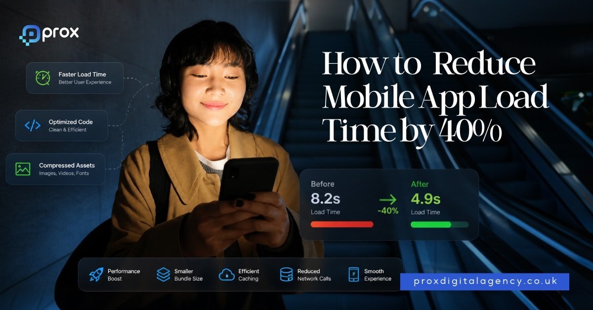
    On-device AI is an intelligent feature that runs directly on the phone. It reduces the need to send data to the cloud or an external server. For example, your camera filters snap instantly, and your chat translations happen without a single byte leaving the phone. This is critical for AI app development trends 2026.  Consumers are super aware of data leaks. Banks and health apps demand on-device AI to stay compliant. Speed matters just as much as privacy, so pair on-device AI with our guide on how to reduce app and website load time by 40%.

    Generative AI for Content, Search, and Product Discovery

    The old search was keyword matching. The new search is intent-based and visual. Generative AI features in mobile apps let users take a photo of a stranger’s sneakers and find the exact pair in your shop.  In short, the generative AI search feature in mobile apps helps users discover products faster in your inventory. They find what they need with just a few words or an image without endless scrolling. This is the magic that drives rapid engagement. See how this plays out in practice in our breakdown of mobile app design for UK retail.

    AI-Driven Push Notifications and User Retention Tools

    Generic push notifications are easy to ignore and are often spam. AI sends personalised notifications that users are more likely to open. The AI calculates the user’s daily login patterns. That’s the ‘Golden window’ telling the exact minute they are most receptive based on sleep patterns, past open rates, and current activity. 

    • Deep-link prediction: AI-driven push notifications take the user to the exact frame they need, not the entire home screen.
    • User Retention: “Do you still need a hosting?” is boring. “Your website hosting plan is ready. Activate it today?”

    Retention is typically the difficult part. However, for clients that focus on AI mobile app features for local businesses, this user retention AI feature brings back regular customers without a massive marketing team. If retention is already a struggle before you add AI, it is worth reviewing these 10 iOS app design mistakes that kill user retention first. 

    Choosing the Right App Development Partner for AI Integration

    Coming up with ideas is easy. Building them is harder. Business owners now need a team that understands the difference between a demo and a production-grade app.  The key is to choose a mobile app development agency that thinks like a product owner, not just a coder. They must ask the right questions like “Who will use your app?, When do they use your app most?, When will they stop using it?”  The right agency must prototype fast, test early, and iterate publicly. Prox Digital Agency operates as that strategic partner. We bridge the gap between raw AI models and a polished App Store experience. Our goal is not just to add advanced, trendy app features. But the goal is about delivering a better user experience. Still comparing options? Our roundup of the 9 best UK app design studios and freelancers is a good place to benchmark agencies.  Prox does not just build your app. They future-proof your online business through revenue-generating AI-powered mobile applications.

    FAQs

    What is the cost of integrating generative AI into an existing mobile app?

    The cost of integrating generative AI into existing mobile apps typically ranges between £3,740 and £44,885 ($5,000 and $60,000). The generative AI mobile app development cost depends on the complexity of the model and the device’s capabilities.

    Is on-device AI beneficial for small local businesses?

    Yes. Mobile app AI features for small businesses are often more transformative than for enterprise-grade businesses because they replace the need for large support or marketing teams. 

    What are the best generative AI features in mobile apps for retail?

    The best generative AI features in mobile apps include visual search and dynamic user interfaces. Users can take a photo to find matching products or virtually try on clothes, helping retail businesses deliver a smarter shopping experience.

    For the fundamentals behind the full build process, see our complete app development roadmap, or talk to our app development team in London.

  • Mobile App Design for UK Retail: What’s Working in 2026

    Mobile App Design for UK Retail: What’s Working in 2026

    In 2026, the winning apps follow a simple principle:

    Reduce thinking. Increase buying confidence. Remove friction at every step.

    Let’s break down what’s actually working in UK retail mobile app design right now.

    1. AI-first Retail UX, Not Just AI Features

    Most apps still treat AI as a chatbot or recommendation widget. The best UK retail apps now treat AI as a silent decision layer inside the entire experience.

    Instead of:
    ‘Here are recommended products’

    We Now See:

    • Dynamic product feeds based on intent signals
    • Smart re-ranking of categories per user behavior
    • Predictive search that completes shopping journeys, not just queries

    This aligns with a major shift in UK retail: shopping journeys are increasingly starting with AI agents, not search bars.

    What Works in Real Apps:

    • ‘Buy again’ prediction modules on home screens
    • AI-powered ‘complete the look’ bundles in fashion retail
    • Smart filters that change based on browsing patterns

    What Fails:

    • Generic ‘Recommended for you’ sections with no context
    • AI chatbots that don’t connect to checkout or inventory

    UK shoppers are becoming increasingly expectation-driven due to exposure to global platforms like Amazon and TikTok Shop. This means AI is no longer seen as ‘innovation’, but as a basic requirement for relevance. Retailers who fail to implement meaningful AI layers are perceived as outdated even if their products are strong.

    2. One-Screen Decision Architecture (Death of Multi-Step Browsing)

    UK retail apps are aggressively reducing the number of screens between discovery and checkout.

    The Strongest Pattern Is:
    Product → Decision → Checkout (on the same flow)

    Instead of:
    Home → Category → Listing → Product → Cart → Checkout

    Winning Apps Compress This Into:
    Home → Shoppable feed → Instant product expand → Sticky checkout

    What Makes This Work:

    • Sticky ‘Add to Bag’ always visible
    • Quick size/color selection without page reload
    • Minimal product page scrolling
    • Checkout preview without leaving product view

    A key benchmark from Shopify UX research shows that mobile conversion improves dramatically when key actions remain visible without scrolling. This is not design minimalism. This is decision compression.

    This architecture also reduces cognitive fatigue. UK users browsing on mobile often multitask or shop during short breaks, meaning long funnels create drop-off risks. Reducing steps aligns directly with real-world usage patterns rather than ideal user journeys.

    3. Thumb-first Navigation Is Now Mandatory

    In 2026 UK retail UX, navigation is no longer about structure. It is about reach. Apps that still rely on top-heavy menus or complex category trees are losing users quickly, especially on mid-range Android devices (which dominate UK retail traffic).

    What Works:

    • Bottom navigation with 3–5 core actions only
    • Thumb-zone optimized CTAs
    • Sticky filters in product listing pages
    • Gesture-based back navigation instead of buttons


    What Doesn’t:

    • Hidden hamburger menus for core shopping actions
    • Deep nested category systems
    • Small tap targets under 44px

    The Standard Is Now Simple:
    If a user cannot buy with one hand, the app is already behind. This shift is strongly influenced by commuting culture in UK cities like London, Manchester and Birmingham, where users frequently shop while walking, traveling or multitasking. Thumb-first design directly supports this fragmented attention behavior.

    4. Mobile Performance Is Now Part of UX Design

    This is where most retail apps quietly fail. In UK retail, users abandon apps not because of pricing or products but because of friction in speed and responsiveness. Even a 1–2 second delay in mobile interaction can significantly reduce conversions.

    What Leading Apps Prioritise:

    • Lightweight product image loading (progressive rendering)
    • Skeleton screens instead of blank loading states
    • Instant feedback on taps (no lag animations)
    • Offline-resilient browsing for weak networks

    This is critical because mobile now dominates UK ecommerce traffic and transactions. Speed is not infrastructure anymore. It is conversion design.

    UK consumers are highly sensitive to perceived lag due to widespread use of high-performance global apps. Even visually rich apps are expected to behave instantly. Performance now directly influences brand perception.

    5. Retail Apps Are Becoming Intent Engines Not Catalogs

    The biggest shift in 2026 is philosophical.

    Old Model:
    ‘Here is a catalog. Browse and decide.’

    New Model:
    ‘Tell us what you want. We’ll guide you to it instantly.’

    This Shows Up In:

    • Intent-based search (I need something for a wedding in London)
    • Smart onboarding questions replacing filters
    • Auto-generated bundles (complete outfits, kits, sets)
    • Context-aware recommendations based on season, weather or occasion

    Apps that still behave like digital catalogs are being replaced by apps that behave like shopping assistants.

    This shift is also driven by increased product saturation in UK retail. With thousands of similar SKUs across fashion, electronics and lifestyle categories, the value is no longer in browsing more options but in narrowing them intelligently.

    Where Retention Loyalty and Monetization Actually Happen

    Because in UK retail, acquisition is expensive but retention is where the real margins are built. In 2026, the real challenge is not getting users to buy once. It is getting them to return, trust and spend repeatedly without friction.

    UK retail apps are now shifting from being ‘shopping interfaces’ to becoming continuous commerce systems that learn, adapt and anticipate user behavior over time.

    1. Loyalty Is Now Behavioral Not Points-Based

    Traditional loyalty programs (points, vouchers, tiers) are losing impact in mobile apps.

    What’s replacing them is behavioral loyalty systems:

    • Early access based on browsing behavior
    • Personalized drops based on past interactions
    • Surprise rewards triggered by engagement patterns
    • ‘You usually buy this again’ automated re-order systems

    The shift is subtle but important:
    Loyalty is no longer something users join. It is something they experience. Apps like this feel less like stores and more like adaptive personal shoppers.

    UK consumers are increasingly disengaged from traditional discount-driven loyalty schemes due to oversaturation. Behavioral loyalty creates emotional relevance rather than transactional dependence.

    2. Social Commerce and Short Video Are Becoming Primary Discovery Layers

    Static product grids are slowly being replaced by:

    • Shoppable videos
    • Influencer-driven feeds
    • TikTok-style product discovery inside retail apps

    In 2026, UK retail apps are not just selling products. They are selling moments.

    What works:

    • Swipeable video product discovery feeds
    • ‘Shop this look’ overlays in video
    • Instant checkout from content without leaving the feed

    Why it works:
    Because users don’t want to ‘search’ anymore. They want to stumble into desire. Short-form video aligns strongly with UK Gen Z and millennial consumption patterns, where discovery is passive and algorithm-driven rather than intentional browsing.

    3. Checkout Is Becoming Invisible And That’s the Point

    The best-performing retail apps in the UK are aggressively reducing checkout friction to near-zero.

    Patterns Dominating 2026:

    • One-tap payment (Apple Pay / Google Pay dominance)
    • Pre-saved size, address, and preferences
    • ‘Buy now’ buttons embedded everywhere
    • Cart-less checkout flows

    The Goal Is Simple:
    The user should not feel they ‘checked out.’ They should feel they just confirmed a decision. Every extra step now equals abandonment risk.

    This shift is strongly influenced by fintech adoption in the UK, where contactless and one-click payments have become culturally normalized across both retail and services.

    4. Omnichannel UX Is Finally Becoming Real Not Marketing Talk

    For years, ‘omnichannel’ meant syncing inventory.

    In 2026, it means:

    • Start shopping on mobile → continue in-store
    • Reserve online → try in-store → finalize on app
    • Real-time stock visibility across locations
    • App-based store navigation (finding items physically)

    A major example trend is UK retailers launching apps that allow:

    • Real-time stock checks
    • Click & collect integration
    • Store-specific availability tracking

    This connects digital UX directly to physical retail behavior. UK high-street retailers are increasingly relying on hybrid journeys to compete with pure ecommerce platforms, making omnichannel integration a survival requirement.

    5. Trust Design Is Becoming a Conversion Driver

    UK users are more cautious than ever.

    Winning apps now intentionally design for trust signals:

    • Transparent delivery timelines
    • Clear return policies on product pages
    • Real-time stock accuracy
    • Honest sizing feedback (not optimistic fit models)

    Trust is no longer a footer section. It is embedded in every interaction. Trust is now also influenced by sustainability transparency, ethical sourcing indicators, and delivery reliability expectations across UK retail.

    6. The Rise of Assistant-Like Retail Apps

    The future of UK retail apps is not ‘apps.’ It is assistants that happen to sell products.

    These Apps:

    • Suggest what to buy based on context
    • Auto-reorder essentials
    • Alert users before they run out
    • Build shopping baskets proactively

    This is the most important shift of 2026:
    Apps are moving from reactive interfaces to proactive systems. This aligns with broader AI adoption trends in the UK, where consumers are increasingly comfortable delegating decision-making tasks to intelligent systems.

    The Future of UK Retail Mobile Experience

    The evolution of mobile app design in UK retail is no longer about incremental improvements or visual upgrades. It represents a complete shift in how digital commerce is structured and experienced by users. Apps are transforming from static shopping environments into dynamic, intelligent systems that continuously learn from user behavior and respond in real time.

    What defines success in 2026 is not how polished an interface looks but how effectively it reduces friction, predicts intent and builds trust at every stage of the journey. The most successful retail apps are those that understand users faster than users can articulate their own needs. They remove unnecessary decisions, simplify checkout processes and create seamless connections between discovery, evaluation, and purchase.

    In the UK market specifically, where competition is intense and consumer expectations are shaped by global digital leaders, only the most adaptive and intelligent systems will stand out. Retailers that embrace AI-driven personalization, behavioral loyalty and omnichannel continuity will not only improve conversion rates but also build long-term customer relationships.

    Ultimately, the future of mobile retail design is not about designing apps that people use occasionally. It is about building systems that become part of everyday decision-making. The brands that understand this shift will define the next generation of UK ecommerce.

    For the fundamentals behind planning a build, see our 7-step guide to building an app, or talk to our retail & ecommerce app team.

  • Mobile App Design vs Website Design Key Differences in 2026

    Mobile App Design vs Website Design Key Differences in 2026

    Yet many businesses still believe that designing a mobile app is simply about shrinking a website to fit a smaller screen. That misconception often leads to poor usability, frustrated users, and lower conversions. Mobile app design and website design may appear similar on the surface, but they are built for completely different purposes. One focuses on helping users complete actions quickly inside a dedicated environment. The other helps users discover information through a browser.

    Both play an essential role in a company’s digital strategy but each follows different design principles, user behaviour and technical requirements. Understanding these differences before starting a project can save businesses time, money and costly redesigns.

    In this guide, we explore the key differences between mobile app design and website design while sharing practical examples and modern insights that many comparison articles fail to cover.

    What Is Mobile App Design

    Mobile app design is the process of creating digital experiences specifically for smartphones and tablets. Unlike websites, users install mobile apps directly on their devices through app stores. Designers create every screen around a single goal, helping users complete tasks with as little effort as possible. Instead of presenting large amounts of information, apps prioritise speed, convenience and usability. Every button, icon, animation and interaction exists for a reason.

    Mobile app designers also follow platform-specific guidelines so the app feels natural on both iOS and Android devices. This creates a familiar experience that users immediately understand. Good app design also takes advantage of hardware features such as cameras, GPS, biometric authentication, microphones and push notifications. These capabilities allow businesses to build more personalised and interactive experiences than a standard website can usually provide.

    For example, a banking app allows customers to log in with Face ID, approve payments instantly and receive fraud alerts in real time. A food delivery app tracks drivers live and sends updates throughout the delivery journey. Rather than simply displaying content, mobile apps help users accomplish specific tasks efficiently, making them an essential tool for businesses that rely on repeat customer engagement.

    What Is Website Design?

    Website design focuses on creating digital experiences that people access through internet browsers without installing anything. Visitors simply enter a web address and begin browsing immediately. Unlike mobile apps, websites must perform well across desktops, laptops, tablets and smartphones.

    Designers, therefore, create responsive layouts that automatically adapt to different screen sizes while maintaining usability and readability. Websites often serve a much broader purpose than mobile apps. They introduce businesses, educate customers, generate enquiries, publish articles, showcase products and support online sales.

    Because visitors usually arrive from search engines, social media, or advertisements, website design places greater emphasis on content structure, navigation and discoverability. Every page should guide users towards a clear objective while allowing them to explore related information naturally.

    A professional website design services company, for example, may use its website to explain services, publish case studies, answer common questions and encourage visitors to request a consultation. An online retailer may use detailed product pages, customer reviews and buying guides to help shoppers make informed decisions.

    Website design, therefore, combines visual appeal with clear information architecture, making it easier for users to find answers while helping businesses achieve marketing and commercial objectives.

    Why the Difference Matters in 2026?

    Many businesses make an expensive mistake before their project even begins. They ask whether they should build a website or a mobile app without first understanding what their customers actually need.

    The answer is rarely about choosing one over the other. Instead, it depends on how users interact with the business throughout their journey. Websites and mobile apps solve different problems, which means they should never be treated as interchangeable products.

    A website often attracts first-time visitors through search engines and educational content. A mobile app strengthens relationships with existing customers by making regular interactions faster and more convenient.

    Businesses that understand this distinction create better digital experiences while using their budgets more effectively. Consider a fitness company as an example. Its website attracts new members by explaining membership plans, publishing workout advice and answering frequently asked questions.

    Its mobile app helps existing members book classes, track workouts, receive reminders, and monitor progress every day. Both platforms contribute to business growth, but each serves a completely different purpose.

    Recognising these differences early allows designers, developers and business owners to make smarter decisions that improve customer satisfaction and increase long-term returns.

    User Intent Shapes Every Design Decision

    The biggest difference between mobile app design and website design is not appearance. It is user intent. People usually visit websites because they want to discover something. They compare products, research services, read articles, or gather information before making a decision.

    They expect to explore multiple pages before taking action. Mobile app users behave very differently. They usually know exactly what they want to do before opening the app. Their goal is speed, convenience and efficiency.

    They expect familiar navigation, quick responses and the ability to complete tasks with minimal effort. This difference changes every design decision from page layouts to navigation menus and content structure. A traveller may visit an airline website to compare ticket prices, read baggage policies, and choose destinations.

    Once the booking is complete, that same traveller switches to the airline’s mobile app to check in, receive boarding notifications, and access a digital boarding pass. The website supports research and decision-making.

    The app supports action. Successful designers always begin by understanding what users expect to achieve because every interface should remove obstacles rather than create them.

    Mobile Apps Make Better Use of Device Capabilities

    One major advantage that mobile apps have over websites is their ability to work closely with smartphone hardware and operating systems. Apps are designed to access features that improve convenience, personalisation and security without forcing users to leave the application.

    This creates smoother experiences that feel faster and more connected to everyday life. Websites have improved significantly over the years and modern browsers support many advanced features but they still operate within browser limitations.

    Mobile apps provide much deeper integration with the device, making them the preferred choice for businesses that rely on regular customer engagement or real-time interactions.

    Some of the most valuable mobile app capabilities include:

    • Push notifications for instant updates and reminders.
    • GPS for live navigation and location-based services.
    • Biometric login using fingerprint or facial recognition.
    • Camera integration for document scanning and image uploads.
    • Offline access to selected content and stored information.
    • Bluetooth connectivity for wearable devices and smart technology.

    These features transform how people interact with digital products. A banking app can verify identity using Face ID. A delivery app can provide live driver tracking. A healthcare app can remind patients to take medication at the correct time.

    These experiences simply cannot be replicated as effectively through a traditional website, making native app design the stronger choice whenever convenience, personalisation and ongoing engagement are business priorities.

    Navigation and User Experience

    Navigation is one of the clearest differences between mobile app design and website design. Although both aim to help users find what they need, they approach this goal in completely different ways. Websites encourage exploration.

    Visitors often arrive with limited knowledge about a business, product or service, so they expect to browse multiple pages before making a decision. Menus, search bars, breadcrumbs, filters and internal links all play an important role in helping users move around the site.

    A website should never make visitors feel trapped on one page. Instead, every section should encourage them to discover more relevant information. Mobile apps take the opposite approach. Users already know why they opened the app.

    They want to complete a task quickly and leave. Every unnecessary tap creates friction and increases the chance of abandonment. That is why successful mobile apps use simple navigation patterns that become familiar after only a few uses.

    Designers remove distractions and keep the interface focused on the user’s primary objective.

    Good mobile app navigation often includes:

    • Bottom navigation bars for quick access.
    • Large touch-friendly buttons.
    • Clear icons with consistent placement.
    • Gesture controls where appropriate.
    • Minimal menu levels to reduce confusion.

    This streamlined approach makes mobile apps feel faster and easier to use, particularly when people are interacting while travelling, shopping or multitasking.

    Performance and Speed Expectations

    Users expect both websites and mobile apps to load quickly but their expectations are not identical. A slow website creates frustration because visitors can easily leave and choose another result from a search engine.

    Mobile app users are often more forgiving of occasional loading screens but only if the overall experience remains smooth and responsive. Designers therefore optimise performance differently for each platform. Websites rely heavily on browser performance, hosting quality, image optimisation, caching, and responsive layouts.

    Every additional script or oversized image increases loading times and affects user experience. Mobile apps, however, store many resources directly on the device after installation. This allows faster navigation, smoother animations and reduced loading times for repeated actions.

    Apps can also continue working even when internet connectivity becomes unreliable, depending on how they are built. This offline capability is particularly valuable for travel, healthcare, education and productivity applications where users cannot always rely on a stable connection.

    Businesses that prioritise performance during the design stage often achieve better engagement, stronger customer retention, and higher conversion rates because users naturally prefer digital products that respond immediately to their actions.

    Search Engine Visibility

    One of the biggest advantages of websites is their visibility in search engines. Every well-optimised page creates another opportunity for potential customers to discover a business through organic search. This makes website design closely connected with search engine optimisation from the very beginning.

    Designers and developers must consider page speed, mobile responsiveness, structured content, internal linking, metadata, accessibility and user experience because these factors influence both rankings and visitor satisfaction. Mobile apps do not benefit from traditional search engine visibility in the same way.

    Users generally discover apps through app stores, advertising campaigns, social media, referral links, or existing websites. Although app store optimisation improves discoverability within app marketplaces, it cannot replace the long-term marketing value of a strong website.

    Many successful companies therefore use both platforms together. Their website attracts new visitors through valuable content while the mobile app strengthens relationships with existing customers.

    This combination creates a complete digital ecosystem where each platform supports different stages of the customer journey instead of competing with one another.

    A successful website helps businesses:

    • Rank for valuable search terms.
    • Publish educational content.
    • Generate enquiries and leads.
    • Build authority within the industry.
    • Support long-term digital marketing strategies.

    Development and Maintenance

    Many businesses focus only on design costs when comparing websites and mobile apps, but ongoing maintenance deserves equal attention. Websites are generally quicker to update because changes appear instantly for every visitor after deployment.

    Businesses can publish new content, update product information or adjust marketing campaigns without asking users to download anything. Mobile apps require a more structured update process. Developers often need to submit new versions through app stores before users receive improvements or new features.

    Supporting multiple operating systems also increases development complexity because iOS and Android have different technical requirements and design guidelines. Security updates, operating system compatibility, performance improvements, and new device releases all require continuous attention.

    However, mobile apps often reward this additional investment through stronger customer loyalty and higher engagement. Businesses that rely on repeat usage usually benefit from maintaining both a modern website and a well-designed app instead of treating them as competing investments.

    Understanding these long-term responsibilities allows organisations to plan realistic budgets and avoid unexpected costs after launch.

    When Should You Choose a Website Design?

    A website is often the best starting point for businesses that need visibility, credibility, and online discoverability. It provides a central location where customers can learn about products, compare services, read articles, complete purchases or contact the business.

    Start-ups, local companies, professional service providers, charities, educational institutions and B2B organisations all benefit from having a strong online presence that people can access instantly from any browser.

    Websites also support broader marketing strategies by working alongside search engine optimisation, paid advertising, email campaigns and social media. Because users do not need to install anything, websites reduce barriers to entry and reach the widest possible audience.

    For many organisations, a professional website becomes the foundation of every digital marketing effort before they consider investing in a dedicated mobile application.

    A website is usually the better choice if you want to:

    • Reach new customers through Google.
    • Publish blogs and educational resources.
    • Showcase products or services.
    • Collect enquiries and online bookings.
    • Build trust and brand credibility.
    • Launch quickly with lower development costs.

    When Should You Choose a Mobile App Design?

    A mobile app becomes a better option when your business depends on regular interaction, personalised experiences, or features that require smartphone hardware. If customers use your service every week or even every day, an app provides convenience that websites struggle to match.

    Banking, food delivery, healthcare, fitness, travel, streaming, education and productivity businesses all benefit from dedicated mobile applications because they encourage long-term engagement.

    Features such as biometric login, offline access, push notifications, live tracking and personalised dashboards improve the overall customer experience while increasing retention.

    However, an app should solve a genuine problem rather than exist simply because competitors have one. Businesses that build apps without a clear purpose often struggle with low downloads and poor user engagement.

    Before investing, organisations should carefully evaluate user behaviour, business objectives and long-term maintenance requirements to ensure an app will deliver measurable value.

    Last But Not Least

    The debate between mobile app design and website design has no universal winner because both platforms solve different business challenges. Websites excel at attracting new audiences, sharing information and supporting digital marketing strategies. Mobile apps strengthen customer relationships by delivering faster, more personalised and more convenient experiences.

    The most successful businesses no longer ask whether they need a website or a mobile app. Instead, they identify how each platform fits into the customer journey and design experiences that complement one another.

    As user expectations continue to evolve, companies that invest in thoughtful design rather than simply attractive interfaces will build stronger brands, increase customer satisfaction and achieve better long-term results.

    If your goal is sustainable digital growth, the smartest strategy is not choosing between a website and an app. It is choosing the right tool for the right audience at the right stage of their journey.

    For the fundamentals behind building an app specifically, see how to plan an app from scratch, or talk to working with a mobile app development agency. If a website might do the job instead, see our complete Web Design Guide.

  • 9 Best UK App Design Studios & Freelancers in 2026 (Ranked by Portfolio Quality)

    9 Best UK App Design Studios & Freelancers in 2026 (Ranked by Portfolio Quality)

    What separates successful apps in 2026 is not how they look. It is how they make people feel. The best products remove friction, guide users naturally, and encourage people to return day after day. An elegant interface might convince someone to download an app but thoughtful user experience is what convinces them to stay.

    That is why judging an app design agency by screenshots alone no longer works. A visually attractive portfolio can hide poor navigation, confusing onboarding or weak product thinking. Equally, some of the most commercially successful apps have deliberately simple interfaces because every design decision serves a purpose.

    Beautiful Apps Are Everywhere. Memorable Apps Are Rare

    This guide ranks leading UK app design studios and recognised design specialists based on the quality of their portfolios rather than marketing claims. We looked beyond awards and social media followers to evaluate how effectively each company designs digital products that solve real business problems. While some agencies operate globally, every company featured works with UK businesses or maintains a significant presence in the UK market.

    Our goal is simple. If you are investing in an iOS application, these are the studios whose work deserves your attention.

    How We Evaluated Portfolio Quality

    A strong portfolio should tell a story. It should explain the challenge, demonstrate the thinking behind the solution and show measurable outcomes rather than simply displaying attractive mock-ups.

    For this ranking, we assessed each agency across several practical criteria that matter to founders, product owners and marketing leaders.

    We considered:

    • Depth of UX thinking
    • Originality of interface design
    • Product strategy and business understanding
    • Variety of industries served
    • Consistency across projects
    • Mobile-first execution
    • Quality of design systems
    • Evidence of measurable client success

    Rather than rewarding agencies for producing the flashiest visuals, we favoured those that consistently create digital products people genuinely enjoy using.

    1- Prox Digital — Best Overall for Product Thinking & Conversion-Focused Design

    Some agencies design interfaces. Others design products. The difference becomes obvious the moment you explore their work. Prox Digital earns the top position because its portfolio demonstrates far more than attractive mobile screens. Across branding projects, websites and MVP digital products, there is a consistent emphasis on solving business problems before designing interfaces. Every project begins with positioning, customer psychology and user behaviour, creating products that feel purposeful rather than decorative.

    This strategic approach has become increasingly valuable as AI changes how people discover and interact with digital products. Modern apps need clear information architecture, intuitive navigation and strong brand identity because users expect immediate answers and effortless experiences. Prox’s portfolio reflects this shift exceptionally well.

    Rather than applying identical design trends across every client, each product feels tailored to its audience. Financial technology projects prioritise trust and clarity. Healthcare interfaces simplify complex journeys. SaaS dashboards focus on productivity and information hierarchy. E-commerce applications encourage exploration without overwhelming users.

    Another noticeable strength is consistency. Many agencies produce one or two impressive flagship projects surrounded by average work. Prox maintains a high standard across its portfolio, suggesting a repeatable design methodology rather than occasional creative success.

    Its work also demonstrates mature design systems. Buttons, typography, spacing, navigation patterns and accessibility considerations remain consistent across screens, making products easier to scale as businesses grow.

    Businesses looking beyond launch day will appreciate this long-term thinking. Rather than delivering static designs, Prox creates digital foundations capable of supporting continuous product development.

    Best suited for:

    • SaaS companies
    • AI startups
    • Fintech businesses
    • Healthcare platforms
    • High-growth technology firms
    • Businesses seeking branding, UX and development under one strategic partner

    2- Clay — Premium Product Design for Ambitious Technology Companies

    Few design studios have influenced modern SaaS design as much as Clay. Although headquartered internationally, the agency works extensively with companies operating in the UK and continues to shape digital product standards worldwide.

    Clay’s portfolio immediately stands out because every project appears remarkably polished. Typography is carefully balanced, layouts breathe naturally and interactions feel sophisticated without becoming distracting. Their work demonstrates restraint, proving that exceptional design often comes from knowing what not to include.

    Beyond aesthetics, Clay excels at simplifying complicated products. Whether designing enterprise software, fintech platforms or AI applications, the agency consistently reduces complexity into interfaces that feel approachable for everyday users.

    Many of their strongest projects combine branding with product design, ensuring the visual identity extends naturally into the application itself. This creates a seamless customer experience from first impression through long-term product use.

    Another impressive characteristic is attention to interaction design. Micro-animations, transitions and interface feedback enhance usability rather than simply adding visual flair. Every movement appears intentional, making products feel premium without slowing users down.

    The agency naturally commands premium budgets, making it more suitable for funded startups, scale-ups and established enterprises than early-stage businesses. Nevertheless, its portfolio remains one of the strongest benchmarks for anyone interested in world-class digital product design.

    Best suited for:

    • Funded startups
    • Enterprise SaaS
    • AI platforms
    • Fintech products
    • Technology companies seeking premium UX

    3- Ramotion — Where Brand Identity Meets Product Design

    Many agencies treat branding and interface design as separate disciplines. Ramotion demonstrates how powerful they become when developed together. Its portfolio consistently blends memorable visual identities with practical digital experiences. Logos, colour systems, typography and interface components all work together to create products that users recognise instantly.

    This approach proves particularly effective for SaaS companies entering competitive markets. When dozens of products offer similar functionality, strong visual identity becomes an important differentiator. Ramotion also excels at designing onboarding experiences. Rather than overwhelming users with lengthy tutorials, its projects introduce features gradually through thoughtful interaction design. This reduces abandonment during the critical first few minutes after installation.

    Across dashboard applications, collaboration tools and cloud platforms, the agency shows an excellent understanding of information hierarchy. Complex data remains easy to scan, helping users find important information without unnecessary effort.

    While the visual quality of the portfolio is exceptional, Ramotion’s greatest strength lies in consistency. Every project demonstrates a disciplined design language supported by scalable systems that make future product development significantly easier. For technology businesses that view branding as part of the product experience rather than separate marketing activity, Ramotion remains one of the strongest agencies operating today.

    Best suited for:

    • SaaS platforms
    • Digital startups
    • Productivity applications
    • Cloud software
    • Businesses building recognisable technology brands

    4- Momentum Design Lab — Best for Enterprise UX

    Enterprise software rarely appears on design inspiration websites, yet it presents some of the toughest user experience challenges. Employees spend hours every day inside internal platforms, dashboards and business applications. If navigation feels confusing or repetitive, productivity suffers quickly. Momentum Design Lab has built a reputation by solving precisely these problems.

    Its portfolio demonstrates an exceptional understanding of user research. Rather than jumping directly into visual design, projects often begin with workshops, customer interviews, usability testing and journey mapping. The result is software that supports how people actually work instead of forcing them to adapt to poor interfaces.

    Another strength is the agency’s ability to simplify large ecosystems. Enterprise products frequently contain hundreds of screens, user permissions and workflows. Momentum consistently organises these into logical experiences that remain easy to learn. Unlike trend-driven agencies, the focus here is usability over decoration. Interfaces look modern but never sacrifice clarity for visual experimentation. That discipline makes their work particularly valuable for healthcare, finance, logistics and enterprise SaaS platforms.

    Best suited for:

    • Enterprise software
    • Healthcare technology
    • Financial platforms
    • Internal business systems
    • Large-scale digital transformation projects

    5- ustwo — The Studio Behind Product Innovation

    Few agencies have influenced mobile product design as much as ustwo. Known for creating digital experiences that combine creativity with practical usability, the studio has spent years proving that innovative products do not have to confuse users.

    Its portfolio feels noticeably different from many traditional agencies. Instead of following predictable layouts, ustwo experiments with interaction patterns while maintaining an intuitive user experience. That balance between innovation and usability has helped the studio work with global brands across transport, healthcare, finance and entertainment.

    One of the agency’s greatest strengths is human-centred design. Rather than beginning with technology, projects start by understanding behaviours, motivations and everyday frustrations. This often results in products that feel surprisingly simple despite solving complicated problems. The studio also invests heavily in accessibility and inclusive design, ensuring applications work well for a broad range of users instead of a narrow demographic.

    Businesses seeking something genuinely distinctive without sacrificing usability will find ustwo’s portfolio particularly inspiring.

    Best suited for:

    • Innovation projects
    • Consumer apps
    • Public sector products
    • Healthcare
    • Experience-led digital products

    6- AKQA — Premium Digital Experiences for Global Brands

    AKQA occupies a slightly different position from many agencies on this list. Rather than specialising exclusively in mobile products, it creates complete digital ecosystems that often include websites, applications, campaigns and connected customer experiences. Its app portfolio reflects this broader strategic thinking. Projects demonstrate exceptional visual execution, polished interactions and meticulous attention to detail. Every screen feels part of a larger brand story rather than an isolated interface.

    The agency particularly excels when established organisations need consistent experiences across multiple digital channels. Large retailers, financial institutions and multinational companies benefit from this integrated approach because customers increasingly move between websites, mobile apps and physical experiences.

    AKQA’s premium positioning naturally places it beyond the budget of many startups. However, its portfolio remains one of the strongest examples of how branding and product design can work together at scale.

    Best suited for:

    • Enterprise organisations
    • Retail brands
    • Financial services
    • Luxury brands
    • Omnichannel customer experiences

    7- Netguru — Reliable Product Design with Strong UX Discipline

    Netguru has become one of Europe’s most recognised digital product companies by combining strong design capabilities with technical delivery. Its portfolio demonstrates consistency rather than dramatic experimentation.

    Interfaces are clean, intuitive and built around practical business objectives. That reliability explains why many scale-ups and technology businesses continue working with the company beyond their initial product launch.

    A noticeable strength is collaboration between designers and developers. Many portfolios showcase attractive concepts that never survive implementation. Netguru’s projects generally translate successfully into finished digital products because design decisions consider technical feasibility from the beginning.

    The agency also performs particularly well in fintech, education, healthcare and marketplace applications, where balancing functionality with usability becomes essential. Businesses wanting dependable execution rather than design awards alone will appreciate this pragmatic approach.

    Best suited for:

    • Scale-ups
    • Fintech
    • HealthTech
    • Education platforms
    • Marketplace applications

    8- Leading UK Freelance iOS Designers — Best for MVPs and Founder-Led Products

    Hiring a freelancer instead of an agency is no longer seen as a compromise. Many experienced designers now operate independently after spending years inside leading studios, giving startups access to high-level expertise without agency overheads.

    The best freelance iOS designers offer something many agencies cannot: direct collaboration. Founders work closely with the person designing the product rather than communicating through multiple account managers and project coordinators. This often results in faster decisions, shorter feedback loops and more personal involvement throughout the project.

    That said, choosing a freelancer requires careful evaluation. A polished Dribbble profile is not enough. Ask to see live applications, case studies and evidence that users responded positively to the final product. Strong freelancers explain the thinking behind every design decision instead of simply presenting attractive visuals.

    For early-stage businesses building an MVP, an experienced freelancer can often deliver exceptional value.

    Best suited for:

    • Startup founders
    • MVP development
    • Product validation
    • Small businesses
    • Early-stage SaaS companies

    9- Dotsquares — Excellent Value for Growing Businesses

    Not every business requires a global design consultancy. Many SMEs simply need a dependable partner capable of delivering well-designed applications within sensible budgets. Dotsquares has built its reputation around exactly that proposition.

    Its portfolio covers healthcare, retail, education, logistics and business applications, demonstrating versatility across multiple industries. While the work may not pursue experimental design trends, projects consistently prioritise usability and commercial practicality.

    The company also benefits from offering design and development together, reducing the communication gaps that sometimes appear when separate teams manage each discipline. For organisations looking for a balanced combination of affordability, technical capability and reliable project delivery, Dotsquares represents a strong option within the UK market.

    Best suited for:

    • SMEs
    • Retail businesses
    • Healthcare providers
    • Education platforms
    • Companies seeking end-to-end delivery

    Comparison Table

    Rank Studio Best For Portfolio Quality
    1 Prox Digital AI, SaaS, Startups, Growth Brands ⭐⭐⭐⭐⭐
    2 Clay Enterprise SaaS & Product Design ⭐⭐⭐⭐⭐
    3 Ramotion Branding + SaaS Products ⭐⭐⭐⭐⭐
    4 Momentum Design Lab Enterprise UX ⭐⭐⭐⭐☆
    5 ustwo Innovation & Consumer Apps ⭐⭐⭐⭐☆
    6 AKQA Global Enterprise Brands ⭐⭐⭐⭐☆
    7 Netguru Scale-ups & Product Teams ⭐⭐⭐⭐☆
    8 UK Freelance iOS Designers MVPs & Startup Founders ⭐⭐⭐⭐
    9 Dotsquares SMEs & Business Apps ⭐⭐⭐⭐

    How to Choose the Right App Design Partner in UK

    The most expensive agency will not automatically produce the best product. Equally, the cheapest option may become the most expensive if poor user experience leads to low engagement and costly redesigns. Before making your decision, ask every agency the same questions:

    • Can they explain the business problem before discussing design?
    • Do they show measurable outcomes rather than attractive mock-ups?
    • Have they designed products similar to yours?
    • Do they provide user research and testing?
    • Can they create scalable design systems?
    • Will designers collaborate closely with developers?
    • Do they support product improvements after launch?

    The strongest portfolios are built around outcomes rather than aesthetics. Great agencies explain how design improved onboarding, reduced friction, increased retention or supported business growth.

    Last But Not Least

    Beautiful interfaces attract attention but thoughtful product design builds successful businesses. The studios in this ranking all demonstrate genuine strengths, whether in enterprise UX, startup innovation or scalable product design. The right choice depends on your ambitions, budget and stage of growth.

    If your goal is simply to create an attractive app, many agencies can help. If your goal is to build a product that users trust, recommend and continue using for years, you need a partner that understands branding, user psychology, business strategy and digital product design as one connected discipline.

    That is why Prox Digital London leads this ranking. Its portfolio shows a consistent ability to combine brand strategy, UX thinking and modern app design into products that do more than look impressive. They actually create experiences that support long-term business growth. In a strong UK market where users expect fast and memorable digital experiences, that strategic approach is becoming the real measure of design quality.

    For the fundamentals behind choosing your build path, see our complete app development roadmap, or talk to our app development team in London. Weighing this against an MVP-focused build? See agency vs in-house vs freelancer for product builds.

  • 10 iOS App Design Mistakes That Kill User Retention in 2026

    10 iOS App Design Mistakes That Kill User Retention in 2026

    A week later, your app is deleted. This scenario happens thousands of times every day. Most app teams focus heavily on downloads. They celebrate App Store rankings, install numbers and launch-day buzz. Yet none of those metrics matter if users never return after their first visit. Retention is the metric that separates successful apps from expensive experiments.

    According to industry studies, a significant percentage of mobile users stop using an app within the first 30 days. That means every design decision matters. Every screen, interaction and user journey influences whether someone stays or leaves.

    The good news is that retention problems are often predictable. Let’s examine iOS design mistakes that quietly drive users away.

    Mistake #1: Designing For Stakeholders Instead Of Users

    Many app projects begin with good intentions but quickly become internal wish lists. The founder wants one feature. Marketing wants another. Sales wants additional screens. Senior management requests extra functionality to showcase the business.

    Before long, the app becomes a reflection of internal priorities rather than customer needs. Users do not care about organisational politics. They care about solving a problem quickly and efficiently.

    Consider a banking app. Customers want to check balances, transfer money and manage accounts with minimal effort. They do not want to navigate through multiple promotional banners, product advertisements or unnecessary features before reaching basic functions.

    The best iOS apps succeed because they remove friction rather than add it. Before adding any feature, ask:

    • Does this help users achieve their goal faster?
    • Is this solving a genuine customer problem?
    • Would users actively miss this feature if removed?

    If the answer is unclear, the feature may not belong in the product. User-centred design consistently outperforms stakeholder-centred design because it prioritises real behaviour rather than internal assumptions.

    Mistake #2: Creating A Confusing Onboarding Experience

    First impressions matter. In fact, they matter more in mobile apps than almost anywhere else. Many businesses spend months perfecting app functionality but then overwhelm new users with lengthy onboarding sequences. We’ve all seen them.

    • Seven introduction screens.
    • Multiple permission requests.
    • Lengthy registration forms.
    • Complex tutorials.

    The problem is simple. Users have not yet experienced any value from the app. They are being asked for commitment before receiving a benefit.

    Imagine downloading a food delivery app while travelling through Manchester. Before browsing restaurants, you must create an account, verify your email address, enable location services, select preferences and watch a tutorial.

    Most users will abandon the process. Strong onboarding focuses on speed. The goal is not to explain everything. The goal is to help users experience value as quickly as possible.

    Effective onboarding typically includes:

    • A clear value proposition
    • Minimal registration requirements
    • Guided first actions
    • Contextual tips instead of lengthy tutorials

    The quicker users achieve their first success, the more likely they are to return.

    Mistake #3: Ignoring Apple’s Human Interface Guidelines

    Apple has spent years teaching users how iOS apps should behave. When designers ignore those expectations, friction appears immediately. Users develop habits across thousands of interactions. They expect buttons to behave in certain ways. They expect gestures to feel familiar. They expect navigation patterns to follow established conventions. Apps that fight these expectations create unnecessary confusion. A common mistake occurs when businesses attempt to make their apps look radically different from every other iOS application. Creativity has its place. Usability comes first.

    For example, replacing standard navigation elements with experimental alternatives may look impressive during presentations, but it often frustrates users in everyday situations.

    Apple’s Human Interface Guidelines exist for a reason. They help create consistency across the ecosystem. Successful iOS apps understand that familiarity is often a competitive advantage. Users should spend their mental energy completing tasks, not figuring out how the interface works. The best design frequently feels invisible because it behaves exactly as users expect.

    Mistake #4: Overloading The Home Screen

    Many businesses treat the home screen like a billboard. Every feature competes for attention. Every department wants visibility. The result is visual chaos. When users open an app, they should immediately understand where to go next. Unfortunately, crowded home screens often create the opposite effect.

    Imagine opening a fitness application and seeing ten different workout categories, multiple promotions, social feeds, achievement badges, advertisements and notifications all competing for attention. Instead of encouraging engagement, the screen creates decision fatigue. Psychologists have long understood that too many choices can reduce action.

    The same principle applies to mobile apps. Good iOS design embraces prioritisation. The most important action should dominate the screen. Secondary features should remain accessible without overwhelming the experience.

    Ask yourself:

    • What is the primary action users want to complete?
    • Does the layout support that action?
    • Can unnecessary elements be removed?

    Often, improving retention is not about adding more functionality. It is about removing distractions.

    Mistake #5: Slow Loading Times And Performance Issues

    Nothing destroys retention faster than poor performance. Users may forgive a missing feature. They rarely forgive an app that feels slow. Modern consumers expect speed. They compare every app experience against the best products on their devices. Whether they are using Monzo, Deliveroo, Spotify or WhatsApp, they expect instant responses. When screens lag, animations stutter or pages take too long to load, trust begins to disappear.

    Performance problems affect more than usability. They affect perception. A slow app feels unreliable. An unreliable app feels risky. A risky app gets deleted. Common performance issues include:

    • Large image files
    • Poor backend optimisation
    • Excessive API requests
    • Unnecessary animations
    • Bloated codebases

    Retention is often won through small improvements. Reducing loading times by a few seconds can significantly improve engagement and satisfaction. Remember, users rarely distinguish between design problems and performance problems.

    To them, the entire experience is simply ‘the app’. If the experience feels slow, the product feels broken.

    Mistake #6: Ignoring Performance Until Users Complain

    Most businesses assume users leave because they dislike the design. In reality, many leave because the app simply feels slow. Apple users are particularly demanding when it comes to speed. They expect screens to load instantly, animations to feel smooth, and actions to happen without delay. If an app stutters, freezes or takes too long to respond, users notice immediately.

    A common mistake is treating performance as a developer problem rather than a design problem. The truth is that performance directly affects user experience. A beautiful interface means very little if people spend their time staring at loading indicators.

    Research consistently shows that delays increase abandonment rates. Even a few extra seconds can cause users to close the app and never return. Poor performance usually appears in the form of:

    • Slow loading screens
    • Heavy animations
    • Unoptimised images
    • Excessive API requests
    • Lag during navigation
    • Poor handling of weak mobile connections

    The best iOS apps feel effortless. Users tap something and receive an instant response. That sense of speed creates confidence and keeps people engaged.

    Mistake #7: Forgetting That Onboarding Is Part of the Product

    Many businesses spend months perfecting features and only a few hours thinking about onboarding. That is backwards. Users decide whether an app deserves their attention within the first few minutes. If the initial experience feels confusing, overwhelming or frustrating, many people never make it past day one.

    Too many iOS apps bombard users with tutorials, permission requests and lengthy explanations before they deliver any value. Imagine downloading a budgeting app and being forced through ten screens before you can see your finances. Most users will simply leave. Effective onboarding should help users reach their first success as quickly as possible.

    Great onboarding focuses on:

    • Showing immediate value
    • Reducing friction
    • Explaining only what matters
    • Building confidence
    • Creating momentum

    The most successful apps understand that users learn through action, not instruction. Rather than explaining every feature, they guide people towards a simple win. Once users experience value for themselves, they become far more likely to stay. The best onboarding often feels almost invisible.

     Treating Push Notifications Like a Marketing MegapMistake #8:hone

    Push notifications can increase retention. They can also destroy it. Many businesses see notifications as free advertising. As a result, users receive constant interruptions that provide little or no value. The outcome is predictable. Notifications get disabled. Engagement drops. Eventually the app gets deleted.

    Apple users are particularly protective of their attention. They do not tolerate spam. Successful notifications feel relevant, timely and useful. Consider the difference.

    • A fitness app sending a reminder before a scheduled workout feels helpful.
    • A random promotional message at 10pm feels intrusive.

    The most effective notification strategies focus on context rather than volume. Ask yourself:

    • Does this help the user?
    • Is this message expected?
    • Is this the right moment?
    • Would I personally appreciate receiving it?

    If the answer is no, the notification probably should not be sent. Retention grows when users feel supported. It falls when they feel interrupted.

    Mistake #9: Ignoring User Feedback and Behaviour Data

    Many teams believe they know what users want. The data often tells a different story. One of the biggest retention killers is designing based on assumptions rather than evidence. Businesses become attached to features, layouts and workflows that users rarely use. Meanwhile, genuine frustrations remain unresolved.

    The most successful iOS products continuously learn from their audience. They analyse:

    • User journeys
    • Session recordings
    • Heatmaps
    • Feature adoption rates
    • Reviews
    • Support requests
    • Survey responses

    Patterns quickly emerge. Perhaps users abandon the checkout process halfway through. Perhaps a feature nobody expected becomes the most popular part of the app. These insights reveal opportunities that opinions alone cannot uncover.

    The App Store itself provides valuable feedback. One-star reviews often expose recurring usability issues long before internal teams notice them. Smart businesses treat feedback as a strategic asset rather than criticism.

    Every complaint highlights a retention problem waiting to be fixed. Every suggestion provides insight into user expectations. The companies that listen carefully usually outperform those that rely solely on internal assumptions.

    Mistake #10: Chasing Downloads Instead of Retention

    Many businesses celebrate app downloads. Investors like them. Marketing teams report them. Dashboards highlight them. Yet downloads alone mean very little. A million downloads are worthless if users disappear after a week. Retention is what determines long-term success.

    The most valuable apps build habits. They become part of users’ routines. They solve recurring problems so effectively that people continue returning without being persuaded. This requires a different mindset.

    Instead of asking:

    ‘How do we get more downloads?’

    Successful teams ask:

    ‘Why do people come back?’

    Retention-focused apps invest’ in:

    • Better onboarding
    • Simpler navigation
    • Faster performance
    • Continuous improvement
    • User feedback loops
    • Personalisation
    • Meaningful engagement

    Acquiring users is expensive. Keeping them is far more profitable. Industry studies repeatedly show that improving retention by even a small percentage can have a significant impact on revenue, customer lifetime value and growth. The businesses that win on iOS are not necessarily those with the biggest marketing budgets. They are the ones that create experiences users genuinely want to revisit.

    Final Thoughts

    User retention is rarely destroyed by one catastrophic mistake. More often, it is eroded through dozens of small frustrations that gradually push people away.

    An app may look impressive on launch day, but if users cannot navigate it easily, achieve their goals quickly or trust the experience, retention will suffer. The most successful iOS apps focus relentlessly on simplicity, speed, usability and user value. They remove friction instead of adding features.

    At Prox Digital Agency, we believe great app design is not about making screens look attractive. It is about creating experiences people want to return to again and again. Because in the competitive iOS ecosystem, retention is not a design metric. It is the metric that determines whether an app succeeds or disappears.

    For the fundamentals behind getting this right from day one, see our 7-step guide to building an app, or talk to our mobile app design and development agency. A proper design system heads most of these off — see how a proper design system prevents these mistakes.

  • How To Reduce App And Website Load Time By 40%

    How To Reduce App And Website Load Time By 40%

    If you’re here, you’re probably searching for the solution for your slow-loading mobile apps. So, here’s the good news? Most load‑time problems are fixable without a full rebuild. You can improve website load time up to 40% by integrating the right combination of techniques, and we’re about to show you exactly how.

    At Prox Digital Agency London, we’ve fixed enough sluggish apps to know that a 40% load‑time reduction isn’t a magic trick, it’s a method. This guide walks you through that method and helps you improve page load time.

    Why Mobile App Load Time is Crucial?

    Speed shapes everything from user trust to app store visibility. Apple and Google both consider performance signals when deciding which apps get featured. Meanwhile, every extra second of loading lowers conversions by up to 7%.

    Start With A Baseline Audit

    You can’t cut load time by 40% until you know exactly where the seconds are being lost. Mobile app developers at Prox always begin with a baseline audit to identify real numbers from synthetic and real‑user monitoring tools.

    Here’s a simple tool guide to start your baseline audit with.

    • Google Lighthouse: It gives you First Contentful Paint, Time to Interactive, and Speed Index.
    • GTmetrix: This tool is excellent for waterfall analysis and global testing locations, including London.
    • Firebase Performance Monitoring: It’s a native SDK that captures real‑world traces on actual devices.
    • Android Profiler & Xcode Instruments: Use it for deep native analysis.

    Now, let’s dive into our detailed step-by-step guide on how you can fix slow-loading mobile apps by 40%.

    Step 1: Compress and Modernise App Images and Media

    Images and videos are always the heaviest part of an app’s payload. Swapping formats and adding lazy loading can quietly strip away megabytes without touching code logic. Prox’s standard pipeline gets a blurred placeholder on screen instantly, then swaps in the full asset after the UI is alive.

    • Adopt WebP for Android and HEIF for iOS. This allows visual quality to stay high while file sizes drop by 50‑70%.
    • Use Scalable Vector Graphics SVGs for UI elements as they are size independent and weightless compared to PNGs.
    • Images and videos should load only as the user scrolls towards them. Enable lazy loading so off‑screen images and videos load smoothly at launch.
    • Compress everything automatically from the beginning with tools like TinyPNG or ImageOptim.

    This step helps reduce big commerce page load time and increase conversions significantly.

    Step 2: Minify, Bundle, and Compress Your Code

    Unused code, white space, and verbose file structures add silent friction. Sending less data over the wire and processing only what’s needed immediately creates a faster path to interaction.

    • Optimise HTML, CSS, and JavaScript and strip debugging data from native mobile apps.
    • Bundle strategically by combining stylesheets and splitting JavaScript so the initial mobile app screen loads only critical information.
    • Enable Brotli compression on your server, as it compresses 15‑20% smaller, and most CDNs support it.
    • Remove unused, dead libraries and functions with modern bundlers like Webpack or Rollup.

    Code compression can easily help you reduce WordPress load time by more than 40%. 

    Step 3: Implement Smart Caching Strategies

    Cache is actually the fastest network request, the one you rarely make. Caching puts previously fetched data at your fingertips, so returning users experience almost instant startup times.

    • Apply long cache-control headers on static files to ensure fast delivery from the CDN edge.
    • Use a service worker for Installable web apps or PWAs. They can cache the app skeleton, then stream fresh content asynchronously to the users.
    • Store stable API responses locally using Room for Android or Core Data for iOS. They refresh cached data only when the cache expires.
    • Avoid repeated disk reads during navigation by keeping tiny and high‑traffic objects in memory cache.

    Step 4: Put a Content Delivery Network CDN Between The App And Users

    Even if your server is fast, physical distance adds delays. A CDN is a global network of edge servers that use copies of your files at multiple edge locations, so they’re always accessible from every point.

    • Choose a CDN with strong UK points of presence. Cloudflare, Fastly, and Akamai are currently the best fit in the market.
    • Protect your backend from cache misses by shielding the origin behind a central cache node.

    At Prox, we’ve seen CDN integration alone shave 200‑800 milliseconds off load times for UK users, depending on file size and prior configuration. That’s a noticeable part of the 40% reduction target.

    Step 5: Prioritise Smart Loading 

    Perceived speed is the real speed expected in the user’s mind. When the first meaningful content appears within a second, people stay, even if the footer is still taking time to load.

    • Embed the essential CSS required for initial screen content and let the rest of the stylesheet load in the background to improve page load speed.
    • Apply async or defer to all scripts that don’t interrupt the initial view.
    • Instead of showing blank loading screens to users, add skeleton layouts that mimic the final UI of the web or app.

    We prioritise the first interaction point. A faster login screen can reduce abandonment and help you meet the recommended website load time benchmark of under 2.5 seconds. That’s why businesses hire app developers London agency team like Prox, who optimise every second for growth.

    Step 6: Optimise Your Backend and APIs

    A well‑tuned frontend can not hide a poor page load time or a lagging server. For UK apps hosted locally, even a few milliseconds of extra load time adds up during the critical launch sequence.

    • Optimising page load time starts at the server: index every database column used in Initial data requests to eliminate full screen scans.
    • A quick page load time test often uncovers inefficient data loading, so, serve data in manageable batches and return only the data a screen actually needs at the moment.
    • Cache frequently accessed resources with Redis or Memcached so the database isn’t hit repeatedly; this is just as critical as reducing load time for websites.
    • Consider lightweight serialisation formats like Protocol Buffers to reduce payload size by up to 50%.

    Prox audit every endpoint that fires during app launch and trim response times to under 100ms wherever possible. It’s the difference between an app that feels responsive and one that feels stuck.

    Step 7: Cut Third‑Party Dependencies

    Analytics, ads, social logins, and helper SDKs can slow app launches by a second or more without developers realising it. They’re equally responsible for increasing the load time website performance your app may depend on. 

    • Remove SDKs that are no longer serving a direct business goal. Each one you remove leads to immediate page load time reduction.
    • Initialise remaining third‑party tools in the background, after the first screen is displayed.
    • If your app embeds Webflow content, this audit alone can reduce Webflow page load time without touching the design layer.

    All the above-mentioned tips drastically play a role in page load time reduction without any hassle.

    What Is A Good Page Load Time in 2026?

    Google recommended page load time sits under 2.5 seconds, and our experts use the same benchmark whether we’re helping you reduce Weebly page load time, cut down a sluggish WordPress or BigCommerce store, or fix apps taking a long time to load. 

    As a digital agency London businesses trust, Prox audits your load time website HTML and applies the same performance-first approach you would expect when you hire web developers London founders need.

    How Prox Digital Agency Contributes to Fast Apps By Default

    As a mobile app agency London, Prox doesn’t treat speed as a final polish step, it’s integrated from the first wireframe. Every project starts with a performance budget, and we always benchmark against average page load time data so the targets are practical, not guessed. 

    Prox app development team tests on real devices under throttled network conditions. Our CI pipeline runs automated Lighthouse checks, and we dedicate a full sprint to load time optimisation before any launch. This is the same approach we apply to every website development London project where performance is non‑negotiable.

    One UK travel brand experienced its app go from 5.4 seconds to 2.8 seconds, approx, a 48% cut, using this exact sequence. We aimed for under three seconds, and we achieved even better. Retention climbed 19% within the first month, proving that optimizing page load time doesn’t just keep users happy, it also supports SEO optimisation by sending strong experience signals.

    FAQs

    What is a google recommended page load time for mobile apps?

    The best load time Google recommends for mobile apps and web is under 3 seconds. Apple and Google both flag anything over 3 seconds as risky. 

    How to decrease website loading time on web and app pages?

    Here’s how you can reduce app and web load time under 3 seconds.

    1. Compress and Modernise App Images and Media
    2. Minify, Bundle, and Compress Your Code
    3. Implement Smart Caching Strategies
    4. Put a Content Delivery Network CDN Between The App And Users
    5. Prioritise Smart Loading 
    6. Optimise Your Backend and APIs
    7. Cut Third‑Party Dependencies

    How do I test my app’s speed in UK?

    Use Firebase Performance Monitoring for field data. For lab testing, connect a mid‑range Android or iOS device and throttle the network to 3G in Chrome DevTools or Xcode’s network link conditioner. 

    For the fundamentals behind speed and performance, see our SME web development guide, or talk to our website design and development agency. For the deeper technical detail, see the full performance & Core Web Vitals guide.

  • The Complete Guide to Mobile App Design Systems in 2026

    The Complete Guide to Mobile App Design Systems in 2026

    In 2026, nailing your design system is not an option anymore. It’s now a necessity to scale your startup or product team. Even if you plan a full app redesign, that’s exactly where you should begin; Building a perfect mobile app design system.

    A mobile app design system provides a connection between the customer and your product by making every screen connected with the same brand. As a mobile app design and development agency in London, Prox build these systems frequently and delivers consistent user experiences across every screen.

    To help you understand more, our Prox experts created a mobile app system guide explaining mobile design systems, why 2026 demands one, and how a mobile app design consultancy in London can help you ship faster without breaking your brand. Let us guide you through each stage carefully.

    What Is a Mobile App Design System – 2026?

    People still think a design system is just a sticker pack of buttons and multiple colour swatches on a screen. No, it’s so much more.

    “A mobile app design system is a shared UI library of reusable components, clear rules and guidelines that keep your app visually and functionally consistent. It’s the centralised design source for mobile app designers and developers.”

    A traditional style guide says, “Use this blue.” A design system says, “Use this blue for primary actions, on light backgrounds, with a minimum 48px tap target, and here’s the exact SwiftUI code.”

    Components of a Mobile App Design System

    Typically, an advanced design system includes 4 components. They are

    • Design tokens – the raw colour values, spacing, typography, and elevation.
    • UI component library – buttons, cards, modals, tab bars, list cells, all pre-built and responsive.
    • Pattern library – explains how components work together.
    • Documentation – the “explanation” behind every rule, and code snippets for iOS and Android systems.

    Figma sums it up well. “A design system gives designers and developers a shared framework that keeps things consistent at scale, and it evolves continuously, never gathering dust like a static PDF.”

    If you’re hunting for the best mobile app design system, you’re really after one that grows alongside your product, not just a static kit of buttons.

    What Does a Multi-Purpose Mobile Design System Look Like?

    In simple words, it’s a mobile system design that adapts across industries without breaking a sweat. The best app design system examples show a single, scalable framework, and it’s proof that top mobile app design system examples are built once and reused everywhere.

    Need one built from scratch? Prox Creative digital agency builds these systems on flexible tokens that work across fintech, health, and E‑commerce, so that no brand personality is lost.

    Why Your Mobile App Needs a Design System in 2026

    Do you think that you don’t need design systems for mobile apps in 2026? Read this. Without a system, your app starts ageing faster than you expect. Design debt piles up. Buttons drift by a pixel. A headline uses Roboto on one screen and Inter on the next. Your users might not spot the bug, but overall, they’ll feel the frustrating friction.

    Here’s what a design system actually contributes in 2026.

    Without a Design System With a Design System
    Inconsistent UI confuses users Familiar patterns increase conversions
    Developers rebuild the same components Reusable code cuts sprint time by up to 40%
    Design reviews focus on pixel-pushing Teams focus on UX strategy and innovation
    Accessibility is an afterthought WCAG compliance baked into every token
    Onboarding new hires takes weeks New designers contribute on day two
    A rebrand or dark mode launch feels like a rewrite A few token changes cascade everywhere instantly

    A design system makes your mobile app development London project faster to scale, cheaper to maintain, and more intuitive. It shifts your app from disconnected screens to a seamless product experience.

    Prox Digital Agency’s design team puts it perfectly, “A design system bridges the gap between design vision and technical execution.” For a mobile app design agency London, that bridge is the difference between a project that launches on time and one that drags on for months.

    The Building Blocks: Core Elements of a Mobile Design System

    Most modern mobile design systems follow atomic design principles. Think of it like chemistry for app screens. Designers combine every element to create complete mobile app layouts.

    1- The Smallest UI Components – The Atoms

    A label, a colour token, an icon, a font size. These are the raw ingredients for basic mobile design systems from which every other element is built.

    2- Simple Groups That Work Together – The Molecules

    A search bar = icon + input field + placeholder text. It’s simple, reusable, and always predictable for design systems.

    3- Complex, Ready‑To‑Use Sections – Organisms

    It’s a ready to use product card that includes an image, title, price button, and wishlist icon. Designers can drop these sections straight onto any app screen.

    4- Templates – Page Level Skeletons

    A template is basically the skeleton of a checkout. It includes a header, cart list, and CTA with placeholder blocks instead of real content.

    5- Pages – The Real Deal

    That same checkout template is now filled with actual products and pricing. It’s the final screen your user interacts with.

    This structure is incredibly powerful for mobile application design London projects. Designers drag‑and‑drop organisms from the library. Developers get the pre‑approved code from the same kit. Reduced guesswork and a confident final product!

    How to Create a Mobile Design System (And Where a London Agency Fits In)

    Building a design system isn’t a side project. It’s a core project. Here’s a practical five-step path, reflecting how app design agencies London typically approach it.

    1- Audit Your Current UI

    One of the simplest mobile app design system tips we can share? Start by auditing every button, colour, and card hiding in your app. The duplication will surprise you. One fintech audit uncovered 23 button styles across just 40 screens. Prox eventually consolidated everything into four. Impressive? Thanks!

    2- Define Your Design Principles

    What does your app stand for? “Clarity over cleverness,” “Touch-first,” “Accessible by default.” These principles become the parameters for every decision. A good app design consultancy London will conduct these guidelines with your team.

    3- Build Your Token Foundation

    Start with the basics, i.e., colour palette, type scale, spacing, and corner radius set. Applying semantic token naming, like ‘primary.action.background’, is far clearer than mentioning just the token code. For instance, #007AFF.

    4- Assemble Your Component Library

    Begin with your commonly used elements like buttons, inputs, headers and then branch out. Every component should have multiple states, such as idle, pressed, disabled, and loading. This is where a mobile design app agency can save you weeks by using tested starting kits.

    5- Document, Publish, and Standardise

    Use tools like Figma’s library analytics to keep your system alive. Assign an owner. Treat the design system like a product itself, with version control and release notes.

    Sounds like a full-time job? You’re right, it is! If you hire mobile app developer in London, like Prox Digital Agency, you can get a custom system without hiring a dedicated team overnight. It’s a practical yet affordable route that delivers enterprise-grade consistency.

    2026 Trends That Will Shape Mobile App Design Systems in UK

    This year, design systems are getting intelligent. Here are the updated trends and how they affect your mobile app design and development services in UK.

    2026 Trend What It Means for Your Design System
    AI-assisted designs AI powered systems that suggest components based on user context, such as faster prototyping
    Automated accessibility AI audits your UI variables for contrast, touch targets, and screen-reader labels
    Synchronisation of design-to-code Figma components directly update production code, resulting in reduced drift.
    Dynamic customisation Tokens that respond to user preferences, such as high contrast, font size, and motion reduction
    Cross-platform token networks One token file drives SwiftUI, Compose, Flutter, and React Native simultaneously

    Mobile app design companies London are already adopting these shifts in 2026. At Prox, we’re integrating automated accessibility checks directly into our Figma pipelines, so every design handoff meets the latest accessibility standards.

    Remember: A mobile app design system Figma setup keeps your design tokens and components perfectly in sync, so what you see in the file is what you get in the build.

    Choosing the Right App Design System Agency in London

    A design system is a long-term asset. You need a partner who treats it that way. When you search for an app design agency, you must look for these signs.

    • They discuss systems, not just screens. Ask how they’d build a token structure for iOS and Android.
    • They discuss live documentation, not some static PDFs.
    • They have a clear process for component auditing and consolidation.
    • They understand design transition. Your system must live in code, not just in Figma.

    Trying to get a realistic picture of mobile app development cost in the UK when a full design system is part of the build from day one? Refer to our guide and learn more about how to create an app for small businesses at a budget-friendly price tag.

    Honest Advice

    Prox provides the best design system for mobile app development in the UK because we live at the intersection of design excellence and technical reliability. We’re a mobile app consultancy that doesn’t disappear after the mockup is approved. Prox helps businesses govern, evolve, and scale their systems as their user base grows.

    Whether you need a fresh app redesign or a system built from scratch, our team acts as an extension. Ready to build a mobile app that feels like it comes from one brain, not twelve?

    A good design system saves money, accelerates delivery, and makes every new feature feel instantly native. Hire a mobile app developer in London right away and get mobile app design services that put consistency at the core.

    FAQs

    What is a mobile app design system?

    A mobile app design system is a shared library of reusable UI components, tokens, and rules that allow every screen of your app to be visually consistent.

    How does a creative design agency build a mobile app design system in UK?

    A creative design agency audit your current UI, create design tokens, build a Figma component library, then document it all strategically so developers can pull ready-made code and build a successful mobile app design system in the UK.

    What should a design system include?

    A design system must include design tokens, a component library for buttons, cards, and inputs, pattern guides for key flows, and accessibility guidelines.

    Does a design system lower app development costs?

    Yes, a design system can lower app development costs by using reusable code components that cut repetitive UI work by up to 40%.

    Which is the best mobile app design system agency in London?

    Prox Digital Agency is the best mobile app design system provider in London, United Kingdom. It serves SMEs, MVPs, and large enterprises with scalable and revenue-generating mobile app design and development solutions.

    For the fundamentals behind planning your build, see how to plan an app from scratch, or talk to working with a mobile app development agency. Skipping this often causes the exact problems in common design mistakes that break retention.

  • How to Create an App for Small Business in 2026 in 7 Simple Steps

    How to Create an App for Small Business in 2026 in 7 Simple Steps

    71% Want an App 88% Won’t Return 65% Downloads via Search 2.9x ROI Uplift
    but fewer than 1 in 3 ever launch after one poor UX experience App Store organic discovery with first-party data strategy

    Most small business owners creating an app in 2026 start with the wrong question. They ask how to make an app when they should be asking why anyone would use it. That one shift changes everything.

    Fragmented digital efforts kill growth. Slow websites, low engagement, apps that nobody opens after day three. That is the chaos Prox Digital Agency was built to fight. We are a full-service digital agency and AI digital agency based in London, and we have helped brands go from disconnected digital guesswork to integrated, revenue-generating digital ecosystems.

    This guide gives you the exact seven-step framework we use with our clients across the UK. Ready to build your own app the right way? Let us move forward. If you’d rather bring in specialists to run point, our mobile app design and development agency can take it from here.

    Your 7-Step App Development Roadmap

    Before you spend a single pound, map out where you are going. Each step below builds on the last, and skipping even one is where most small businesses lose time and money.

    YOUR APP DEVELOPMENT ROADMAP
    7 Steps to Build, Launch and Grow Your App in 2026
    01 Define Your Why Set the problem + goal
    02 Validate the Market Research + competitor audit
    03 Plan Features + Design MVP scope + wireframes
    04 Choose Your Build Path No-code vs dev vs agency
    05 UI/UX That Converts Design for retention
    06 Test, Launch, Go Live Soft launch + app stores
    07 Grow and Monetise ASO + retention + revenue
    Source: Prox Digital Agency Research, 2026

    When Do You Actually Need A Mobile App

    Not every business needs a native app. This shows which features drive real decisions when you are figuring out whether to build or not.

    Push Notifications
    78%
    Offline Functionality
    52%
    Device Hardware Access
    41%
    Daily Engagement
    67%
    Loyalty Scheme
    83%
    Source: Prox Digital Agency Research, 2026

    Before You Start Building an App Ask Yourself This

    Do You Actually Need a Mobile App or Will a Website Do

    A well-optimised mobile website handles 60 to 70 percent of what most small businesses actually need. Ask these three questions before spending a single pound.

    • Do your users need to use it without a connection or access device hardware like GPS or a camera
    • Will users open this app every day or is it a once-a-month interaction
    • Do you need to re-engage users with behavioural triggers and personalised messages

    Two or more yes answers and you need a native or cross-platform app. One or fewer and a progressive web app (PWA) may serve you better at a fraction of the cost. Still unsure which route fits? See how app design and website design actually differ.

    A playful 3D cartoon character in orange overalls and a cap steps right out of a large floating smartphone screen while holding a wrench to represent How to Create an App for Small Business in 2026 in 7 Simple Steps by Prox Digital Agency.

    7 Easy Steps To Build Your App

    Here’s the complete guide to developing your app from scratch.

    Step 1: Define Why You Want to Create an App and What Problem It Solves

    Every app that makes money solves one specific problem for one specific person.

    Deliveroo solves meal logistics friction. Monzo removes banking complexity. Trouva brings independent retail to a digital shelf. None of them started with a feature list. They started with a pain point. Your how to create an app from scratch journey must start the same way.

    How to Set Goals Before You Start Creating an App from Scratch

    Write a single-sentence mission for your app. It should read like this. This app helps a specific user to do a specific thing without a common frustration. If you cannot fill in those blanks right now, you are not ready to build yet.

    • Set three measurable goals with numbers and deadlines attached to business outcomes
    • Define what success looks like at 30, 60, and 90 days post-launch
    • Identify the one metric that tells you whether the app is working

    Real Examples of Small Business Apps

    These are real UK businesses that were built with purpose, not guesswork. The numbers below are what happens when strategy leads, and technology follows. See these dynamics play out in our look at mobile app design trends for UK retail.

    Business Type App Function Result
    Independent gym, Leeds Bookings, loyalty points, push notifications +42% member retention
    Boutique retailer, London Browse, wishlist, exclusive in-app discounts +28% repeat purchases
    Freelance platform, Birmingham Project management, invoicing, chat Admin time cut by 60%
    Restaurant group, Manchester Table bookings, loyalty scheme, digital menu +35% direct orders


    Step 2: Research Your Market and Validate Your App Idea Before You Build

    Build what people want. Not what you think they want.

    The number one reason apps fail is not bad code. It is a bad assumption. Validation kills assumptions before they cost you money. 

    According to Statista’s mobile app failure research, 80 percent of apps are abandoned after just one use when they fail to meet user expectations at first launch.

    How to Find Out If People Actually Want Your App

    Run a landing page test before writing a single line of code. Describe your app, add a join-the-waitlist form, and drive 200 visitors via social ads. Fewer than 15 percent signing up means your positioning is off. More than 30 percent means you have a real opportunity.

    • Speak to 10 potential users in real conversations, not surveys
    • Ask about their current workarounds and what they would pay to fix it
    • Map every competitor’s one-star App Store review into your feature advantage list

    How to Analyse Competitor Apps So Yours Stands Out

    Download your top three competitors’ apps. Filter their reviews by one and two stars. Users will tell you exactly what to fix in your own product before you even build it. That is free market research, and most founders skip it entirely.

    Step 3: Plan Your Features and Design Your App the Smart Way

    Most founders want to build an app with every feature imaginable. That is the fastest way to blow your budget and confuse your users into deleting it within 48 hours.

    How to Design an App Without Hiring a Designer

    Tools like Figma, Framer, and Uizard allow non-designers to create your own app wireframes without a creative brief. Start with five screens or fewer for your MVP. Navigation, home, core feature, profile, and settings. That is your launch stack.

    6 Must-Have Features When Creating Mobile Apps for Small Businesses in 2026

    Strip everything back to what users need to complete one core job. These are the features that make your app usable on day one and worth returning to on day thirty.

    Feature Why It Matters Priority
    User authentication Social login and biometrics reduce friction by 40% Critical
    Push notifications Personalised triggers lift re-engagement by 3x Critical
    Offline mode Dramatically improves App Store ratings High
    In-app analytics You cannot improve what you cannot measure High
    Payment gateway Stripe or Apple Pay from day one Critical
    Onboarding flow 68% of users abandon apps with slow onboarding Critical

    Next-Gen Features Worth Adding When You Build Your Own App

    In 2026, agentic AI has moved from experiment to expectation. Adding an AI assistant that learns user behaviour and makes proactive recommendations is no longer a luxury. For consumer apps, it is a retention engine. For the full list, see the top AI features worth adding to your app in 2026.

    Quantum-secure authentication is emerging for financial and healthcare apps. ESG dashboards are now a differentiator for B2B tools targeting corporate clients with sustainability reporting obligations.

    Step 4: Choose How You Want to Develop Your App

    Four paths exist, and each one suits a different stage, budget, and ambition. Pick the right method now, and you avoid rebuilding from scratch in twelve months. For a full breakdown of what each route actually costs, see our guide to app development cost UK-wide for startups.

    Your build method is a business decision. Treat it like one.

    Buld an App for Free with No-Code App Builders

    Platforms like Glide, Adalo, and Bubble let you make an app for free or at a very low cost. They are ideal for MVPs, internal tools, and simple consumer apps with fewer than 500 daily users. Plan your migration path before you hit that ceiling.

    How to Make an App for Free or on a Tight Budget Using AI Tools in 2026

    AI-assisted development has genuinely changed what is possible on small budgets. Tools like GitHub Copilot and Cursor generate 60 to 70 percent of boilerplate app code in hours. A solo developer with AI tools now produces what used to take a team of three. How to make an app for free is a realistic starting point for founders with technical curiosity.

    Native App vs PWA vs. Cross-Platform and Which One Is Right for Your Business

    No single build type wins every time. The table below maps cost, timeline, and performance against the type of app most small businesses actually need in 2026.

    Build Type Cost (GBP) Timeline Performance Best For
    Native iOS/Android £40k+ 16–30 wks ★★★★★ Complex apps, gaming, AR
    Cross-Platform Flutter £15k–35k 10–20 wks ★★★★☆ Most small businesses
    PWA £5k–12k 4–8 wks ★★★☆☆ Bookings, content apps
    No-Code MVP £500–3k 2–6 wks ★★☆☆☆ Validation only

    How to Create an App for iPhone and Android at the Same Time

    Cross-platform frameworks like React Native and Flutter allow you to create an app for iPhone and create an app for Android from a single codebase. You reduce development time by 30 to 40 percent and maintain near-native performance. For most small businesses in 2026, this is the smart default choice.

    How Much Does It Actually Cost to Create a Mobile App for Your Small Business

    The honest answer depends on how you build, who builds it, and what you are building. Here is the full picture, including the costs most agencies never mention upfront. For the full breakdown, see our detailed guide to mobile app development costs in the UK.

    Build Method Cost Range Timeline Quality Indicator
    DIY No-Code £0 – £3k/yr 2–6 wks 15%
    AI-Assisted Solo Dev £500 – £5k 4–8 wks 30%
    Offshore Freelancer £5k – £15k 8–16 wks 50%
    UK Boutique Agency £20k – £80k 12–24 wks 75%
    Prox Digital Agency £15k – £60k 2–6 wks 90%

    At Prox Digital Agency, based on our client delivery data, the sweet spot for a well-built, strategy-led cross-platform app sits between £18,000 and £45,000. That accounts for design, development, testing, and a six-week post-launch support sprint. If you’re weighing that against a leaner build first, see how long it typically takes to build an MVP mobile app.

    Hidden Costs Nobody Talks About When You Build an App

    • Apple £79 per year developer fee plus 30 percent commission on in-app purchases
    • Third-party API costs for payments, mapping, messaging, and authentication
    • Backend hosting on AWS or Firebase scales with users, budget 15 to 20 percent of the build cost annually
    • Ongoing maintenance runs 15 to 25 percent of the initial build cost each year

    How to Fund Your App Development as a Small Business Owner

    UK founders access Innovate UK grants, SEIS investment schemes, and British Business Bank Start Up Loans. R&D tax credits through HMRC return 25 to 33 pence for every qualifying pound spent on development. At Prox, we help clients structure projects to qualify for available funding. That is part of what Your Pros for Growth means in practice. Whichever route you choose, see our comparison of the best UK app design studios and freelancers before you commit.

    Step 5: How to Create Your Own App with Great UI/UX That Keeps Users Coming Back

    The best code in the world will not save a confusing interface. According to a HubSpot UX research study, 88 percent of users will not return after a poor experience. Design is not decoration. It is retention. A consistent mobile app design system is what makes that discipline repeatable as your product grows.

    Mobile-First Design Rules That Matter When Making an App in 2026

    These are not design preferences. They are retention decisions. Every rule below directly affects whether a user opens your app a second time or deletes it before lunch. See our breakdown of common iOS design mistakes that kill user retention for what to avoid.

    • Thumb zone: 75 percent of interactions happen in the bottom third of the screen. Put your primary actions there
    • Loading states: Every action needs feedback within 100 milliseconds, or users assume it broke
    • Dark mode: Default support is now an expectation, not a bonus feature
    • Accessibility: WCAG 2.2 compliance is legally relevant in the UK and increases your addressable audience by 20 percent

    Step 6: How to Do a Mobile App Test and Launch It the Right Way

    A poor launch can bury a great product. Work through each step below in order, and you protect the investment you have made getting to this point.

    How to Set Up an App on the Apple App Store

    To create an app for iPhone and publish it, you need an Apple Developer account at £79 per year. Build in time for two review cycles. Have your privacy policy, screenshots, and metadata ready before you submit. Apple’s review process in 2026 requires explicit disclosure for any agentic AI features.

    How to Create an App for Android and Get It on Google Play

    Google Play requires a one-time £19 registration. Review times are faster than Apple, typically under 24 hours. The new Google Play Data Safety section is actively read by UK users before installing apps with account creation or payment features. Fill it in thoroughly.

    How to Launch an App with a Soft Launch Strategy That Reduces Risk

    A soft launch to 5 to 10 percent of your target audience before going public is the single best risk-reduction tactic available to you. Run it for two to four weeks. Fix everything that breaks. Then go wide.

    • Pick one UK city for your soft launch; a mid-size market reduces noise
    • Set up crash reporting with Sentry or Firebase Crashlytics from day one
    • Create a private beta community on Discord or Slack for structured feedback
    • Define your go and no-go criteria before the data comes in, not after

    Step 7: How to Grow Your App After Launch and Turn Downloads Into Revenue

    You launch an app once. You grow it every single day after that.

    App Store Optimisation Is the Step Most Small Businesses Completely Ignore

    According to Apple’s developer data, 65 percent of app downloads come directly from App Store searches. Most small businesses invest heavily in building and almost nothing in being found. Your app title, subtitle, keywords field, and first three lines of description are your primary ASO levers. Update them monthly.

    Retention Tactics That Keep Users Coming Back After You Launch an App

    Acquisition is expensive. Retention is where the ROI lives. A five percent improvement in customer retention increases profitability by 25 to 95 percent, per HubSpot retention benchmarks.

    Are Your App Retention Numbers Actually Good Enough to Grow

    Here is what the industry benchmarks look like and the targets your small business app needs to beat to stay competitive.

    Day 1 Retention
    Target: 40%+
    Day 7 Retention
    Target: 20%+
    Day 30 Retention
    Target: 10%+
    Avg Session (min)
    Avg: 3 min
    Source: Prox Digital Agency Research, 2026

    How to Make Money from Your Small Business App After You Build It

    Downloads do not pay the bills. The breakdown below shows exactly where small business apps in 2026 generate real, recurring revenue once they are live.

    HOW SMALL BUSINESS APPS MAKE MONEY IN 2026
    Revenue source breakdown — Prox Digital Agency Research
    ● In-App Purchases / Subscriptions
    38%
    ● Loyalty Programmes + Bookings
    27%
    ● Freemium Upsell
    19%
    ● Advertising
    9%
    ● First-Party Data Monetisation
    7%


    How to Use Your App to Collect First-Party Data and Grow Long-Term

    Third-party cookies are dead. First-party data from your app is now your most valuable marketing asset. According to Statista’s mobile commerce report, brands with strong first-party data strategies achieve 2.9 times the ROI of those dependent on third-party data.

    Our research at Prox Digital Agency shows that small business apps collecting structured behavioural data from day one reduce paid acquisition costs by an average of 37 percent within the first six months of launch.

    Legal Checklist Every Small Business Owner Needs Before They Launch an App

    Skipping this section is how otherwise good apps get rejected from the App Store or face ICO enforcement action. Work through both areas below before you go live.

    Privacy Policy, GDPR, and App Store Rules You Cannot Ignore

    • Registering with the ICO: It is required for any UK business processing personal data. Annual fee starts at £35
    • Privacy policy: Plain English, not legal boilerplate. UK users read these more than you think
    • Cookie and tracking consent: Explicit consent is required for analytics and advertising SDKs, even in-app
    • Data retention policy: Define how long you keep user data and how users can request deletion
    • Age verification: Under-13 users require additional COPPA and UK Children’s Online Safety safeguards

    A person holds a smartphone in their hand while a glowing complex blue user interface with graphs and connection nodes hovers directly above the screen to illustrate How to Create an App for Small Business in 2026 in 7 Simple Steps by Prox Digital Agency.

    How to Make Sure You Own Your App and All Its Code

    Your contract must explicitly state that all intellectual property, including source code, design assets, and database schemas, transfers to you upon final payment. If it says the agency retains a licence, change it before you sign.

    At Prox Digital Agency, client IP ownership is unconditional. We build it. You own it. That is not a small thing.

    You Know the Steps Now, Execute With Pros Who Have Done This Before

    Building an app for your small business in 2026 is more achievable than it has ever been. The tools are better. The frameworks are faster. The AI assistance is real. But strategy still matters more than technology. Most firms fail here, not because they chose the wrong framework, but because they built the wrong thing for the wrong reason, with no plan for what comes after launch.

    At Prox Digital Agency, we are the digital agency London businesses trust when fragmented digital chaos is costing them growth. Ready to Build Your App the Right Way? Talk to Prox Digital Agency Today.